Mexico 68 and the Designs That Never Left
Historical Background
In 1968, Mexico City was chosen to be the host city for the XIX Olympic Games in October. For Mexicans and people from all over the world, this event isn’t remembered for the superhuman abilities that the participant athletes showed during two weeks, nor for the joy that comes with a massive and international event like this one. Instead, if you mention “Mexico 68” the first thing that comes to the mind of thousands is the student massacre that took place just ten days before the opening ceremony.
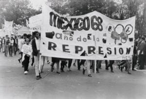
“Mexico 68, Year of Repression”
In that year, social movements all over the world against the bureaucratic and military elites were erupting, like in the United States where people were protesting against the Vietnam War and participating in the Civil Rights Movement. Continuous protests started being organized in the capital of Mexico, and the government was nervous about the image of Mexico that was being distributed by the media just before the Olympics, especially since hundreds of journalists started arriving in the country during the months previous to the sports event. The image that the government, led by president Gustavo Díaz Ordaz, was trying to transmit was “peace and cordiality” which evidently wasn’t the case.
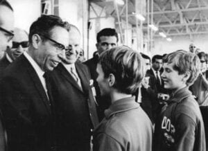 Gustavo Díaz Ordaz greeting some athletes
On October 2, 1968, over fifteen thousand people gathered at La Plaza de las Tres Culturas (Three Cultures Plaza) to protest peacefully asking to stop police brutality, among other things. Nonetheless, the government decided to send military forces. They opened fire without any warnings and shot indiscriminately at students, teachers, men, women, and children. The death toll was manipulated and hidden for years, but it’s said to be around 325 deaths. However, this event not only left scars but also, in a less evident way, it left some good things behind that until today are icons of Mexico City. One of these things is the visual identity developed for the Olympic Games that until today is present in Mexico City’s inhabitants’ daily lives.
Lance Wyman: The Chosen One
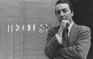 Lance Wyman in 1968
For the Olympic Games branding, Mexico organized an international competition to find a designer and Lance Wyman was the winner. Wyman, back then, was a 29-year-old designer born in New Jersey. He graduated with a degree in Industrial Design in 1960 from Pratt Institute in Brooklyn, New York. After that, he attended Yale for his graduate studies, where he met Paul Rand and became interested in logo design.
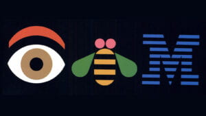 Paul Rand’s logo design for IBM that someone presented in class during our second week of class (1981).
Lance Wyman first worked as a graphic designer for General Motors, and then, in 1962, he did the graphics for the 1962 USA Pavilion at the trade fair in Zagreb, Yugoslavia. The theme of the exhibition was “leisure time” and he designed a logo in the shape of an hourglass with a sun and moon image in the top half. The logo became a three-dimensional structure that was the gateway to the exhibit.
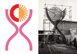 Wyman’s Logotype for the US Pavilion
Wyman went to Mexico City in 1966 for the Olympics graphic design competition with Peter Murdoch as his partner and about this he said that: “It was the beginning of an adventure that has continued to influence my work and my life”.
The Construction Process of “Mexico 68”
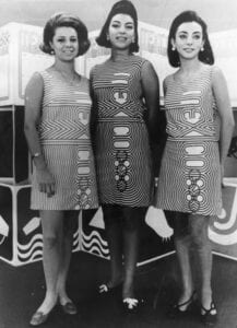
Mexico 68 Staff Uniform including the logo of “Mexico 68”
Wyman obtained inspiration by visiting the most famous museums in Mexico City, especially the museum of anthropology where numerous objects from the prehispanic cultures are preserved. From the pre-hispanic art he took the bold lines, geometric shapes, and the colorfulness he observed. To this, he added optical art he appreciated when he was in New York.
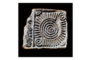
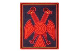
Pre-Hispanic Art that inspired Wyman
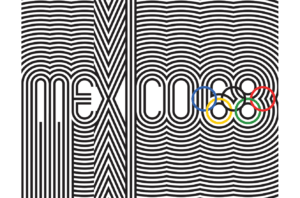
His departing point for the logotype were the Olympic rings that he incorporated inside the number “68’

Then, he added the word “Mexico” next to the number. And finally, a pattern that follows the shapes of the letter and the numbers. 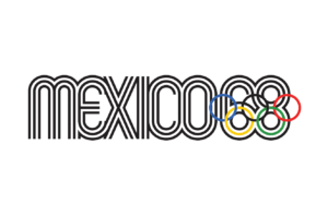
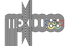

The Rest of His Work
Weyman developed a whole typeface that was used everywhere in Mexico City to promote the games. From the names of the stadiums, to dresses, hats, and balloons. The typeface was there to indicate that something was associated with the sports event.
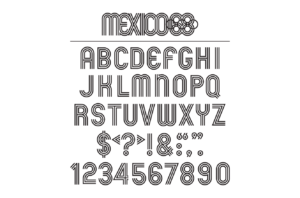
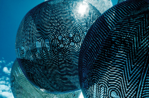
Mexico 68’ Typeface and promotional products.
In September 1968, Mexico City’s subway system was inaugurated and it also needed a branding. To help the visitors move around the city, the branding team was also in charge of creating a navigation system organized by colors. The navigation system and the branding needed to be created in a way that was understandable for locals and for the thousands of tourists that were going to visit the city for the event.
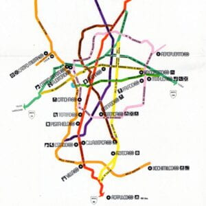 Color coded map of Mexico City with the main stadiums
The STC (which is the system in charge of the metro in Mexico City) also wanted a logo and a representative icon for each metro station. The metro logo was designed by Wyman and the stations’ iconography was designed also by him and the Mexicans Arturo Quiñónez and Francisco Gallardo.
 Mexico City’s Metro Logotype
The three designers studied meticulously the history and what characterized the surrounding area of each one of the stations to come up with a representative symbol for them.
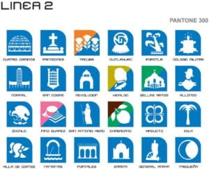
Line 1 of Mexico City’s Metro System
For example, in the picture above, the fifth station has a tree as an icon. This is because next to that metro station is “The Tree of The Sad Night” which is the tree where Hernan Cortés cried after he was defeated by the Aztecs.
Conclusion
Mexico 68 is a wound in Mexico’s history, but it did me good to learn about these magnificent designs and the legacy they left behind. I grew up knowing that the nearest metro station to my house had a shrimp as an icon. I didn’t even know how to read, but I already knew how to use the metro (or sort of). In my personal opinion, Mexico City’s metro system is the easiest one to use compared to the one in NYC, Paris, and Dubai. No matter the language you speak or if you don’t know how to read. You can use the metro in Mexico City thanks to the power of graphic design.
 “Camarones” (shrimps) Metro Station Icon
Consulted Websites
Wooldrage, Chloe. “Mexico Olympics 1968”. Medium. https://medium.com/fgd1-the-archive/mexico-olympics-1968-32fc8d7e0e45 17 October 2017.
Redacción ADN 40. “Esta es la historia de los íconos de las estaciones del Metro CDMX”. ADN 40. https://www.adn40.mx/ciudad/metro-cdmx-iconos-estaciones-mva-especial 11 May 2021.