With Valentine’s day quickly approaching, many individuals may find themselves drawn to a particular retailer for some last minute shopping for a romantic date night this February 14th. It was brought to my attention by a close friend that Zara was featuring a clever advertising campaign video on the first page of their website.
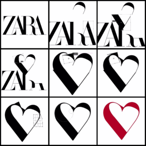
Curious to see, I searched the fast fashion company up and found much to my surprise a recording of the fast fashion company’s logo being transformed into a heart. It is simple photoshop editing: cutting off parts of the simple serif logo and manipulating the shapes of these pieces slightly in order to form an outline of a heart. The promotion video is a sped-up screen recording of this process that produces a captivating advertisement. When it seems like the end of the video with the transfigured heart being covered up with declarations of love in multiple languages, it then reverses, playing backwards and putting back together the company’s logo.

Zara was created originally in 1975 by Amancio Ortega and Rosalía Mera, and called Zorba for a brief moment. It was changed to the name we know it as today, Zara because another store was using the initial name. Its first logo was a clean serif typeface print of its character in all capital letters. The founder rejected the idea of creating a symbol or logo as any product typically has if it is a high quality product. Zara’s four Latin letters hence went on to be known worldwide as the brand’s symbol. Over the years it expanded its empire and now has close to 6500 stores across 88 countries around the world. The logo was changed for the first time in 2008. The letters were spaced out and shortened, seeming flatter and more serious and confident.

No more than ten years later, the logo changed yet again in 2019 catching many customers off-guard. It now features more elongated letters that are superimposed on each other. A very different look in comparison to the previous wide and shortened characters. The letters and leg of the “R” were a bit more curvy. Overall, this new change attempted to make the company appear parallel to top luxury fashion houses in the world with its bold, all-caps logo. It’s typeface is similar to the brand’s artistic director, Fabien Baron’s signature typography. In fact, Baron is also the creative director for the luxury brands, Dior, Burberry, and Maison Margiela. This only affirms that Zara is trying to establish itself with other fashion houses by rebranding.
And yet, it all seems in vain as at around the same time, Yves Saint Laurent, Balenciaga, Balmain, Berluti, and Burberry changed their logos to similar, sans serif characters that can be deemed more versatile and easier to reproduce on different objects and screens. There is no risk of incorrectly scaling the logo and its lettering. They do risk looking very similar, no longer being distinctive and memorable.
:quality(70)/cloudfront-eu-central-1.images.arcpublishing.com/businessoffashion/CAVJK7JASJAK7EXZ4R47GXUPKY.jpg)
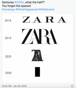
Meanwhile, the main criticism of Zara’s new look was its compactness. Several memes and jokes revolved around the concern that its characters would overlap and get closer together over time.

This year’s Valentine’s day promotion video, however, exemplifies how the new logo can be malleable. In addition, it’s a brilliant marketing ploy as it makes viewers pause on their website and want to watch the recording multiple times in order to understand the process of the logo being transformed into a Valentine’s day heart. By replaying it, viewers unconsciously are becoming more and more familiar with the brand’s name and image, practically memorizing it. This is a form of the concept that we covered in class: the Principle of Familiarity. People tend to remember and develop a preference for products or ideas that they are more familiar with. Basically, “We covet what we see” as Hannibal Lecter claims in Silence of the Lambs. One can do a lot with typography–and a little bit of photoshop.
—–
References:
https://1000logos.net/zara-logo/
https://designbro.com/blog/industry-thoughts/zara-iconic-logo-evolution/
https://www.today.com/style/zara-has-brand-new-logo-it-s-causing-big-commotion-t147819
Hi Zelalem ! Thank you for this very well written and interesting post! I am also not a huge fan of the redesign. It makes me feel claustrophobic, and my mind has to struggle to make sense of what I am reading whenever I see the logo. Thus, I just don’t shop there. However, I also feel like that it was definitely a step forward for the brand to appeal to the younger generation but at the same time claim its place among the older, more established brands of the world like Gucci and LV. But would it have killed Zara to add just a little bit more space between the letters, just for readability? Hahah anyway, happy valentine’s day <3
Hi Zelalem, just wanted to say what an insightful blog post that you had made about one of the most iconic fashion brands of this day, Zara. After reading about the malleability of Zara’s logo design, it immediately put me into perspective of just how serious the world of logo design is now. Nowadays, a logo designer can’t just think of a simple logo that represents the brand or company on a poster or something. Logo designers now even have to think about how a particular design would look like when it is being used or printed on either a tote bag, shoes, clothings, accessories, billboards, or even something intangible such as the Internet or the Metaverse. Logo designers now even have to take into account whether the logos would look differently if it’s being shown on different places and whether it can be manipulated for other future creative purposes, just like changing Zara’s logo into a heart.
Hi Zelalem! I didn’t realize that Zara had mad a move to update it’s logo so that it would more closely align with those of older, more notable fashion houses. A really interesting point that tangentially comes for your post is that fact that logos a designed and redesigned within an industry context. Designers not only have tools to recall other cool designs, but industries like fashion use a visual language to recall themselves and each other.
I don’t think the Zara redesign was unsuccessful despite the move of it’s competitors to assume a more uniform look and feel. It is important to remember that these brands are in different life stages: whereas Zara is a new brand that has more recently made a name for itself, these older fashion brands have been producing products for dozens of years. Distinctiveness in logo design is more likely to be a better choice for Zara especially since it does not support a branded symbol.