For my first blog entry within this class, I wanted to talk about various topics including my overall reflections, thoughts and ideas that I had as I recalled all of the things we have discussed within our classes so far.
Logo, Brand, Emblem
Before taking this class, I was completely oblivious and had zero clue about what logos “truly” meant and what kind of complex meanings and symbol they entailed. Now looking back at this, it is really ironic as logos are literally everywhere around we us and it will always appear in our sight no matter where we turn to look. For example, I now realize just how amazing this phenomenon of logos truly is as we can see logos everywhere. Whether it being outdoors walking in a random street in the city or even indoors when we’re just studying or relaxing, we can see logos everywhere on our everyday objects that we don’t normally pay much attention to their logos such as water bottles, laptops, chargers, phones, etc.
Another fascinating piece of information that I learned from our class when we were researching about the deeper meanings and symbolisms behind various famous brands within their logos. It was that there were in fact other “forms” of logos: brands, emblems, and markers. Though we did not exactly go over the difference between all of them, I was immediately curious about what each of them meant and what were their differences.
Logo?
Firstly, what is a logo? Essentially, a logo is a symbol that is made up of texts and images that accurately identifies a business. A good logo in this case will be able to show what a company does and what the brand values. From what we learned in class, a logo should also be able to make your own brand stand out from the other competitions. For example, I found this interesting logo (Figure.1) of the Cactus Dental company where the logo perfectly distinct itself and its company that it is representing with something that not only is unique but perfectly represents the key attributes of their company. What I personally loved about this logo, though it was hard to understand immediately what the brand was about, was that not only did they incorporate a vital attribute of their company name (cactus) into their logo but they were also able to turn parts of the cactus into toothbrushes, helping us to immediately make the connection that they are a dental company. Therefore, from my own understanding, a logo is a symbol that includes texts and images that identifies a business or company.

Brand?
Secondly, moving on, what is a brand? A brand refers to a business and marketing CONCEPT that helps people identify a particular company, product, or individual. The most important aspect of this definition that I want to point out is that “brand” is just a concept, an intangible idea. I personally felt that this definition is important to me as I always catch myself being confused about what exactly was the difference between brands and logos when talking about it on a day-to-day basis. Interestingly, according to Investopedia, in contrast to a tangible or visible thing such as logos, a brand is essentially “…the collective impact or lasting impression from all that is seen, heard, or experience by customers who come into contact with a company and its products and services.”
After learning about the real definition of what a brand is, I was able to truly realize what this “intangible concept” of a brand meant. For example, whenever I think of a brand such as McDonalds, I immediately associate it to my previous experiences that I had with it, such as fast foods and their fast-paced working environment. Though on the other hand, when I think of other luxurious brands such as Wolfgang’s Steakhouse, I immediately associate it to an entirely different experience where it is more luxurious, formal, waiters wearing suits and gloves, people being all dressed up and just overall a totally different atmosphere and experience for its customers there. Interestingly, this difference in customer experiences can also be reflected through the two brands’ logos (as seen below). For example, the typography used for the two logos is very different, where McDonald’s typography (Figure 2) gives off more of a casual feeling, whereas Wolfgang steakhouse’s logo (Figure 3) immediately has a more formal typography and its full name of the company being listed out as well in its logo just emphasizes on its professionalism.
Emblem?
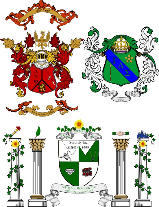
Thirdly, I then moved on and wondered what exactly is an emblem then? Apparently, an emblem is a badge or symbol with a picture and words that are a motto, essentially. Common examples of emblems are normally ones that represent a larger whole. The most common example of an emblem could be the Girl Scout symbol (Figure 4) or the symbol of a fraternity in college (Figure 5). In these two examples, these emblems are representing a larger whole, such as the girl scouts and the whole fraternity.

Taiwan Graphic/Logo Design History
After searching and learning about the deeper meanings and differences between a logo, emblem and brand, I got to thinking even more about interesting stories of graphic and logo design. Therefore, I landed on wanting to know more about the graphic design history of my own country, Taiwan, as I have no heard anything or anyone mention my home country’s history in graphic design throughout my whole life. There were large amounts of information explaining the entire history of graphic design in Taiwan, but I will only include parts that I found to be really interesting and notable.
In the article “Researching Taiwanese Design History in the Context of World Design History” by Dr. Wen Huei Chou, it started off by briefly stating the fact that Taiwan was a hybrid of different cultures such as Chinese, Japanese, and Western cultures such as the United States. Therefore , this will act as the largest influencing factor for the changes in Taiwan’s historical timeline for graphic design. A research that was conducted by Tsuen-Shiung Yau in 2005 found out how the model of industrial production that started to spread widely in Taiwan was later adapted from other external cultures such as from Japan and also later from the United States. This was done by Shiung Yau’s research on the form and style of Taiwanese graphic design and sorting them into typologies like packaging design or labels for various goods.
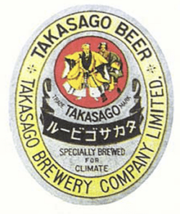
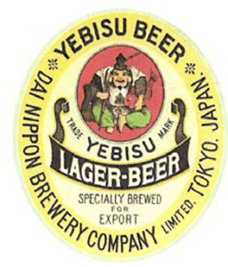
One example of these graphic and logo designs for various goods that I found intriguing were the beer and sake logo design history that showed the influence of external cultures on Taiwan’s local graphic and logo design culture. Basically, there was a beer label design, called Takasoga beer, that was designed in 1920 in Taiwan. The Takasoga beer label design (Figure 6) in Taiwan was later found out that it was actually imitated from the design of another beer label, called Yebisu, (Figure 7) in Japan.
Another example is another series of label designs that were produced for “Longevous Liquor” in Taiwan in historical times. The “Longveous Liquor” was produced during the Taiwan Restoration times and were particularly made for Chiang Kai-shek’s birthdays. Due to some political and historical reasons, the Chiang Kai-shek government had a strong liking to Chinese tradition. As a result, the graphic and logo design culture during this period of time were mostly focused on showing nostalgia for the Chinese cultures and traditions as well as political propaganda. Therefore, as seen in the picture below, one of the “Longevous Liquor” (Figure 8) made in 1969 had its label and packaging designed in red and gold, where the gold color was used to signify supremeness and honorableness in Chinese culture, and the red indicated auspiciousness and joyousness.
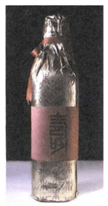
From these two examples of beer brands at the time, it just shows the large influence of external cultures (Japanese and Chinese) that were caused by colonization had a strong influence in Taiwan’s local logo and graphic design culture at the time.
Restoration of Taiwan’s Graphic & Logo Design Culture
Even though Taiwan’s graphic design culture was heavily influenced by external cultures, there are now numerous Taiwan-based design organizations and centers being formed that aims to slowly restore Taiwan’s graphic design culture by incorporating Taiwan’s own unique culture into more of these graphic and logo design. For example, a design research that has derived from the Taiwan Design Center is called “L’ Beautiful Chaos”. This project invited the ‘Design Together’ (Figure 9) design association, which was formed by seven young independent designers, to incorporate features from current Taiwanese society into their design. By doing more of this, hopefully one day Taiwan will be able to retain and form its own unique local graphic design culture.

Wow ! I never thought there was an actual difference between logo and emblem or perhaps emblem being a particular form of logos. Thank you for making this clear now. I am curious to know what your favorite logo or emblem is. One that I love is Galerie Lafayette’s. Not only I find the typography to be very elegant and fancy, but the Eiffel Tower is hidden in the letter ‘f’, solidifying its French roots. When I knew about it, I couldn’t unsee it and now have to tell everyone about this interesting fact haha.