I have always been somewhat fascinated by typography. But, last year when I began my graphic design minor that fascination soared to new heights. I never realized how much work or thought goes into designing type and mixing fonts, much less the technique and skill required. After having Wissam Shawkat visit class and talk about calligraphy, I think it would be fitting to reexplore some of the basic things that I learned in world of typography, after all practice makes perfect.
I have found that when given the tools to think about type, it becomes much easier to talk about, work with, and ultimately make decisions around type and its usage. Further, I was able to explore some of the different philosophies around its application. Below I detail a some of the things that resonated most with me.
Anatomy of Type:

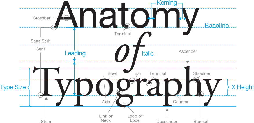
Above is an image that describes some of the primary information around letters and type creation. It is the details of the a types anatomy that you can begin to understand how it is constructed and make better decisions about the sorts of fonts that mix well together. I find that finding letters that share a similar weight or whose letters have similar counter and axis shapes pair well. Learning about these terms and how they show up in different type classes can be super important in the way of communicating what you mean and perfecting your design. It’s in knowing what these parts of construction are that I now know to check for them.
Type Classes:
The following definitions are paraphrases from the book Thinking With Type by Ellen Lupton who offers 7 classifications for type classes. It is important to know that although these are offered as a way to classify type, there is no universally agreed upon classifications system–in fact there are many classifications systems for type. Multiple systems exist because type was not made to fit into a system, therefore the variation and earmarking of specific details as important and distinct continues to be disputed.
1. Old Style / Humanist: This type category is defined by a diagonal stress on rounded strokes, heavy hairlines, and equal spacing between letters. It emerged as a typeform in the 15th and 16th centuries based on roman calligraphy and is now a popular choice for newspapers. Sabon is a recommended specimen exemplar.

2. Transitional: Produced originally in the 17th century, this type class is defined by it’s wide and sharp serifs, vertical axis, and moderate contrast. Baskerville is a primary example.

3. Modern: This category was produced first in the 18th and 19th centuries. Featuring thin and straight serifs, with high contrast within strokes, this category sets itself apart. Bodoni typeface is a fitting example.

4. Egyptian Slab: Recognized by its bold serifs and uniformly heavy weighted lettering style, the slab style category rose to popularity in the 19th century. Clarendon is a primary example.

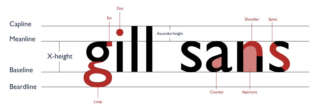
5. Humanist Sans serif: This category of types was popularized in the 20th century. Distinguishing characteristics include small counters and line weight reminiscent of a calligraphic style. Gill Sans is a prime example.

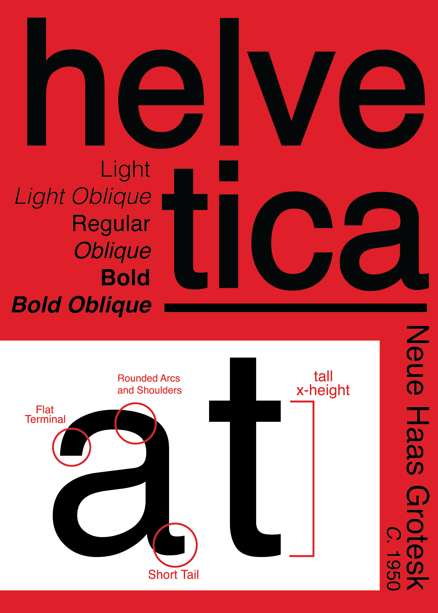
6. Traditional Sans Serif: Fonts of this class became popular in the early 21st century with an emerging push for minimalistic design. This class is defined by uniformity in its full, upright pointing characters. Helvetica is features as a primary example.

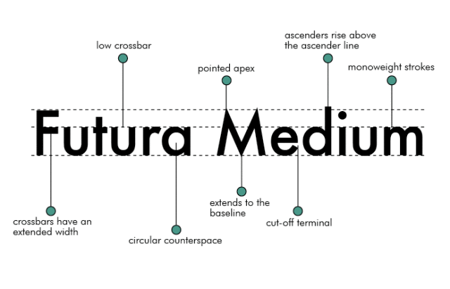
7. Geometric Sans Serif: These typefaces are characterized by geometric and congruent shapes. For example any type face with an “o” that is a perfect circle or has a capital “a” similar to a triangle would fit into this category. Fonts like Futura are good examples for this classification.

Typographers: Amended List
This is just a short list of typographers and typefaces that I was exposed to for research. One of the most important things I have learned in the way of creating within graphic design is to see the work that others have created. It builds inspiration, shows you others solutions to a problem, and ultimately gives context for the future of work in the field.
Resource: Type@Cooper
I love sharing resources, and the Type@Cooper vimeo is easily one of the best I have come across. Produced and shared by the typography department at the Cooper Union, this is a yearly conference/series that brings different designers and typographers to take about their work and the philosophies they hold in their practice. This is a great space to explore different themes of type and to dig deeper into the types of fields that require and use graphic design.
These are all the things I have come across in the way of type. I hope you found some further resources to explore.
Olivia! As I am also interested in typography, reading this post ws fascinating to me. I especially like your analysis for the type Futura, mainly because I like the font’s geometric shape and its neat and clean compoisition. It is so interesting to think about how they are all so different, yet communicate the same alphabet. Depending on the thinkness, roundness, sizes and proportion, each fonts communicate different feelings and emiotions as well. I am curious to find out what are each of our favorite fonts!
My personal favorite is Helvetica Neue.
Hey Soojin! If you’re interested in Helvetica as a typeface, there is a great film about its rise in the last few years and the takes some notable graphic designers have on it. I think I linked it above.
P.S. My favorite fronts are Baskerville, Balboa Plus, and Avebury Black. I like fonts that have personality and visual impact.