One of my most recent projects is co-curating an art exhibition in the Cube, The Arts Center with a good friend of mine, Fatema Al Romaithi. The exhibition we are creating aims to solidify and spotlight the intersection between the Emirati identity and feminine identity. The exhibition analyzes works that reflect this sentiment in both contemporary and historical contexts. We would like to ask the question, “What does it mean to be an Emirati woman?” What does the ‘Emirati woman’, as an identity, represent, and what is she emblematic of?
Preparing for the exhibition not only requires a logo but a solid marketing and promotion plan. First, let’s start with the logo. Initially, we wanted to give it an intimate touch and perhaps have a handwriting and handmade element to it. So I started off sketching the word Emaratiya in Arabic, which turned out like this:
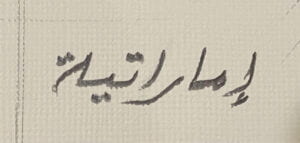
The purpose of this logo is for it to be vinyl on the Cube and on all our social media’s promotional content. But for us to easily achieve that easily and cohesively, we decided to have the logo digitally in Mishafi with the tracking increased:
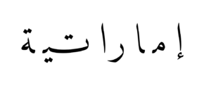
The increased tracking is still readable and gives into one of the many notions the exhibition’s artworks tackle like tension connection.
This is how our render looks like for the exterior of the Cube:
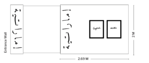
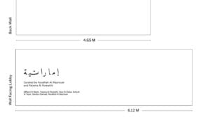
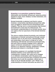
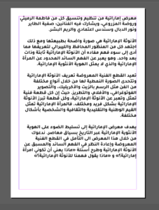
The Arabic and English boxes are intended to be the exposition’s curatorial texts that are going to be posters on the exterior of the cube instead of vinyl, since it will be easier to mount. With the help of my aunt, a Professor of Translation at UAEU, I was able to get the curatorial statement translated to Arabic. Then, I had both texts on Indesign, set on A1, in Gotham and Tajawal. They are planned to printed on heavyweight paper.
Now on to the promotional content for social media. We came up with a schedule that will be followed by the entire team, including the artists behind the Emaratiya exhibition and it entails:
May 1st: The teaser instagram video that will only be uploaded on instagram stories will look like this:
May 10th: For the actual post that is planned to be posted onto the feed is a continued video:
Click to access the video (Video is too long to an in-line attachment)
The names featured are the participating artist’s names in their own handwriting. This allows us to evoke that same intimate and handmade element we wanted to emulate in the beginning.
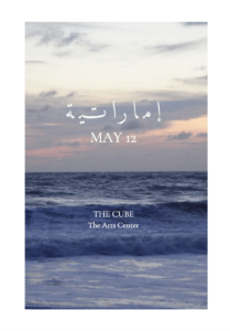
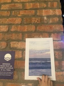
Now for the poster that is being planned to be posted around campus, we are planning to have a simple still from the promo video:
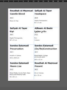
As for the artwork panels that are going to be attached by the artworks on the cube (describing the artwork’s title, size, medium) are planned to look like this. A mixture of Gotham and Times New Roman, the arabic is Tajawal. They were created on indesign and are planned to be printed on heavyweight paper.
Last but not least, we wanted a brochure that includes the information from the artwork panels + some information behind the concept of each piece written by the artists themselves.
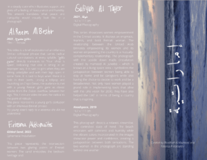
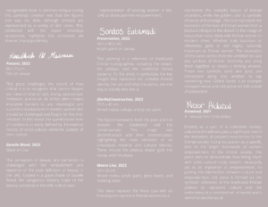
Again, the concept of the girls including their names in their handwriting adds to that original element.
The exhibition is planned to be showcased from May 12th to June 9th, with an installation period from the 10th to the 12th of May, and a de-installation period from the 10th to the 12th of June. We believe it is a great idea to be joining the Pop-Up showcase in the Art Center as this will generate a lot more foot traffic for our show. This blog also acts as an open invitation to anyone reading this, as we would love to have you there. See you on the 12th at 5 pm!
Puzzled by the detached letters. Why not kashidas?
Hello Prof, thank you for your comment. The detached letters is simply a unique artistic and conceptual choice. Adds to the many of the ideas presented in the exhibition.