When learning about what makes a great brand or logo, we often look for the best success stories like Nike, or Adidas, or Coca-Cola. However, sometimes by looking at what doesn’t work and why some major brand redesigns failed dramatically, can tell us a lot about the decisions we need to make while designing our own logos. With less than a month left till we reveal the final designs to our clients, let’s take a look at some of the worst brand redesigns that didn’t end well for the companies involved.
1) Gap
Gap is a retail clothing store that used its square blue logo mark for most of the company’s history. The serif-font, on top of the dark blue background was (and still is) the heart of the company’s brand identity. Unfortunately, they decided to have a rebrand in 2010 to follow the more minimalist, simplistic design trend that is all the rage at the moment.

The first thing that really bothers me in the redesigned logo is the change in font, and the change from an all uppercase logotype to a standard ‘Gap’. The large blue square that made the logo standout was now a tiny, less vibrant square at the corner of the logo. Furthermore, the company’s attempt at embracing a minimalist design failed as well with the use of a dull gradient in the square. The vibrance was gone, the iconic logotype was gone. The company’s brand identity went from being ‘GAP’ to just another generic ‘gap’. Most importantly, the essence of the brand was lost- the biggest mistake you can make when redesigning your logo.
2) Yahoo!
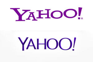
Yahoo is an online search engine and news-provider that once used to be the go-to-browsing location before Google took over the world. Its original funky logo resonated with the company’s ambitious goals of covering everything from web browsing to news. The misaligned text and font also went well with the brand name: ‘Yahoo!’.

However, when the company decided to boost their market image and went for a rebrand in 2013, the designers responsible for the new logo went in all the wrong directions. The silly, fun vibe associated with the original logo was gone and in came a more generic, rounded, aligned sans-serif font. In addition to that, during a period where brand redesigns went for flat, minimal designs, Yahoo! went for chiseled alphabets with a darker gradient purple to replace their original, flat ‘Yahoo!’ violet. This redesign would’ve worked in the skeuomorphism era, but it was a total failure for the time it did happen.

It is fair to note that Yahoo! did realize their mistake and opted for another brand redesign in 2019. This newer logo is more aesthetic and minimal, but I still think it lacks the silliness of the original logo that made it standout.
3) Juventus
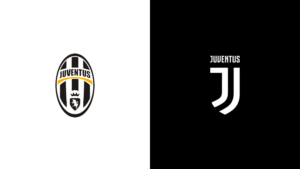
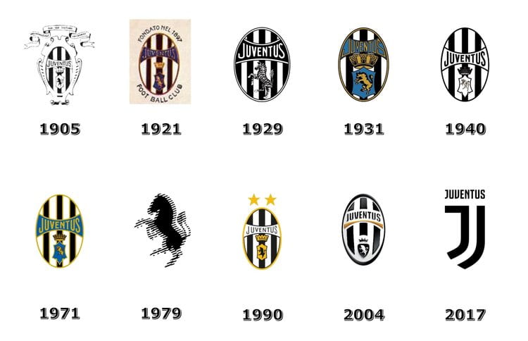
Juventus is an Italian football club that plays in the top division called Serie A. It has cemented its reputation as one of the top teams in Italy and Europe, and the iconic black and white stripes that are present in its original ‘badges’ are still present on today’s kits. However, the club decided to go for a complete rebrand in 2017 and in my opinion, Juventus became unrecognizable.

Coming from a person who does personally enjoy watching football and supporting football clubs, the latest Juventus logo completely missed the mark. When I first saw it, I couldn’t even tell that ‘oh, that’s Juventus!’ The black and white stripes inside an oval badge had become an embodiment of what stands for Juventus (from 1905 to 2017). Therefore, the sudden removal of such a key element of the logo made it lose the essence of the club’s image. There are also other problems with the redesign. The capital ‘J’ that makes up most of the new logo is designed in such a way that makes it look like there are two ‘J’s in the name (even though there aren’t). Maybe this was an attempt at preserving some form of the black and white stripes, but in my opinion it doesn’t really work. Sadly, this is what the club’s brand identity has become, and it doesn’t look like it is about to change anytime soon.

Thank you for this insightful entry, Shawn! I know nothing about football but I have to admit that the new Juventus logo looks better in my opinion. The rebranding in itself has a purpose which is to essentially enable “Juventus” to become a lifestyle brand that is a part of the entertainment industry and no longer be confined to football alone. Redesigning the logo to look more sophisticated is a successful move and will surely help them associate the letter “J” with their brand in the future just as Google is associated with “G” or McDonald’s with“M”.
I agree with this. I really like the new Juventus logo as well. I think they were clever to hold onto the stripes in the form of the J, but I do agree that it looks like two Js. Maybe if they connected the two lines at the top it would be better? Just a thought.
Hi Shawn!
In general I’m very skeptical when I see that a company renewed/ modified its logo. I guess I’m a person of habits and I’m not very open to changes. I agreed with you on your views with these rebranding cases, and to be honest I never noticed Gap’s new logo back in 2010.
I consider that for a rebranding to be successful, it still has to keep a lot of elements, or the essence, of the previous one, if not they become almost unrecognizable and people don’t associate them to the brand anymore.
Hi Shawn, this is a super interesting direction to explore. I actually had a strong reaction to the Gap rebrand–it’s bad. :'( When I first saw Gap’s new logo I though it was for the Gap kids outlet, which I think is very similar to the Gap kids in-store branding, but it is something about font and the all caps and the blue square that just work. I don’t know the importance of those design decisions based on the Gap brief, but it closely related to the Gap brand itself.
On another note, the second yahoo rebrand is a travesty. It looks like it was pulled from the early internet websites and it a true step backward. I’m not mad at the newest rebrand however, it put a polish on the personality that the original design was dripping with. If I had one critique, however, it’s YAHOO! not yahoo!. (I don’t know anyone who would say Yahoo lowercase, but then add an exclamation point.)
Hey, Shawn! Thank you for an interesting read, it made me think of how much I personally dislike that all the brands are turning to sans serif fonts. Though, these logos are easier to read now, they also are harder to tell apart. Font is of course not the only mean through which one may be able to communicate the identity of the brand, but it is a very crucial one. If we, as artists and designers, are given a choice between accessibility and creativity, which one do we sacrifice?
Thank you for this conceptually thought-provoking post. I agree with you on how we could learn so much from others’ failures. This reminds me of the class exercise we did on eliminating logos when we were deciding on the potentil logo designs that we could focus on as a class. By eliminating the design that aren’t the most effective, we were able to identify the most effective designs.
In regards to the three logos you explained above, I see a common trend in logos becoming more simple, and less decorative. While I agree with Rania on how the new logo looks much “nicer” since I don’t have any emotions attached to the previous logo, I believe that such a drastic change in logo can be risky. It will take the personal attachment to the brand away. This is why I think for our projects, we need to design a logo that can last long.