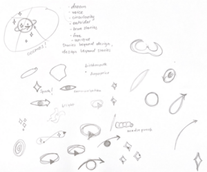
On Wednesday we had our last impossible brief given to us by Massimiliano Sagrati and Serena Ciriello. We were given about an hour and a half to create a visual identity for Cosimo, a clothing brand by Cosimo Ippolito based in London with a DNA of Italian craftsmanship. This brief was communicated in great details, which allowed for some immediate ideas and thoughts to pop up in my head. The concepts and words that I have found important for the visual identity to include were: circularity and uniqueness. Those two stood out to me the most as Cosimo positions itself in a circular way, “stories beyond design, design beyond stories”, and through its mission and values tries to stand out from the other brands.

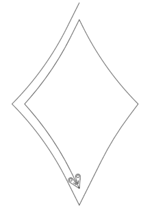
When sketching, I first write out the key words and phrases, so that I don’t lose my focus in the process and end up making a logo that is loosely connected to the brand. I was drawing lots of circles as I was thinking of circularity and it made me subsequently think of planets, eye iris, and sparks. Fast forward to the end of the second half of the workshop, I have ended up presenting this:

Initially, what I wanted to communicate with this design was the circularity of the brand. I was imagining circularity to be strictly of a circular shape, but then I have realized that it can be any continuous shape. So I have chosen a shape of a spark, which in a way is a symbol of uniqueness. It’s only after that that I have started thinking of adding something more to the design because it was just a single plain spark. I have realized that it’s outline looks like yarn or a thread and that’s when I have recalled that this brand is unique for its special Italian sawing technique, aguglia. I decided to add this little mirrored detail that looks like a needle at the inner end of the spark. By this point I have run out of time, so I had to present my design as it is. I was quite upset with the outcome because it barely looks like a logo, more like a sketch. I liked this brief quite a lot and wanted to give it some more time, which is what I am using this blog post for.
Few things that I want to work on in my second attempt at proposing a logo for Cosimo:
- focus on the concepts of sewing, and aguglia;
- keep in mind that Cosimo is a clothing brand, so the final design must look like nice, clear, and recognizable on the clothes.
After some thinking and sketching on Illustrator, I came up with a few possible designs. All of them are tightly connected to the aguglia as a fish, the shape of the needle, and the letter ‘C’ (the first letter in the brand’s name). This time around, I was more confident and less lost while sketching. Getting some feedback from professor, seeing my classmates’ ideas, and settling on one idea as opposed to trying to cover multiple aspects at once contributed to this positive change. You can see my sketches below.

In all of my designs, I have used the long and sleek shape of the aguglia fish to make a letter ‘C’. I then played with the angles and the widths to create some variations of this design. As you can see, the two designs in the left column have an additional detail to make them resemble the needle eye. This way I am communicating both concepts: aguglia, and sewing.
The two designs on their right, on the other hand, only communicate the aguglia fish and have the upper part of their edge split into two to make it look like its mouth. I don’t favor these two variations, because they are too abstract and resemble a snake more than a fish. On the good side, they made me think of brands like Lacoste, PUMA, and Polo Ralph Lauren. These clothing brands have various animals illustrated in their logos and I have realized that I can do the same. For some reason, I keep forgetting that minimalism and abstraction are not the only ways to go for in a design. With this in mind, I have drawn aguglia on illustrator. You can see the image below.

I actually like this design the most out of the ones I have done so far. If I were to present my logo design again, I’d present this one and the first one in the left column from the four variations shown above.
Hi Adina!!
I loved the logos with the needle eye and to be honest I came back to read your blog entry because the aguglia fish caught my attention and I didn’t see at first the connection with the brand. But once reading your process I think it’s extremely creative. I also have the same problem that I forget a logo can go beyond minimalism. For the SMART logo, professor Goffredo suggested to go for a hyperrealistic lizard, but Shawn and me didn’t love the idea and ended up going for an abstract and minimalist version of a gecko.
Adina, I love how clean yet visually interesting your logo is. I love reading about your creative process and see the outcome. It’s great that you have challenged yourself to finish the design. Well done!
Hey Adina! I’m glad to see that you came back to this brief because that was something very much on my own mind after that class. I didn’t know that aguglia was also the name of a fish, much less a super recognizable one. I really enjoyed the two toned nature of the design and the detail with which you executed your idea. Simplicity and abstraction in logo design can be such a tricky thing to decided when is best to use or refrain from use. I think the detailed aguglia design speaks even to the craftsmanship part of the Cosmo product and a super cool brand identity could be built around this. Congrats!