Professor Goffredo Puccetti mentioned in class, as designers, we are in an exciting time and location to express our creativity and explore our full potential with the exciting opportunities presented. Therefore, in this blog post I will discuss some factors that I have noticed in the corporate logo trends of Abu Dhabi and the MENA region, which gave me an idea of how the visual branding scene works here.
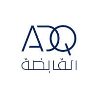
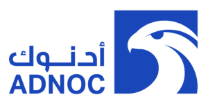
If you take a look and reflect on the corporate landscape of Abu Dhabi and the MENA economy, you’ll notice it is quite concentrated among a few prominent state-owned companies with abbreviated logos – that look pretty standard.
Names would start with Abu Dhabi’s abbreviation – “AD” – and then another few letters describing something about the industry they’re operating in. Generally, the font style would be standard too across the board (i.e. Arial, Tahoma, etc) and blue or black shades seem to be on a winning streak, as you can see below.

What’s interesting to watch out for is that recently there seems to be a momentum around launching companies or institutions with names, logos, and branding that have an ‘edge’ within Abu Dhabi. Take for example the new Venture Capital Fund launched by one of Abu Dhabi’s sovereign wealth funds with the name ‘DisruptAD’ or Mubadala’s newly launched special acquisition company with the name ‘Blue Whale Acquisition Corp’. This sort of ‘movement’, as I like to call it, is unfolding among initiatives and investments led by state-owned companies and seems to be influenced or even driven by the wider developments happening in Abu Dhabi and the region’s startup ecosystem.
 (This logo probably receives many critiques from logo designers, specially regarding the Arabic translation of the logo “دسربت أي دي”)
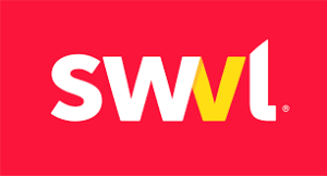
Startups within the MENA region are becoming more creative with their logo designs in hopes of differentiating their businesses and products in an increasingly competitive market. Take ‘SWVL’ – a company providing mass-transit solutions to help people share rides in buses or vans to reach every neighborhood in Cairo, Egypt. A bold bright red logo that does not follow the general blue and black theme in the corporate world of this region. Though the word, SWVL, does not have a particular meaning in Arabic or English but looking at the logo below – it does bring the act of ‘swerving’ or ‘going about somewhere’ in mind.
Another interesting startup logo can be found in ‘Abjjad’ – a digital reading platform allowing access to a variety of Arabic books and connecting minds through Arabic literature. The Arabic letters subtly indicate the theme and mode of communication within the platform with perhaps the ‘d’ in Arabic shaded in orange to emphasize the “d”igital component of the startup’s offering, which includes mistakes in the calligraphy that could have been executed in a better way (for example the letter ج).
![]()
Regardless of the execution of these logos we can see that the usual trend of corporate logos in Abu Dhabi is being gradually transformed. The ambition to be unique and different in logo designs is gradually becoming a part of the visual identities of companies based in this region, showing a contrast between the previous and more recent logo designs created.
The main takeaway is that successful logos bring about a sense of curiosity to people – whether investors, customers, or other stakeholders. The questions of what does the logo mean? Does it stand for anything? immediately springs to mind and that’s the objective of startups – to get you thinking, wanting to know more, and hopefully contribute financially or through other means to support the company’s growth.
The prioritization of nailing the logo design entails that the visual branding and identity of the startup does have a significant impact on their success and particularly their ability to raise money. This is becoming strikingly important as businesses are becoming more automated and creativity is being appreciated, as it is the main differentiator. On a more granular level, logos give you insight about the team – particularly their collective ideas, focus areas, ambitions, and general spirit (and that’s what investors are betting on). On the other hand, a creative logo also allows teams to visualize and come to terms with their identity which, in turn, transcends into often scattered though creative thoughts guided by the logo’s artistic direction.
It seems the trend of edgy logos is here to stay and it sure is having an impact on the look and feel of the wider economic sectors driving Abu Dhabi and the region – particularly in tech (emerging NFTs, FinTech, etc). Companies are becoming more dynamic, creativity is welcomed and artistic expression is becoming much more fundamentally valued.
Amazing post, Nouf ! Creativity is indeed key to success. It truly enables people to think critically and solve complex problems in exciting ways. I always believe that creative people look at things from a unique perspective that no one else could and because they are great observers, they are usually able to catch details using all of their senses and approach tasks differently. It is therefore a skill we all need to develop and one that must be taught in schools, universities and companies to everyone whether it is the arts, science or humanities field.
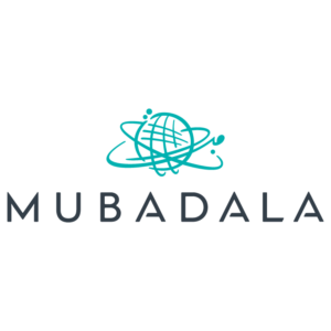
What’s your take on the mubadala logo? To me is an example of overdose of elements. What do you think of the calligraphy in the mark?
Yes I agree. I think the Mubadala Logo is trying to portray the investment company in a way that emphasizes their investment coverage across the world. This is especially shown in their website as well with the world map constantly appearing on the screen. I think that the logo could have definitely avoided restating the same meaning since “Mubadala” in Arabic (مبادلة) directly translates to exchange. A minimalistic approach for this professional investment company could have been a much better approach, the globe looks cliche and unoriginal not showing the purpose and ambition of Mubadala.
Thank you so much for sharing your observations and thoughts about the logos and branding in the MENA region. It’s curious that there is a trend of using shades of blue in most of these logos you mention. I wonder why this might be the case? Creativity is becoming more appreciated as it is the key differentiator and yet there seems to be an attraction or resort to standardizations which you point out with the choice of font type and color.
I totally agree with the points you have stated. The commercial or corporate industry is getting more and more competitive everyday and companies are really finding it hard to stand out. Not ‘standing-out’ in today’s world is basically going to lead you to bankruptcy. Hence, having a distinct brand identity is really important and in order to have that you sometimes need to go against the trends. Great article!