I have been mulling over what Professor Goffredo has mentioned as a passing comment on multiple occasions in class about us possibly creating a collective visual identity amongst the research centers here at NYUAD. At the moment, they are all quite distinct and that is what makes them feel disparate from one another.
| al Mawrid Arab Center for the Study of Art
|
Center for Astro, Particle, and Planetary Physics
|
| Center for Behavioral Institutional Design (C-BID)
|
Center for Cyber Security
|
| Center for Genomics and Systems Biology
|
Center for Global Sea Level Change
|
| Center for Interacting Urban Networks
|
Center for Prototype Climate Modeling
|
| Center for Space Science
|
Center for Stability, Instability, and Turbulence
|
| Global TIES for Children(no official logo) | Public Health Research Center(no official logo) |
| Water Research Center
|
Library of Arabic Literature
|
| Neuroscience of Language Lab(no official logo) | Humanities Research Fellowships for the Study of the Arab World(no official logo) |
| Center for Quantum and Topological Systems(no official logo) | Arabian Center for Climate and Environmental ScienceS (ACCESS)(official logo in the making) |
| Center for Artificial Intelligence and Robotics(official logo in the making) | Center for Smart Engineering Materials(official logo in the making) |
Before tackling how we could possibly unite the unique images of these centers, I would first like to bring into the discussion other collections of logos that fall under a single overarching label and analyze how they are brought together.
As a university student, I often turn to–what is now called–Google Workspace for my general note taking with Google Drive and email on Gmail. It struck me one day in Design class when I was going to Google Drive that Google has put forward icons that all are in conversation with one another in the last couple of years. They have achieved this by using a main motif of four colors for their icons: green, yellow, blue, and white (exception with Google Forms in purple). In addition to this distinctly Google color palette, the icons include round corners that look like folded edges of paper, but all have their own individual shape and image. When this new design was pushed forward in late 2020, there was a bit of backlash. One individual commented that, “Google sees uniformity. I see confusion.” With all the icons looking quite similar, it is difficult to recognize the individual apps solely based on their shapes. Color made it easier to identify an app at first glance rather than their shapes. (Take a look at their promotion video for the new design here: https://www.youtube.com/watch?v=uZXa0N0-Zu0&t=33s)

Another platform that has a collection of subcategories is Adobe. Unlike Google Workspace though, the Adobe Cloud kept their iconography simple with the use of two letter abbreviations in a vibrant color atop a darker shade from the same hue scheme. It seems that the purple shaded icons are for the apps that have to do with motion graphics and film while blue is for editing photos and pink for developing websites and other shared user experiences. The greens deal with 3D materials, stage and renderings. Orange for illustration and red for productive collaboration. In all honesty, it’s a lot. There are so many different programs that it is hard for even professionals to know what each icon and program is used for. It reminds me a lot of the periodic table which I found tricky to use in Chemistry until I got the hang of some of the elements since I used them so often. I feel like this applies to all the programs that Adobe has to offer. Despite having variations in color, it is difficult for a user to distinguish what each application is used for because there is no visual cue other than the combination of letters on the square tiles to distinguish them from each other.

Personally, if it’s not already obvious enough, I prefer the approach that Google Workspace has taken with creating a collective visual identity amongst their different programs. Now, looking at our Research Institute Centers here at NYUAD, I believe that we could have all of the logos be either square or circular emblems with a simple signature design that plays on negative space and corresponds to the center’s purpose. An excellent model of this is The Center for Astro, Particle, and Planetary Physics.


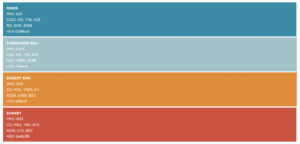
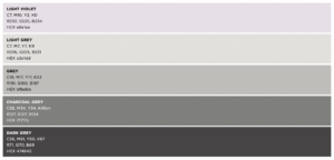
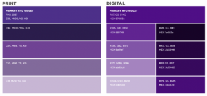
To further tie them all together under the torches of NYUAD, we can refer to the color palettes in the Brand Guidelines. Despite them stating the accent palette is meant to work alongside the primary and neutral palettes, and always be used sparingly and never as the dominant color in a project, I think we might want to revisit this prohibition as it would be in NYUAD’s best interest to have a core set of colors, including these dynamic colors, the signature purple/violet and neutral colors, for their research centers/branches to use.


This is just an idea that I had when observing the Google Workspace and Adobe Cloud applications. I really do think the research centers of NYUAD could use a little revamping to seem more connected, but this is just one person’s point of view. I’m not the sole student at NYUAD. Please, let me know what you think. How else could we make our research centers more unified if not in shape and color? How can we make sure they do not come across as the same, and thus confusing to recognize?
——————————-
Reference Links:
https://nyuad.nyu.edu/en/research/research-institute-centers.html
https://www.youtube.com/watch?v=7W0ISI3yqwo
https://nyuad.nyu.edu/content/dam/nyuad/news/documents/nyuad-brand-guidelines.pdf


You brought an important point Zelalem, as a logo you want to give the brand an identity unique to them but still want it to work with the other logos in the community. You brought an interesting point in the blog, with all the icons looking quite similar, it is difficult to recognize the individual apps. We have to be careful when designing an identity and be considerate to everything surrounding the brand, and the examples from the institutes here in NYUAD is a helpful insight the I will keep in mind with working in the research center’s logos. THANKS FOR THE INSIGHT!
I am so happy to read this post because I was also thinking about Goffredo’s passing comment on creating a logo family that glues different research projects at NYUAD together. This may seem trivial at first but I believe that in long term, it will make a huge difference as an institution. Through this shared identity the sense of pride, bonding, and the connection with each other can be built. Thank you for sharing two very different but examples of cohesive brand identity. I took a time to reflect about what makes Google icons unique and distinctive from others. Although they look very different at first, if observed carefully, they are all have round edges, paper-fold like effects that are composed with simple shapes. The colors are also the key feature that brings these shapes together. Unlike Google, Adobe has more apparent feature that brings the icon together. I agree with you that some of the icons are very similar that it is hard to recognize the differences except the initial letters. However, this also serves as grouping feature where tools used for similar projects are color coordinated. Great work!
I can still remember the first time you brought up this amazing idea one day in class and I really like how you were able to associate it to the NYUAD research center logos and proposing this possible idea in the future. I also agree that it would be amazing if NYUAD can create a collective visual identity for all of its research centers but I think one of the main obstacles and difference between NYUAD to Google is the overall purpose. For example, in the case of NYUAD research centers, I think that the main reason why it is hard to create a collective visual identity for all these research centers is because they all have completely different aims, objective, and purpose so this naturally causes their logos to be more distinct from each other. Whereas in the case of Google, though I am not 100% sure but I think all of those other Google tools are essentially created for a similar purpose, which is to provide a collective platform for users to be able to use all these different applications and tools on just a single platform. However, it is also true that these research centers have a somewhat collective feature between all of them, and that is the color purple. Perhaps a possible idea is to include a wider use of the color purple in all of the research centers in NYUAD? But at the same time we do not want to restrict the creativity of logo designers, so I guess this is the main question to ponder upon.
Hi Zelalem, I really appreciate your insight on how we could visually link all NYUAD research centers together. While I believe it would be great for the logos to look connected, I don’t necessarily think they should be unified in shape and color as this might make them difficult to recognize, similarly to what happened with Google and Adobe. If the university was to require associating all logos to NYUAD, I am sure this would limit the creativity and originality of each center’s logo. I am not sure if we still have time to work on this project, but I feel like this could be a great Impossible Exercise for the students taking Yes Logo next semester. It sounds challenging but fun. Thank you for sharing <3
Hi Zela!
It’d be simply beautiful to have a more uniform and coordinated visual identity for the different centers that NYUAD has. Professor Goffredo laughed at the fact that I chose google when we needed to talk about an important logo, but I still defend it. I also love the way they gave a similar identity to all its different apps, and mainly I love the colors that google uses. I think they are vivid and dynamic colors.
Hi! I must admit that when the professor suggested that we create a system to connect all of the existing logos, I had a hard time understanding what that meant. MIT Press’s logo was the first center system design that we talked about in this area, so your examples of Adobe and Google were actually super useful in helping to expand the idea. I most enjoy how you go about thinking about how the smaller pieces of the design elements work super hard to show branding similarity. From color and shape to font and style, how those small choices speak when seen next to each other was super impactful in helping drive the point home.