When designing logos for the Arab Climate and Environmental Sciences Center and the Center for Intelligent Engineering Materials, we are asked to come up with an abstract representation of a complex idea that will subtly refer to the center’s activities. In turn, when designing the logo for the Cosmo brand, I completely skipped the process of looking for allusions and immediately started experimenting with shapes that would depict the letter “C” in an interesting way. I wanted the character of the letter to refer to the company’s personality, the user should get the coferent feeling of the brand, both from the product itself as from its communication. Here are some of my sketches.
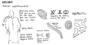
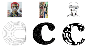
So often, especially among fashion brands, I come across logos consisting only of minimal lettering. This probably led me to subconsciously imagine the cosmo logo as the letter “C”. Logotypes of fashion brands tend to be very minimalistic. This makes sense as they are usually displayed on t-shirts, bags, t-shirts, and must remain relatively indistinctive so as not to clash with other patterns. This does not mean, however, that the logotypes do not represent anything interesting. Every year there are new typographic trends that allow brands to stand out from the competition.
Blurred logos
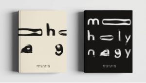
One of the trends featured in the 99designs review are the blurry logos. It is expected that Designers, rather than focusing solely on readability, will be increasingly experimenting with blur effects to emphasize fluidity and movement.
Source: Pentagram
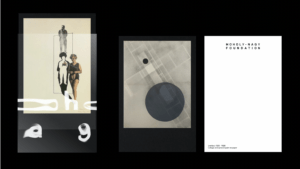
A great example of a brand that took this trend to its greatest advantage is the Moholy-Nagy Foundation, which fosters and shares knowledge about Moholy-Nagy’s art and life. When designing this expressive identity, the Pentagram studio followed the mindset and methods used by Moholy-Nagy himself in his work. – experimental photographs with light, known as photograms.
Source: Pentagram
Inspired by the artist’s experimental approach, Marina Willer and her team created a set of typographic forms using a series of projections using light and water. It is these intriguing letterforms that form the basis of the brand’s fluid identity. Pentagram managed to create a “striking and sympathetic identity which, without mimicking his groundbreaking work, perfectly honors his amazing legacy” (Pentagram).
Scribbles and sketches
Another trend that has been listed among “11 innovative logo design trends for 2022” by 99 designs has been scribbling. While some designers are striving to achieve cleanest and minimalism, some are going into a totally contarctic approach following a childish, shaky nostalgia.
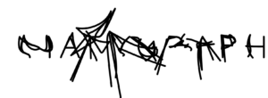
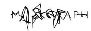
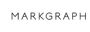
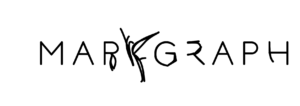
I was especially intrigued by the dynamic logo design for Atelier Markgraph, a studio for brand and theme experiences. The studio believes that its employees are its strength and has decided to embed one of the most personal means of expression in its logo, the voice.
Source: Schultzschultz
First, they recorded their employees saying the company name, Markgraf, then decoded the sounds and represented them through the lines. The result is a dynamically changing Logo, blurred by random looking scribbling, yet having an interesting story behind it. The Specially designed font not only fits into contemporary minimalism, but also allows you to play with these different states of letters.
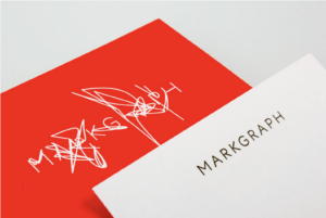
Source: Schultzschultz
Vintage
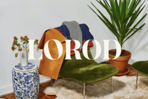
Another emerging trend is the modern twist to vintage to the 70s inspired designs. I was personally drawn to the logotype of the LOROD, the fashion brand of Lauren Rodriguez and Michael Freels, which redefines timeless basics with modern, distinctive fabrics and vintage-inspired chic. The logotype was adapted from Austin Bold, “a modern 1970s serif font (Pentagram).” The first “O” in the name is slightly tilted, which is meant to allude to the unexpected details in the clothes that make each piece seem like a one-of-a-kind find.
In addition, the brand’s website shows “cut-out graphic shapes, a reference to the construction of the garments, which uses alternative pattern-making techniques”(Pentagram). This is a very unique solution that makes the brand appear less corporate and more fun and quirky.
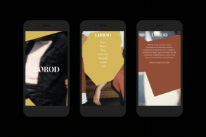
Source: Pentagram
This was an interesting blog and now I know why logotypes of fashion brands tend to be very minimalistic, as it forgot about how they need it to not clash with the design of the shirts and bags. Logos can contain graphic and typographic elements. The examples you presented were really intriguing, all three as I noted them down. Your work with fashion branding is amazing and I can see your passion in the writing, you have a fine eye for detail.
It is really interesting to see the different trends and the changing trends of the logo design. All three examples of fashion brand logos you have shared above have strong identitys. Whether it is through blurring letter forms, being playful with the strokes, or adding cut-out graphic shapes, they all leave strong sentiments to the viewers. I find it especially interesting to think how Logo is not about readability per se. Instead, I believe that it is about how much emotion it can convey. As a designer who focuses a lot on readability and usability of the products, it is a fresh insight to think about.
Regarding your decision to quickly narrowing down your focus to play around with letter C, when designing a logo fo Cosmo, is highly admirable. I think some of the greatest talent of the designer is to be able to make decisions quickly. I personally like your first logo variation the most for its elegance and the texture that reminds me of threads.
Thank you for this wonderful entry, Marta ! I have to say that the whole concept of brands/people following/abandoning trends bothers me a lot, especially when it comes to design and fashion. I respect design and its rules, however I also realize that it should be unique to each and every one of us. What I actually love about design is that nobody can tell you something is right or wrong, because if you strip everything down to the bottom line, there are no rules, humans create rules. To me, successful design is personal, it’s truly a reflection of one’s personality !
I totally agree Rania! That’s why in my essay I’ve identified brands that appeal to me personally out of the logos listed within certain trends categories – trends helps to classify them. Nevertheless, it seems to me that we are subconsciously influenced by trends, what we think looks good is probably due to the vast number of similar designs we have come across. Brands continue to rebrand to follow these trends, maybe if design wasn’t so close to the business world, it wouldn’t be like that.
Wow! I really enjoyed reading your post. Your explanation on how you tackled the impossible brief of the Cosimo logo was really interesting to read about, because when looking at your great logo designs in class I wondered what was your thought process behind this result. By immediately experimenting with the letter C your focus was very efficient and your design process was very clear and had a great objective with the visual branding of fashion brands. I truly can imagine your logo designs with their variations being beautifully implemented for Cosimo. Your exploration of the different ways logo type design is being recently expressed through either blurred, scribbles, or vintage gives the reader a great idea about the world of logo design through creative typography.