I think it is very interesting how one word can be associated with two widely used distinct things, and yet they are not confused.
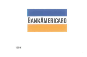
The first visa is the brand “Visa” of which a short brand history is in order. It began when thousands of Americans received a yellow, white and blue card – the Bank Americard – to launch the all purpose credit card. The stripes were chosen to represent the hills of California where the Bank of America’s roots can be found – blue for the sky and yellow (gold) for the golden hills.
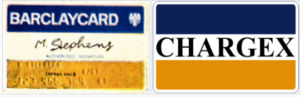
The company underwent many changes and restructuring, such as that in 1974, the International Bankcard Company (IBANCO), a multinational member corporation, was founded in order to manage the international BankAmericard program. BankAmericard became an international organization, but “there was no unifying brand name” as “each brand used its own name with some version of the blue, white and gold flag” (Ron van der Vlugt). The directors of IBANCO determined that bringing the various international networks together into a single network with a single name internationally would be in the best interests of the corporation; however, many countries were reluctant to issue a card associated with Bank of America, For this reason, in 1976 in 1976, BankAmericard and all its licensees united under the new name, “Visa”. The brand’s founder, Dee Hock, who “recognized the power of one unifying global brand” came up with with the name together with his employees. The brand retained the distinctive blue, white and gold flag for “reasons of continuity”.
For the next thirty years the logo did not change much until in 2000 it was restyled slightly to and a corporate logo with a, surprise surprise, yellow swoosh was introduced. Later on, as the bank card business was growing into a plastic free industry, the literal picture of the card (which is what the flag with the name in the middle resembled) was too limited an a separate corporate logo proved confusing and somewhat against the point of uniting under a single brand to begin with. A need arose for a single brand framework that accommodated all payment types and services with one single logo for use in multiple environments. This resulted in a new logo in 2006 where the “V” was given a distinctive accent by twisting a serif, and the space consuming borders were removed making the Visa name much more prominent (Ron van der Vlugt) (and thankfully, the swoosh was removed).
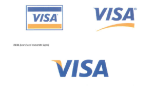
![]()
Image credits to Visa’s inhouse design team.
Today, Visa is very highly known – its logo is seen on cards, but not only. It is one of the largest card payment companies and was reported to have processed 100 billion transactions during 2014 with a total volume of US$6.8 trillion.
From a branding standpoint, it is interesting that (in the perhaps somewhat limited pool of people that I am acquainted with) most people know about Visa, but not what they actually do. The few individuals I asked about it for the purpose of this essay said that they think it has to do something with credit cards, but did not know exactly what. Visa actually facilitates electronic funds transfers throughout the world, most commonly through Visa-branded cards (credit, debit cards, prepaid). Contrary to what is most easily assumed, Visa does not actually issue cards, they provides financial institutions with Visa-branded payment products that they then use to offer credit, debit, prepaid and cash access programs to their customers. But regardless, the main point is that the logo is known and recognizable.
The other totally different visa is the one that you might need to travel to a country you are not a citizen of. The word visa, coming from the Latin charta visa, meaning “paper that has to be seen”, is a conditional authorization granted by a polity to a foreigner that allows them to enter, remain within, or, more rarely, to leave its territory. Visas have come into major use after Word War I, clearly preceding the establishment of Visa Inc, so it is a little unclear why they decided to go with the name considering that it has already been associated with something quite widely used. It is also unclear how the brand became so widely recognized despite there already existing something with a similar name. Perhaps this has to do with the fact that Visa was a rebranding and merging of a preexisting international organization with millions of customers and not something new, or perhaps it was because it had its origins in the late 21st century and foreign travel (and by extension visas) were not on the minds of people as much as they are on our minds.
One could argue that this is something like Apple, where now the word is associated more with the company rather than the fruit, but it might not necessarily be the case. There seems to be a distinction that we have between the two visas that we have in our heads depending on the context. I have never had anyone assume that I am applying for a bank card when I said that I am applying for a visa, and similarly, I have not ever had anyone assume that I am talking about a travel document when I tell them that my Visa card did not accept the transaction.
Perhaps this works because visa (the travel document) is not a competing brand, but rather a word for something (perhaps it actually is similar to apple?) but I wonder if Visa (the brand) would have been more or less successful and recognized if it wasn’t named a word also associated with something else? Does this only work because when you talk about it the context is so clear. What if it wasn’t?
It is also interesting that Apple’s logo is an apple, and Visa’s logo is the word spelled out. It is very readable, visible and straightforward. No metaphors or hidden meaning – just the word spelled out. What if it was a picture mark? Would that still work if our brains had to train to associate “visa” with whatever that picture is? This also opens the question of “should brands be named with real words or things that already exist?” What affect does it have on brand recognition and marketing? From a design standpoint, it might not be so important if the logo is iconic, but regardless, how does the association we have with the word break the association we have with the logo? These are all questions that I wonder about, but do not necessarily feel qualified to answer.
Sounces:
Logo Life
https://ideas.repec.org/p/hoo/wpaper/16107.html
https://web.archive.org/web/20150501055215/http://usa.visa.com/download/corporate/_media/visa-fact-sheet.pdf
https://www.forbes.com/sites/danielfisher/2015/05/06/visa-moves-at-the-speed-of-money/?sh=7a2d8b6057c3
https://www.finextra.com/pressarticle/65412/unionpay-takes-top-spot-from-visa-in-22-trillion-global-cards-market—rbr
https://www.ukfinance.org.uk/data-and-research/data/cards/card-spending
https://www.theguardian.com/travel/2006/nov/17/travelnews
chrome-extension://efaidnbmnnnibpcajpcglclefindmkaj/viewer.html?pdfurl=https%3A%2F%2Fwww.visa.co.uk%2Fdam%2FVCOM%2Fdownload%2Fcorporate%2Fmedia%2Fvisanet-technology%2Fvisa-net-booklet.pdf&clen=2314216&chunk=true
Super interesting entry, Leo ! I also always ask myself the same question: “Should brands be named with real words or things that already exist?” I actually don’t think there is a right answer to this because what is a real word? What does Google or Oppo mean for instance? Maybe we can all discuss this once we are back in class.
“Should brands be named with real words or things that already exist?” is an excellent question that I think we should delve into more in class. I often wonder when we, as designers, should either use the name of the brand/company or create an icon image for brand recognition and marketing. Is there ever a right answer? It seems to vary, especially as there are a lot of factors that play into getting recognition.