By Shawn Nassabi
Logo design trends, or design trends in general, are always changing to cater to the keen eyes of the ‘modern’ consumer. The definition of ‘modern’ design back in 1980 was very different from what it is now. Gone are the gradient shadows and intricate details of the 80s, which are now replaced by simplicity and flat design. It is interesting to think about what influences these major evolutions in logo design trends. Is it technological development? Is it pop culture? Is it the media? Through this blog post, we will take a look at the evolution of some of the most iconic logos from different industries and analyze how and why logo design trends change over time.
The Extra Detail Era
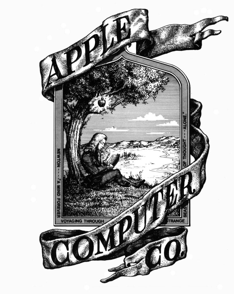
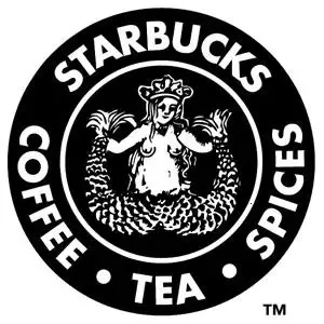
What you see above is the original Apple logo, designed in 1976, and the first Starbucks logo, designed in 1971. Clearly, there are very detailed illustrations embedded within the logos, especially the Apple logo, which features a drawing of Isaac Newton underneath an apple tree – linking it to the discovery of gravity. In other words, the Apple logo is trying to convey the message of ‘innovative technology’, albeit through a very realistic, detailed illustration. Similarly, the Starbucks logo features a two-tailed mermaid with very minute scales and features. The design trends during this period of time are quite the opposite of today’s trends. The idea of beautiful design during the 70s seems to be linked to realistic detail. Although it is fair to mention that not all logos during the 70s followed the same pattern. A distinct example is the Nike Swoosh logo which was designed in 1971.
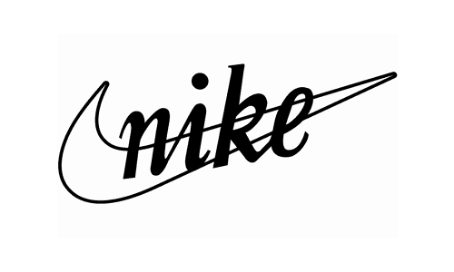
Clearly there aren’t any fancy details in this logo! However, you can still contend that the current Nike logo is even simpler, since it only contains a sole ‘swoosh’, without the ‘Nike’ logotype.
The Skeuomorphism Era
“Skeuomorphism refers to a design principle in which design cues are taken from the physical world” (link 1). In other words, skeuomorphism design tries to mimic the texture and feel of real-world materials/objects.
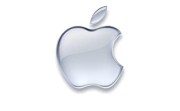
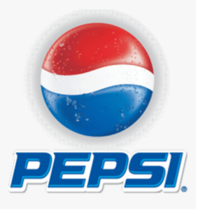
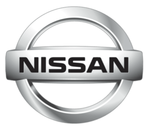
The logos above are the 2001 Apple logo, the 2001 Nissan logo, and the 1996 Pepsi logo. An element of all three of these logos that stands out to me is the reflective or shine effect created with the use of gradient colors and shading. The apple logo tries to replicate the feel of glass or shiny plastic, the Nissan logo resembles the metal chrome texture of an actual physical emblem, and the Pepsi logo tries to replicate the feel of a real can of soda – the tiny droplets of water around the edges of the logo’s curves truly accentuates this effect.
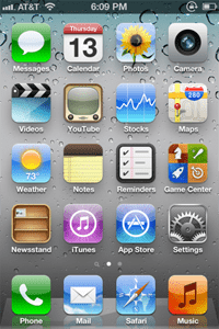
The rise of skeuomorphism was partly due to its use in computer software logos and design. Take, for instance, the screenshots from Apple iPhones in 2010. The logos or icons used for the applications follow the same principles of skeuomorphism that were mentioned above. The inclusion of shadows, gradients, and other realistic detail, makes the designs resemble their real-life counterparts. The logo for ‘Notes’ looks like a real notebook for example. Skeuomorphism dominated design trends during this era because it allowed people who used computer devices for the first time to be able to recognize an application for its use and conveniently navigate within the UI. However, as people got more familiar with using computers and mobile devices, skeuomorphism slowly began to fade, and simplistic, flat design became the new norm.
The Super-Simplicity Era
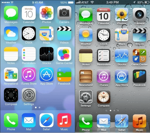
The picture above is, in my opinion, the perfect example of the transition to a simple, flat design. The photo on the left is from the Apple iOS 7 operating system (released in 2013), compared to an older version of the software. As you can see, the use of gradients has become very subtle or in some instances, is completely avoided. The shadows underneath the logos have disappeared, ‘extra’ detail is removed, and the designs no longer resonate with realism. At the same time, it is still very easy to recognize that the camera logo is for the camera app, and the notes logo is used for notetaking, without the use of skeuomorphism. This is known as the flat design trend, which aims for designs to convey their message in the simplest way possible.

As you can see, the current logos for Pepsi, Nissan, and Apple also follow the same trend. A major influence that has led to the rise of this ‘simplicity’ trend is the need for efficient, and elegant digital communication. Almost all companies or brands now have their online websites, and the use of flat, simple design allows their logos to easily be integrated into digital environments.
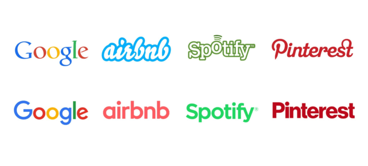
However, it isn’t true to say that flat design doesn’t have its flaws. Many people argue that the ‘over-simplification’ of certain logos can ruin elements that made the original logos unique. This can lead to logos that look quite similar to each other and lack their own personality. As you can see in the image below, the current logos for Google, Airbnb, Spotify, and Pinterest all use a sans-serif typeface with very minor differences between them. It can, however, be stated that the reason why simplified logos are still effective for many companies is because they are already well known by most people. Being a brand that millions of people are already ‘familiar’ with makes it easier for logos to be effectively simplified and still be recognizable.
Links Cited:
link 1 – https://www.techopedia.com/definition/28955/skeuomorphism
This is such an interesting post Shawn, and I enjoyed reading every single word of it because of how coherent the entire post is! I felt like I was traveling through time looking at the entire history of logo design with you haha. Not only so, but I really liked the usage of the same brands through different eras to accurately show how different trends within logo design slowly emerged through time, such as the logos of Nissan, Apple, and Pepsi. I had never heard of the term “Skeuomorphism” until you had brought it up in your post, so thank you!
Hey Shawn! This is a very interesting blog entry. The day Professor Puccetti asked us about the logo that we considered the most iconic or important (I said “Google” haha) I was actually thinking about the instagram logo. The first personal device I had was an iPod touch back in 2013 and it still came with the logos from the Skeuomorphism era. The Instagram logo back then was a 3D vintage camera and I remember when the recent logo came out and I didn’t like it. I was too used to the previous one. But now looking back I’m more in favor of the simplified logos. During one of our first classes when we needed to present the history of one logo, I bumped into the website 1000logos.net and I was fascinated clicking and learning about a lot of logos, and I specially didn’t like the Skeuomorphism era of a lot of them. With all the due respect, the logos from this period seem tacky and at the same time futuristic.
Thank you for this post that taught about a term I had no idea about it.