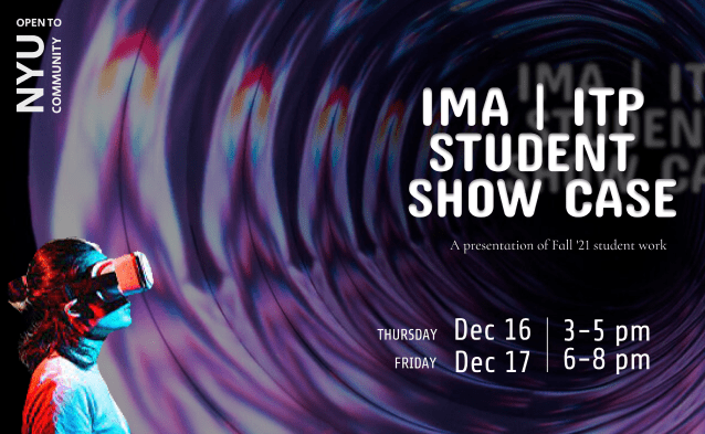
Fig.1 Soojin Lee, IMA | ITP Student Show Case Poster
Last semester, when I was studying away in New York, I had an opportunity to propose a poster for IMA/ITP winter showcase – a two-day showcase of creative interactive projects by the students of ITP/IMA. It was not until I started designing a poster that I realized my major program NYU IMA (Interactive Media Arts), does not have a logo. Despite having a wonderful cross-disciplinary, innovative, and all-encompassing curriculum that intends to bring design, technology, and innovation together, ironically, the program itself was missing a visual identity that communicates such an excellent program. As an Interactive Media Student who studies visual design and knows the importance of visual identity, the fact that IMA program does not have a logo brought me concern and a sense of shame.
Below are the profile pictures of the social media accounts associated with IMA program – Instagram, Twitter, and Facebook in order.
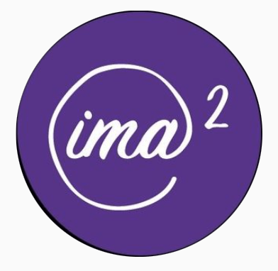
Fig.2 Interactive Media Arts [@ima_nyu]. Instagram, instagram.com/ima_nyu/
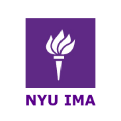
Fig.3 IMA|Tisch|NYU [@IMA_NYU]. Twitter, twitter.com/IMA_NYU
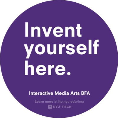
Fig.4 NYU IMA [@NYUIMA]. Facebook, facebook.com/ima.tisch.nyu
I was beyond shocked to find out how inconsistent the visual marks were used in social media to represent IMA program. It is often misunderstood that a logo is only needed for commercial businesses such as Coca-cola, Nike, or Adidas. However, it is not only commercial businesses, but also non-profit organizations, geographical regions, and even individuals need branding. As Mollerup writes in his book Marks of Excellence, branding is a ‘way of being’ (Mollerup 46). Therefore, while the project was initially about designing a “2021 ITP/IMA Winter Show” Poster, I decided to proceed with designing a visual identity for NYU Interactive Media Arts Program. Furthermore, noticing the lack of visual guidance on the way-finding system for the 4th- floor ITP building, where the IMA/ITP department is located, I designed a way-finding system for IMA/ITP space. In this blog, I would like to first share the process of designing NYU IMA logo, as well as how I worked with two other colleagues to improve a way-finding system for the 4th-floor ITP building.
Interactive Media Arts Program
Interactive Media Arts Program, IMA is NYU’s interdisciplinary undergraduate Bachelor of Fine Arts program launched in 2018. The program originated from a graduate program, NYU Interactive Telecommunications Program (NYU ITP), under the Tisch School of the Arts. Both graduate and undergraduate programs focus on exploring the imaginative use of communications technologies to bring delight, utility, and meaning into people’s lives.
Logo Design
Brainstorm & Inspiration
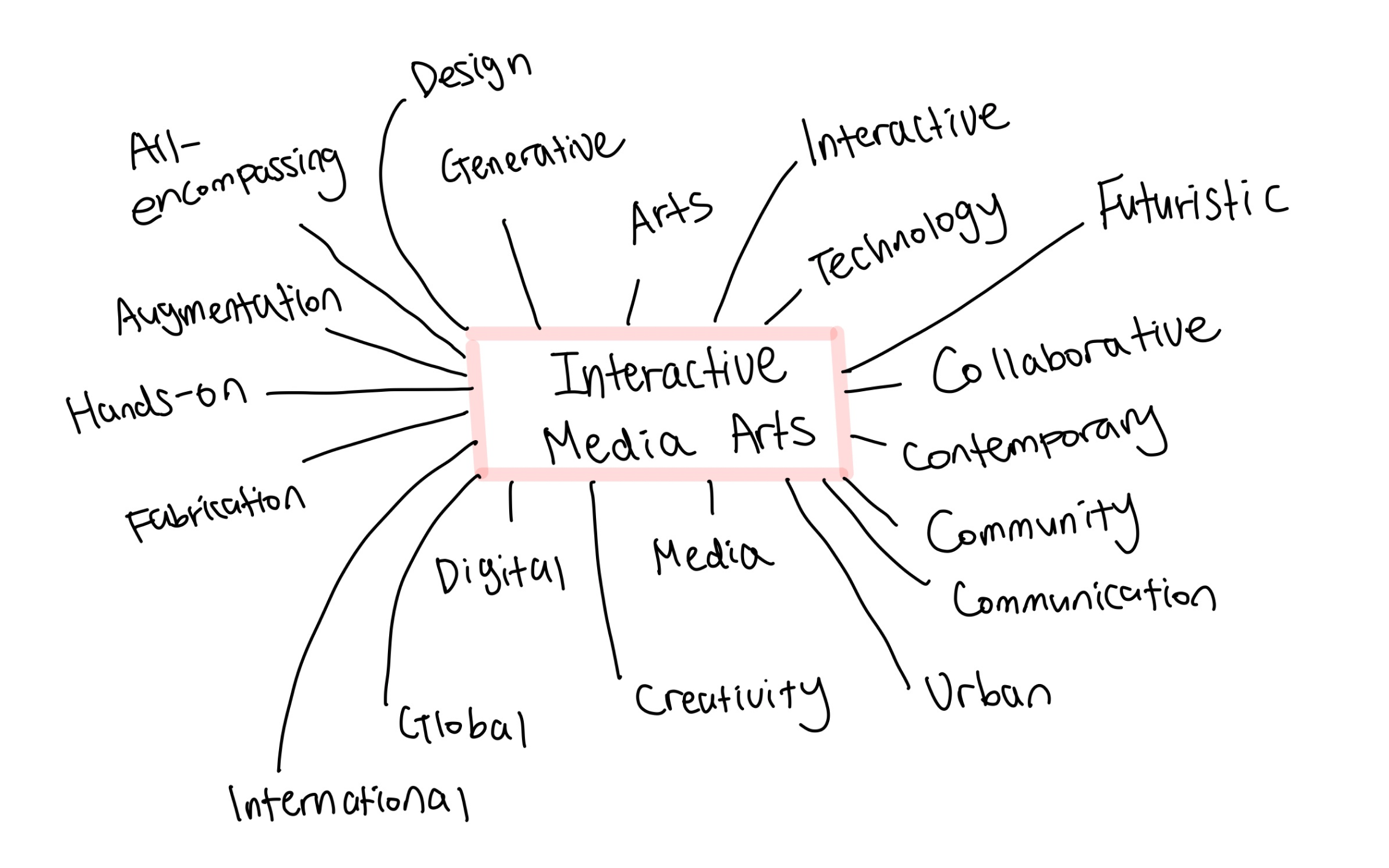
Fig.5 Soojin Lee, IMA Associated Words
To begin with, I started to write down the words that I associate with IMA program – from fabrication, generative, media, global to urban, digital, and communication. When sketching ideas, these words gave me great conceptual inspiration. For the visual part, I was greatly inspired by MIT Media Lab’s simple visual identity. Partnering with Michael Bierut, one of my favorite graphic designers, Pentagram redesigned the graphic identity for MIT Media Lab. Based on a grid system that can be pulled apart and put back together, Pentagram’s identity forms numerous individual glyphs for 23 separate research labs to be part of the bigger, cohesive MIT family. Highly impressed by these static glyphs that are playfully rearranged and repositioned to communicate MIT Media Lab’s ever-changing identity, I wanted to design a simple and adaptable logo for IMA program.
Pentagram, “MIT Media Lab’s Transforming Logo”, Vimeo, 2015, https://vimeo.com/109891648
Sketches
With the conceptual and visual inspirations above, I started to sketch ideas. Some of them are more abstract that the letters are almost unidentifiable, while some of them are more direct. Regardless, all of them uses the the three letter “IMA” that are visually represented to communicate one or more identity of IMA program.
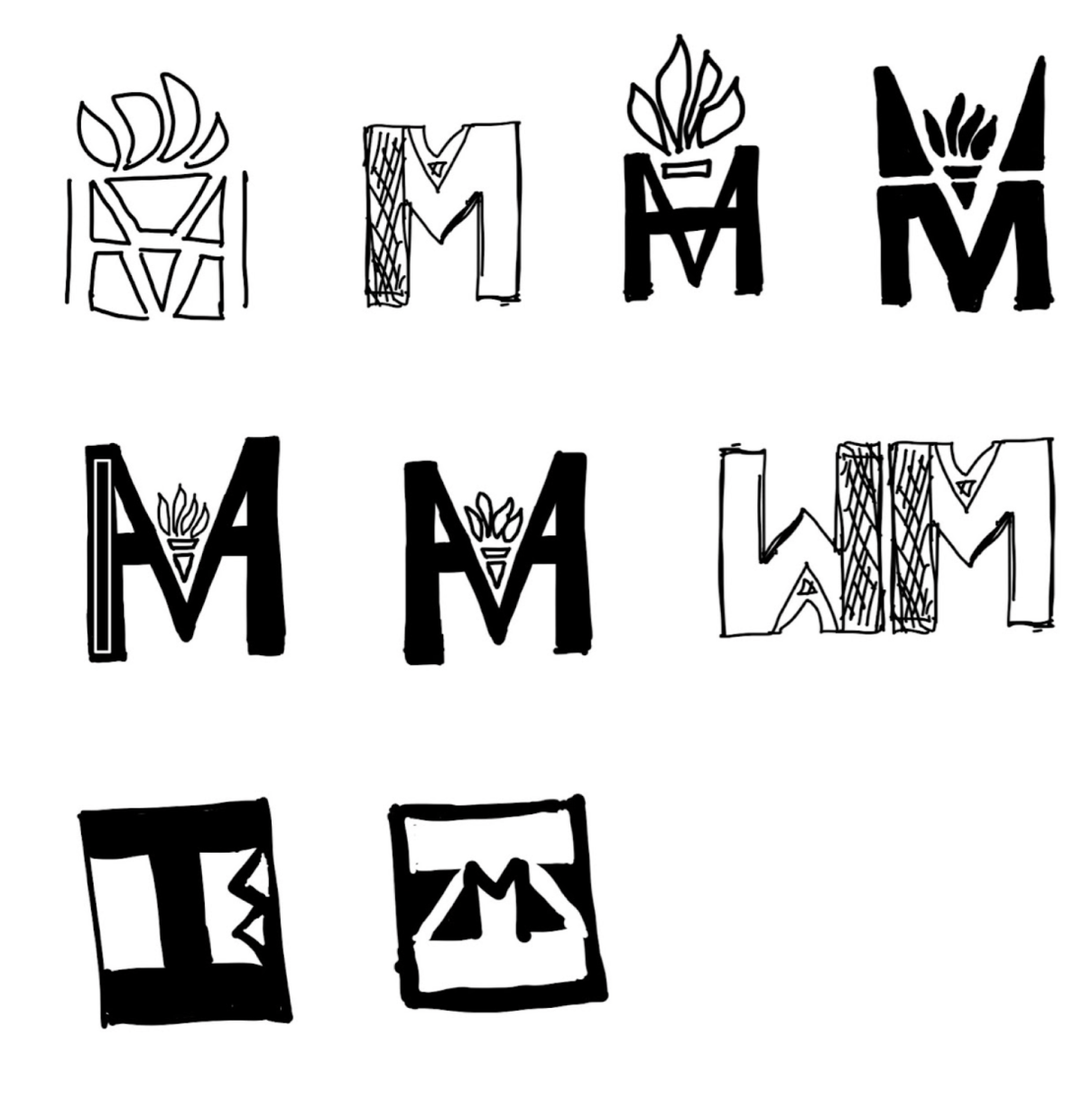
Fig.6 Soojin Lee, IMA Logo Sketch 1
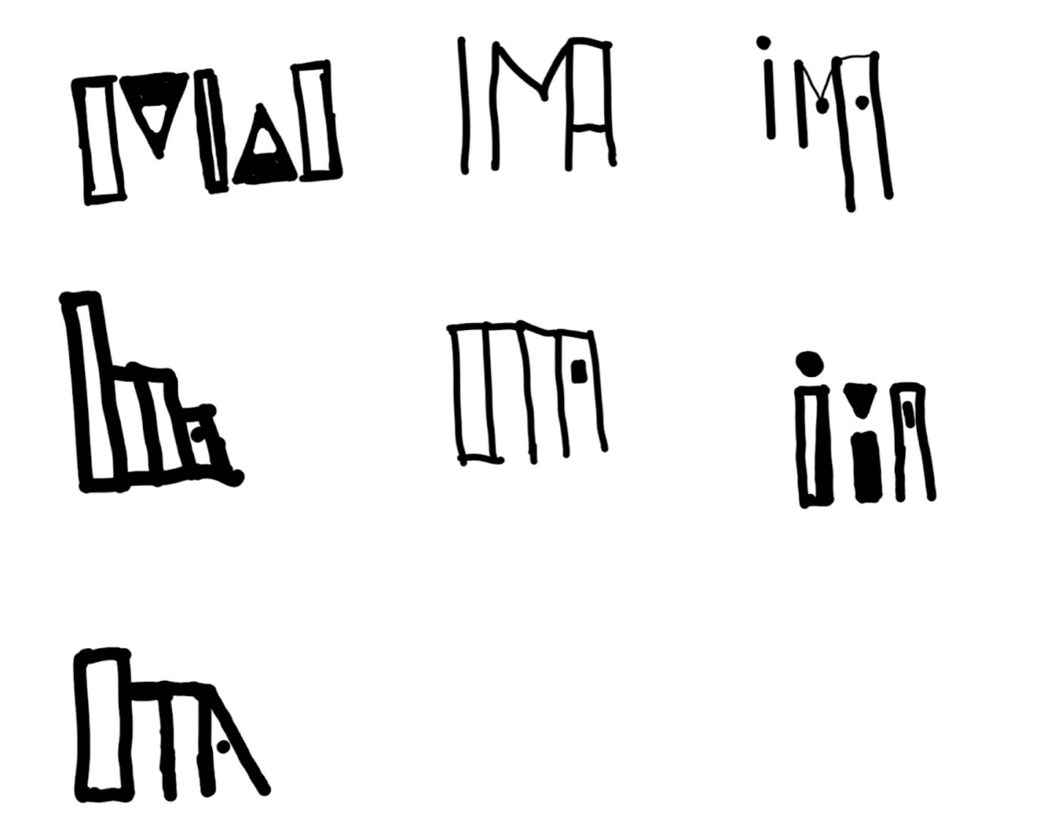
Fig.7 Soojin Lee, IMA Logo Sketch 2
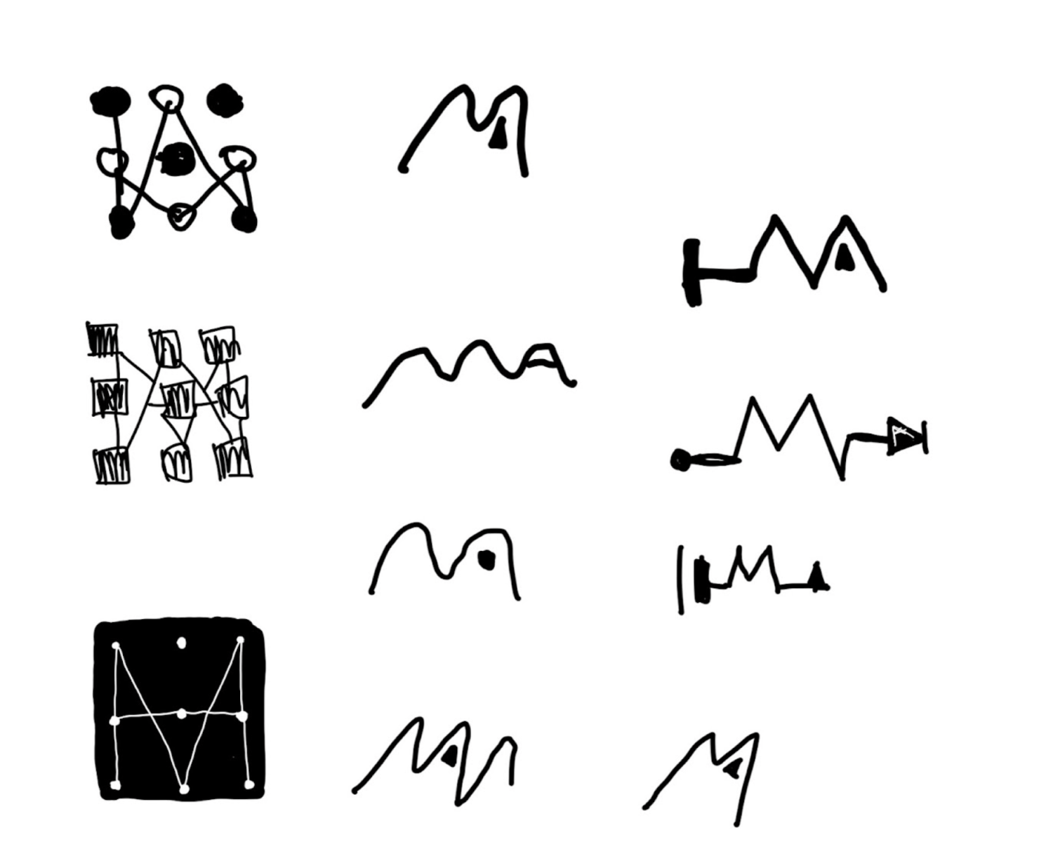
Fig.8 Soojin Lee, IMA Logo Sketch 3
Present & Feedback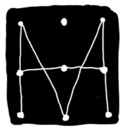 Fig.9 Soojin Lee, IMA Logo Selected Design
I shared these sketches with the IMA community including students, faculty, and instructors. The design with the most positive feedback was fig.9 for its simple, sleek, and effective communication of IMA program. When coming up with this design, I was playing with the idea of connecting dots, technology, programming, and data. Only using simple shapes, I made a 3 x 3 grid where the dots are connected by lines to create three letters “I”, “M”, and “A”. Along with the letters, I wanted to visually remind Arduino Board, the electronic prototyping platform used to create interactive electronic objects.
Final Design
Using Figma, I have transformed hand-sketch design into a digital form. I designed one grey-tone logo and a color logo.
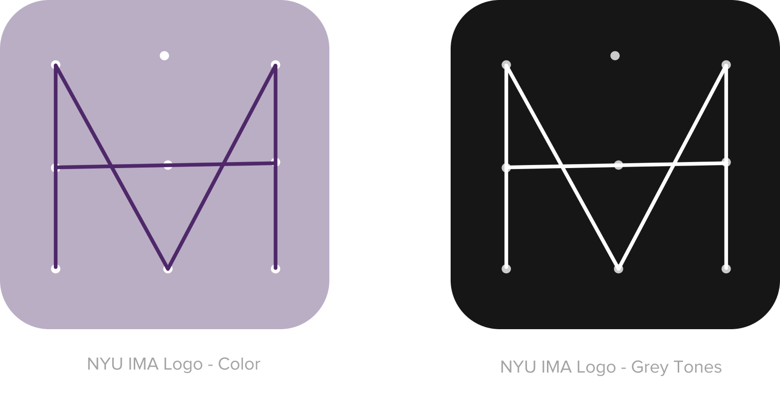
Fig.10 Soojin Lee, IMA Logo Color & Grey Tones
Logo Design Guideline
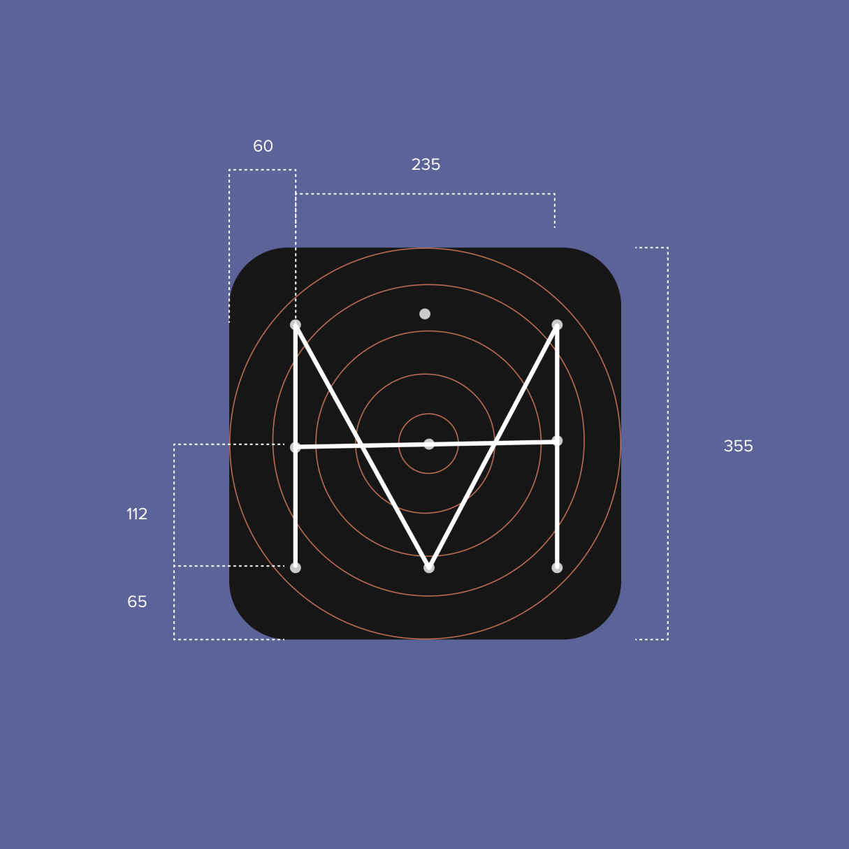
Fig.11 Soojin Lee, IMA Logo Guidelines
Way-finding Design
The way finding project started with the irony of IMA | ITP program teaching how to make an effective and creative communication while there is a lack of communication and system on how to navigate within IMA/ITP space. For this project, I collaborated with two other colleagues – Pauline and Hazel – to make an improvement in the way-finding system at the 4th-floor ITP | IMA building.
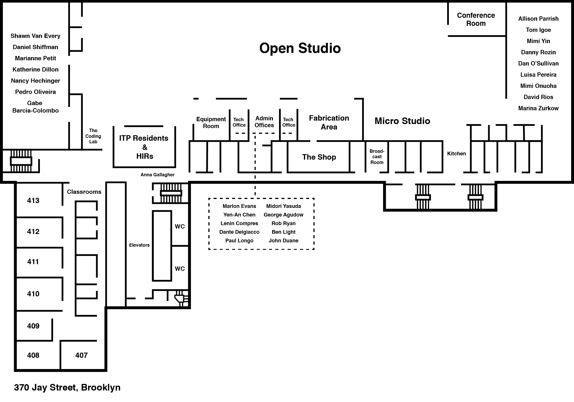
Fig.12 ITP/IMA Floor Map, http://timszetela.com/itp/floorplan/
Above is the existing floor plan of ITP/IMA 4th floor map. Although it has all the information about the space, it is very difficult to read, especially for the visitors who are visiting the space for the first time. Therefore, I first identified the key areas of this space, then identified the difficulties and challenges navigating to those places.
Identified key areas by their function were:
Faculty offices, The Shop, IMA Space, Classrooms, Residents Offices, Conference Room, Motion Capture Studio, Fab Lab (Fabrication Lab).
Below are the images of places in IMA/ITP space and the quick sketches on how the way-finding system could be improved.
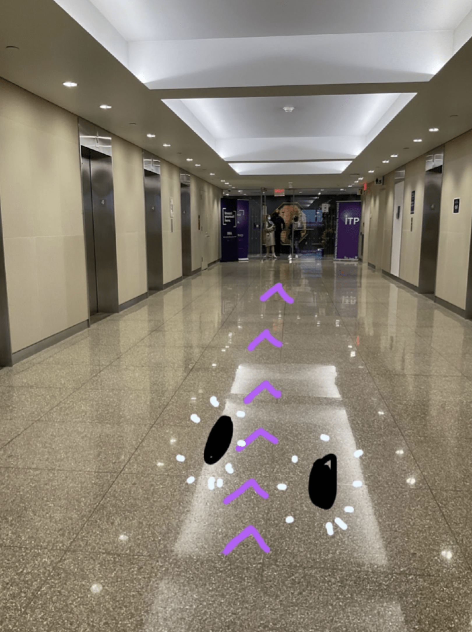
Fig.13 Soojin Lee, Index on the floor indicating direction to the entrance
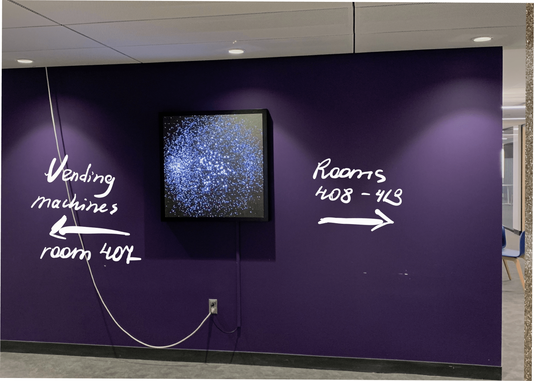
Fig.14 Soojin Lee, Signage on the entrance wall
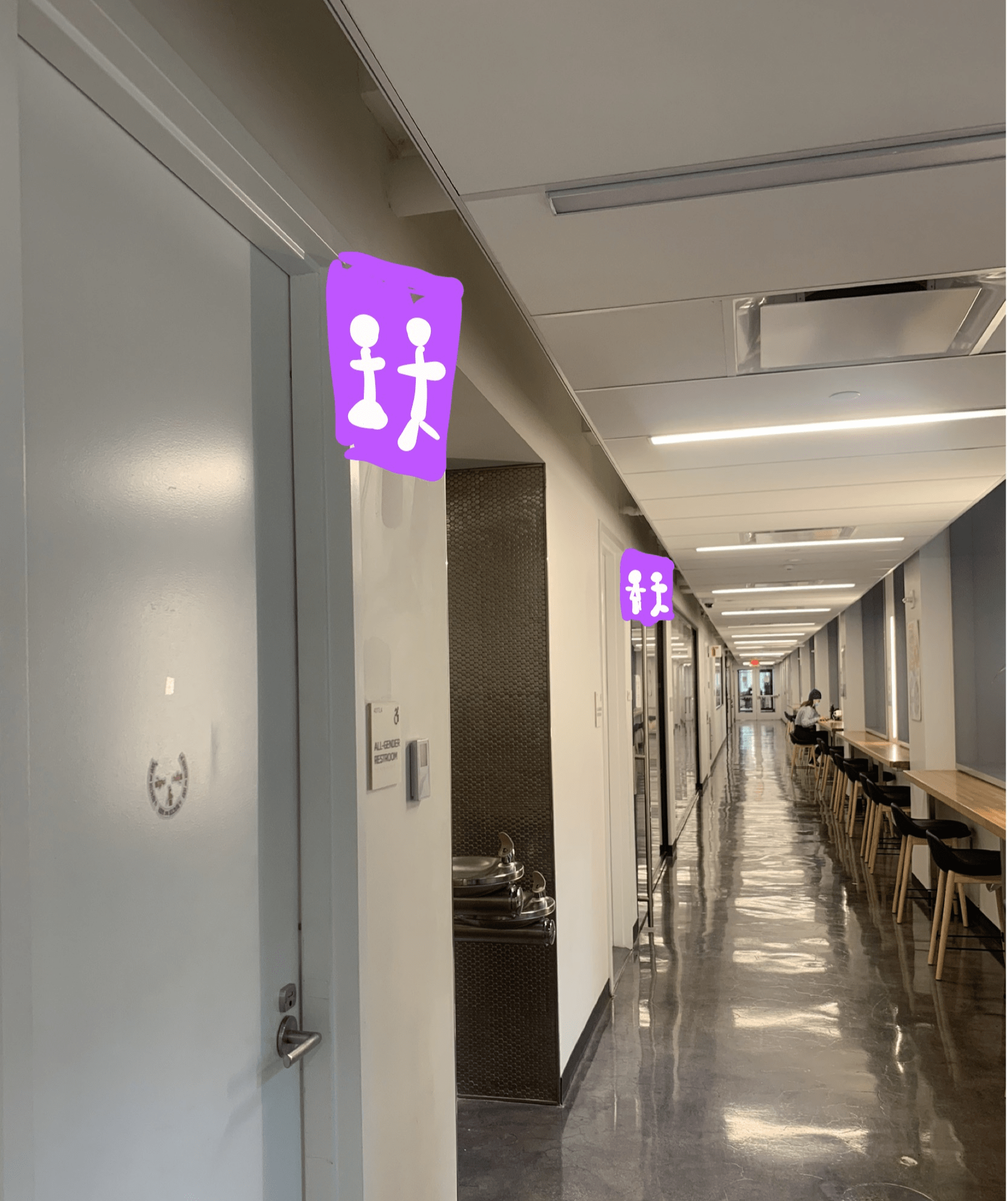
Fig.15 Soojin Lee, Bathroom Signage
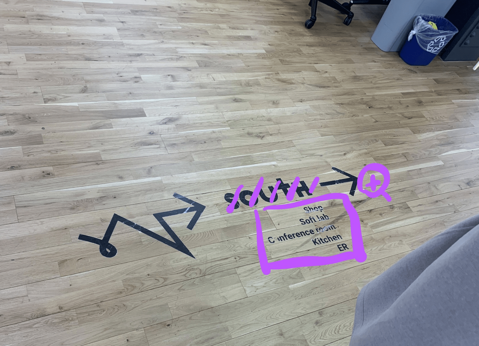
Fig.16 Soojin Lee, Floor signage – Put necessary information only
The Two main way-finding challenges that we identified were:
-
- When the visitors get off from the elevators, they don’t know where to go
- There is no floor map that visually communicates where the key areas are located at
To create an effective visual map that indicates all key areas, I first designed icons that could also be used for the signages on the walls and floors. Elaborating on IMA logo design, I designed simple and modern-looking icons for the key areas. Each icon makes visual communications on the use of the space and has a hint of NYU purple highlight.
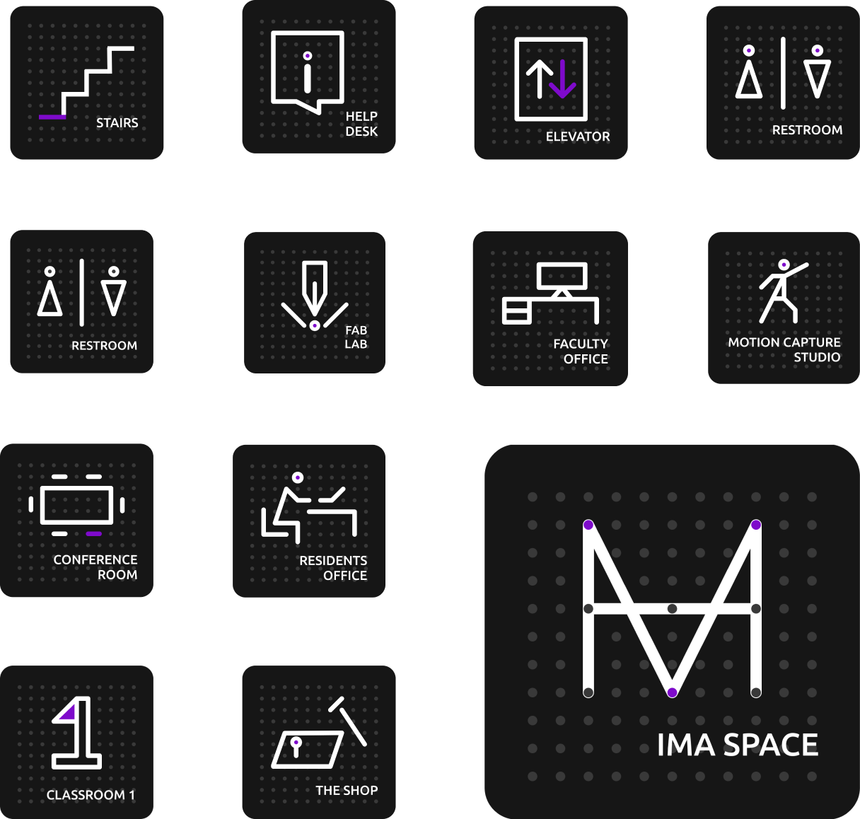
Fig.17 Soojin Lee, Icon Design
Font & Color
For the colors, I used monochrome and one of the NYU Purple colors. For the font family, I chose the font Ubuntu for its modern, sleek, and technical design.
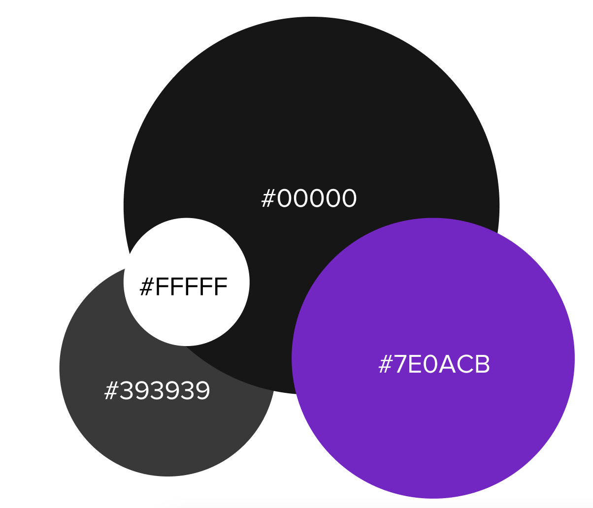
Fig.18 Soojin Lee, Color Guideline
Mock-up
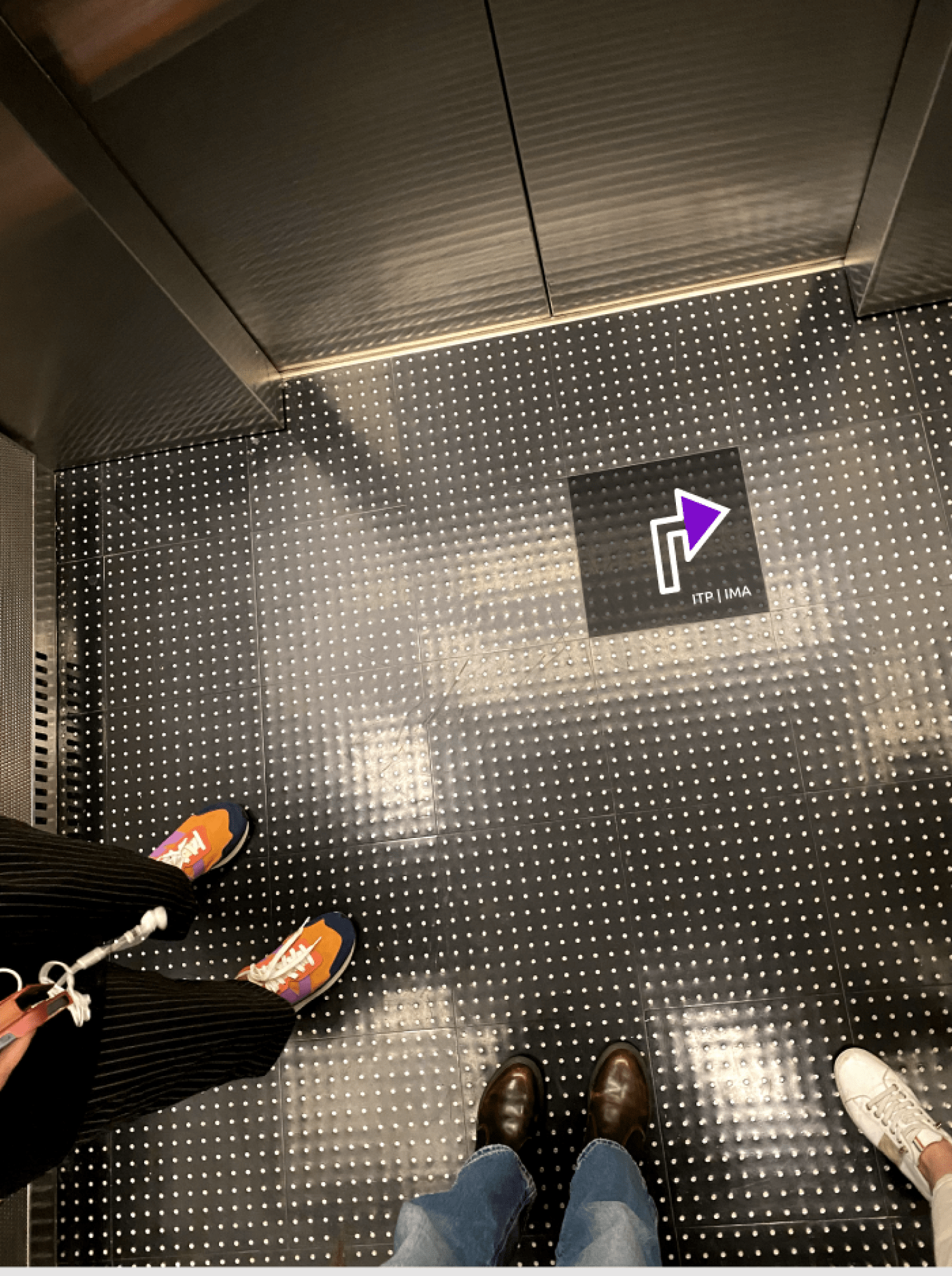
Fig.19 Soojin Lee, Elevator Mockup
Most of the people reach to 4th-floor ITP/IMA space using elevators. There are eight elevators in total on both sides of the hallway. Every time I get off the elevator, I get confused – which direction should I walk to find IMA/ITP space? To solve this issue, I installed the visual cue on the floor of the elevator that helps people to find the entrance.
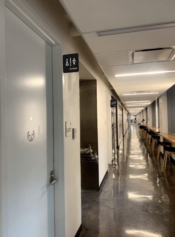
Fig.20 Soojin Lee, Bathroom Mockup
Floor Plan
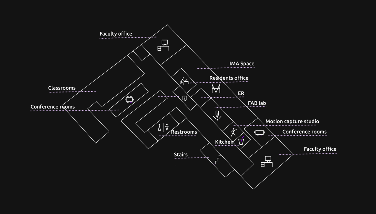 Fig.21 Pauline, Floor Plan
Incorporating the Icons that I designed, Pauline re-designed the floor plan. This floor plan is designed to visually communicate functions of the sections of lMA/ITP floor.
Working on this project, I found my passion in using visual design as a tool to help people have better communication and more delightful experiences. My next step is to get more feedback from people, especially on the logo design, make iterations and propose the design to relevant people who are in a position to make it official. I want to end this blog with a note that it is important for us, as designers, to stay conscious of the surroundings so that we can provide design solutions to small and big problems in the community that we join.
Works Cited
Interactive Media Arts [@ima_nyu]. Instagram, instagram.com/ima_nyu/
IMA|Tisch|NYU [@IMA_NYU]. Twitter, twitter.com/IMA_NYU
ITP/IMA Floor Map, http://timszetela.com/itp/floorplan/
Mollerup, Per. Marks of Excellence. Phaidon, 2006.
NYU IMA [@NYUIMA]. Facebook, facebook.com/ima.tisch.nyu
Pentagram, “MIT Media Lab’s Transforming Logo”, Vimeo, 2015, https://vimeo.com/109891648
Super cool! The video you included of MIT’s media lab logo was incredible. I also noticed that some of your initial sketches were very similar to Maroon 5 haha. A couple quick edits for you: when you share with your reader the logo that your focus group liked the most, you say it is figure 6, but I think you mean to say figure 9. Further, in the section about way finding, under the “Two main way-finding challenges” section, bullet #1 has a capital S that should be lowercase. Really impressive work!
This is so impressive Soojin! Just the sheer commitment and efforts you have put into designing an entire logo for the IMA department is so awesome! I love your design and the incorporation of dots to symbolize data and physical computing as well as the Arduino board! However, I did find it a bit confusing with the horizontal line that crosses through the middle of the logo as this creates two “A” letters instead of one in “IMA”. I think maybe instead of making the horizontal line cross all the way through, you can make it stop at the middle so it is more visually clear that it’s only one “A” on the right and so it can read from left to right the letters “I”, “M”, and “A”? Just an idea!
Wonderful job on this, Soojin ! Because you mentioned how passionate you are about visual design to communicate ideas and improve experiences, I would suggest that you take the “Wayfinding” class with Professor Goffredo if you haven’t already to work on real life projects and learn more about building a better environment for people to live in through efficient design. It is impressive how design can be so satifying for designers, and when done the right way, it can “provide solutions to small and big problems” in the community. Bravo !!
Impressive! Well done Soojin.