Looking into the brief for Al Reem Al Hosani’s Project has inspired me to look more into the multiple and contrasting logos of Art Institutes around the UAE. This can help me seek some sort of inspiration and analyze the different attributes each art logo has, the pros and the cons, and what is special about them.
The Louvre Abu Dhabi
Starting off with the classic Louvre Abu Dhabi logo. Of course, I know now that the logo has been changed twice since the announcement of its presence in Saadiyat Island. The first logo was designed by Phillipe Apeloig.
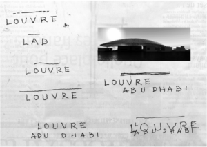
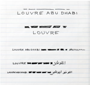
Sketches by Phillipe Apeloig. “Louvre Abu Dhabi’s New Visual Identity.” Graphéine – Agence De Communication Paris Lyon, 4 Jan. 2020, www.grapheine.com/en/logo-news/louvre-abu-dhabi-s-new-visual-identity.
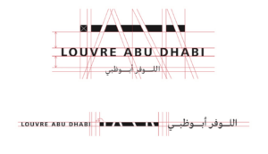
The typography is the creation of young Lebanese designer Kristyan Sarkis. “Louvre Abu Dhabi’s New Visual Identity.” Graphéine – Agence De Communication Paris Lyon, 4 Jan. 2020, www.grapheine.com/en/logo-news/louvre-abu-dhabi-s-new-visual-identity.
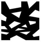
In my opinion, I can see the appeal of the subtle and simple design that is used to embody the Louvre. But I can also see why they would redesign it. In a way, it seems too minimalistic for a museum that doesn’t only caress minimalistic art. It is also home to renaissance, abstract expressionism, impressionism and romanticism just to name a few. Therefore, a lot can make sense when we see the new logo:

Instead, designed by an unknown designer, the Louvre Abu Dhabi decided to tie their identity to something more concrete, more personal and unique to their institution. Something that is not seen in the Louvre Paris or any other museum; their domed ceiling, much like a planetarium. Jean Nouvel, a Pritzker-prize winning architect, is responsible for the unique design of the Louvre Abu Dhabi.
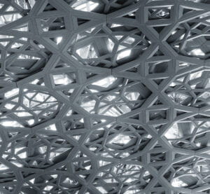
“Louvre Abu Dhabi Sparking Light.” Inhabitat, 2 Oct. 2015, inhabitat.com/the-louvre-abu-dhabi-is-a-museum-that-is-its-own-work-of-art/louvre-abu-dhabi-sparking-light/.
Warehouse421
An art institute that sees that collaboration with local, regional, and international institutions is essential. It is a locally-based arts and design centre committed to exhibiting and supporting local creative talent. Warehouse421 is a locally based art and design centre committed to exhibiting and supporting local creative talent. Collaboration with local, regional, and international institutions is essential. Through learning, research, and commissions, it hopes to contribute to the growth of the UAE’s creative environment. Their logo seems to me like an excellent one and I will tell you why.
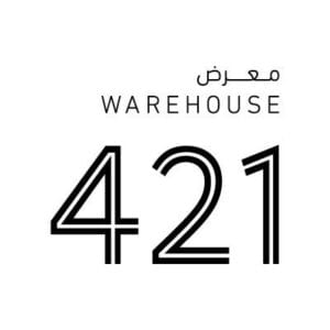
Because of its unique location to be one of the few functioning warehouses in Mina Zayed, there is some leverage where the design team took advantage of the number 421 as their selling point. It’s simple, straight to the point and unlike The Louvre Abu Dhabi’s first logo, the minimalistic element of this logo correlate with the type of artworks warehouse421 exhibits with most modern and contemporary expositions.
However, one thing that I would want to point out is the inconsistency with the translation of the word “warehouse” where the Arabic word for that is “مستودع” not “معرض” which is Arabic for exhibition. Thus, in Arabic, it says “exhibition 421.”
AlQattara Arts Center
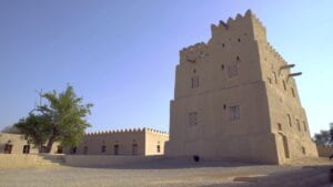
As someone who is originally from Al Ain, I have to rep an arts centre that I artistically grew up in. It is The Bin Ati Al-Darmaki House, a historic mud-brick tower and home that was transformed into the Al Qattara Arts Centre. The centre is built in a regional architectural style that combines well with the surrounding area, which includes a number of historic structures from Al Ain’s early heritage.
In Al Ain’s art and cultural landscape, the Al Qattara Arts Centre plays a distinctive role. It was founded in 2011 as a place for Emiratis to study, practice, and develop art and culture. The art gallery in the centre features works by expatriate and Emirati artists. There is also a permanent exhibition space for archaeology and heritage exhibitions, as well as art studios for students.
“Al Qattara Arts Centre.” Abu Dhabi Culture, 21 Feb. 2022, abudhabiculture.ae/en/experience/culture-centres/al-qattara-arts-centre.
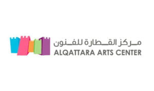
This is an excellent logo because of the consistency of using “ال” in Arabic and having that mirrored in English with the “Al” before “Qattara.” Additionally, the space of the art institute is basically a revamped and renovated old palace, hence the multi-coloured forts that represent that artistic and developed element of the place.
Sharjah Art Foundation
The Sharjah Art Institution, created in 2009 by Hoor Al Qasimi, is a contemporary art and culture foundation situated in Sharjah, United Arab Emirates. The Sharjah Art Foundation aims to encourage public education and engagement in artistic endeavours. Exhibitions of Arab and international artists’ work, performances, music, film screenings, artist lectures, and educational programs for a wide variety of audiences, from children to adults, are all part of the foundation’s programming.

The significance of this logo is exquisite in my opinion, it gives off a sense of regalness and power. Especially because this institution hosts the famous Sharjah Biennial. Eliminating the dots and dashes in the Arabic lettering, in this case, does not remove from its phonetic form. This can be tricky for some Arabic speakers, as I, did not even notice the Arabic lettering at the top and thought it was a random design.
Works Cited:
“Al Qattara Arts Centre.” Abu Dhabi Culture, 21 Feb. 2022, abudhabiculture.ae/en/experience/culture-centres/al-qattara-arts-centre.
“Sharjah Art Foundation.” Wikipedia, Wikimedia Foundation, 5 Feb. 2022, en.wikipedia.org/wiki/Sharjah_Art_Foundation.
Warehouse421, www.warehouse421.ae/en/.
www.louvreabudhabi.ae/?gclid=CjwKCAiAgvKQBhBbEiwAaPQw3EecfMCyFnvQE8Y4vS4sfRhNZGLvClFwCgXVcsxjLx-OdH6TUv1jthoC2vMQAvD_BwE&gclsrc=aw.ds.
I am interested in your comment that, even as an Arabic speaker, at first you didn’t not notice that the “random design” above the words Sharjah Art Foundation was actually Arabic lettering. As my group designed the word “data” in Arabic out of Arabic 1s and 0s, it too took on the more design feature than text. How did you feel about it when you realized it was lettering? Did you feel as though you had found the hidden arrow in FedEx, or did you feel as though the lettering had been done poorly?
Thank you so much for your comment, Megan. I did not feel as though it was done poorly at all. It was more of a happy surprise and close to the feeling that you described when finding the missing arrow in FedEx!
Thank you so much for this post Roudhah! I am also interested in knowing more about what you think about omitting of the dots and dashes in the Arabic letters for the Sharjah Art Foundation. Specifically on what you think should be the fine line between retaining the proper Arabic letters with all of their dots and dashes and excluding some of them for artistic or aesthetic purposes? Also, I noticed a small typo in the sentence at the start of the post regarding the Louvre, it says: “it seems too minimalistic for a museum that doesn’t only caress minimalistic art.” Did you mean to type caress or did you mean to say “only [cares about] minimalistic art”?
Hi Ryan! Thank you so much for your comment. I actually meant to write ‘caress’ as I wanted to use a word that describes ‘holding/carrying’. As for your question about omitting the dots and dashes in the Arabic lettering, it’s important to know the history of such an old and rich script. The dashes in the Arabic language actually represent two dots, so all in all, dots are what make the consonants clear. And before the spread of Islam, the script was read and understood without these dots, since dots are considered to be one of the first developments in the language. And because of that, the Holy Quran can be difficult to read because of its lack of development in the language due to its perseverance to stay authentic to its original scripture. So yes, it is in some way tricky to figure out the phonetic depiction of the Arabic words but it is not impossible or considered to be done poorly. Retaining the proper Arabic letters with all of their dots and dashes is considered correct, and excluding some of them can rather be considered artistic or aesthetic but in some way, it can be seen to be even more authentic.
Thank you for this amazing and insightful post, Rhoudhah ! I personally love how unique and creative the Louvre logo is. What I find particularly interesting about it is how the idea came from building a collaboration with an already established high museum to create this kind of “guarantee of unparalleled experience” that the Louvre name holds already. While the Louvre in Paris has a strong brand image that is easily recognizable and highly regarded by both visitors and the art world, it did not stop the UAE from trying and designing a specific and unique brand identity for the Louvre in Abu Dhabi. This is just fascinating and I am glad that design has no rules, no limits!
Very nice post Roudhah! Reading through your analysis of some of the art centers’ logos in the UAE is a great source of inspiration for our own designs. The way you explain what works and what doesn’t in a particular logo, like why the first Louvre logo had to be redesigned, gives a very good insight into what we need to look out for when designing logos. Personally, I feel like the Arabic in the Sharjah Art Foundation logo did sort of ‘butcher’ the way arabic is supposed to be written. I find it very difficult to read it as well. Pretty sure Mr. Shawkat wouldn’t be happy with it!