What is the mark of a great logo? Given that I posed this question while taking a logo design class, let me rephrase this question by asking, how does one make a great logo?
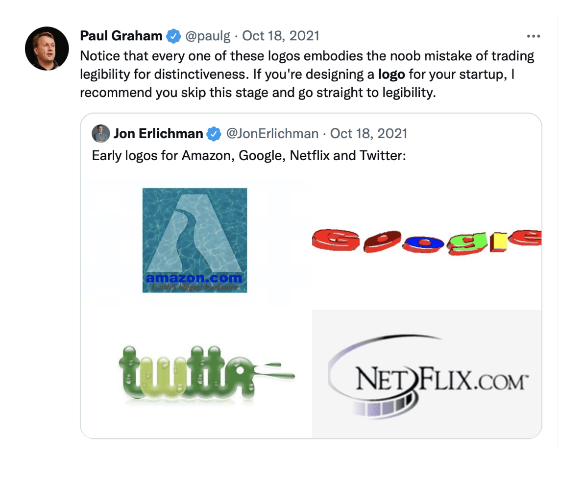
A while back, I came across a tweet by Paul Graham where he remarks on the early logos of Amazon, Google, Twitter, and Netflix. He writes: “Notice that every one of these logos embodies the noob mistake of trading legibility for distinctiveness…”

This remark aligns with what I’ve been thinking about: the mark of a great logo is not the logo itself, but mostly the product/company behind it. (spoiler alert: I changed my mind a bit) I strongly think what makes the Apple logo great is not the logo itself but the great product behind it.
Let’s think of a great product/company but a bland, boring logo. First example that comes to mind is Berkshire Hathaway. Berkshire Hathaway is an American holding company known for its control and leadership by Warren Buffet, who serves as chairman and chief executive. Buffet is a legend in the business and investing world with Berkshire Hathway averaging a more than 20% consistent return for decades.
 Image credit: Berkshire Hathaway Inc.
[Okay small big caveat, maybe Berkshire Hathaway is a great logo! I’m investing my dear dollars hoping to get a risk-free return on my investment. I’m looking for a boring process that takes in my money and churns back out more money. Nothing fancy – I don’t want to worry about my investment. Shiny logo says volatility. I think startups. I think risk. I don’t want my money anywhere near risk. So then, there is likely merit in Buffet’s boring, bland logo choice. Take a look at the firm’s website, straight out of web 1.0.]
Let’s do the opposite and think of a great logo but a terrible product/company. I’m blanking.
Since starting to write this blog post, I’ve changed my mind on what it takes to produce a great logo. Nike had a great product; but so did dozens of other companies. Nike stood out by building a brand empowered by the swish. In this case, the great logo is the product. In a sea of similar products/services, these logos help the one item standout.
To an extent, it seems one could get away with a mediocre logo if they are producing a sufficiently unique product or service. The company selling the first preventative cancer medication doesn’t need to think much about its logo. The new athletic wear startup popping up on my twitter feed on the other hand needs to have an equally great logo/brand to stand out.
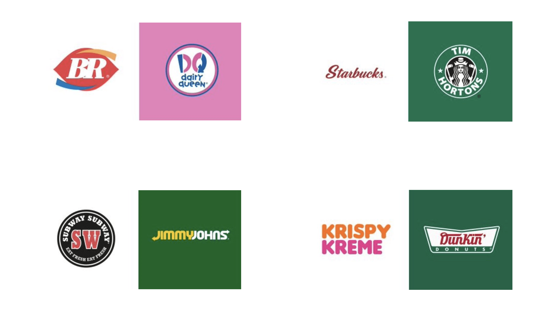
A parallel question I was asking myself is: does a great logo (and think of super great top 10 logo ever here) have to be popular? The intuitive answer is yes, of course. All the great logos that come to mind are so ingrained in our heads, we would recognize them in a flash.
 Image credit: Bored Panda
I argue that a great logo does not have to be popular. Our first criterion for a great logo from earlier is that it has to be behind (infront?) of a great product. But, there are supposedly great products we have around us but we don’t know the brands of. Even on the NYUAD campus: the faucets, door handles, etc are great products as evidenced by how well they are surviving student abuse. They also have the manufacturer’s logo on them but we barely pay attention to it, if any. The logos of these products are far from popular.
But I think they are still great logos. We are perhaps making a mistake by the way we are decoupling the brand of a company and its product. I am not the target user of the water faucet per se, the purchasing manager at NYUAD is. They are the ones who have a say in what product to purchase. I see this with one of my family friends who is a contractor. He would come over to visit and recognize random brands from the house (ceramics, water heater, door handles etc.) In fact I still remember the logo of a (supposedly) great door lock brand (KALE), after being tasked with changing the lock of a few doors in my parent’s house. These logos help a great product stand out and be recognizable. They are popular in their target audience. Hence a great logo is not the logo known by the most people in the world, it’s the one known by most of the people it’s trying to reach.
Hence a great logo is not the logo known by the most people in the world, it’s the one known by most of the people it’s trying to reach.
Nice way to put it! Well done Roba, so much food for thought here.