In the first few weeks of class we have thought about the considerations that come with designing logos and crafting visual brands. For this post, I am interested in exploring how completed branding communicates design considerations and directs correct usage. To that end, New York University’s Abu Dhabi campus branding and guidelines will be my primary example. Herein you will find an analysis of the NYU brand breakdown, NYUAD’s logo, and NYUAD’s color guideline subsections.
You can access a digital PDF of the NYUAD brand guidelines here.
NYU Branding Breakdown

Marks of Excellence defines branding as an ongoing process of “development and maintenance […] which in turn includes three elements: the brand core, it’s presentation, and the resulting image” (Mollerup 46). In the case of NYU, the brand core or, to put it another way, the branded object is the university which includes higher education, research, and career guidance. The logo and wordmark are just feature of the brand presentation which is simply the audio and visual language used to identify the brand core. Lastly, image represents the the public and consumer opinion of the brand core which is heavily influenced by the the brand presentation.
NYU breaks down its brand presentation through an endorsed brand architecture. Endorsed brand architecture is defined as the branding relationship wherein two or more sub-brands share one main brand name or namesake. In the case of NYU, the brand structure is striated. New York University refers to the New York City campus which houses 13 sub-brands in the form of schools (i.e. NYU Stern, NYU Steinhardt, and NYU Tandon). NYU Abu Dhabi and NYU Shanghai are the official international sub-brands within this architectural framework.

Pictured above is a picture of NYUAD’s center of campus. Through the placement of an enlarged NYU logo–synonymous with the NYU New York namesake brand–at the top of the building followed a smaller NYUAD installation in the windows, hierarchy is leveraged in service of the visual presentation to communicate NYU’s endorsed brand architecture.
NYU Abu Dhabi Logo
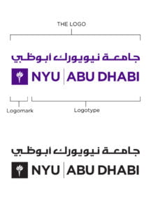
Above is the NYUAD logo breakdown. I think it is important to note that even the logo clearly communicates the parts that comprise the whole: the logo which is “Abu Dhabi” in Arabic script, the logomark which recalls NYU New York’s symbol, and the logotype which describes the namesake and sub-brand’s affiliation. This logo is doing a lot of work in communicating brand and cultural relationships.
Within the rest of the logo section, constraints and use cases are described for the logo. There you will find instructions on color usage, horizontal and vertical orientation, and exterior logo spacing.


Above are successful applications of the logo branding guidelines you can find on and around campus.
Color Guidelines
In an expansion from the color guidelines for the logo, which call for the exclusive and uniform use of NYU violet, black, or white, the brand colors are quite expansive. I was surprised by this section because it contained separate purple color palettes for print and digital and an accent color palette.
The print v. digital color palette was surprising because the colors are similar, but not quite the same. The digital color palette featured more vibrant colors which is probably an affordance of the digital display color range. Despite the slight difference in purples across the two color palettes, they all seem to read in the same world.
I was most surprised, however, by the tropical themed accent color palette. Honestly, I laughed and said to myself “they never use these colors”.
But they do…

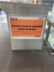

I cannot tell you how alarming it is to realize just how branded our environment can be. In all these small, but big ways the color palette is applied and once you see it, you can’t unsee it.
Works Cited
Mollerup, Per. Marks of Excellence. London: Phaidon, 2006.