Chelsea FC, a Premier League football club based in London, England, was founded in 1905 by Gus and Joesph Mears. After acquiring the Stamford Bridge athletics stadium, the pair decided they would form a football team to play in it. In their early stages of branding, they threw around names including “Stamford Bridge FC”, “Kensington FC”, and “London FC”. However, in the end they decided on now widely recognized “Chelsea FC”. It is interesting to contemplate how a branding decision like the selection of a different name could have affected the life of the club. For example, should the Mears chosen “London FC”, it comes with an even larger weight on the shoulders of the club, the staff, and the players to outshine the other clubs in the city (Fansided – The Pride of London).
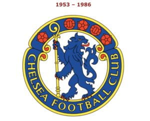
The next step in branding the team was deciding on a logo and official colors. After the club found its way to the top division in English football in 1907, the club presented it’s players celebratory badges in the shape of a lion, the symbol of the house of Lord Cadogan, the club’s president. However, this did not become the club’s inaugural logo. Rather, the circular crest seen below featured a Chelsea Pensioner (a former member of the British Army and a resident of a special retirement home in Chelsea (Chelsea Pensioner – Wikipedia)). This design lasted almost half a century before it was dramatically changed to a shield with a CFC letter mark/initial aberration (Per Mollerup 112 and 121).
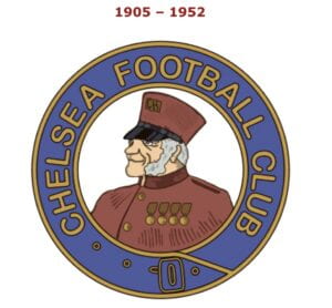
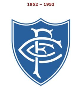
(Logo-World.net)
While the letter mark/initial aberration returns in the late 90s before disappearing again, it is still seen on today’s kit featured on the back neck of the top and the socks.

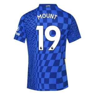
(AmStadion and LittlewoodsIreland)
Included in these designs is the signature color, the royal Chelsea Blue. Today, these colors are still the official hues of the football club.


Notice that the first three colors are rich jewel tones, suggesting the regality of the club (2115 C is only used to shade objects in 7687). In fact, Chelsea Blue became such a prominent part of the culture that the team’s nickname changed from “the Pensioners” to “the Blues”. This underlying theme of club royalty extends past just paints. Inspired by the symbol of the clubs first president previously mentioned, Lord Cadogan, the lion became a central fixture beginning in 1953. The lion symbol is often referred to as the “king of the jungle”. Thus, it could be inferred that the club’s use of the lion declares themself to be the king of the Premier League.
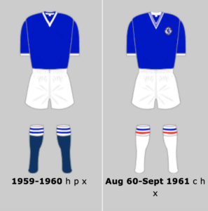
(Historicalkits.co)
The 1953 crest was the first to be included on the team’s jerseys. The rebranding was central to rid themselves of the “jokes about the Pensioners” (What is the Story Behind Chelsea’s Badge – Youtube). The presence of the lion remains through its current logo, although it bounced to an modified silhouette between 1986 – 2005.
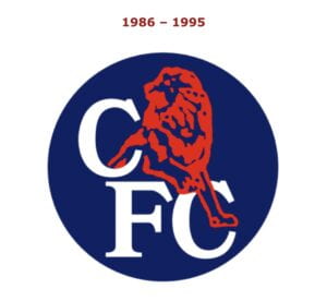
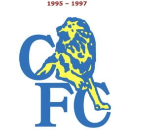
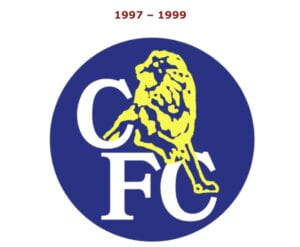
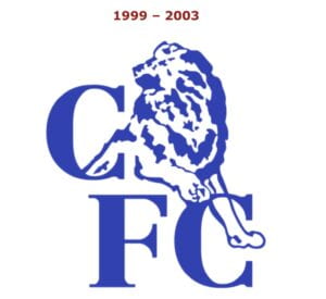
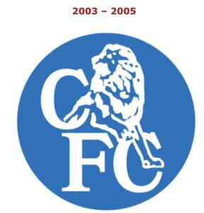
The below logos came as a great joy to the fans as they were not pleased with the reign of the ones above. So, for the club’s 100th anniversary it launched the new logo in time with an increase in spending on talented players and managers. The 2005 logo was announced the fall after they were crowned champions of the Premier League, for only the second time in the clubs history. Then, during their first season of playing under this crest, they won the Premier League for a second year in a row. Thus, this symbol became associated with an era of success and trophies for the team.
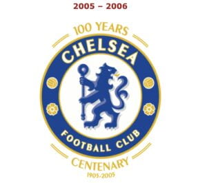
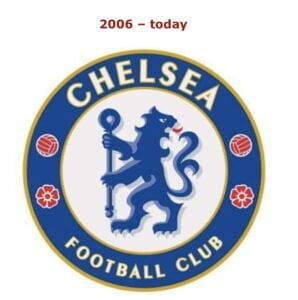
(Logo-World.net)
In today’s logo we still see strong resemblance to that which debuted in 1953. The prominent lion is joined by a staff, footballs, and Tudor roses. These flowers represent England, and thus the crest demonstrates the “kingdom” of Chelsea FC to be of football and country.
Sources:
Marks of Excellence, Per Mollerup
https://www.pantone.com
http://www.historicalkits.co.uk/Chelsea/Chelsea.htm
https://logos-world.net/chelsea-logo/
https://theprideoflondon.com/history-chelsea-football-club/
https://www.worldfootball.net/winner/eng-premier-league/
Really interesting stuff! I like how the fans can influence a football club’s brand and the overall image of the team. Another thing that is visible through the huge transformation in Chelsea’s logo is how they retained the positives from their old badge and removed the parts that weren’t good enough (like associations with the ‘pensioner’). Overall, a great informative post!