What Makes a Good Logo?
Whether consciously or subconsciously, we interact with hundreds of logos every day. We see it on the billboards (fig.1), on the t-shirts (fig.2), and even on the corner of the screen that you are staring at right now (fig.3). Logos are everywhere.
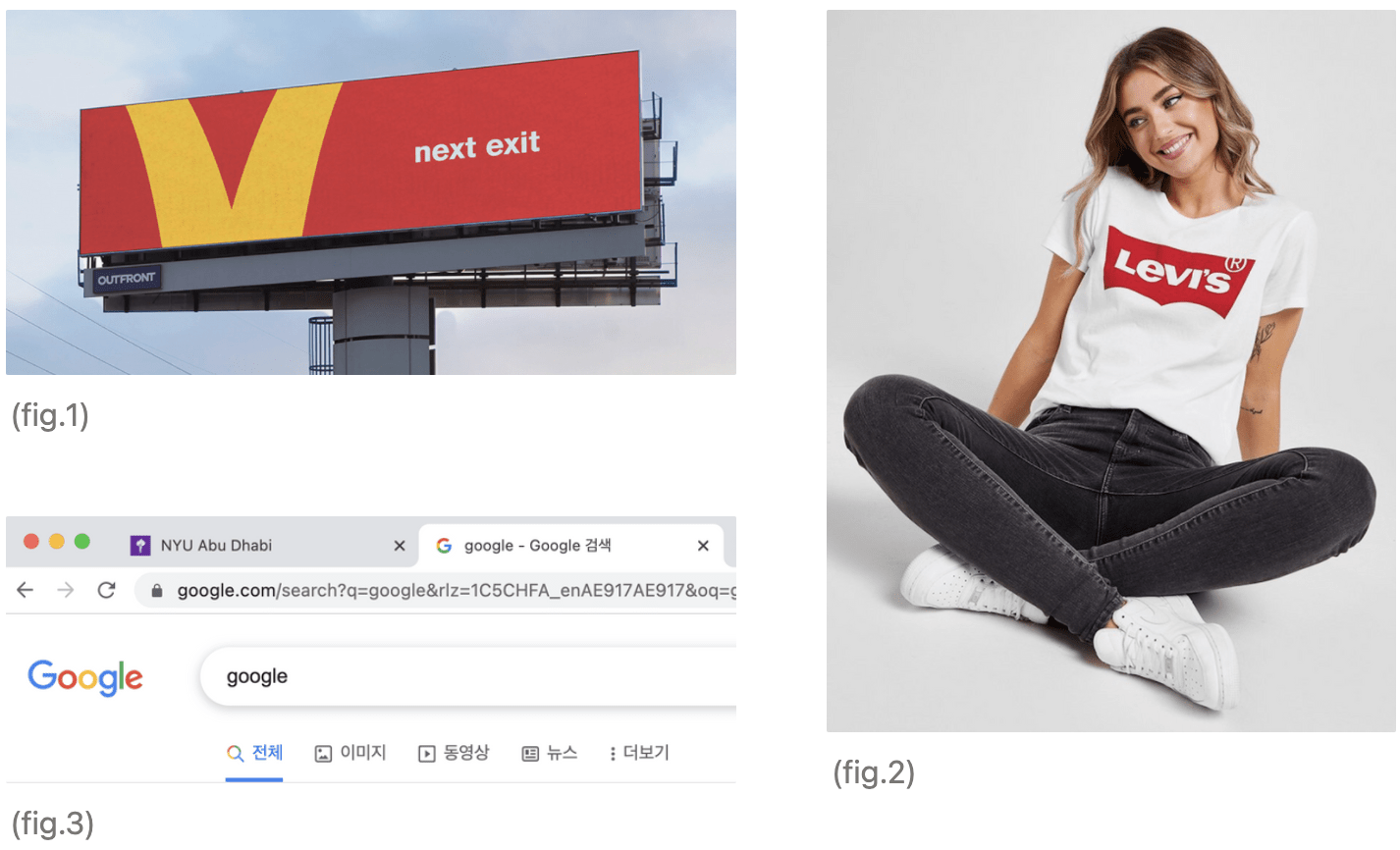
Although our familiarity with logos varies across cultures and personal interests, some of the most successful logos are universally appreciated. Such successful logos are so powerful that the brand identity is communicated even when only a segment of the logo is shown. One of the successful examples of this is McDonald’s directional billboards (fig.3). In this clever advertisement by Canadian creative agency Cossette, McDonald is adapting its Golden Arches logo into directional signage for its restaurants. I find it truly amazing how we immediately interpret such an abstract yellow shape on a red background as a McDonald’s logo. In Marks of Excellence, Mollerup mentions that children recognize and say Coca-Cola before they can read, (9 Mollerup). This implies that we are visual animals that are hardwired to engage and react to visual identifiers. Hence, logos, the visual identity of the brand, play a crucial role in communicating brand values and helping people to create emotional connections with the brand. Therefore, most of the companies and busineses have logos, but not all of them are successful. Then how can we design a successful logo? What makes a good logo great? Before we start answering these questions, I invite you to do a small exercise. Please sketch three Logos that are meaningful or memorable to you.
Please scroll after sketching three logos
Below is what I drew:

(fig. 4)
I also asked my friends and family members to do the exercise above.
Here are the logos that my friends and family members sketched:
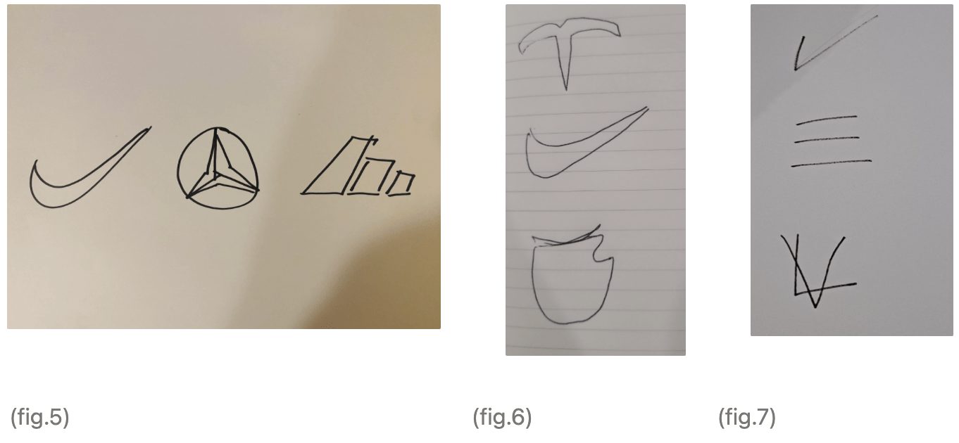
Some of the interesting patterns were found from this exercise. All four participants, including myself, drew a Nike logo. Granted, the goal of the exercise was not to draw a pixel-perfect logo, it was still surprising to find out how we can’t even recall the details of some of the biggest and the most ubiquitous brands’ logos around the world. Despite seeing the Apple logo every day, (fig.4), I sketched the apple bite on the wrong side; I drew it on the left side instead of the right side. On the other hand, my dad forgot to draw the leaf for the Apple logo – he drew a stem instead (fig.6). This shows that even with the most familiar logos, public find it hard to remember the details.
Here is another interesting small exercise – Try drawing the NYU logo on a paper without looking at your student ID.
Please scroll after sketching the NYU logo

(fig.8) (fig.9)
I was able to draw it fairly accurately, but I still got it wrong. Only through this exercise, I got to realise that the torch symbol has four flames – not three. From the two exercises above, it is inferred that simple logos are more memorable.
Simple logos are not only easier to be recognised and to be remembered, but they are also more versatile. It is important for the logo to be equally visible on all sizes of the products, since logos are applied everywhere. For instance, for our first client, ACCESS (Arabian Center for Climate and Environmental Sciences), the logo will be applied on its seminar brochure, on the surface of the drone, on the website, or even on the team t-shirts. Therefore, it is important for the logo to be simple and versatile so that it can stand out against the busiest surface of the wall or on pixel-based media such as website favicon.
Another interesting discovery I made was that oftentimes, the color of the logo is recalled with better accuracy than its shape.
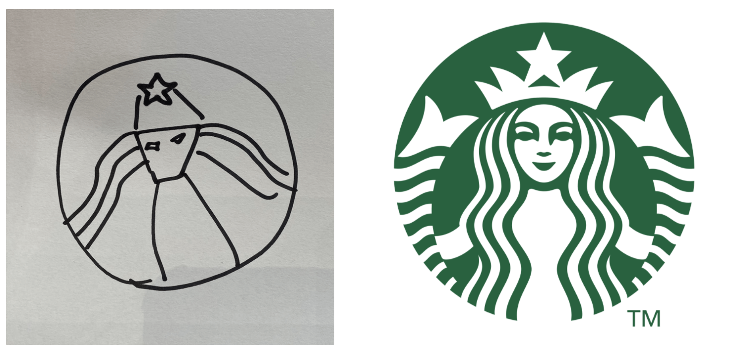
(fig.10) (fig.11)
It was frustrating when I couldn’t draw the Starbucks logo. I could clearly remember the color of the Starbucks Logo, but when it comes to shape, I could only remember that it has a woman figure with long hair.
Amazed by how we remember the color of the logo so accurately, I curated a list of brands with strong color identities. How many brands can you recognize just from seeing the color?

(fig.12)
Scroll to see the answer
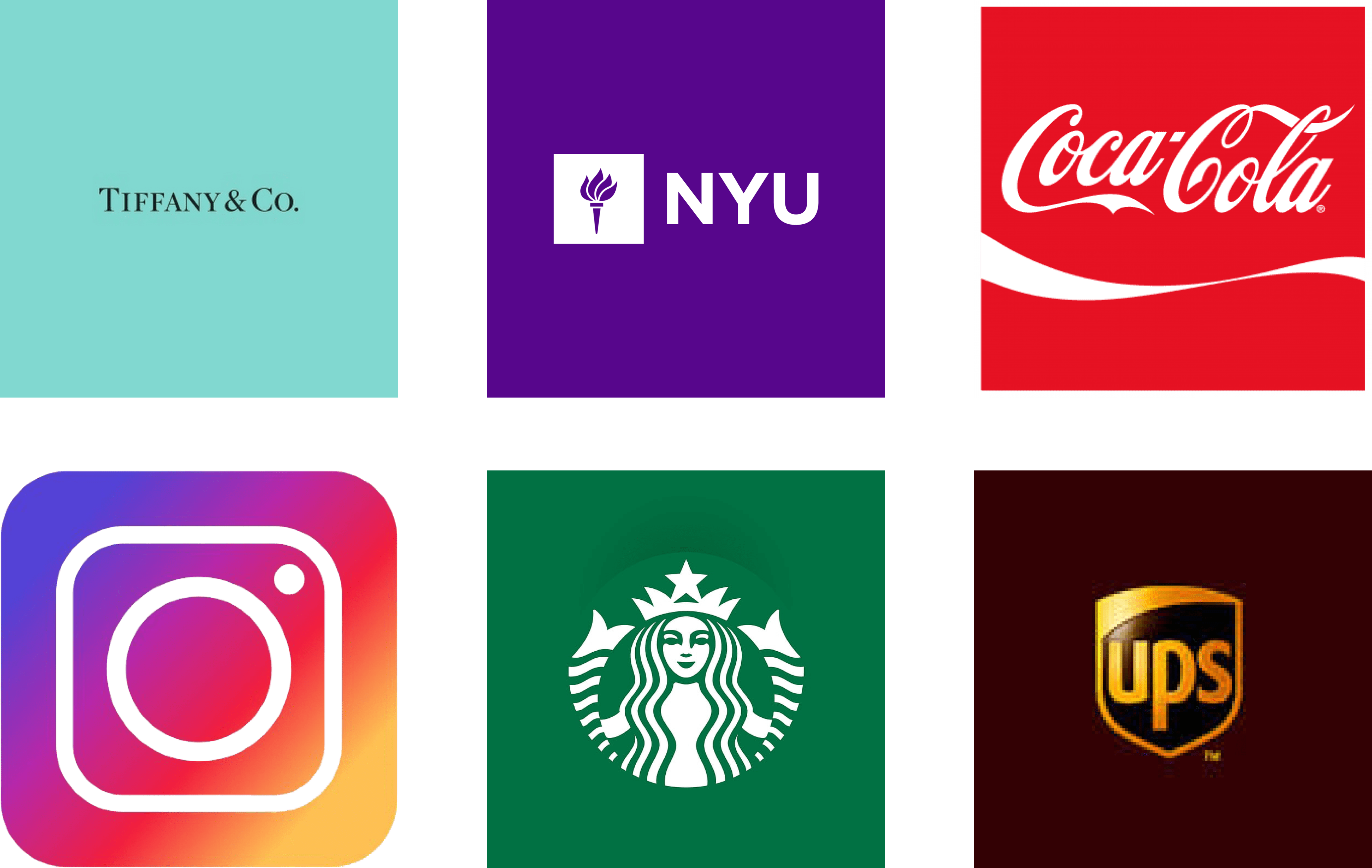
(fig.13)
Color plays a huge role in branding as it touches people on an emotional level. Color choices give a visual connection to the company’s values and personality.
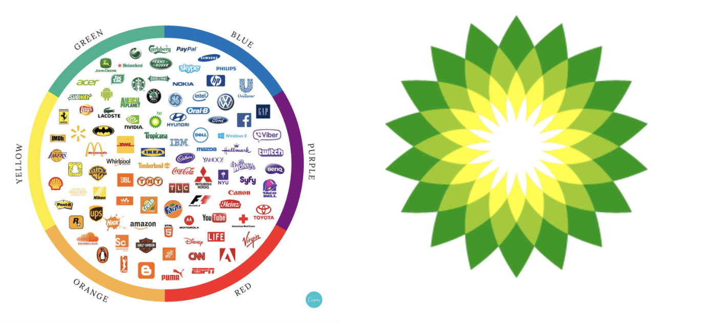
(fig.14) (fig.15)
For example, the color blue communicates trust and confidence that it seems to be highly effective for logos of the companies in the finance, tech or health industry. On the other hand, since the color blue is often associated with spoiled foods and as it suppresses human appetite, it seems to be less effective for the logos of food and drink companies. For this reason, I believe that when choosing colors for logos, it is important for the designers to think critically about what messages the colors communicate and how people react to them.
Green is a restful color as it is most comfortable for the eyes. The color suggests a sense of balance, calm, and a connection to nature. It is not a mistake that BP, the British Petroleum company uses green in its logo (fig.13). Branding with the color green and the values it associates, despite all the obvious environmental harms the petroleum company makes, BP communicates the brand’s environmental sensitivity through its logo.
As such, when creating a logo, it is important to realize that although we cannot control peoples’ actual emotional responses to the brand, we can control shape, style, and color to guide these interpretations. Whether it is the typography, the color, or the shape, as a designer, we need to pay careful attention to each component so that the story and the value the company is communicated to the public.
Works Cited
Mollerup, Per. Marks of Excellence. Phaidon, 2006.
Images Cited
Levis Batwing T-Shirt | JD Sports – Global.jdsports.com. https://www.global.jdsports.com/product/white-levis-batwing-t-shirt/157781/.
Campaigns, Famous. “McDonald’s Turns Its Logo into Directional Billboards.” Https://Www.famouscampaigns.com/, https://www.famouscampaigns.com/2018/03/mcdonalds-turns-its-logo-into-directional-billboards/.
Color Psychology: The Logo Color Tricks Used by Top Brands … https://www.canva.com/learn/color-psychology-the-logo-color-tricks-used-by-top-companies/.
“Branded in Memory.” Signs.com, https://www.signs.com/branded-in-memory/.
Really interesting entry! I especially liked how you called attention to the fact that we can recognize logos with ease, despite having difficulty recalling the exact details from memory. A quick edit for you: in your first paragraph when you are referring to your first three figures, you should refer to figure 1, then 2, then 3 instead of out of numerical order. Also, when you quote Per Mollerup in paragraph 2, you should remove the comma before the in-text citation.
Great work!
-Megan
Very brilliant of you to make this post very engaging and interactive in some way! My drawings were very similar to yours and following onto what Megan mentioned in her comment, logos can be easily recognizable but hard to reproduce from just our memory. Good job on this, Soojin !
Also, give this article a look !
https://www.boredpanda.com/famous-brand-logos-drawn-from-memory/?utm_source=google&utm_medium=organic&utm_campaign=organic
Mmm… This is an excellent entry but the bit on color needs further investigation…
“For example, blue is an inoffensive color, a safe but sophisticated hue. It communicates trust and confidence that many companies in finance, tech, health, or insurance use the color blue in their logo (fig.14).” So what about all the other companies in finance, tech, health or insurance that uses all other colors but blue? Should HSBC, ING, ADCB, UBS, BNP (it goes on ad libitum….) change their brand????
Thank you Professor Goffredo for the feedback. I have edited the blog entry based on your feedback. Instead of prescribing color blue with certain industries, I talk about how it may be effective for certain industries but not for others, hence my perspective on the importance for the designers to think critically about the messages the colors communicate and how people react to them.
Really fun post! Loved the interactive element of it, which keeps the reader engaged throughout. I also learned some key information regarding logo design, like the importance of simplicity specially when a logo needs to be used in many busy formats. Great stuff!