In the first few weeks of class, we have been able to study a wide array of design principles employed in Wayfinding Design ranging from typefaces to pictograms to the concepts of ‘affordance’ and ‘nudge’. While discussing and thinking about these concepts, I would always find myself looking for related examples in the environments around me and the cities I have been to. In this blog, I will explore some important principles using Lahore as a lens.
Lahore, Pakistan’s 2nd largest city, has seen an expansion and rapid development in mobility options over the past decade. It is not like one of our usual organized cities (think Manhattan and its beautifully organized grid pattern); Lahore is chaotic and so are its streets, public transport, and their organization. Just taking a simple look at Lahore’s map will give anyone a clear idea: there is no perceptible pattern to how its mobility systems are organized.
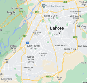
So, what are the subtle wayfinding cues that help the residents and the daily large influx of people from different cities in navigating the city? Let’s look at them as subsections.
The Canal Bank Road: Consistency and Logic
The Canal Bank road is a major signal free road dissecting Lahore in a generally east-to-west direction running besides a canal. An eight-lane road, this road offers links and exits to multiple neighbourhoods of the city and experiences high volumes of traffic every day. Let alone the multiple links, even ensuring a continuous flow of traffic could be challenging on such a route. However, the road experiences only minimal restrictions to the flow of traffic even at busy times of the day. How so? Well, a number of smart (and some not so logical) elements allow it to do so. Let’s look at some of them one by one.
1- Underpasses:
To ensure a continuous flow of traffic, the road has adopted a signal free model (contrary to the popular design practices in cities across Pakistan). This is achieved by the 12 underpasses that line the road along its length. Instead of having to rely on what may seem like a forced design in the form of traffic signals, which would also increase traffic load and delays, the integration of these underpasses is something a driver barely even notices making the drive seem like a natural flow instead of a restricted, artificial, and unnecessary practice.
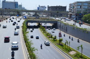
By lining the roads with tall overhead signage and arrows on the road directing traffic towards the different destinations, the underpasses are a seamless integration in the road system. They allow bypassing unnecessary stoppages in all the neighborhoods on the way for drivers, who can easily drive to the exact exit they want. And when I used to drive through the city, the underpasses really subtly nudged me into steering into their direction.
2- Signage boards
To prepare the drivers to anticipate an underpass ahead and decide on their route, the signs near and before the underpasses pass on information assisting wayfinders in on-the-route planning and any adjustments they may need to make. Through giving information on routes, the signs assist in intelligent and educated decision making in finding one’s way through this large city.
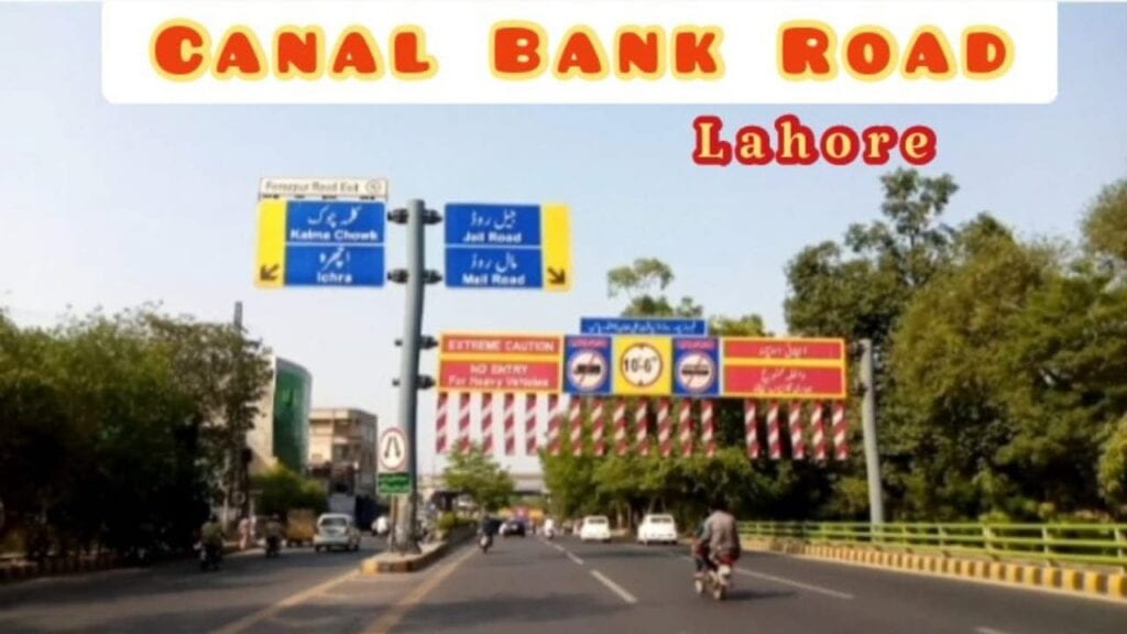
The signage use reinforcement through text (Sans Serif) and icons to not only provide information about routes to different places but also necessary information about the road that can come in handy for route planning for different vehicles and purposes. By following a consistent theme of blue color for neighborhood names, yellow for warnings and ‘heads-up’ information, and red for warnings, the signage along this road makes it really easy to quickly get information when speeding through at 70-80km/h at this road. The large font size, icons in black against a white background, and information in Urdu and English do a really effective job in guiding the traffic. On top of that, informational signage on height limit along with the plates (colored in red and white stripes) rely on visual, auditory, and tactile cues to prevent tall vehicles from entering underpasses. Unsurprisingly though, I have very frequently seen tall container trucks still ignoring these warnings and finding themselves stuck in an underpass which makes me wonder if there is an inherent flaw in design being ignored since years. Let me know what you think and I may as well submit a report to Lahore Development Authority.
Is all still as good as it seems?
If everything is flowing so seamlessly on this road, shouldn’t the entire world of wayfinding and road designers use this road as an ideal example? Well, not really. Let’s talk about an issue due to which I personally have wasted a lot of time, fuel, and mental energy even after driving through the road countless timing. The issue is about not following logic and consistency.
To someone who starts at one end of the road moving to either direction, they become trained and educated by a very obvious pattern: all the underpasses are to the right side of the road along the canal’s wall and all the links branch out from the left side of the road. So, one would expect this continuity of logic in a consistent pattern throughout the road and easily cruise through the road to their destination at the other end of the road. Actually, not true due to a very absurd design.
Midway through the road, a driver anticipating an underpass on the right side is surprisingly met with this time the branch actually leading out from the right side of the road and underpass starting on the left side of the road. All too often, it is very late before a corrective measure can be taken and the driver is forced to drive and take a diversion through a neighborhood they didn’t intend to visit. In addition to being annoying, it makes the wayfinding process very confusing especially for someone who is new to the city (and it wastes quite a lot of time and fuel). Additionally, this point and the drivers taking a late corrective action (which, I believe, they should not be blamed at) lead to a traffic jam and traffic accidents at this point in addition to those dangerously breaking the traffic rules to go to the other side of the road.
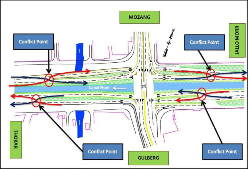
An case study (cited in the picture credits above), describes this phenomenon as “traffic weaving” that arises from a conflict point at 4 different positions on this road. And what is this rooted in? A design that seems absurd, which does not follow a person’s perception on logical and consistent flow of a pattern they have been trained at by the road itself. This point breaks that flow. So why was this design even adopted and then approved and implemented making it the only outlier? Well, the answer is that this underpass was among the first ones to be constructed and others followed (which, someone decided, needed to be on the other side). To date, no correctional actions have been taken and the apparently mysterious design continues to pose trouble to the city’s wayfinders.
This, on top of naming of underpasses after people and not neighborhoods adds to the breaking of logic and people have to rely on other cues and strategies to efficiently find their way through the city. The number of the underpass is thrown to the side of the signs, with the name taking the most space and, thereby, not allowing the logic offered by numbers to even come into play.
Even Google Maps fails at this point! Not everyone has zoomed in to the depth of noticing a slight (and unexpected) diversion on the road no matter how much the map plans the route for you and then you better be familiar with other wayfinding strategies.
Signal Free Corridor at Jail Road
Another important, yet shorter road in Lahore is the Jail Road. It serves major hospitals, universities, parks, offices, and Lahore’s central railway station. Such an important corridor, yet I still remember it being clogged by traffic any time of the day when I visited its neighbourhoods as a child. Few years later, I am offered a smooth, uninterrupted, seamless driving experience on the very same road. How so? A move away from the conventional (and usually dreaded) design pattern of traffic signals and signs. The road used to be lined with these signals at very short intervals due to it being connected to many different stops and exits. The city’s officials decided a radical shift to how the road will be and redesigned it entirely shifting it to a signal free corridor with minimal signs and diversions that smoothly integrate into the flow of the traffic making it very natural for drivers.
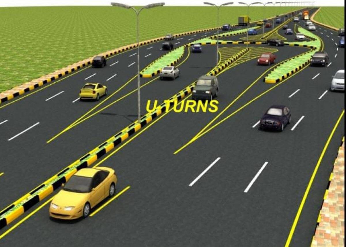
By only replacing the traditional design of signals with U-turns, the entire road is now mostly free from traffic jams. So, a move away from traditional design patterns and thinking of newer, better ways of designing the same systems can offer a significant improvement. This system does so by also nudging the drivers towards the U-turns through the curve of the road and the arrows on it near the turns.
Metro Bus: an example of simplicity
We also talked about how wayfinding design should be simple. Not too simple, but simple. Lahore’s MetroBus system could offer a prime example of this simplicity. The bus isolates itself from other road traffic by fences on both sides of its path that follows only two lanes for buses running in opposite directions. You have a bus, running in a single and straight direction, isolated from other traffic creating an independent to and fro system of its own. Running in a North to South direction throughout the city, this bus serves areas of incredibly high volumes ranging from the old city to the more recently developed neighborhoods; a route where road transport was on the verge of breaking down. With millions of people served every month, the last thing the administrators or citizens would want would be for the bus system to be complicated or confusing. Therefore, it keeps it simple in the aforementioned ways and also by keeping its very route simple.

A straight line route, numbered stops, labels in English and Urdu on either sides of the route information system, and simple key and colors make the system very easy to navigate. You get on at a station, you know you are moving in a single line with no branches, the labels are clear, you see your stop and get off their from this easy to read route. Simple and clear design and a good wayfinding experience.
Orange Line Train: Commonality of Design
The latest urban transport project to be completed in Lahore is the Orange Line Train system. A project similar to other intra-city rail projects, this project is simple in the way that it currently only serves one single route. While there are plans for expansion, the early stages of the project play really well into keeping things simple for people in such a complexly weaved city. However, that isn’t the focus here. The focus is the design principles.
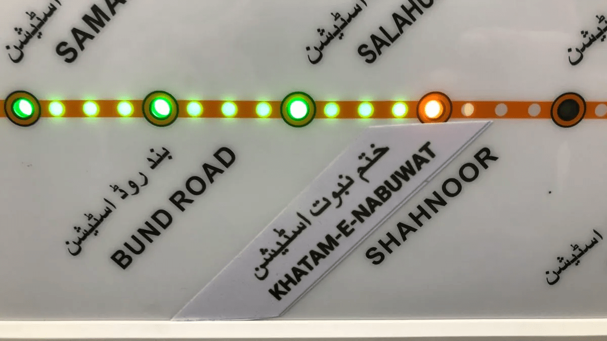
The entire system is designed similar to metro systems around the world. Walk into a station, and apart from branding and Urdu text, you would rarely spot a difference in design from a subway station in New York or Boston. The text arrangement on routes, the lighting along a line, the Sans-Serif fonts, and even the text rotation, all seem to be very common in subway systems around the world. Lahore’s own Orange Line seems to be doing the same, not spending energy at reinventing the wheel but leveraging something a lot of people have already inculcated into their subconscious mind: the idea that this is how a subway system should look like and this is exactly how it would make it easy for us to read and navigate.
Concluding Remarks
Lahore is a very complicated city. So many neighborhoods, people from a variety of backgrounds, traditional and centuries old routes that were taken by traders and empires of the Sub-Continent. Now, it is growing with these routes and more ranging from so many roads to the MetroBus and Orange Line systems trying to support this growing city. And we have seen some common design elements and some not-so-common principles coming into play all because of different design practices, some good and some bad. Yet, the simplicity and (to some extent) isolation of these systems link them up in a very good way to form a complexly connected yet simple to navigate system as a whole. The isolated pieces become pieces of a very good puzzle, supporting the wayfinding of millions of people daily in some subtle and some explicit ways yet covering the entire city.
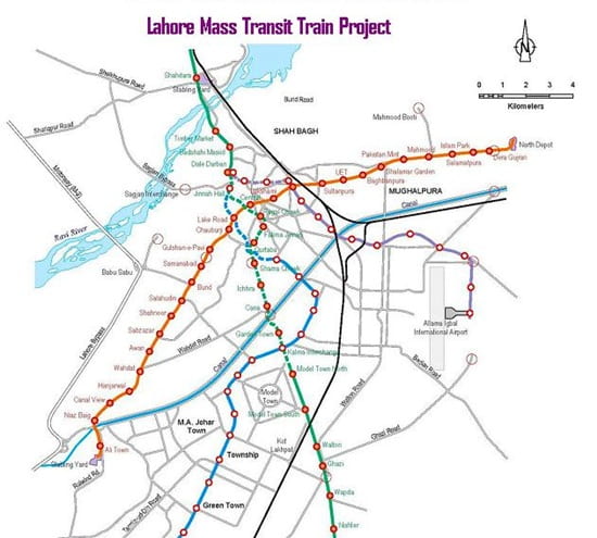
And for such a complicated and widely spread network, good wayfinding design become somewhat critically necessary. Otherwise, if all else fails, you can always rely on a confident Lahori passerby who will confidently guide you to your destination even though they would have absolutely no idea of the routes and your destination. (This was a joke, don’t try it even if all of your wayfinding strategies from this class have failed and you are stranded. You have a better chance by not doing so)