Post Four: What I learnt from my peers

Entering the last month of this spring semester, I took some time over the Eid break rereading some of the posts made by my peers. Seeing our collective knowledge on wayfinding and design being broadened and applied, one post at a time, further highlights the pervasive nature of design in our daily lives. Blown away by the depth and diversity of the thoughts presented by each post, I wanted to take this time to write about some of the learnings I’ve had from my peers.

Hasin’s writing made me realize how the approach taken in the design process directly affects the quality of work produced. Hasin talks about his creative process that comes from a combination of introspection and giving ideas a physical form, in the form of sketches, scribbles, and lines. These forms might not initially have a clear meaning at the moment of creation but the visualization opens doors to future possibilities for the designer to make sense of their thoughts without relying on memory. This process itself can give rise to new ideas. Seeing the quality of work Hasin produced for his pictogram definitely  inspired me to take on a more hands on approach in my next design assignment. 

Abdelrahman’s post points out the inability to fully enjoy the convenience and accessibility of artifacts presented by museums, when not given the entire history of how they got there. It is true that artifacts made by humans, whether they are from Egypt, Korea, UAE, etc, tell a story about our collective humanity. But, some artifacts hold more significance to a certain group of people over the other. In most cases, the origin country in which these artifacts were birthed in, used and developed should have ownership over these objects and how their stories are presented to the future generations. If the artifact is displayed elsewhere, an ethical exchange and borrowing of artifacts is crucial to ensure that the origin country does not feel violated and stolen of their precious artifacts. Unfortunately, from history, it is clear that these exchanges did not always occur in ethical ways which provokes a sense of discomfort when encountering artifacts foreign from the location of the museum. It makes us question, “How did it get there?”. Unfortunately, too often, we are not given an honest answer from the beholders. In most cases, the process of how they got there is forgotten and not given enough attention to, perhaps with intention. 

I could sense Abdelrahman’s passion for design that stemmed from all the way back in 2013, prior to taking Wayfinding. It was interesting reading how even as a designer who has been active for the past 9 years, one’s idea of what design is and should be is continuously reexamined. The ambiguity of the word “design” provides this flexibility for redefinition based on context. Perhaps the question of what design means and should mean is one that we, as designers, should always ask ourselves and reexamine based on the context in which the design is applied. 

Laura’s post further provoked more ethical questions regarding the ownership of artifacts in museums. The line

“But if objects carry these words, these messages, and even lessons about history, adding value to the society of today, one could argue that owning these objects would equal owning history”

made me question, where does the identity of objects lie? Is it simply in the location of residence? The owner? Who owns artifacts? 

Considering the change of ownership that occurs throughout history, the narrative containing how artifacts end up on the hands of multiple owners should also be presented and made more transparent by the museum. Presenting the viewers with not only the context of creation and the ways of usage but also how the artifacts have gotten to its current location.

Laura also presents us with the question, “Is history purchasable?”

Let’s say a country managed to purchase an artifact from another country, giving them the right to use and display the artifact freely. Can they truly own this piece of artifact in its entirety? The history stored within the artifact makes it impossible for its previous identity to be fully erased with money as long as we, as viewers, remember it and keep it in our record. Hence, the non-tangible identity and history of the physical artifact seems to retain its value regardless of its physical location as long as the story is remembered and told.

I believe that it is part of the museum’s role to preserve the artifact’s story and history in its entirety, up to the point of how it got to the very museum it is stored in. Laura also points out how “the preservation of history should be the goal regardless of who owns it”. This made me think whether preservation and the act of recording history is always better than having no record? This question becomes even more important for preservation processes that involve stealing and a complete disregard for the ethics of the origin country. Are some artifacts better off not being discovered, protected under the grounds of their origins, until the country is ready to unravel and showcase them at their own pace? Do we always have to adjust to the pace of discovery and preservation of the “faster-developed” countries?

Prior to reading Jennifer’s post, I thought that the usage of analogy, metaphor, and synecdoche was limited to text and speech. Having read her post, I now recognize the power of using them in visual communication to leave a more permanent and striking impact on the viewers. It made me think about how an analogy could be successfully executed in visual form. It seems from the examples presented of the Hiroshima posters, the visual analogy can be supported by text to provide further context of the image. The WWF, on the other hand, provides the context entirely through visuals achieved by including more details onto the abstraction – in this case, adding the individual constituents of the ecosystem, the animals, inside each block of the Jenga to represent the fragility of the ecosystem as a whole. The abstract way of thinking, encouraged by the usage of analogies, metaphors, and synecdoches, in visual form allows room for freedom to be creative in the design process. 

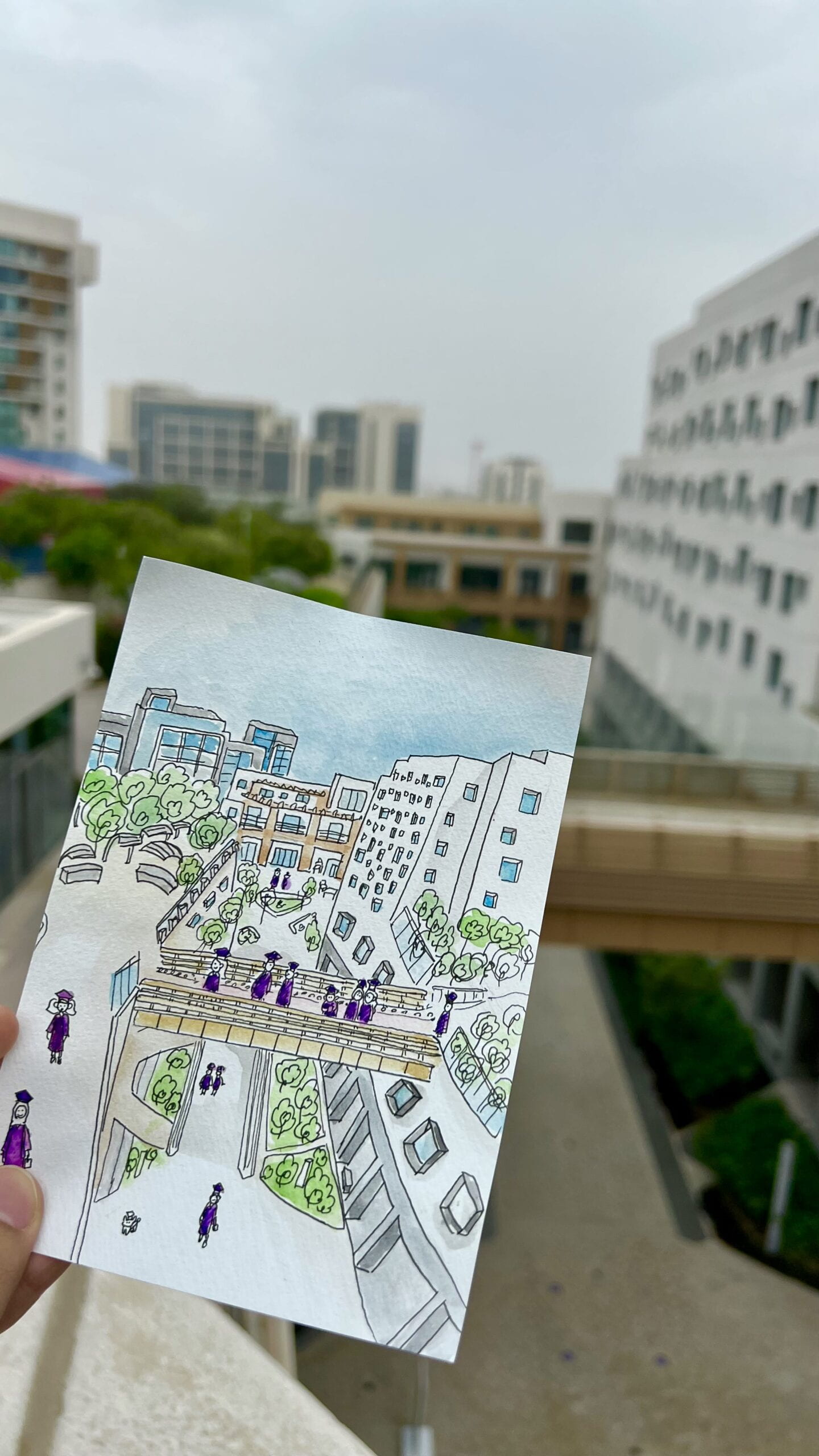
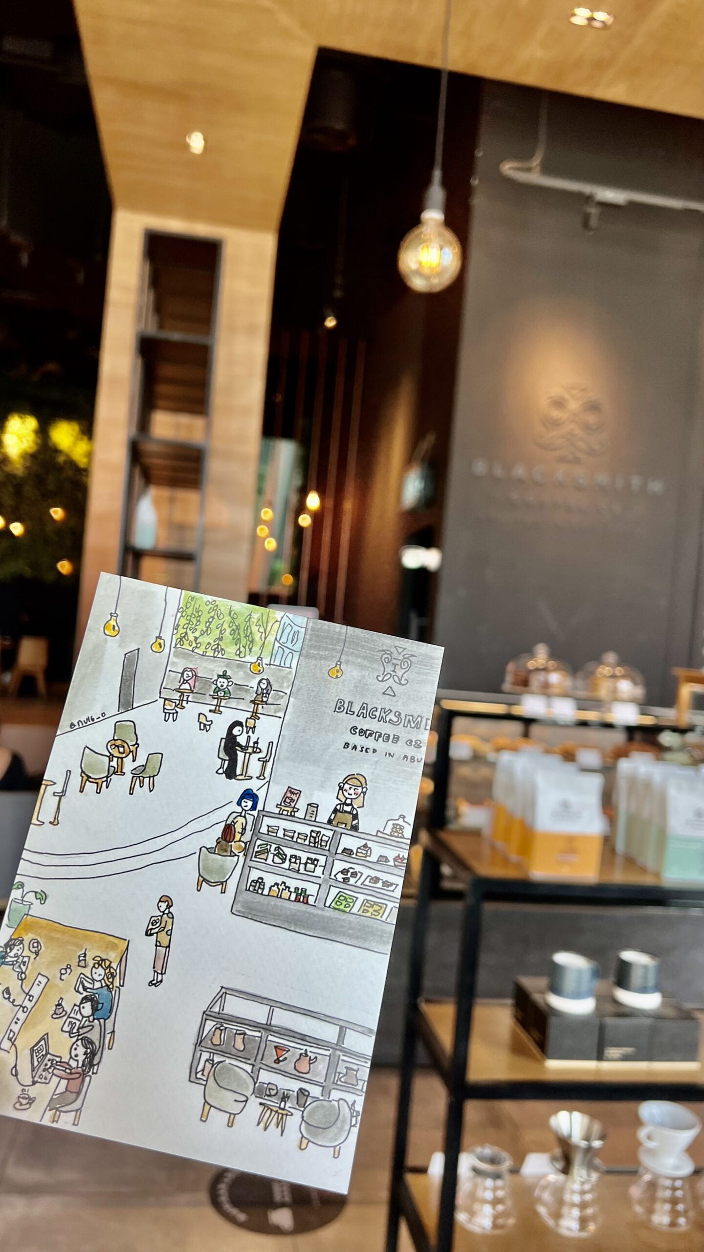
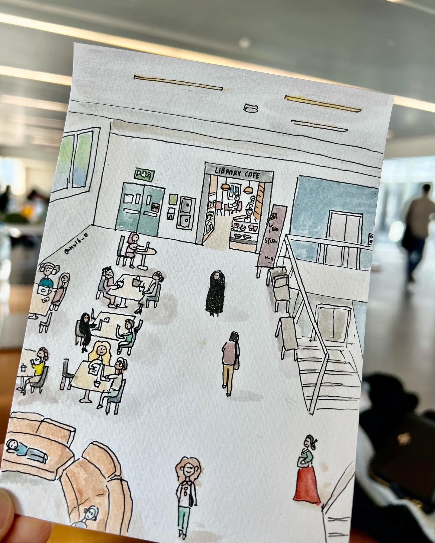
To conclude this blog post, I wanted to share some new additions to my campus illustrations series made throughout this semester, inspired by the conscious decision to be more attentive of the physical systems that surround us on a daily basis. 
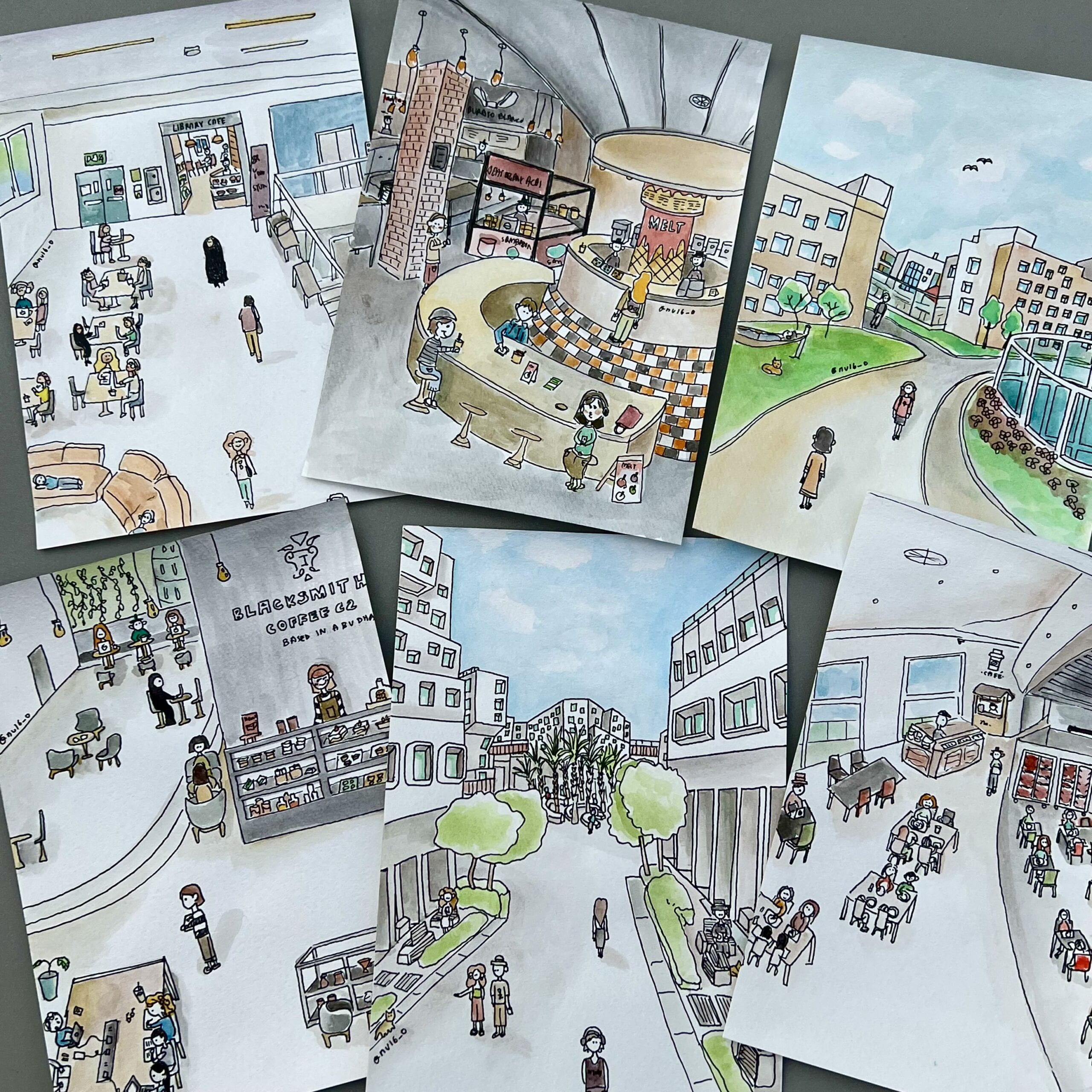
Illustrations of library cafe, market place, high line, blacksmith, campus center, and d2
Last one of my campus illustration series 🙂

Post Three: Christian Greco’s Talk & The Future of Museums

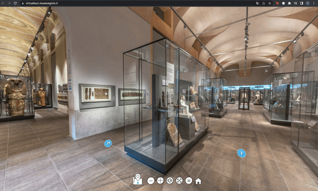
Virtual Tour of Museo Egizio

After Christian Greco’s talk, I was prompted to search up the main website of the Egyptian Museum (Museo Egizio in Italian) out of curiosity. An interesting finding was the virtual tour under the tab “Discover the Museum”. 

The virtual tour is a 360 degree digital experience in which users can navigate themselves through the museum with photographs and documentations of pieces displayed. When the user clicks on the information button, they can read more about the pieces just as they can in the physical space. The interface includes blue arrows allowing users to “move around” the museum. 

Link to the Tour if you’re interested: https://virtualtour.museoegizio.it/

The VR tour encouraged me to think, once again, about the future of museums that Greco mentioned in his talk. He mentioned how COVID expedited the emergence of on-line museums within the last two years. The epidemic required people in all areas of the world to socially distance themselves in the physical space – museums being no exception.

Faced with this challenge, many museums and exhibitions turned to the web to continue providing a digital space where users could continue to engage mentally with the museum’s carefully curated pieces and ideas. The web is a relatively new medium, a powerful one, in which objects stored within it are untouchable to the threats of the physical world. 

This relates directly to Greco’s point:

“We cannot preserve without innovation”.

In contexts, such as COVID, where the access to physical objects becomes challenging, adapting to a new medium is essential to continue fulfilling the museum’s role of preserving and creating memory. Preservation and innovation are inseparable. 

Relating to the role of museums, Greco mentions how museums cannot be defined or understood outside the realm of societies. Museums provide a space where people can collectively engage in objects and ideas relevant to the culture created in the past, relevant in the present, and those that will be created in the future.

This prompted a question in my head – is social media a hub where all users can be curators of their own digital museums? Where users select moments in the form of images and videos and narrate them through attaching personal meaning to them? These questions made me imagine a near future where people prefer a quick visit to a digital museum over engaging physically in the actual site. How would this impact the role of museums? Would curators actively fight for the preservation of the physical museum? Once the general audience has access to technologies that can create perfect simulations of these physical museums, what would keep these physical museums alive? These questions become ever-more relevant with the collective increase in the time we spend online.

The answer could be simpler than we think. These mediums store the same content and information but they do not feel the same. Just as the experience of reading a physical book differs from that of reading through a screen, visiting a virtual museum will never feel the same as visiting a physical one. Physical museums distinguish themselves through layering each encounter with a feeling that only physical presence could bring. 

It seems that the museum not only functions to inform but to provide an experience. In the 2024 project that Greco mentioned, the floor map shows the incorporation of spaces, such as the Egyptian garden and the literary café, that do not serve to exhibit pieces but to fulfill other needs such as eating, breathing fresh air, socializing with others, getting some sun and vitamin D etc. The incorporation of these features is not yet entirely replicable in the digital space. Until we have access to technologies that smoothly encompass all of the 5 senses – sight, touch, smell, hearing, and taste – the physical museum seems to be safe from the digital invasion for a little while. 

Additional Questions 

    1. Greco mentioned at one point of the talk that we, as humans, think we are powerful but objects are stronger in their ability to last and endure through generations. Digital objects seem to be at the next level of strength in terms of preservation. Does this necessarily make them more valuable? Impermanence and rarity of objects and experiences give objects value. If these digital cultures are imperishable in the form of data, making the contents permanent, how do we measure value in digital objects?
    2. How does the field of  archaeology look like in the digital space? Archaeology is “the scientific study of human activity through the recovery and analysis of material culture.” How does one recover digital culture? Do they not have to be recovered at all? 


Post Two: On Juxtaposition & My NYC Subway Commute – Yeji Kwon

Thoughts on Juxtaposition

For this blog post, I wanted to explore the idea of juxtaposition in design. This inspiration came from an example mentioned in class – a trash bin located right in front of a subway map.

The issue lied not in that fact that they were in the subway. It is when these two objects, each with their respective functions, are placed too closely to each other, that an issue arises. This creates an awkward situation in which there are two parties trying to do two different things in the same space – trash throwers and map readers that are now required to multitask in order to not get in each others’ ways. Neither can carry out their functions in the best way.

Juxtaposition is what creates the problem”.

The issue arose with the juxtaposition of two objects. More specifically, how they were juxtaposed. This made me rethink the importance of cautious juxtaposition of elements when trying to optimize a certain function. It is important as, evident from the subway example, there are unintended consequences that could arise when this process is not kept in mind.

It is perhaps the role of the designer to juxtapose elements in a way that could optimize a function. This made me enquire, how can we design systems – specifically way finding systems – so that we make can optimize the juxtapositions we make? How does one enhance their ability to juxtapose? 

Designing features for a public transport is extra challenging as you are designing for billions of people. You must be aware of what the people are looking for, where they could look for it, and provide the best model of juxtaposition of reduce confusion and help them find their way. 

Keeping these thoughts in mind, I wanted to revisit the process of my commute during my semester abroad in New York, Fall of 2021. As an interactive media, most of my classes were situated in Brooklyn (where the IMA / ITP department relocated to a couple of years back).

My NYC Commute Experience

During my fall semester, I had to commute from Manhattan to Brooklyn three times a week. The commute took approximately 50 minutes including the wait. The length of the commute along with the poor internet connection underground forced me to disconnect and look around.

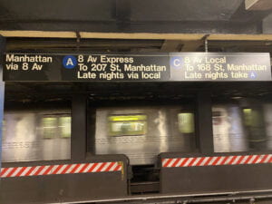
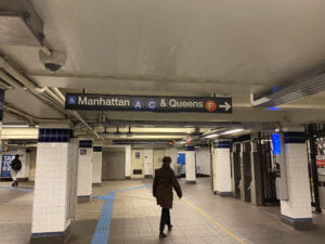
I took some pictures during my commute. Back then, I did not have much knowledge on signage systems – I just knew I liked the bright colors and the use of Helvetica. But taking this class made me want to revisit these pictures with a new eye. 

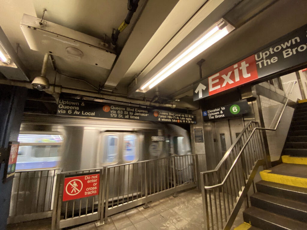
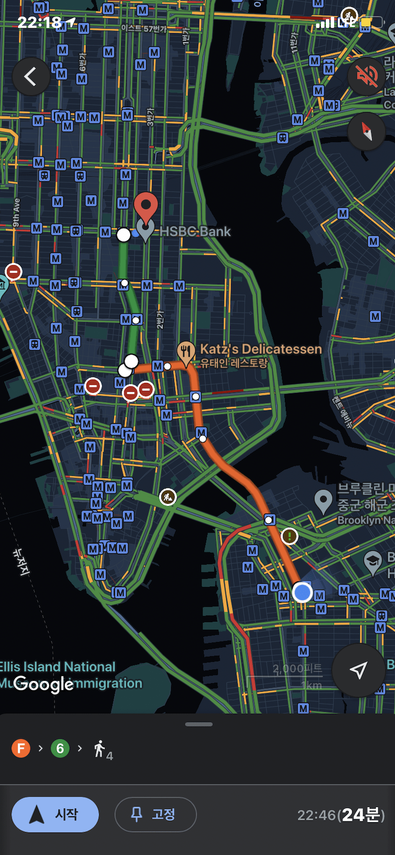
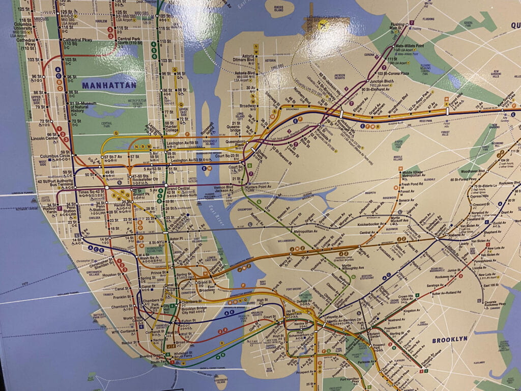
Navigating the New York subway system as a newcomer in the 21st century is an interesting one. With the emergence of smart phones, the way we navigate in the physical space has changed forever. Prior to taking my trip, I first opened my google maps to construct a brief mental map of my route. From google maps, I knew that I had to take the lines F and line 6 and the subway station I had to walk towards. 

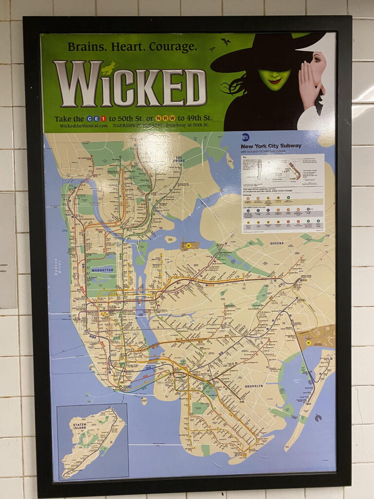
One challenge I faced during my first week in New York was that I did not have a sim card and internet data. This meant that once I reached the subway station, I had to rely on physical signages. Once I reached the metro, I saw a map displayed by the entrance. 


Now I know that this map was designed by Michael Hertz, influenced by Massimo Vignelli’s 1972 map design. Looking at the screen shot of my google maps, I looked for the starting point (Mad Sq Av Park) and the destination (Jay St) to familiarize myself with the lines (the colors helped alot!) and to also ensure that I was taking the right track.

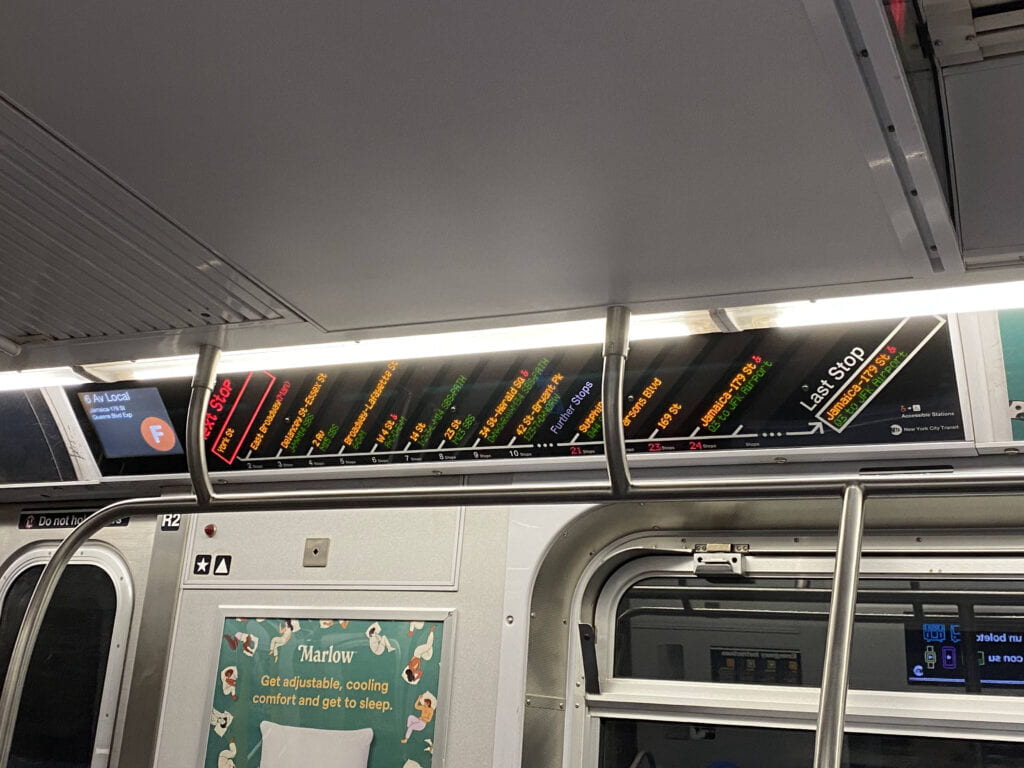
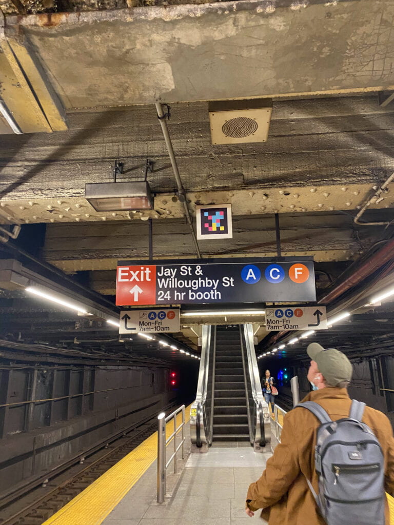
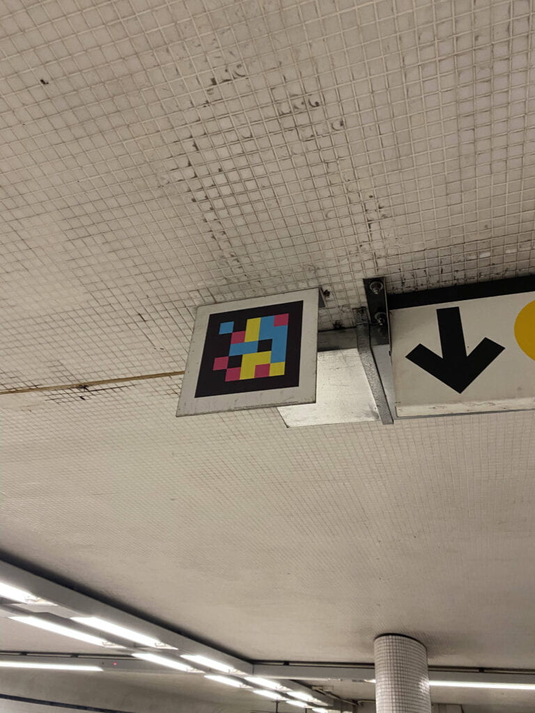
Once I got on the subway, there was a digital screen that updated the stops as the metro moved. The blend of digital and physical signage systems was very interesting. I also noticed QR codes around each station – the function of which I did not know back then. 

With some research, I found out that these QR codes were part of NaviLens which reads out signs and provides train arrivals in audio to help blind or low-vision users navigate the station. (Read more about that here: https://new.mta.info/accessibility/stationlab/navilens)

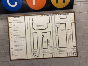
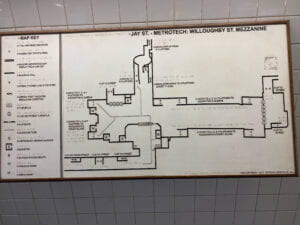
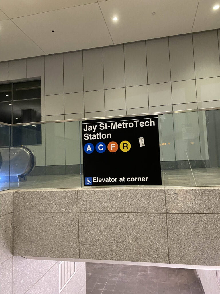
Once I reached the jay st metro station, I noticed black and white maps that had a different style to the main metro map. These were floor maps that showed the surrounding infrastructure once the user left the station. Each exit / entrance had a floor map, helping the navigator decide the nearest exit to their destination. 

Each entrance and passage had the lines available for users to follow. 

As someone who had never visited NYC before, it took me around a month to get used to navigating my commute without a phone. My mental map of NYC itself was non-existent. It seemed like I was taking on the final level of the video game before completing the previous levels. My first month involved not only getting used to the NYC subway system but getting used to NYC itself. 

To a local, taking the F line heading to Queens took no thought but as a new comer, I had no idea where and what Queens was. Because my first encounter of NYC’s land was through the subway system, if someone asks me now to recount the places I visited in NYC, the first thing that comes to my mind is the NYC subway map.

The NYC subway map has forever imprinted an irreplaceable mental map into my consciousness. 

Post One: My Thoughts on Wayfinding and Design – Yeji Kwon

Four weeks into the course, I am starting to realize that this class is not only about reading maps and following directions well but rather about equipping us with the right tools to navigate our own way in all areas of life that require decision making and problem solving.

I am coming to realize the importance of being attentive and sensitive to our surroundings from not only a single perspective, but from every possible perspectives that exist out there. This attentiveness seems to be a crucial quality in being a person capable of designing for accessibility.

This comes particularly from the example that was mentioned in class on the steps in Jumeirah beach. When I initially saw the image of the stairs on top of the beach, I saw no single issue with it. In fact, I saw the steps as a considerate design choice for people who didn’t want sand in their sandles. I completely overlooked the fact that a person could not walk on the steps. I was taken aback by recognizing a privilege which I have taken for granted. It made me question – how many more perspectives and lives out there am I oblivious to? How do I expand my point of view? I think the answer lies in being being attentive, keeping my ears open, and embracing sensitivity.

I used to think that sensitivity was a weakness that one had to endure and overcome to become stronger, but I have come to realize that it is the single most important quality that allows one to see and feel things beyond what the average person can. This, now, I perceive as a strength; as the first step to solving a problem is recognizing the problem itself.

This further made me realize that any quality we perceive as a weakness, can be reframed into a strength. Physical and mental disabilities present more challenges to one’s lives – but it also gives them the ability to empathize with people with the same challenges. This thought inspired me to view my own struggles in a more positive light. The experience of pain and challenges allows me to relate with those with the same pain and challenges. Such knowledge equips me with more experiences to ensure I am designing for a wider range of people.

Before recognizing this, I was designing solely from my perspective and saw no issue with it. Activities we had in class helped me see that such approach to design in the real world would be disastrous. In the first group activity where we presented a design brief for a sports event, we were required to help visitors navigate their way to the stadium. We first needed to abandon our mental model of the campus completely, and design from the perspective of a newcomer. I looked through emails of my candidate weekend to remember how that felt like – being completely oblivious to what NYUAD looked like. It was quite challenging trying to unlearn something embedded so deeply within your conscious. We also tried not to make assumptions and expect visitors to know pieces of information, meaning we had to start from scratch – from a blank slate.

I have also become appreciative of the soft skills in design – such as the ability to communicate clearly and succinctly, being practical and realistic through keeping your word and delivering what you promised. The work itself isn’t the end product – you are, in a way, part of the product that you must sell. The work presents a solution but how you present the work and yourself is equally important.

This brings up the question what is the “right way” to present yourself as a designer? I believe it comes from the inner values that the designer holds and being aware of the “air of the time” – Zeitgeist, in German. The ability to read and catch the cultural shifts as they happen requires a multidisciplinary set of knowledge and skills. Hence, it seems that being a good designer does not solely depend on one’s ability to use their tools perfectly, illustrator for example, but knowing how and where to use them.

And there is no single answer to it, which is the most challenging and beautiful part of design.

This class has been inspiring me to be more attentive to my surroundings and wanted to share some of the results of doing so here 🙂

People working in Blacksmith
People working around Library Cafe