I never expected that I would learn Wayfinding, its principles, and other essential principles in Design ever in my life. Before taking this course, I was convinced that design requires one to be born with certain skills and some degree of talent to succeed in the field. This course proved to me it is not true: although talent and a good sense of people’s needs helps in using design to suit one’s goals, hard work and experience are ultimately the most important determinants of success in design.
I have collected some phrases throughout the semester from the lectures by the professor and the guests. I believe that the phrases are very helpful in understanding what design is and how we should approach it, so I am going to include them and offer my interpretation of them.
‘’Never underestimate how much you can progress.’’ This is motivation. This phrase shows that no matter our starting point in design, through sufficient and consistent practice, anyone can improve their skills a great deal. The best part about this phrase is we all already know that this holds true – all of us are much more knowledgeable and much better at design than we were at the start of our course!
‘’Sometimes it’s the better presentation, not the better design.’’ This is one of the things that the professor urged us not to forget. No matter how good your design is, to convince others and put it out there, you need to be a good presenter.
‘’Communication doesn’t have an opposite. There’s always communication.’’ I still remember that funny experience where I was instructed by the professor not to respond to him. But when he was bombarding me with questions, I felt like even though I was silent the whole time, the professor was able to extract some information on my persona on the way I was handling the silence task. By seeing that I smiled and almost laughed, the professor discovered my childish/goofy side. If I did not move a muscle on my face, which I did, he would still be able to get valuable information that I am serious when it comes to carrying out tasks. And if I ignored his task and proceeded with responses to him, he would still extract some valuable information on the way I behave myself with other people’s requests. In the end, communication exists everywhere – in silence too.
‘’What if the poster stays for one more day?’’ Although I do not remember what the poster was, I can still remember clearly why I wrote this down as an important quote. Design product should not lose its relevance after it has served its purpose. This question reminds me of the future–proof aspect of our designs – they should always be prepared to be used more, and not lose their effectiveness over time.
‘’We don’t always notice the exclusiveness of designs. Accessibility needs to go hand-in-hand with design.’’ This is self-explanatory. Design exists to serve people. If it serves not all but only some of them, then it is a bad design. Don’t be a bad designer.
‘’Complexity of the world requires that designers understand the needs and dilemmas.’’ Every epoch is characterized by certain prevalent ideas and public movements, and design is shaped under great influence by those ideas and movements. To be a good designer, one must know what epoch they are living in right now and be respectful of the values of that epoch. Moreover, designers have the power to influence those values through the propagation of their personal beliefs. Designers should be mindful of that and use it to better the world.
‘’Have experts help you with things that you are not competent at when you work on projects.’’ Designers often work in complex projects that require extensive knowledge in several areas. It is impossible to be an expert in all areas that exist, so chances are every designer will have to deal with things they don’t know at least once. At times like this, it is much wiser and more effective to ask for help and guidance, or even hire someone who is an expert in the field your project intersects with.
‘’In 20-30 years, where is your design going to be? Always ask yourself this question.’’ This ties in closely with the poster question from earlier: we should always think about the future of our designs, because designs that will not survive the changes of times will quickly be left out of attention and lose its effectiveness.
‘’How can we learn from our mistakes in the past?’’ Another valuable lesson every designer should hold dear to their heart is improvement. Design, from what I have learned so far, is a journey rather than a destination. Design always changes and designers unavoidably make mistakes. The most important thing is to learn from the mistakes. So exercise this habit of always asking yourself this question, not only in design but also in other areas of your life
‘’Emotions such as fears and anxiety need to be considered to develop an efficient design.’’ Design serves other people. People are full of emotions. Every action that we take and all the decisions that we make are heavily influenced by what we feel. Therefore, understanding what people could feel in certain situations is a must to becoming a more effective designer and implementing better Wayfinding solutions.
‘’People don’t always do what they say or what you expect them to do. People resist change. The greater the change, the stronger the objection. Therefore, always include people – your clients – in your project to make them feel more secure and safe.’’ Design serves people, but it also influences them. Any kind of influence can be considered a threat on a subconscious level, so it is natural that people might resist changes that design invokes. To solve this, from time to time designers should make people participate in their work to create an inclusive decision-making environment. There are other advantages to having clients help you – you will learn exactly what your clients want and how to create a work that pleases them the most.
These are some of the quotes that I feel are very valuable to learning the gist of Design and Wayfinding. These quotes made me realize the great importance of Design and all its little tricks that I would probably not learn from somewhere else, for which I am very grateful!
Category: Ulan (uk2042)
Advertisements and their role in our society
Creativity, or Manipulation?
Our world is run by advertisements. Ads accompany us on all of our paths, whether real-life – in public places – or online – visiting websites. Considering their vast presence in our lives, it is only natural to assume that their influence on us is of no little importance. But why exactly should we care about ads, and how do they shape the ‘theme’ of our time?
First, let’s define what an advertisement is. Google defines it as ‘a notice or announcement in a public medium promoting a product, service, or event or publicizing a job vacancy.’ The principle that advertisements make use of is very simple – the more people know about a particular product, service, or event, the more people are going to know enough about that particular thing to buy it, use it, or attend it.
For an ad to be very effective, other than being shown to a lot of people, it should also be convincing. After all, the likelihood of a person wanting to jump over a cliff after they stumble many times upon an advertisement that says ‘jump over a cliff to win a million dollars’ would still be slim, if a person is sane of course. So to convince a customer to choose YOUR product over any other similar product is of great importance to the success of that advertisement campaign. To make their advertisement more convincing, companies make use of two universal principles – attractiveness bias and familiarity principle.
Attractiveness bias is based on an assumption that all people associate positive qualities with anything that looks beautiful, or attractive. In other words, ‘beauty’, in this case, becomes a synonym for ‘good’. This is one of the most heavily used principles in advertisement, and it is exactly why models exist. Familiarity principle, on the other hand, is how people tend to trust what they know or are familiar with. If a person received two different reviews – one from a close friend and the other from a stranger – on the same product, they would intuitively trust their friend more than the stranger. Similarly, the familiarity principle states that to win a person’s trust, an advertisement needs to include someone or something that the person is familiar with. In many cases, this familiarity is created by popular actors with good reputations. In other cases, it could be created by featuring some old ‘that is from my childhood’ memories. A gaming company could do this: since many former students have had this memory of hurrying home from school to play videogames, including this action in the advertisement would help boost the sales of that gaming product. I personally would love to see and get reminded of such warm memories!
However, the ethical implications of these principles is questionable. The whole idea of advertisement can be questioned in the first place – is it ethical to ‘guide’ people to buy and use your product over other companies’ products, since the product you have might not be the best one?
The idea of associating good qualities with attractiveness flips and empties the moral narrative of listening to what is inside and not to what is shown. In other words, the abuse of attractiveness bias leads to moral exhaustion. What is scary about this is that by frequently observing ‘beauty’ to be ‘good’, people might begin to expect ‘good’ to be ‘beautiful’, which is wrong. In the end, this can lead to the perpetuation of the vicious cycle that shouts ‘everything good is beautiful, and that which is not beautiful is not good’.
On the other hand, the familiarity principle leads to the abuse of trust of one’s audience. It is very common for celebrities to create their brands and use their fame to found profitable companies. For instance, a hip-hop artist 50 Cent, who revolutionized the industry with his record-breaking albums in the early 2000s, partnered with Glacéau company to create his own ‘Vitaminwater’ brand and profited an estimated amount of 100 million dollars, according to Forbes.

Of course, it is not right to call the natural drive to profit from sales an ‘abuse’. Many people might go as far as to say there is nothing wrong with a celebrity profiting from their fame. Yet I disagree. Advertisements should be much bigger and much more important than just following people. Advertisements should become agents of change and signals of the new things coming our way. Through advertising, people should explore new products that can revolutionize the world as we know it now. In this case, having a celebrity on your team is not a signal of change but rather ‘the old’ that clothes itself as ‘the new’.
We largely underestimate the impact of advertising on society. Through efficient advertising, a regular company can become a monopoly in an industry. Through efficient advertising, values of one company can become mainstream and shape the norms of modernity. As always with anything that tries to affect us, we should be wary and take things with a grain of salt.
“Design creates culture. Culture shapes values. Values determine the future.”
Robert L. Peters
The user is always right, even if they are wrong
The user is always right, even if they are wrong. After all, the product of any project is aimed at consumers, so if they are not satisfied with the results, what good is the product anyways?
Without question, the phrase “a customer is always right” is often abused by dissatisfied customers that regret spending their time and resources on a particular product. The scene that comes to my mind – no pun intended – is a middle-aged woman yelling at a manufacturer/seller for handing her a faulty phone, while in actuality it was one of her mischievous children that dropped it in water. In such situations often portrayed in the media, customers are almost always shown to be obnoxious and wrong. However, there is much truth that lies in the phrase “the user is always right”; designers can learn valuable information on how to improve their product even when their client is wrong, which, in the end, makes the client right. For this reason exactly, the user is always right even if they are wrong.
“How can a woman who dropped her phone be right in complaining to the seller?” you could be wondering. A manufacturer definitely learned that people who buy their products do drop their phones in the water from time to time. Therefore, that manufacturer gets a suggestion: make their phones waterproof! As simple as that. Now let’s consider this in the realm of Wayfinding…
In Wayfinding, the user is always right. When a particular design is not used how it was supposed to, it points to the lack of the usage of nudge or other efforts of consideration from the designer’s side. One of the best examples for this are park paths. Parks have grasses, and when people follow the same way to cut corners or get from one point to another, after some time there forms a grassless path. This path then becomes an indication of a path of least resistance. To account for the path of least resistance, designers should be wary of people’s preferences and first try learning their behavior in cutting corners and walking through the environment. This way, the designer will be able to build the walkways accounting for the paths of least resistance. Such an environment will not have trampled grasses. A great example of this is Hyde Park in New York City.
A similar analogue is a grassfield in front of dining hall 2 that prevents visitors from taking a straight route from the direction of Central Plaza. Instead, people need to go around that grass: either around the whole system of implementations, or around the grass but within that system still. This need to choose between the two routes instigates a feeling of indecisiveness: on the one hand, going through the system and around the grass would save time compared to a total all-around path. On the other hand, that closer route results in a very inconvenient path with sharp turns, which requires additional physical effort and a mental capacity to not stumble due to those edges and a thin path. As a result, not being able to make the best choice in a time interval of a split second puts enormous pressure on the person that just wanted to enjoy their meal. Now, there is a much simpler and a much more peaceful way of reaching the kingdom of food: going straight through the grass. In Wayfinding, this is referred to as the “path of least resistance”. It is the path that requires the least amount of effort and confrontations.

Figure 1. The dilemma I face everyday: which way to go? I often end up crossing the grass
When asked “what do you think of students crossing the grass field on their way to d2”, one of my friends said that there are students who do that as a sign of protest: such an ignorant-to-human-needs design does not deserve to be treated with respect and consideration, so it is best to do harm to that design for such things to not exist in the future. Of course, design does not follow a natural selection process: there are no genes in design systems that could be ingeniously eliminated as a result of some designs struggling to pass their genes onto the next generation. So such bad designs can reign forever if no resistance is applied against them. In other words, students walk on that grass so that the administrators notice and finally acknowledge the drawbacks of that design and take actions to improve the situation. From this perspective, crossing the grass is an artificial way of imposing challenges upon design systems and it is not only the right but also a necessary measure to improve the environment for the better of its users.

Figure 2. I can’t help but notice the perfect straight path that leads to Central Plaza
However, crossing the grass is not technically allowed. Therefore, anybody who is doing so is doing wrong in terms of rules and behavioral ethics. Thus, people who still knowingly do that show no respect for the school that has to spend a considerable amount of resources to fix the foot trail that was formed as a result of the grass-crossers’ actions. As Abraham Lincoln pointed out in the series of seven debates against Stephen Douglas, just because a particular law is bad does not mean that law should be violated. Law does not see ethics, needs, or any moral judgment. Law exists to maintain order in any particular system. Instead of violating the law, people should strive to improve it.
There are many perspectives to the righteousness of people’s actions, and Wayfinding is no exception. However, one thing is clear: people violate the order for a reason – the discovery of this reason often leads to the improvement of a system as a whole.
What I learned from Design and Wayfinding so far
Design is something I have never done before, and yet something I have always wanted to do. Taking this course is going to open a whole range of possibilities to me, because it helped me become more familiarized with the main concepts in design and wayfinding in just three weeks of learning.
Design is social
Artists can present their work without any accountability for other people since the sole purpose of art is entertainment, whereas design cannot be selfish – it has to serve other people (hence the term Human-Centered Design, or HCD). Design helps make one more empathetic. A classic example of this is that a designer of a staircase needs to make sure to implement enough space and resources to build a ramp since there are people on wheelchairs and with prams that cannot use stairs to climb up (Another great quote by the professor: “A ramp can replace any staircase with a ramp”). The accessibility aspect of Wayfinding Design comes into play here: all systems of infrastructure must be accessible to everyone. What I love about this is that a person’s disabilities are not defined by a person’s nature but by the environment. If a person cannot perform a particular task, it is not their fault but of the faulty design (take the stairs problem for example again, and another one of the professor’s quotes: “We don’t always notice the exclusiveness of designs. Accessibility needs to go hand-in-hand with design”). This gives hope to many people that suffer from not being able to carry out regular tasks on a daily basis. I believe that if all people learn the basic principles of design, our world would become a much kinder and more inclusive place to live in. But we should start with ourselves first…

Blackfriars Road in London, England
Photograph by Alvin Pastrana
Exclusive Wayfinding lenses
One of the students in an introductory video on wayfinding that we watched during class said that taking the Wayfinding course results in wearing lenses that cannot be taken off. Those lenses are how one sees the world around themselves and the design systems that make living on that world possible. For now, the lenses I have can be taken on and off. If I pay close attention to a particular place on campus, I can now notice what that place’s disadvantages are. During one of the classes, the professor said, “if you are eating soup with a spoon and you notice its shape, then there must be something wrong with that spoon.” As such, the best design is one that is not noticeable. Design is like an invisible force that constantly tries to improve our lives…

The best way to learn is to do
“Think globally, act locally” is a phrase that my high school loved to promote. This course is an educational manifestation of that phrase. But this time, I am truly invested in it. I am convinced – thanks to the activities we have done in and out of the classroom – that our campus Wayfinding system has a lot of areas to improve in, ranging from mocking elevator buttons for visually impaired people to the misleading signage system. It is us Wayfinding students whose responsibility it is to correct the drawbacks of our campus. Of course, it is not as easy when it comes to actual problem-solving. To be honest, when the professor gave us our first individual assignment – the door challenge – I was caught off-guard, and did not know what to do. My result was something that did not make use of any of the universal principles of design. Part of the learning process I guess! Jokes aside, the professor said in one of the earlier lectures to “never underestimate how much we can progress.” He also added that “failing, for a bright person, is failing for the last time in that area.” I hope I am bright!

Unpressable elevator “buttons” for visually impaired people on campus.
Photo by Muhammad Hasin Shabbir
The user is always right, and Affordance
In Design, and especially Wayfinding Design, it is a classic rule that the user is in the right, or, at least, not the one to blame. Design has to consider all the possible usages of a system by a user and isolate the usages that the designer prefers. If a table should not be used to sit on, then that table should be designed in a way that does not let people sit on it. This is called affordance, which is one of – if not the – most important principle in design. In other words, affordance is a property of a design system that defines its possible uses. I wonder if table designers slept during their classes on affordance since I have not ever seen a comfortable table that I cannot sit on!

Of course, it is not that easy. Design has many intricacies that complicate the development of a final product, which can lead to complications. Sometimes designers have to give up on a particular property of their product in order to highlight the other. The question is, how much are you willing to give up to show what you can do best?
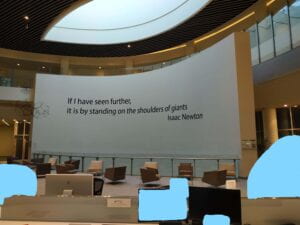
P.S. I felt like there is an excellent inspiring phrase that can be written on this curved rectangular wall while I was writing this blog in the library. Check this out and tell me what you think of the social and “photoshopical” aspects of this change!!

Sources:
https://blog.miragestudio7.com/ramp-stairs-for-the-able-and-disable-less-able/3979/
https://www.istockphoto.com/photo/youve-got-to-see-it-to-believe-it-gm1305313808-396237496?utm_source=unsplash&utm_medium=affiliate&utm_campaign=srp_photos_top&utm_content=https%3A%2F%2Funsplash.com%2Fs%2Fphotos%2Fglasses&utm_term=glasses%3A%3A%3A
https://create.vista.com/unlimited/stock-photos/188724600/stock-photo-young-man-sitting-table-talking/