A Letter: Top 10 Lessons From the Wayfinding Class

Dear Professor Goffredo and classmates,

I want to thank everyone for being part of this eye-opening experience that not only changed the way I think about design but also everything around me. Three months ago, I didn’t know that wayfinding exists. I believed that when a project is planned, all we do is create designs for it for the sake of the aesthetics and that’s it; we don’t need to think about anything else—the project is done, and everything is ready. Looking back, I realize that it is, and will never be, this easy. Every blog post I wrote here documents the moments of progress and realizations I have had throughout the 14 weeks, an evidence how one’s perception of lots of things around him can change so easily. That’s because design is not just a style; it’s a language. My biggest realization from the class is that we don’t master design by learning how to use Photoshop; we learn it by looking into ourselves, trying to master, understand, and expect how we think. 

Therefore, I want to use my last blog to share with you and remind my future self of all the main takeaways from this class that were transformative for me, which  I summed up in the following tens points. 

  1. How you present the idea can be more important than the idea itself.

I’ve learned in this course that creativity is never enough. If you can’t present the product of your thought in a clear way that is as superb as your idea, then no matter how creative you’re, your idea/work might end up not being as successful as you expect. 

2. If your first sketch for an idea is good, DON’T stop.

It feels great to find an idea from the first time you start working on a project, I know. However, think about it. If this is your starting point—your first sketch. For some reason, you decided to stop at that point. By doing that, you lose the opportunity to come up with something that is really impressive. Just imagine how amazing your final sketch will be if you keep on trying, sketching, and editing. In the end, you’ll come up with the best idea possible. Don’t settle for your first idea.

3. If the user can’t use/understand it, then it is not his fault.

This class taught me how to be sympathetic towards myself. I no longer blame myself when I cannot open something from the first time, or when I fail to find the turn-on button for the iMac screen. I now know that bad design exists, and I’m not, as a user, the one to be blamed. While this realization makes me feel good about myself, it also leaves me in constant fear that I might commit the same mistake of bad design in my projects. In my opinion, one should always keep an attentive eye to notice such errors.

4. Don’t be afraid to share your work. It might get harshly critiqued, but it is a free opportunity to learn

I think that one of the problems designers in general face is the fear of sharing work. Most of us fear being criticized or have what we created get critiqued. I learned in this class that a designer’s lifetime goal is to always seek improvement. How do you improve? It’s easy: ask those around you and start a discussion. See what they notice, what their comments are, and how they feel about your work. Probably my favorite moment in this class was when I presented my cheatsheet on Visual Explanations’s chapter two by Edward Tufte. I was happy to see how everyone was willing and open to share what they found wrong about the slides or what looked off. I wrote down all their comments, and  I still have them till this day that. Whenever I work on a presentation, I will make sure not to make the same mistakes again. 

5. Feedback is free. Always ask for it.

I will probably be using this advice forever in my academic career. For some reason, we students always get distracted by the requirements of an assignment, forgetting that the source himself (the professor or the TA) are always there to help. If you feel stuck, just ask for their opinion. Professor Goffreddo once said something along the lines of: “I’m the one who will be evaluating this. So it makes sense that if you feel the need to ask about something, just send me an email.” I think this is important as we, for some reason, might get overwhelmed to the point that we are both wasting time and making no progress, while, in fact, the solution is in front of us. 

6. Appreciate your years at NYUAD

Professor Goffredo once said that if you are part of a design agency and you have to do international work, you’ll have to work with a diverse group of designers from different parts of the world—something that is really expensive. We, at NYUAD, have diversity of all kinds for free here. All we have to do is just go to D2. That’s it. Literally. In other words, we should make use of our university years, appreciate them, and try to learn as much as possible from our colleagues. 

7. Design is a universal language, but take care

While the psychological behavior of us humans is somewhat similar (our reaction to nudges, for instance), that doesn’t mean that what applies somewhere applies elsewhere. Professor Goffredo once told us about the story of the hand gesture that a police officer made, which the Professor misinterpreted as it means something offensive in Italy. Few days ago, I came across a post on Twitter that said that the poster of the Movie Doctor Strange in the Multiverse of Madness was edited to suit the Italian audience because of an inappropriate hand gesture that Doctor Strange makes in the original poster. This reinforced my belief that designers should put extra effort to make sure that none is offended by their work.
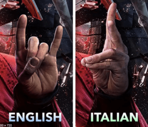

Marvel’s Doctor Strange in the Multiverse of Madness poster before and after

8. Creativity is a skill you can nourish and boost 

The beautiful thing about design is that there is no limit to what one can create. Even if you know nothing about it, with some creativity, you can do a lot and bring insightful opinions to discussions. If you’re not creative, then don’t worry. It’s a process that takes time, and with practice, you’ll be amazed at how fast your mind becomes capable of finding ideas in short periods of time. 

9. We learn (and get inspired) by sharing 

Seeing my colleagues’ work throughout the semester has always been inspiring to me. Every time I left my desk to check my colleagues’ work on their computers, I found that I always learned something new, got inspired, or found a mistake that I knew I might need to avoid in the future. Indeed, that moment of all of us sharing our work together at the same moment was priceless, and it made learning exponential. 

10. You’ll never stop learning

Perhaps this is the most important point I realized from this class. Seeing Professor Goffredo’s passion with his guests, and how he, even after all these years of teaching, is always open to that moment of new realization that will change his perception of design and “unlocks something new” was indeed inspirational. It taught me that a student of design should always do away with his ego and be open to that one simple concept that he might not notice at first sight but will blow his mind once he does. 

To me these were the top 10 lessons I’m glad I’ve learned in this class. While they might not appear related to wayfinding, I believe this couse was not just about wayfinding. It was never about the roads, the ways, or whatever. It was always about us humans trying to find our ways around. It was always about us understanding ourselves so we can predict our next move, and that’s the whole idea of design. 

To everyone, 

Thank you!

P.S. Attached is an image of a desire path I came across today.
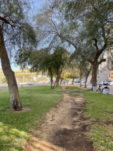
A desire path near Al Wahda Mall

From The Grand Egyptian Museum to the Louvre Abu Dhabi and Museo Egizi

Christian Greco’s lecture on museums was an eye-opening experience for me; it did not only help me realize how the role of museums is constantly changing, but it also emphasized to me again the importance of design in everything around us. 

I grew up finding museums everywhere around me in the cities I lived in. I fell in love with not only how they were the door to see more of the past but also with their purpose; how they are determined to preserve the past to be seen even after thousands of years. Until a year ago, a museum was meant to be a place where the remnants of the past can be found. And as a kid, while I also liked every time I visited a museum, I couldn’t understand how and why they never thought about innovating something new; they all looked the same from the inside. For some reason, it didn’t make sense to me. 

A year ago I read about the Grand Egyptian Museum, and a week ago I attendeed the lecture by Christian Gerco about the Museo Egizio, and this week I went to the Louvre Abu Dhabi. After this accumulation of exprience and hearing from different sources, I realized that my conception about museums has always been wrong.  Museums are not just a place to keep artifacts; they are much more than that. They are there to both preserve, research, and keep track of the past. Most importantly, I realized that their role is constantly changing, and design is part of this change and the vision they want to achieve. 

Therefore, I’m going to speak about the Grand Egyptian Museum and the Louvre Abu Dhabi, and the role of design in delivering that message.  

  1. The Grand Egyptian Museum:

The Grand Egyptian Museum (GEM) is the world’s biggest museum that is dedicated to a single civilization. On my way to my boarding high school every week, I used to pass by it, impressed by its great Egyptian-themed design. I was, however, unaware of the bigger picture, of what this museum represents and what it symbolizes. 

The Grand Egyptian Museum aligning with the Great Pyramids of Egypt

It was later when I realized that there was more to that. It’s not designed that way to be just a museum; it was that way to convey a message, as if this museum was the way to connect both the past and the future of the country. As you can see from the image to the right, the GEM is not only built to be considerably close to the three pyramids of Giza but it was also inspired by the pyramids themselves. The three rays shot out from each pyramid are met together in one point that defines the body of the museum.

This also correlates with the goal of the museum. The museum’s ultimate goal is to become a global center of advanced conservation and research in the field of Egyptology and archeology through both theory and practice. When Gerco spoke about the changing role of museums, this was the first thing that I thought of. Indeed, museums are not there just to preserve the artifacts but also research and understand them.

Preservation of artifcats

This was something that I didn’t know about, but now that I know, I appreciate the design even more as it represents the visual relationship between the project and the pyramids.

The Louvre Abu Dhabi:

Inspired by Greco’s lecture about museums, I decided to visit the Louvre Abu Dhabi for the first time. I noticed the following:

  1. The artifacts and artworks from different cultures are not presented based on geography or civilization
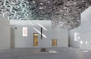
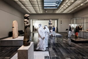
  2. Unlike all the museums I saw when I was in Egypt, the design of the interior of the museum is simple, close to minimalism
  3. The museum’s collection of artifacts and artworks isn’t limited to some cultures  only; it focuses on human history as a whole. 

Similar to the case of the GEM, the Louvre Abu Dhabi’s design seems to be connected to the goal and vision of museum leaders and the purpose for which the museum was built.

I later discovered that the design of the outside of the Louvre, which is also the Arab world’s first universal museum, is made the way it is to resemble the shape of Arab homes here in the region, and the minimalist approach is to lead people to focus more on the artifacts. What was even more surprising is that the reason why artifacts are not presented based on geography or civilization is that, as a universal museum, the Louvre wants to show the world how all civilizations are connected, and they were put next to each other based on common aesthetics and themes in that way to emphasize that idea. 

While I support the accessibility of history and antiquities for everyone and everywhere as a human heritage, I still hold on to my belief that such a thing should be done with the consent of the people to whom these antiquities originally belong. When I was a kid, my father used to tell me stories about how in the village he lived in he would see statues taken from under the ground and put into large trucks, and they were never seen again. Later, the village knew that these statues were stolen and sold. While I don’t know if this is what happened in reality or not, it saddens me to see how history can be stolen and sold in that manner. I’m not saying that these statues should remain exclusive to Egypt; what I’m saying is that this is not the appropriate way to treat the past. Unfortunately, I’m sure this was the way most Egyptian antiquities were taken outside the country to be presented in foreign museums. 

In the end, I want to stress my belief that artifacts from any time are human heritage. What I only oppose here is the way through which they get transferred from one country to another, which most of the time can be depressing and humiliating. To me, museums aren’t just places that hold antiquities; I prefer the Arabic word for it, which is “متحف,” which shares the same root with the word “أتحف” which means “to amaze.” A museum is a trial to understand the past, reflect on the present, and shape the future. I’m thankful to Gerco and his lecture: indeed, they made me rethink my definition of a museum and the past it holds, and how design can be the bridge between two remote places and times. 


User Experience and Wayfinding

My childhood: opening doors was (and still is) a hard decision

Since I was a little child, I have always had a problem with doors. I hated them. Even now, people who know me in real life might notice that the moment I’m 5 meters near a door, I will zone out, look for clues, and try to make that door open from the first time I push/pull it. While this might sound trivial, for my younger self it wasn’t. As a 7-year-old kid, I remember going to a nearby supermarket to bring groceries home, and every time the elderly man standing on the cashier would point at me and make the same joke of how every time I always forgot how to open the door, making his customers laugh at me. While, of course, I don’t care about this now and forgot about it, I later realized that this has become entrenched in my subconscious mind: every time I open a door, I have to think about it beforehand to give myself enough time to open it correctly from the first time. I have always believed that it was my fault: “maybe I’m not good enough at opening doors?”

What is the diagnosis?

While I’ve always known that user experience and interface is important in web and application designs, I never thought about it in the context of the real world: how it affects our lives and how us, as designers, affect it as well. I think the problem here is that all of us grow up to find ourselves surrounded with doors with push/pull signs and we have to deal with them ourselves; we are told that it’s no one’s problem but ours if we don’t know how to open it correctly from the first time, as there is always that belief that designers don’t make mistakes. Well, now I believe this is wrong: if someone tried to do something, depending on his instincts, and, for some reason, wasn’t able to do it, then it isn’t his fault; it is whoever designed is. This realization is important, in my point of view, as it specifies the relation between designers and users, indicating that the user is always right.

How does the user’s experience relate to wayfinding?

The user’s experience is an integral part of the wayfinding process. The problem with badly designed wayfinding systems or anything in badly designed in is that the user is not given enough information to help him decide his course of action. He simply has everything in front of him yet he is incapable of knowing what he should do next. As a designer, I believe that the problem with today’s wayfinding designers or planners is not the incapability of designers to come up with solutions, but rather the fact that wayfinding is the last step in this process of planning. Elements of wayfinding, as accessibility, directional Signs and pictograms, and all of these are only thought of once the whole process of planning is finished—not while it’s happening. Designers, therefore, look at it as as the cherry on top: if it exists, that’s a bonus. If it doesn’t, then it’s okay; the user will manage to do it himself. As long as the design is beautiful it is okay and nothing will happen, thus becoming simply ignored. 

I hence plan on analyzing the cases in which the user experience is influenced by bad choices and how they differ based on the designer but still lead to the same issue. I will use the term “designer” to refer to anyone in charge of planning or playing a role in guiding others to do/find something. 

  1. First case: The designer made the job perfectly, but he doesn’t care what happens afterwards

    Unreadable Push/Pull sign on a door/ Source: Unknown

As we can see here, the designer did a great job of adding push and pull in both sides to facilitate the process for the user. However, the problem here is that he didn’t pay attention to the fact that the door is made of transparent glass, which causes the signs to appear from both sides thus becoming unreadable and unidentifiable, leading to confusion and error. Most probably, the designer saw it after finishing but decided to ignore it and mind his own business.

At the end of the day, everyone will see it and think that the job is done and might even blame themselves if they don’t identify the words, while, in fact, there is a problem.

2. Second case: Good design over practicality & clarity

Coming from Cairo, where signs in the streets might barely exist, I want to say that no words could express my happiness when I arrived here for the first time and saw the pictograms and signs on campus. As a designer, I pay attention to the fonts, especially to how the Arabic font share the same personality with its English counterpart as if they were from the same family type. That’s in addition

 to the pictograms, their unified personality, consistency, alignment, and so on. What I didn’t like however was the lack of practicality: although the designs are well made, it was indeed hard for me to understand how and where I am supposed to go. 

On of the things I went through the second day I arrived here was finding my way back to the lifts.

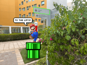
Lifts sign with an arrow pointing downward

“What does this arrow mean here? To where does it point? So if I want to go to C2, should I use the lift to go downstairs or go downstairs to go to to the lift? Until this moment, I want to know what the designer was thinking of when he made the design of the downward arrow next to the lift. To me, whenever I see the sign the first thing that comes to my mind is Super Mario’s pipes, where whoever designed this expected us to use it to go downstairs. While it’s true that he provided signs at a decision point, the arrow was in fact confusing.

Super Mario Pipe Transportation (takes place when your designer places in arrow pointing nowhere)


 3. Designers who know there is a problem, and instead of fixing it, they accuse the user of being wrong. 

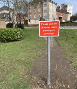
As we can see here, the designer knows that there is a problem 

“Please use the purpose made paved path provided” sign placed in the middle of a desire path/ Source: https://americasbestpics.com/picture/I49uqAFX8

but he is reluctant about solving it in the first place.  Here, in the picture, once the designer realized that the users created their own desire path, instead of paving and providing a pathway way here, he tells them “Please use the purpose made paved path provided.” Probably, the way people use this path is that it might be shorter and it saves time, but for the designer, the first and easies thing that comes to mind is a signage to prevent people from passing. A normal response to this can simply be “pave here then” as this designer, if he knew about desire paths he should have know that this is not a user’s problem but rather the designer’s.

One of the principles I love about wayfinding is “don’t give the user too many choices in navigation.” In my opinion, good designers are the ones who are able to expect the user’s next step and act upon it. Those who put in extra effort to present something that is beautifully done and also practical. I believe that the most important component of wayfinding is understanding that the user is always right, especially when all the users agree on something but the designer is for some reason reluctant about it. Good design makes life easier. Bad design makes everything like a math equation you have to solve, complicating it further. 


My Thoughts on Wayfinding

My experience with design

I have been a graphic designer since 2013. Throughout all these years, I have come to create manipulation designs, branding projects, marketing campaigns, and localized Arabic logos. Previously, when I thought about concepts such as planning, way-finding, or any similar concepts, I previously believed they were mainly related to the job an architect or an urban planner, not me as a graphic designer. While this might be, to some extent true, I come to realize lately that my entire perception of graphic design was limited—more of a digital-oriented definition— if we can describe it that way. And whenever the word “design” came to my mind, the first thing that I would think of is Adobe Photoshop and Illustrator, and nothing else. However, when I think of the same word “design” in Arabic, I think of design in the real world, not the digital one. While this might seem an ordinary point, it was they eye-opener for me; since the class started, I began to notice how design is everywhere around us, not just some elements, images, or shapes that insert into a screen or a software like Adobe Photoshop.

Design and the user

I would like to quote Professor Goffredo’s words that the English word “design” adds a type of ambiguity to the word that makes it comprehensive of all meanings related, unlike Arabic. Design in my opinion is how you change the experiences of others and give them a new way to witness and be affected by them. It is how you guide the subconscious minds of people to do things they might not be aware of, but we, as designers, must be aware of in order to give users the best experience. I think that such a conception is important in the sense that it will change designers’ motto from “the client is always right” to “the user is always right,” because through it we put ourselves in the shoes of users and know what will be suitable and what won’t, and this will be reflected in everything surrounding us.

Losing my way at NYUAD

When I first arrived here at the NYUAD campus for the first time, I was accompanied by one girl from the senior class who kindly volunteered to show me the way to the residential buildings. We walked from the welcome center, passing by the gigantic words of “NYUAD” that welcome visitors, and then headed left and straight on to the elevator. I was impressed; “where is this elevator taking us?” I asked myself. In less than a minute, I found myself in front of residential buildings, as if I teleported to another place. The idea of buildings that are built on other buildings—particularly our campus—was difficult for me to fathom. At this very moment, I realized how complex the NYUAD campus is. In the days that followed, I struggled to find my way around, was even made fun of by friends who questioned how I couldn’t navigate through the campus and went through embarrassing moments because of it. With all of that, I thought the problem was me, as the design is good, and as long as it looks good, then it is perfect. I was wrong.

Why can’t we find the way easily?

The problem today with design is that there is less focus on the experience of the user, and we are working more on producing the most beautiful designs without caring about the practicality and accessibility of what we design. I believe that questions such as “Is what we are designing suitable for people with disabilities?”, “does this design make it easy for people to navigate around and find their way without being lost?” or “is the signage we are designing catchy enough for people to notice?” are questions that are rarely asked in such design processes. When Professor Goffredo told us that the process of establishing means of wayfinding started right after construction, not in the process of designing the campus itself, it explained a lot to me why anyone is subjected to losing his way around campus, at least ones.

Two weeks ago, my group was asked to go around the NYUAD campus to analyze and evaluate wayfinding on campus starting from the car park in level B2 until we reached the torch club right above D2. Through that process, it happened that we, particularly people who are supposed to be familiar with the campus and its intricacies, even went through lots of problems with finding our way, let alone guests who come here for the first time. Hence, this course made me realize the importance of wayfinding around us.

The purpose of wayfinding

In my opinion, the purpose of wayfinding is making the user able to go around somewhere for the first time, and you, as a designer, has made sure that you prepared the route and the tools for him, through which he, even without prior knowledge on his part, can still able to find his way easily to his destination without losing his way. From what I see today, designers build and expect users to be able to discover and experience for themselves; there is not much focus on how making the user find his way, and if there is, then it is most probably not efficient (consider our campus as an example).

From B2: There are no banners, signage, or anything that can guide through the way

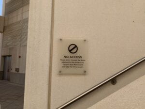
Sometimes designers do leave signs and directions; however, they can be misleading as well depending on the events taking place.

Signage says: No Access, while this is the only way to access the torch club

This can be due to various factors such as:

  • An unclear numbering system
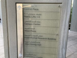
  • Not focusing on how the direction design will be applied in real life (and where it will be put and choosing ambiguous pictograms (a triangle or an arrow for instance)
In this picture, it is hard to find where the arrows are pointing to
  • Using fonts that lead to difficulty in readability
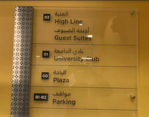
  • A variety of naming systems used in designs at different names to refer to the same places, which might confuse the user.
    We discovered by chance that the University club is the same as the Torch club

    While this class helped me put on a new lens of finding such mistakes in wayfinding, it also made me realize how difficult it can be to find solutions, it was eye-opening for me and made me realize how brilliantly our subconscious minds operate the way they do. We should put ourselves in the shoes of the user and think accordingly; if we leave something in front of the user, then it must have a purpose. If there is a button, then the logic says it must be pressed. If there is a sign, then it is there for one to follow. Hence we should always pay attention to these certain cases of affordances because even a slight change in the typeface can lead to drastic changes and how the message and its tone are conveyed. In the end, all it takes is a single sign in the street, which can lead to both the confusion of the user or him finding a way.