Learning from Others


“Professional development is a collective resource, not a personal prerogative. Peer engagement forges powerful links between teacher learning and student growth”.

 — Laura Lipton

The remarkable words by Laura Lipton, the Director of Miravia and an international consultant with extensive research and experience in learning-focused relationships and building high-performing teams, resonate with my personal growth to wherever I stand as of today. 


I remember as I was growing up, I was a relatively shy and quiet kid with low self-esteem and confidence, but how I progressed and triggered my personal growth was through learning from my peers. I adapted to the way that my confident peers spoke in the assemblies, started understanding the questions they asked in class, the approach they had towards learning and reading, and consequently I adapted the best of the qualities from everyone around myself. It can be seen in a very similar way to how we adapt to the style and fashion of the people around us, and in fact we also subconsciously adapt to the conceptuality and thought process of the people around us. This is why it is believed that the company of an individual is most likely to influence them and their actions. Thus, I have always firmly believed in being open to having the opportunity to learn from others, since those lessons are unforgettable and undoubtedly help an individual progress towards the better.


Professor Goffredo Puccetti, in his course Wayfinding: Graphic Design in the Built Environment, has also always advocated collaborative learning. I remember from the very first online class, an intriguing lesson was conveyed, first through drafting a presentation in a small group on a topic related to wayfinding and design, having very little in-depth theoretical knowledge of the subject, and this was then followed by a critique on the presentation of others, all of which was supposed to act as a learning experience from others and their mistakes. We had the opportunity to understand the thought process of each individual in our team and become familiar with them, and then mutually come to an understanding to present an idea. After this, we also had the opportunity to understand how other teams tackled a similar change, and what they did better which we could learn from.


“To look at the work of your peers, and learn how to explain with kindness and precision, the nature of their mistakes is, in fact, how you learn to diagnose your own work.”
– Steve Almond


Not only did this task act as an Icebreaker between myself, Ulan, and Abdurrahman, but since then I have realized and acknowledged Ulan’s capabilities for thinking of great ideas, and Abdurrahman’s skill set for producing amazing graphics. Throughout the semester, even in every single individual task, assisting others and collaborating with them was never considered cheating or a breach, but in fact it was always regarded as collaborative learning.


This brings me to one of the most intriguing lessons from the course – on the topic of Affordance, and particularly the very specific lecture, on the 15th of February, in which this concept was introduced. First, we were taught that Affordance is the property of objects that defines all possible uses of it and makes clear how it should be, as well as could be used, specifically considering all possible uses and not only the ones we would be thinking of. Then, we were given two tasks in two groups that would have engraved this concept in our minds forever – Goffredo’s Staircase and Roberto’s Piano. I was a part of the group to receive the task of analyzing how to ensure Roberto’s Piano, which was not possible to be moved, could have stayed safe during an extensive renovation of his house. 


Being in a team with Ishmal, Yeji, and Jennifer, we applied all possible uses of the packaging of the piano to prevent any damage to it from any mistakes by the workers. I still remember Professor’s remarks during our discussion to allow a chance for those to express their opinions who are not extremely vocal, and just by doing that, we came to the perfect conclusion. A triangular shaped carton at the top of the Piano would reduce any affordance for putting tools on top of the piano, disallowing it to be used as a table, and this idea was coupled with other preventions to reach a perfect conclusion. At this point, instead of thinking who came up with the idea, we all were proud to have given each other the chance to learn and express, and that is how we came to a result that none of us might have if we had worked individually.


Furthermore, collaborating and discussing with others also always help to clear out ideas and come up with new ones. This was the exact case when I was discussing an Impossible Pictogram design, pertaining to sarcastically solving the problem of a lamp covering a physical map on one of campus’ walls, with Ishmal. An idea from her to tear apart the lamp through the gap between the poles by Ishmal, inculcated with the idea of putting dumbbells over there by myself formed a very interesting solution, one I could not have come up with myself. Such engagements were a result of the opportunity provided by Professor Goffredo, and are attributed to the Wayfinding class.


I have had a great amount of learning throughout the semester, and a great deal of it had to do with my peers in this class. Be it the creative spirit when everyone was presenting their ideas about certain topics, or more specifically designing their own maps for Jug Cerovic’s workshop, or even drafting their own pictogram designs. Or be it the style of their presentation when pitching their mobility idea to Giuseppe Atoma, every single individual had their own unique style and outcome. Every single piece of creativity that was put on the wall was distinct and demonstrated the uniqueness of each individual’s thought process. A university like that of NYU Abu Dhabi, where hundreds of nationalities, speaking hundreds of different languages are brought together, a learning experience is cultivated which is beyond any opportunity that is imaginable. 


Even outside of the classroom, I believe it is empirical to learn from the diverse people around us. Whether it be to apply for internships or jobs, or it be to do community service, or even learn a very basic skill. I believe that the cumulative experience of the people around us surpasses what we could learn by only surfing the web for information.


“The best part of learning is sharing what you know”. 

— Vaughn K. Lauer

Influence of Design on our Thought Process

In our everyday life, we make use of a vast variety of products and services which belong to numerous brands and companies. While the process of creating a physical product requires different planning from developing a software product, one thing they have in common is designing it to effectively cater to the needs of the target audience. However, a very important part in the design process is to also make it look visually appealing, since we are Visual Mammals – one of the first statements by Professor Goffredo from the Wayfinding Class that stuck with me.

As per my personal experience, I often purchase products that have a better design, since I believe it subconsciously triggers my brain that design emphasizes the credibility of products. A brand that comes up with a new bottle of shampoo with a very old school and boring design, but actually very effective, may not even attract my attention, however, a brand that has a very stylish and fancy bottle having only a plastic bottle with a good color combination and a decently designed wrapper in their product would automatically become more appealing. 

A similar example of this is a new brand of toothbrush and toothpaste that I saw for the first time in my life at the convenience store at NYU Abu Dhabi. The packaging immediately attracted my attention even though the toothbrush was 2/3rd the size of a regular toothbrush and the toothpaste was equivalent to a travel size bottle of toothpaste. Regardless of the huge difference in quantity, the price difference was inversely proportional, such that the new brand was twice the price of a Colgate Toothpaste but half its size. Similarly, the toothpaste did not have any unique features, it was a plain and simple toothbrush, but the only thing that felt different from a first look was the way it was presented, its packaging and design, immediately grabbing my attention. Being honest, I was instigated to purchase that toothbrush just to try it out, but a rational mindset prevented me from doing so.


Knowing how design instigates my thought process and decision making in the regard that is mentioned above, I can’t help but think over the reason behind such rationale. This leads me to dwell upon the discussion of Familiarity and Bias in our Wayfinding class. As was highlighted in the class, brands pay a significant amount of money for advertisements, such as those in Times Square, in order to build trust so we subconsciously care more about them. I believe that a similar ideology can be navigated towards our familiarity and bias of the types of design. The way we can differentiate between a good design and a bad design is aided by the trust that is being built by the advertisements and design that is most frequently present around us. To explain this further, I will bring back the example of the aforementioned toothpaste company and appreciate the way they made use of the concept of nudge by producing a design that resonated with the concept of royalty and eliteness that is present in our mind. An elegant, pure black, simple and shiny packaging with a high price would definitely nudge us towards paying attention to that product.

Moving from the digital products to software products, websites and web applications have also developed a certain style of design that pertains to the norm and in a very similar fashion, the credibility of these startups is sometimes analyzed by how well their website is designed, at least to myself. If a company advertising its new software has a very sleek, unique and stylish website, I will be triggered to check it out in its entirety, but would not even pay full attention if the website is just like any other basic website.

As I have explained how I believe my personal decision making is influenced by design, it in fact goes far beyond an individual’s personal preferences and also impacts situations that have a life-changing impact. Two scenarios of such are explained in the Second Chapter of the book ‘Visual Explanations’ by Edward Tufte, from which we will look at 

One of them was the Space Challenger Shuttle that exploded on the 28th of January in 1986, resulting in the death of 7 astronauts. In this scenario, it is very difficult to attribute a space shuttle and explosion to visual design, however the principles and learnings towards design lie at the back-end of this incident. When the engineers realized that the temperature on the day of the launch could potentially be detrimental towards the launch of the rocket, they immediately faxed a total of 13 charts to NASA, proposing to halt the scheduled rocket launch. However, the proposal was disregarded due to the lack of evidence presented by those charts, meaning that a lack of visual representation and convincing resulted in the lives of 7 people.

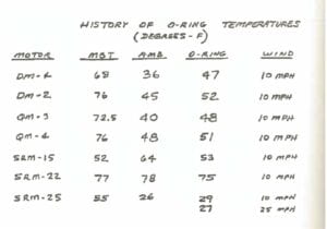
Researching deeper into the charts presented by the engineers, not only was there loads of irrelevant information not pertaining to the impact of temperature on the rocket, but incorrect representation with a lack in the data that was presented to support it. An example of this can be seen via the following graph that demonstrates the relation between temperature and O-rings, which was the cause of the explosion.

Compared to the next graph, which was produced later after the explosion as a learning from the incident, explains it much more clearly, to any individual not even pertaining to the field of engineering. It clearly shows how there were some incidents with temperatures of 70 degrees, however, as we go below 63 degrees, the incidents become more frequent, and just with this information, any individual would not be in favor of allowing a launch at the temperatures between 26 and 29 degrees.

Similarly, an interesting chart that was produced later beautifully shows the relationship between temperatures and the severity of incidents. It can be clearly seen that a lower temperature than 53 degrees would be totally a no-go. 

By now, through the representations, it may seem that I am stating the obvious, however proper visual representations and design do have a great amount of significance to influence our decision making process. As we are Visual Mammals, we are appealed towards what pleases and convinces us visually.

User Experience & Design

In Summer 2021, the end of my Sophomore year, I was interning at Credit Book – a startup focused on financial technology (fintech in the startup lingo) in Pakistan. The position I held was of a Data Engineering & Science Intern. At that point in time, it had been 8 months since they launched their Application on the Google Play Store and had around 2 million downloads – resulting in a good amount of data work. Working on the data side of the application, I was not expecting that analyzing the data actually helps understand and shape the User Experience of an application. Hence, I was definitely up for a surprise. 

My very first learning from the experience was working with the Team Lead to figure out the problem with less retention on the application. Retention is when an application is downloaded, but then the user stops using it. From the data analytics, it was apparent that while the application had more than 15,000 downloads in a day, it was being deleted by many of those in only a span of a few days. On analyzing the application usage for those users, the pattern which seemed evident was when most users reached the stage of generating a One Time Password on the application through a text message on their phone number, the application would be closed only a few seconds after. The analyzed reason was a delay in transmission of the One Time Password – ultimately leading towards lesser retention, a case of the impact of User Experience in the digital world that was apparent to me from a first person perspective.

Now, the question for me to answer is how does it relate to design? For me, if I downloaded the application I had a certain expectation from it. I was targeted by the people working on Digital Marketing at the company, who spent hours on making sure they reached the appropriate audience. Hence, I downloaded the application since I wanted to try it out. A good job by the company so far! However, upon downloading, if I click on a button to wait for a One Time Password but have no idea whether it is working or not, that is the result of bad design. Considering my motivation to download the application, I would be willing to wait for the One Time Password, only if I know I am going to receive it. The way I could know that the functionality of the button is intact is through Design. A change from the transparent button to a green button – demonstrating success, along with a feedback pop-up letting users know that the request was received would surely help at least some of those that downloaded the application to actually wait for the message. 

Once you experience such design practices from a first hand perspective, you become more observant. That has been the case with me, where I noticed another very recent example of Design and User Experience. The mobile application of a local bank in Pakistan, namely Habib Metropolitan Bank, which I have been using for 3 years now, updated their application’s user interface. A decently working design, which I faced no problem with, except for a relatively old school feel, was replaced with bolder colors to match the design trends of this decade. 

At first, it looked nice, however when I tried my first transaction, a not so urgent one, I faced a similar issue with the One Time Password (as the new users of Credit Book must have felt). I waited a while for the One Time Password, tried again 5 minutes later and then lost faith in the User Experience of the application. A demonstration of the screen can be seen as follows:

Screenshot from the Habib Metro Application (1)

Looking at the above picture, one would click on the Lock Icon expecting something to happen. Then, I naturally tried pressing the ‘Pay’ button which in turn would ask me to enter the OTP first. In frustration, I closed the application, looking to sort it out later.

However, it was soon that I had to make an urgent transaction, and so I had to ask my father (a very regular user). Since he had a phone with a larger screen, he told me it’s at the bottom, which is how it usually shows up for him. Ultimately, I discovered the mysterious button in the following manner:

Screenshot from the Habib Metro Application (1)

This was one of the worst user experiences I have faced personally. It was time to use my basic photoshop skills and some idea of user experience, from inference, to produce a proposed design. A very simple thing that could made it easier to navigate towards the OTP button would have been a scrollbar in the following manner:

Proposed solution by myself (1)

The minimal scrollbar would be noticeable by those having a problem and would make it easy to find the button. Otherwise, better scaling of the content with the Generate OTP Button in the following manner could work as well:

Proposed solution by myself (2)

While the experiences I have described pertain solely towards digital applications, these kinds of bad design principles can be seen all around us. The evolution of successful e-commerce businesses is becoming dependent upon how easily and conveniently they allow a customer to purchase an item from their application or website and this is synonymous with the concept of the shortest path that people take in the real world. A person walking through a grassy patch instead of a paved way, saving a minute of their time, shall not be considered wrong, in fact the bad design should be acknowledged such that the user’s preference and ease is not considered. The User is always right, and the design of things should be centered around that principle, making it easier and convenient for the intended audience.

This idea brings to light the concept of Affordance, which is the property of an object that defines all of its possible uses, not only the ones we think of. If a user of a normal sized table is able to sit on a table, the table allows an individual to do so, basically creating an affordance towards that. Hence, a person sitting on it is not to be considered wrong, the designer of the table could have made the table a bit higher to not allow people to sit on it or otherwise sturdy enough to hold the weight of a person.

This concept of Affordance, as discussed earlier, can be applied to web or app design as well. The fact that only seeing the button to ‘Generate OTP’ solved my problem – particularly due to the digital affordance that it created. Digital affordance in this case was to make the hyperlink on the page to resemble a real world button, which would have allowed users to press it, hence producing a similar digital feel for the digital button.

I believe there is a great deal to learn about the depth of User Experience and User Design, these are entire industry fields to be studied, especially with the growing digital era that we are in. People want ease in terms of the digital applications that they use, and the companies that offer them appropriately are succeeding.

My First Thoughts on Wayfinding

“Wayfinding: Graphic Design in the Built Environment”, a course posted on Albert caught my attention because the course reflected a crossroad between two seemingly unrelated and independent dimensions – graphic design and Wayfinding. A friend of mine advocated for this course and I decided to enroll in it hoping to be amazed as I have been with most of my cores. Looking back at it, only in the span of 4 weeks, I consider it to be one of the most intriguing learning experiences during my 2 and a half years at NYU Abu Dhabi. 

Before the class, I wondered the relevance of physical Wayfinding systems in the digital era that we live in. We have digital maps in our pockets through the powerful web and mobile applications by companies such as Apple and Google. These maps even support regularly updated satellite images, support aerial view, shortest paths, make use of Machine Learning and have any relevant information you would need.

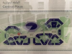
The essential need for the maps like the one attached below could be replaced:

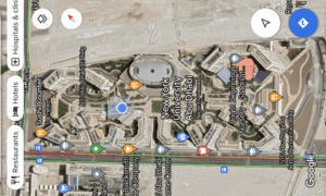
Now that the digitized version attached below is even more enhanced:

However, I have come to believe that it is in fact very necessary to have efficient physical Wayfinding systems in the built environment. These digital maps may navigate us across broader areas effectively, however they fail, owing to the limitations of the existing technology, to serve the needs at the micro level. If you are inside of a College Building, or a Mall, or even in a relatively smaller open area, regardless of the satellite view, it becomes difficult to navigate through. Adding on, being dependent on technology is not always reliable. What if your phone battery dies or you lose the internet connection? It is essential in any case to be familiar with the Wayfinding systems.

If Google Maps or other similar applications had been reliable enough, it would not have been a regular sight seeing Deliveroo and Talabat riders roaming around the highline at NYU Abu Dhabi, seeming to be very lost and finding it difficult to communicate in a foreign language to ask for directions.

However, technological advancements have been taking place rapidly. An example of this is the ‘Live View’ feature of the google maps which makes use of Augmented Reality. A very recent development in this regard has been made with the partnership between the Zurich Airport and Google for providing directions on the user’s smartphone screen, making use of the back camera, which will guide them through directions on their screen. While this is a very interesting step and allows us to dwell on what the future in Wayfinding could potentially look like, perfecting this technology may definitely take time and then mass adoption by people could take even further. It may be easier to navigate, but not when someone is rushing for their flight by looking at the directional signages on the huge sign boards – they wouldn’t make the effort to open their phone, wait for the application to load up and hope that the machine guides them accurately and instantly. The need for physical Wayfinding systems, no matter where technology leads us, will always be integral to us.

If you haven’t noticed, all the aforementioned perspectives have taken into regard gifted individuals only. A very specific user base, the ones that can potentially read this blog post and those who could write using a keyboard. A significant learning on the Wayfinding has been to take into account the differently abled individuals amongst us as well. While the technological advancements do help with this by making use of Audio directions, the traditional methods will always be very essential (referring to the reasons mentioned earlier). This is what emphasizes the importance of design in Wayfinding systems, making it clear, accessible and perceivable by everyone (not only a specific target audience).

Now that we have discussed the significance of Wayfinding, I will look at the Wayfinding systems of NYU’s Abu Dhabi campus – where I have been navigating daily. Looking back at the Candidate Weekend, and then the Marhaba Week on campus, it is only now that I realize it was never my fault to not know my ‘way’ across campus. While I thought the campus was literally a puzzle over Candidate Weekend, it was still slightly better in the Marhaba Week and even then I had to ask an upper class person for a tour around the mere 8 buildings on campus. 

Dwelling back, thinking from the perspective of an outsider, we were given the task, as part of the course,  of guiding our way through a few buildings on campus, starting from the basement. Keeping aside the appreciation of the campus’ architecture, the task acted as the realization of the inconsistent Wayfinding design on the campus, coupled with the essential urge as a student to fix it, and the potential difficulty to be suffered by any visitor – particularly those who would have had to navigate their way from the (basement) B2 and might have to go to the (building) B2, not knowing when they are at their destination. Inconsistency in language was the major takeaway, as there were instances of ‘University Club’ and ‘Torch Club’ on different signages when they pertained to the same location. Even the Dining Halls, D1 and D2, are referred to by various names such as the West Dining Hall and Campus East Restaurant, lacking consistency. The lack of an easy-to-navigate system is what has caused me to understand the ways around campus only by walking around and getting lost multiple times. 

My family always considered me as ‘inattentive’ for not knowing the ways of my area by heart, relating this discussion to my younger self, I realize it was again not my fault solely. While I do agree I was not extremely attentive to memorizing the ways then, I was not the same way in my study away in New York in Fall 2021, as I can claim to guide myself to 23rd Street and 3rd Avenue, where I lived, from any corner of Manhattan. 

This brings me to the topic of the amazing New York Subway system. Once again, the google maps did get us closer but finding the actual entrances of the subway system, which might have been a challenge, were resolved due to the consistency in the design, specifically pertaining to their font, Helvetica. You could spot from afar, the similar designs and representations from the entrance designs of the subway to the banners and signages, and if anyone were to get lost in the streets of New York – I would regard it to the lack of attentiveness.

Wayfinding and Design go hand in hand. Whether it be towards considering accessibility or a general consensus on Sans Serif font for Wayfinding Signages, the goal is to progress towards enhancing the experience of a user. A similar combined effort as is between the user interface and user experience of mobile and web applications can also be applied towards Wayfinding design.