Wayfinding: What I have learnt from my peers

As I write my final blog post for the semester, it is hard to believe that we are coming to the end of the fourteen weeks of Wayfinding. At this realization, I am met with a range of emotions: sadness, excitement, gratefulness, and motivation, to list a few. But, I suppose the notion of wayfinding does not end as these fourteen weeks do. Wayfinding is everywhere; from along the Highline to on the busy city roads to inside metro stations and shopping malls, to even digital means. This class helped me recognize the weight wayfinding design carries. In addition to the ever-presence of wayfinding, there are some takeaways from this class that I will take with me beyond this classroom. I want to share my most important one: what I learned from my peers. 

Before I begin enumerating some snippets of what my peers have taught me, I want to give a little tribute to Professor Goffredo. From the very first virtual class, Professor Goffredo has been imparting little words of wisdom here and there. ‘Life Lessons with Professor Goffredo,” if you will. Yes, I have coined the term now. Anyway, one of the first “Life Lessons” Professor Goffredo gave to the class is one that has stuck with me. He said something along the lines of that people, in general, invest so much money, so much time, and so many resources into trying to bring together a diverse group of people; diverse in terms of financial background, race, ethnicity, religion, gender, political beliefs, etc. All we have to do is go to the D2 dining hall. Our wayfinding class has proven to be an obvious example of this. 

It was from Ishmal that I realized the importance of universality in pictogram design. She highlighted to there is a balance needed between consistency for clarity and brand identity in terms of pictograms through her analysis of the unique set of pictograms designed for Expo 2020 Dubai. Perhaps pictograms are not the place for companies to be reinventing the wheel as they can leave users even more confused. On a side note, she also taught me how getting on the wrong bus in Florence can push you to discover a whole new part of the city – and put you even further away from your intended destination. 

It was from Jennifer that I truly comprehended the notion of affordance and nudges in wayfinding design. Through sharing her experience at Umm Al Emarat Park, she highlighted the discrepancy between what the design of the environment allows the user to do and what the user is actually permitted to do (in this case, according to the security guard). But if I am able to stand on the slabs of concrete on the water, they probably want me to, right? Jennifer also did an in-depth analysis of Olympic pictograms. This blog post of hers was super useful for me to generate ideas for my own impossible pictogram – so thank you, Jennifer! 

It was from Laura and her experience navigating through the Istanbul Airport during a layover that brought valuable insight into the necessary features of airport wayfinding systems. Big, clear, and visible signage systems, useful and conventional pictograms, an intuitive layout, and accessible pathways are all important components of such a system. Especially with so many people traveling in and out of this airport from all around the world, it is important that the airport functions seamlessly to avoid frustrating, and costly, complications. 

It was from Yeji that I was compelled to make more of a conscious effort to be more attentive to my surroundings, and from a multi-faceted perspective. In terms of design, this finding has helped me make sure I keep the user experience in mind – in whatever form that may be. For instance, designing for accessibility, intuitiveness, comfort, ease, etc. Moreover, this attentiveness has also prompted me to take a step back more often to pause and just be more attentive to the world around me. Just as she did with her amazing drawings!

It was through Hasin that I learned the power of tactile brainstorming. Perhaps this is another one of Professor Goffredo’s life lessons. Hasin covered entire whiteboards with sketches, drawings, and brainstorms of ideas for his impossible pictogram. When I felt stuck and felt like I had run out of ideas, I went to him for help and the advice he gave me was to keep sketching…in a tactile form (on paper, the whiteboard, etc). It was eye-opening to observe the process of how an idea can evolve and develop as you continue to draw it and work with it in different ways.

It was through Zunair that I was able to broaden my definition of wayfinding to include online wayfinding as well as broaden my definition of online wayfinding itself. I was under the impression that online wayfinding entailed applications such as Google Maps or Waze. After reading Zunair’s blog, however, I realized that navigating through all kinds of applications and websites are also forms of digital wayfinding. This is especially important with the rapid development and growth of technology, even more so in a pandemic/post-pandemic society. 

It was through Ulan that I have become less naive to the effect that advertisements have on me. I know to be wary of tactics employed heavily by the advertisement industry such as the attractiveness bias or the familiarity which help in persuading consumers to purchase the product/service being advertised. It is quite scary to know that through these methods, industries as such have the power to shape societal norms and behaviors and subtly mold the mindsets of consumers. 

It was through Abdulrahman that I was able to ask for help more comfortably. Abdulrahman and I sat next to each other throughout the semester. Thus, he was naturally the first person I would turn to ask for feedback on an idea, to ask for help in navigating software like Photoshop or Illustrator, to test out my ‘Cheat Sheet,’ etc. I will admit that all this required me to change my mindset and push myself outside my comfort zone. I had to realize and internalize the notion that asking for help is not a sign of weakness or incompetence, but a request for more information and knowledge. 

And that is just the tip of the iceberg. I can not list every single thing I have learned from each of my peers, but I hope this provided a little insight. I have learned so much from those around me and have grown tremendously because of it. My knowledge of wayfinding design has grown, my ability to effectively communicate visually and verbally has expanded, and my capacity to ask questions and for help has developed by many, many folds. All in all, I have been prompted to reflect on my time at NYUAD thus far and grown to appreciate the interactions I have had with the diverse student body to a whole new level. The fact that such diversity is so readily available to us is incredible and this class has allowed me to be grateful for the space I hold here – and what I can do with it.
Christian Greco and Virtual Wayfinding: Looking at Museo Egizio and the Lourve Abu Dhabi

This Friday, our wayfinding class had the opportunity to have Christian Greco speak to us about his work as the director of Museo Egizio. He delved into the nuances of what is a museum and what makes a museum, why museums matter, and the future of museums – specifically, the projected plans for Museo Egizio. This talk promoted me to get thinking about museums and the integral role they play in society – and that is where this blog post stemmed from. I will first discuss some key personal takeaways I had from Greco’s presentation and then look at several virtual museum tours and the future of online/digital wayfinding. 

One of the most interesting concepts that stood out to me from Greco’s presentation was the dichotomic nature of museums to conserve and innovate simultaneously. Are these not contradictory? Where does conservation end and alteration begin? To innovate, he explained, we must conserve the objects and artifacts in the museum to research them and deduce theories of the past. This dichotomy also lent itself to the role of a museum in terms of collective memory. A museum displays and conserves memories of the past through the objects and artifacts it displays but is also a space where we can build and innovate memories of the now. 

Greco also brought forth this idea of research museums and participatory museums and the interplay between them. He highlighted research to be a critical aspect of understanding the biography of objects, being able to preserve and narrate them, and ultimately sharing knowledge. He gave an example of a coffin that has been preserved at the Museo Egizio where research done on the coffin found the coffin to be made out of reused materials as well as provided information about familial connections. Research regarding objects and artifacts allows us to address new questions, formulate theories, and highlight the importance of museums in education. I found it especially interesting that modern technology has enabled us to understand the past in a way that otherwise may have been lost or forgotten. 

In conjunction with being a research museum, museums such as Museo Egizio are also participatory museums. A museum is not separate from society but rather a product of it. It holds history and provides insight into the evolution of society. It helps build bridges across society through language, memory, and other inclusion initiatives. Greco took the example of Museo Egizio in their work with social inclusion and community outreach programs – which perhaps was the part of Greco’s presentation which surprised me the most. He commented on the interactions the museum has had with schools, hospitals, jails, immigrants, etc., highlighting how the museum is a prevalent symbol of society, inclusion, and community. 

Christian Greco mentioned that another key role of the museum is to share knowledge. What could this sharing of knowledge look like in the pandemic world? Museums are symbols of culture, memory, and history, and serve as important structures in society. With lockdowns all over the world, the travel and tourism industry halted, and thus, so did physical visitors to museums. Museums all over the world were forced to adapt to navigate this new environment. Some pivoted to virtual tours and exhibits, some to videos, etc. These online means made museums more accessible to those near them as well as those around the world, giving people easy access to information they did not have previously. After Christian Greco’s talk, I was prompted to virtually visit Museo Egizio and other museums around the world. I will look to comment on the virtual tours of different museums around the world as well as the future of online wayfinding. 

Virtual Tour – Museo Egizio

Upon arriving at the main website of Museo Egizio, we can see a lieu of drop-down options. The virtual tour of Deir el-Medina and Tomb of Kha can be found under the ‘Discover the Museum’ tab.

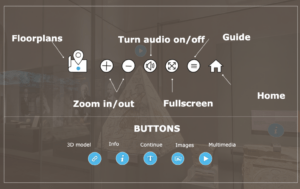
Museo Egizio Virtual Tour Instructions

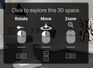
Opening the virtual tour, a pop-up appears outlining the different features and functionalities of the tour. This is an extremely helpful tool that can be accessed at any point during the tour as well. This is a great virtual wayfinding design – it is clear and to the point, uses helpful pictograms, and allows the user to navigate through the virtual tour easily. There are five different language options available as well. However, the tour and videos remain in English – the only aspect that changes with different language options is the text on the above pop-up window. 

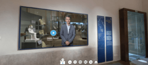
Virtual ‘Entrance’ of Museo Egizio

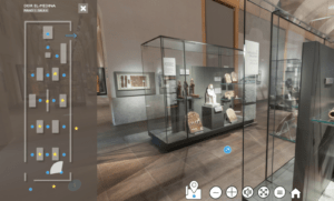
Entering the virtual museum, we are greeted by Cèdric Gobeli, a curator at Museo Egizio, who welcomes virtual guests to the virtual tour and provides an overview and some background information about the room we have entered. This video, through virtual, provides some human interaction and a greater sense of belonging and direction which helps break down the virtual barrier to some extent.

Virtual Wayfinding tools of Museo Egizio

In terms of wayfinding, the virtual tour is easy to understand and navigate as a user. The blue arrows on the ‘floor’ allow the user to move around the virtual space and for navigation. In addition, a map of the floor plan is available to allow the user to orient themselves easily. It informs the user of where they are in spatial relation to the room, where the exhibits are, what way they are facing, and overall just increases the user’s spacial awareness. This is especially useful in this online space as the user can not simply ask someone on the floor for directions – as they could have in-person. The map even allows the user to click on the blue dots – indicating where the blue arrows are – and it will guide the user to that area of the room. An improvement I could think of pertains to the yellow stars on the map. It is not clear what these stars mean or what they symbolize. Perhaps a small legend or key could be useful here. Additionally, it can be difficult to see certain exhibits close up as there are a limited number of arrows, and therefore spaces the user can move to, and if the exhibit is not spatially proximate to the object or artifact, it is difficult to navigate. This may be a software limitation but can be an area to look into. 

3D Model of Amenhotep I in Museo Egizio

The tour includes in-depth information about the pieces on display – ranging from museum webpages of information about a particular piece, videos about the object (with closed captioning), images, and (my favorite!) even some 3D models. These elements work to break down this virtual wall and provide an immersive experience – even adding elements to the virtual tour that are unavailable in the physical tour.

The virtual tour was informative, easy to navigate, and overall a great addition to the amazing work that Museo Egizio is doing. The virtual wayfinding tools and practices they have implemented into the tour are intuitive and allow for a pleasant online experience. I am actually not the biggest fan of museums myself but this virtual tour definitely has intrigued me to stop by Museo Egizio if I ever find myself in or around Turin. 

Virtual Tour: https://virtualtour.museoegizio.it/ 

Lourve Abu Dhabi

The other museum I decided to virtually visit was much closer to home. Actually, it’s right here on Saadiyat Island – The Lourve. From the landing page of the Lourve Abu Dhabi, navigating a virtual tour seemed to be a much greater challenge than for Museo Egizio. The website search engine guided me to one after it was prompted. The virtual tour found was of the Abstraction and Caligraphy – Towards a Universal Language exhibition.

The Lourve Abu Dhabi Virtual Exhibition Instructions

Similar to that of the virtual tour of Museo Egizio, a pop-up appeared guiding the user on how to navigate the virtual space. In terms of wayfinding design, the visuals and text instructions are clear, straightforward, and intuitive. However, the pop-up, in this case, provided less information – probably because there were also fewer features in this virtual tour. 

Virtual Exhibition at the Lourve Abu Dhabi

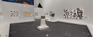
To move around the virtual space, the circular indicators on the ‘floor’ indicate where the user is able to move. These circles cover the entire floor plan quite well and extensively – you are able to go up close to the displays and can even read the small prints without having to open the information icon. The user is even able to use the arrow keys on their keyboard which makes moving around the exhibition especially easy. However, a downside of this virtual tour is that it does not have a map that allows the user to orient themselves. It does have options to enter specific rooms, but an overview map would have allowed for greater spatial awareness as well as ease of navigation as trying to figure your way through the space without it can get frustrating. 

Example of piece descriptions – this one is Dance of People and Birds on a Blue Sky by Joan Miró

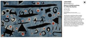
When looking at specific pieces, there is basic information given about the piece such as its title, artist (with the addition of a section regarding the artist), medium, and brief description. Perhaps a more immersive approach could be beneficial here. 3D views, videos, or even a little bit of narration, could have made the virtual tour more engaging. The current visual tour feels quite detached from the human experience – with little to no contact with even the voice, sound, or sight of a person. 

Overall, the tour is quite basic – it showcases the work and that is about it. It is not an immersive experience that leaves you wanting more – as was the case for me with Museo Egizio. Perhaps adding more interactive features would be beneficial. From a wayfinding perspective, it could definitely use some improvement in terms of the addition of a map to ease the transitions between rooms as well as to provide some insight into user orientation. 

Virtual Tour: https://www.louvreabudhabi.ae/Explore/exhibitions/abstraction-and-calligraphy/exhibitions-virtual-tour 

Many industries found the pandemic time to be challenging – the museum and tourism industries being no exception. However, perhaps the pandemic yielded a little glimmer of positivity in the form of virtual tours. Virtual tours increased the accessibility of knowledge for people living far and wide. They also provided (online) traction to museums and cultural institutions which the pandemic otherwise halted. As not the biggest fan of museums myself, these virtual exhibits and Greco’s talk allowed me to appreciate the work and energy that goes into curating and preserving museums. Try and see if your favorite museum has a virtual tour – it would be quite interesting to take a look! 

Route-finding on the Abu Dhabi Bus System

A well-functioning, reliable, and efficient public transportation system is a valuable addition to a city. Services such as metros, trains, public buses, monorails & trams, etc. can provide various benefits to a city and its occupants. Some cities have almost seamless public transportation systems. Take for instance New York City, Dubai, or Hong Kong – the public transport systems have become cultural identity factors of the city and their efficiency has decreased the need for people to invest in and use private transportation, ultimately reducing road congestion, pollution, and cost. Few cities have little to no public transportation infrastructure. 

Most cities fall somewhere in the middle of these extremes. For example, my home city of Manila, Philippines has a metro system and public bus system. However, they are overcrowded, dirty, and ultimately not used by most of the city’s population. Most people, therefore, have private vehicles (and multiple of them!), leading to so much congestion and traffic that Manila has consistently been ranked by the TomTom Traffic Index (Abu Dhabi Traffic Report: TomTom Traffic Index) as one of the top five cities for worst vehicle congestion. Another example of a city that lies somewhere in this middle ground is New Delhi, India where there is a well-functioning metro line, and a decent public bus system. However, these systems are just not equipt to handle the 30 million-odd occupants of the city. All this to say that there are so many aspects that go into what makes a public transport system efficient – and that these aspects vary from city to city.

The most cost-effective method to head downtown from campus to downtown Abu Dhabi is the public bus. The 170 line takes you directly from campus to Hamdan Street and beyond. I did not see many flaws with the system in place. It was clean, efficient, and cost-effective. Until this past month. I took the public bus downtown a couple of weeks ago and this time, I found myself paying attention to the aspects of good, and bad, wayfinding design in this space. 

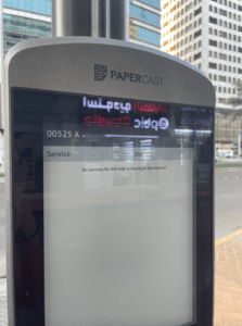
Signage Screen on Bus Stop

Firstly, I noticed that as you approached the bus stop, there was a screen to tell inform you about the buses that are due and the time they depart. I thought this was a great idea – it informs the viewer of the bus schedule and allows the user to plan accordingly. I know that there is an app that displays this information as well, but it is hard to use and many tourists may not have it or may not have cellular services to access it. However, I found that the screen was not working properly and all that was displayed was text stating that there were “No services for this stop to display at the moment!” The entire system was down – all throughout the city. Well, how am I supposed to find the timings for my bus then? Am I supposed to just wait here indefinitely till the bus I need to take shows up? 

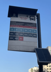
Hamdan Street (00529B) Bus Stop Signage

I also noticed that the bus stop mentions on its signage the bus numbers that depart and arrive at that stop. But, what do these numbers mean? What route exactly does each bus take? Where is the nearest bus stop to my desired destination? Do I have to change bus lines? Which stop do I change it? There are 3,603 of them (DARB – Bus Times, Bus Routes, and Updates)! Perhaps a map similar to that of a metro map could be added with the bus stops at each station. A conscious and straightforward map that informs the user where it is they are going and which bus to take to get there. Without this, for people not familiar with Abu Dhabi, it seems quite daunting to navigate all these numbers and try to figure out how to find your way from point A to point B. In addition, the numbering system is not consistent. While DARB only has 99 bus routes in Dubai and Abu Dhabi, this sign suggests there are many more than that. Some routes are even labeled with a number and a letter (eg. A1). As mentioned in Per Mollerup’s book Wayshowing > Wayfinding: Basic and Interactive, Mollerup mentions that the two basic requirements for a good numbering system are logic and consistency. Perhaps all the routes should be labeled with numbers only or all with a letter and number – what I am trying to get at is that perhaps the labels should be consistent and use the same logic. Or perhaps these buses are different than the rest, but there is no indication as to why. Improving clarity in this would allow users to use other wayfinding strategies, such as inference, to navigate the system. 

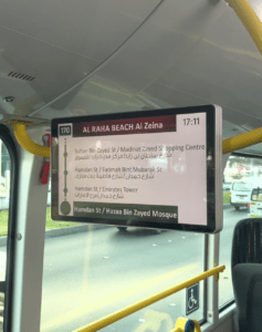
Monitor inside the Bus

Additionally, in terms of signage, the inside of the bus is equipped with multiple screens displaying the next stops on the bus route, the time, and additional safety information. This information is displayed in both English and in Arabic, making it more accessible for both the local and expatriate community of Abu Dhabi, as well as tourists visiting the city. I have observed that this is quite a new addition to the public bus system but it is one that has been extremely helpful. However, perhaps there could also be an announcement as the bus is approaching stations for those with visual impairments or those just simply not paying full attention to the bus (sleeping, talking, etc.). This plays to this idea of simplicity versus redundancy, which is also mentioned in Per Mollerup’s book Wayshowing > Wayfinding: Basic and Interactive. Although the addition of a loudspeaker to also verbally communicate this information may be redundant, this redundancy may clarify the message and information for some passengers. 

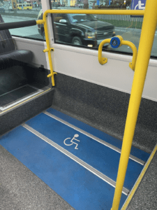
Accessibility Measures on the Bus

A particular aspect of the public bus system that I began to pay more attention to after taking this class is accessibility. From what I have noticed, all of the public buses have a ramp that can be employed for someone with a disability or in a wheelchair to be able to access. The buses also have an area to store a wheelchair or for people in wheelchairs to sit and hold the rail while the bus is moving. I found that in terms of accessibility, the Abu Dhabi public bus system aims to make this form of public transportation accessible to everyone which is really important. It is a public system after all. 

As the population of Abu Dhabi and tourism in the region continue to increase, an efficient and easy-to-navigate public transportation system is vital. Perhaps a few changes and additions in signage, logic, and redundancy could improve the existing system and allow users to use additional wayfinding methods such as inferencing or map reading to better navigate through the system and the city. In any case, it is apparent that the designers of this system and the Abu Dhabi government have put significant time, effort, and monetary support into developing the existing public bus system in Abu Dhabi. Even more so, these bodies seem open to improving the existing system as they have been making adjustments even recently – with the addition of new technologies and accessibility measures. Maybe in the next couple of years, we may see fewer cars on Abu Dhabi streets and a whole lot more buses – or even a metro?


Sources:

“Abu Dhabi Traffic Report: TomTom Traffic Index.” TomTom Traffic Index, https://www.tomtom.com/en_gb/traffic-index/abu-dhabi-traffic/.

“DARB – Bus Times, Bus Routes and Updates.” Moovit, DARB, https://moovitapp.com/index/en/public_transit-lines-Dubai_Abu_Dhabi-3824-864210#:~:text=DARB%20is%20a%20public%20transportation,Dhabi%20with%203603%20Bus%20stops.

Mollerup, Per. Wayshowing> Wayfinding: Basic and Interactive. BIS, 2013. 

My Initial Thoughts on Wayfinding

Whether it be catching a flight for a Spring Break holiday, heading downtown to the Corniche, or just getting to a class in A6 on time from A2 – we are always navigating through the world in an attempt to get to our desired destination. Sometimes this task is straightforward if routes are easy to navigate. Other times, they may be frustrating and have you going around in circles.

I have always loved traveling and exploring and everything that comes with it: the unknown territory, the finding your way, the uncertainty, and the adventure. With a map in hand and an eye out for signage and directions – I love leading people through new cities, navigating through airports, and the chaos of finding your gate on the other side of the concourse or calling ‘shotgun’ in the car so I can navigate the Google Maps route. There are so many times that I have felt defeated or incompetent when I get lost – or get others lost. It is frustrating when I can not reach where I want to go on time or as easily as I hoped – especially as I pride myself on having a good sense of direction. 

Just a couple of weeks into the course, I have begun looking back on such situations with a fresh set of eyes. Perhaps these instances should not have me questioning my sense of direction. Perhaps if there was some sort of signage or some accurate visual representation of the area – if the environment was better conducive – I would not have gotten lost in the first place. Our campus serves as a microcosm for this. There are so many examples of bad wayfinding designs that we have already seen on our very own campus. How can we expect first-years to get to classes on time during the first few weeks of the semester? How can we expect visitors to get to meetings on time? It all goes back to wayfinding and the aspect of user-centered design. 

The idea that the “user is always right” is a common mantra in the design world. Good wayfinding design should keep the user and the user experience in mind. This mantra was enforced during our second lesson of the semester through a simple game of Pictionary. In an attempt for the class to remember my name through a simple icon, I decided to draw a smiley face. I chose this because ‘Muskaan’ translates to smile in Hindi and Urdu. However, what I failed to keep in mind was that just because this connection made sense to me, does not mean that it makes sense to everyone – all the users. What if the user interprets the entire emoticon icon rather than just the smile element? Or what if the user does not speak Hindi or Urdu? Does the image make sense then? Again, this served as a microcosm to show that design does not always have the user experience in mind and to be mindful of this when designing. Would it be nice for it to? Yes. Is this reality? Most often not. 

To keep the user experience in mind may mean broadening your horizon of what a user is – keeping in mind that you may not be the only user. In the real world, we see this with issues of accessibility, language, typography, brand identity, etc. Are stairs needed, or would a small ramp do the same job – while allowing wheelchair user accessibility? Does this font interfere with comprehension for those with dyslexia? These questions were not obvious to me initially when looking at wayfinding. However, their importance has become highlighted just a couple of weeks into this course.

Such questions should guide designers when designing wayfinding systems. Wayfinding systems, in any form, should guide people and allow for seamless navigation. They should not pose additional problems or confusion in navigation. Perhaps a wayfinding system is most effective when the user is not alerted of its presence. In other words, when the system is integrated seamlessly within the built environment and provides accurate and complete information to a user, the user will have an uninterrupted journey. Perhaps I can assist my argument here with a counterexample. 

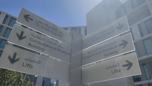
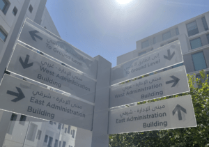
We do not have to look too far to see bad wayfinding systems. Let’s take a look at our campus. The signage system around campus is full of inconsistent language and ambiguous – or even outright incorrect – directions. This can leave the user confused and disoriented. For instance, we have seen two pillars opposite each other point in two different directions to the same place. Where actually is it? Looking at those signs, I guess we will never know. The current signage system may cause users to take a second, stop, and reevaluate their surroundings to decipher which of these directions are accurate. The signage system should integrate itself into the greater campus system and almost be unnoticeable to a user. It should not force them to stop in their tracks and evaluate the directions themselves. In that case, what would be the point of the wayfinding system anyway?

Directional Signage outside A3 Building
Directional Signage outside A4 Building

Examples of Bad Wayfinding signage systems on campus

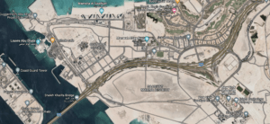
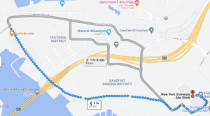
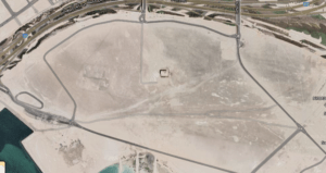
Widening our scope beyond NYUAD, let’s take a look at the greater Saadiyat Island. One of my first weeks on campus last spring, a friend and I went to the Lourve Abu Dhabi. We decided to walk back to campus. Google Maps found us the shortest route – which would take us about an hour. However, when we looked into the satellite view of the path, the path consisted of a nonexistent road supposedly located in the Saadiyat Marina District. If we had not examined the path ourselves, we would have been looking into an area of sand and construction, and perhaps our walk to campus would have turned into a nightmare. Interesting, right? Isn’t it fair to assume that Google Maps is reliable? Apparently not. 

Source: Google Maps

Source: Google Maps

Source: Google Maps

All this to say that wayfinding is everywhere. We use it almost every day, and it must be integrated into the built environment in a conducive and efficient manner. A couple of weeks into this course, I realize that perhaps this class may be a blessing and a curse. It has become difficult for my friends to take me anywhere without me commenting on the “bad wayfinding” at least once. I have become more aware of the disruptions that a bad wayfinding system can cause as a user. At the same time, however, being able to notice these disruptions is the first step in being able to fix them. As Professor Goffredo mentioned in class, our position as students at NYUAD is a unique one. We are within a system that is just getting started, which means we also hold the ability to critique, better, and build it.