Final Thoughts on Wayfinding

When I think of the impact Wayfinding has had on my life, I’m grateful (and surprised) that the scope doesn’t just end at “design.” I enrolled in this class, hoping to learn about designing tools, maps, and the definition of “wayfinding,” but I ended up learning more about their importance and how they can be used to achieve personal, economic, and political goals. Given the maximum potential of practicability that I gained from this class, I’d like to dedicate my last blog to the main lessons I got from this course. 

“Because maps have so many decisions behind them, they are more than just designs, they are part of our perception of experiences.”

The first one is very unexpected and breaks stereotypes. Before this class, if someone wanted to talk to me about maps, I would have formed the thought “how boring.” But apart from any prejudices I might have had about maps being uninteresting before this class, I think generally speaking maps has never been a topic you see people being particularly passionate about—it has become almost like a niche. However, after our lectures with Giuseppe Attoma and Jug Cerovic, I can never see maps the same way. Firstly because I know that they are not completely accurate (geographically speaking) and second because I know the impact that the latter piece of information has had in using maps to alter politics and influence history (e.g. the map of Berlin). Now, everytime I go out and I use a map, I find myself thinking how much it was altered to look like that, simpler and more practical. I wonder if there is any particular reason for every silhouette or figure or change the person in charge decided to include. In short, maps have become something more familiar to me, and I can appreciate the role of maps better because of these learnings. I know now that because maps have so many decisions behind them, they are more than just designs, they are part of our perception of experiences. 

“Because maps have so many decisions behind them, they are more than just designs, they are part of our perception of experiences.”

The second lesson I want to take with me is the link between making good design choices and creating more reliable, strong material and messages. Learning about hidden cues that lead to people’s interactions with objects (nudges) and the purposeful use of typefaces taught me that nothing in design is by chance—it has an intention and a goal for which the design was made for. It is not the same using disruptive and disorganized typefaces than using more delicate and simple typefaces to a formal message. There is a reason why the same texts can have different impacts on people’s perceptions of them by changing the typography. Moreover, the use of the concept of nudges can prevent utter disasters in museums and other important places that hold value to history and society (or even just daily spaces that hold things that are important to us). These concepts are not just practical in design, but are useful in day-to-day tasks and should be concepts available to all. 

“Ethics makes good design.”

The final lesson, and personally the most interesting, is that ethics makes good design. When working on the presentation about Edward Tufte’s “Visual Explanations,” I remember being particularly excited about his point of the lack of comparison and truthful research being signals for untrustworthy conclusions. In other words, how being ethical was actually beneficial to the researcher, whether or not that could lead to arguments against their work. Moreover, we can see this point in Christian Greco’s work at the Museo Egizio, where his intentions for remodeling the space come from accepting that the objects they possess truly belong to Egypt, not Italy. From these two examples, I’m truly confident that the best designs come from ethical grounds, not only because of the content, but how their content can contribute to society. 

After the previous reflections, I can say that visual design is key and necessary in conveying the messages of today, and wayfinding design related knowledge is without a doubt very resourceful to achieve this. I’m hopeful about the way I will apply this knowledge in fighting for inclusion and equality in the future, and peacefully knowing that truth always wins, even in design. To conclude, I just want to highlight how design keeps surprising and offering humanity tools to build the future they want to live in, whether that looks like ethical museums, inclusive signage, or innovative maps. 
 

Museums and How They Are Showing Us the Way Back to our Present

Christian Greco’s visit to NYUAD was one that I didn’t know we needed. How do museums impact society and the future when they reminisce about the past? Truly, I had heard the phrase, “Those who do not know their past, are condemned to live it,” but I didn’t understand the practicality of this connection until Greco’s talk, which proved that museums can help us build a better future by critically engaging with the past. But, what if, the future they talk about when having conversations about museums, is the present that we have today?

The last time I visited a museum was last semester, Fall 2021, when I joined a student group visiting the Louvre Abu Dhabi. Not having many museums back at home, I grew up without a fed interest in museums and their importance for society, so I was curious to see what the Louvre had to offer my intellectual curiosity. As I was reading the tags in each object, I found myself looking for one that said that the object belonged to “Venezuela” or, at the very least, somewhere nearby. The closest I found was Peru and Mexico, and I started to question what deemed these places’ objects worthy of preservation. Moreover, a question was raised within the group: does this museum have the right to own objects from other countries? Why aren’t these objects in their so proudly-shown “origin”?  

Rumors of having stolen these objects during, around, and even after colonial times were the predominant answer as to how museums usually get objects from other countries: a different way of showing power dynamics and oppression. Although Greco didn’t talk about how they got these objects, he did mention the fact that they don’t belong to Italy (whether they were purchased or not). Moreover, he talked about the role that design plays in simulating the real home of these objects. In fact, as the museum approaches its 200 year anniversary, they are working on remodeling the museum, including a garden that looks like those in Egypt. Greco talked about the responsibility of taking care of Egyptian history, as these objects are tokens that survived the years that humans didn’t. They speak the words that humans from 1824 are not able to speak to us today. But if objects carry these words, these messages, and even lessons about history, adding value to the society of today, one could argue that owning these objects would equal owning history. And so new questions arise: who gets to own history? Is history purchasable? And should this really matter as long as history lives on?

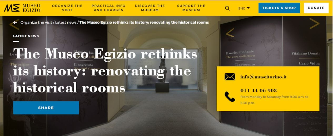
Greco clearly addressed the need for everyone to have access to history through museums. He talked about the importance of promoting the already existing link between the museum and the polis, or community, around it. Events open to the public, as well as collaborations with local schools and organizations, confirm the museum’s compromise to make it accessible while at the same time getting the funds to maintain it. This goes in line with Greco’s argument that the question of, “How to be inclusive without running the risk of being exclusive?” remains a big one to this museum and others around the world. Moreover, an article by the museum’s website itself (https://museoegizio.it/en/explore/news/the-museo-egizio-rethinks-its-history-renovating-the-historical-rooms/), addresses a new point, also covered in Greco’s talk: there is a link between Turin’s (the city where this museum is located) history and Egyptian history that cannot be overlooked. This article talks about the already mentioned remodelations that try to be intentional about the question of “why an Egyptian museum in Turin?,” a question that although not yet answered, is being asked. This article urges us to think about the intertwined history that these two places hold, despite their geographical distance. And isn’t that how our world is being built? A globalized world that shares innovation, economy, and communications, essentially creating SHARED HISTORY. 

I don’t know if I can answer the question of who deserves to own history, but I can certainly say that the preservation of history should be the goal regardless of who owns it. And maybe, if Turin didn’t hold Egyptian history, there would be no records of how these two places’ history became one that remains today, affecting each other after 200 years. I don’t know if this is necessarily good for humanity because I don’t know how Turin or Egypt would look like if their paths hadn’t crossed once, but I’d like to think that this is how it should have been because we can now experience their past in our present. A past that even today urges us to raise these moral and ethical questions about shared history, globalization, and colonization. 

Greco’s talk opened the door to a rich fountain of topics that should be discussed, but they all have in common one thing: these conversations exist because a tangible token of their origin exists someplace in Turin, Italy. They remind us of the decisions, good or bad, that our ancestors held during their lives and reflect on our daily decisions. Moreover, through this museum’s example, we can conclude that design represents an opportunity to respond to our duty, and in this case, to address that these objects do not belong to Turin or Italy, but rather they’re borrowed tokens of history that, as a consequence, generated more history. Museums, without a doubt, play a role in preserving history, shaping our future, but we must not forget that they also lead us to reflect critically about our present. 


Wayfinding and the Istanbul Airport

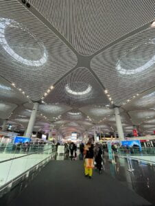
Istanbul Airport, also known as the World’s Largest Airport, is a landmark for international transportation. With more than 40 million passengers and a capacity to handle 90 million per year, this airport was awarded “The Most Efficient Airport in the European Union” by global leading aviation researchers at Air Transport Research Association in 2021. This gives us a peek into the impact this airport has in global commerce and tourism. And having been there at least 3 times, I can attest to the “strong infrastructure, efficient operation, superior technology, and premium travel experience” that it offers. However, I would say its most remarkable yet unnoticed characteristic is its wayfinding design. 

When coming to NYUAD for the first time, I had a layover of 14 hours in Istanbul Airport, exposed to making thousands of decisions based on zero knowledge of the space I found myself in. As a first timer traveling to the other side of the world, I didn’t feel lost during my layover in Istanbul Airport. Of course, I didn’t know back then that this was connected to the good wayfinding this airport has. However, I did feel confused from time to time given the large size of said airport, so I will be going through the good examples we can apply someplace else and the things that can be improved. 

One thing that I believe this airport did right is find a good balance between simplicity and redundancy in their signage and gates. They did a great job of playing with letters and numbers to name the different gates so as to avoid confusion and eliminate the perception that the airport is too big. For example, they could have had C50, but instead they chose small numbers and different letters. The quote in their website is “Do not be afraid to ever miss your flight with us” and it is actually true. They have big screens very close to each other and signage with the right distance between them to make sure no one misses their flight information. The balance of information and medium is perfect and very convenient for travelers from all parts of the world.

Adding to the positive design you can find at the Istanbul Airport, you have accessible pathways! As you navigate one of the biggest airports yet to exist, there are lifts where there are stairs. There are also a lot of electrical path rushers to make it in time for those who can’t run. Moreover, there are various cars to put your heavy bags on for which you can get a reimbursement after you use them almost everywhere in the airport. This is one of the highlights of the airport, and I wish there were more airports with these options. 

In contrast, one thing I struggled with was finding the exchanging places late at night. It was an emergency, really, it was my last chance to try the Turkish ice cream, and I only had big bills for which they didn’t have change. I spent 40 minutes walking all around the airport, asking people around, and I believe they didn’t have any exchange servers sign, or at least not clear, visible ones. I risked losing my flight that night, all because there were no signs about the exchange servers’ locations. Now, on a more serious note, this is very relevant, especially in such an international hub of travelers with people coming from LITERALLY all parts of the world with all different currencies. Therefore, one thing this airport lacks is effective, clear signage of money exchange servers, which would save a lot of people time and struggles. 

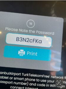
Similarly, there are no signs for the wifi connection places, which needless to say, are very important in Airports. But why can’t people just connect to the wifi from where they are? In Istanbul Airport, you only get one hour of wifi per passport. This means, you need to find a wifi spot, scan your passport, and connect to the wifi. If you’ve been traveling for 12 hours for the first time and you need to let your family know that you made it okay (in my case), then finding these spots should be a priority in signage. Moreover, even if you’re in an airport, you should have the right to know where you are at and do research on questions that might pop up, like where is your airlines’ section or what are the best places to eat.

The wayfinding design at Istanbul Airport is mostly on point, at least the intention: big, visible signage everywhere; clear names for the gates; intuitive signage for bathrooms, food, prayer rooms, and other attractions; and accessible pathways. With this in mind, there are some details to work on, like the visibility of money exchange places and wifi connectivity spots. From my personal experience, I can attest that navigating this HUGE airport is mostly very intuitive and smooth. Overall, there are so many things to replicate worldwide, but some things to be learned from other places and be applied. 

SOURCES:

Wayfinding and Finding Our Way… to the Bathroom, to Berlin, or Just Ourselves

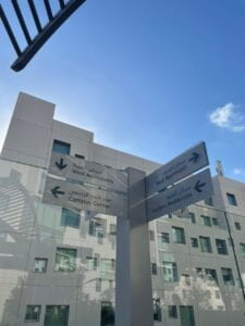
Coming into the course, I had no clue what wayfinding was or why it was relevant to our day-to-day lives—enough so as to dedicate one whole class to it. It was on February 8th, when Prof. Puccetti prompted us to visit some places on campus using the wayfinding resources on campus. In short, it was a total disaster: reversed maps, unclear signage, unaccessible lifts, confusing language… It was then pretty clear that, from thinking about accessibility to the role that signage can play when exploring unknown lands, wayfinding design is key in every aspect of our lives, as individuals who are constantly moving, and trying to find their way.

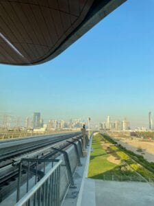
After the campus tour exercise, I haven’t been able to see things the same way—and that is a good thing. If I go to a place and I cannot find the public bathroom or it’s not clear how to use the tram, I already know: it’s bad wayfinding design. Moreover, one of the phrases I’ve always heard, “The user is always right,” has been proven true now that I am introduced to the concept of wayfinding. Finding my way to the bathroom, or even to Berlin, is the result of planning the wayfinding design of the place by being assertive and using the right nudges, also known as unconscious cues, that lead you where you need to go without giving it a long thought. 

Nudges might sound like a simple, maybe even trivial term, but it is key. Let’s say you go to a concert in a city you don’t live in and it ends late—around 1 am. You need to go to the metro to get back home, but you have no idea how to get there and are skeptical of asking random strangers so late at night, but the metro closes soon. Now, how do you get there? Good wayfinding and nudges are key for you not to go through this very personal, and awful experience I had. Similar to nudges, affordance—the property of an object that defines its possible uses—is also key in avoiding getting in trouble and/or preventing the scathing of relevant objects/places that make up our identity and history. These aspects of wayfinding add value to it and the way we conduct our decision-making in life.


Although wayfinding factors like nudges and affordance are important, perhaps one of the most important factors of it, and design in general, is to think like a human, to plan inclusively. Whether you know someone who possesses challenges in terms of mobility and transportation, or you yourself do, or maybe you know no one, it is important to know that they exist, and they deserve to access these spaces as much as you. They—like you—probably want to go to the beach, travel, or go for a coffee around the corner of the street, and they must have ramps, plain grounds, or signage that can help them move around and enjoy—guess what—a normal life. 

From making places inclusive to helping us find our way in unknown places, the benefits of wayfinding are clear, but what about the challenges or dangers of bad wayfinding? As Bernard Rudofsky once said, “Altogether, cities correspond closely to the ideas and ideals of their inhabitants. They are the tangible expression of a nation’s spirit, or lack of spirit.” With that in mind, we can assert that, because wayfinding constitutes the way we explore, navigate, and adapt to cities, and consequently cities represent a nation’s spirit, wayfinding can impact politics, economy, culture, and our existence in this world. Without it, we are theoretically and literally lost in every aspect of our lives.

The scope of the importance of wayfinding reaches our identity and who we are in this world as we explore it. As David Gibson, author of The Wayfinding Handbook, puts it, 

“The heart of a civilization throbs wherever people come together to work, play, shop, study, perform, worship, or just interact. Crowded unto bustling spaces, they share the richness and diversity of human experience as well as its challenges. In these spaces people may “find their way” in the existential sense, but they might also become overwhelmed or disoriented if they physically lose their way. Wayfinding design provides guidance and the means to help people feel at ease in their surroundings.”

In short, what Gibson tries to convey in his book is the fact that we are defined by the places in which we interact with each other, and because wayfinding plays a huge role in us getting to and using these places, wayfinding is also relevant in the role we each play in this world. Therefore, with all of the above in mind and these words from Gibson, there can be no space for doubt that we should all know, at the minimum, the basics of wayfinding.