Two changes this class brought me

1. One biggest takeaway I gained from this class is learning the importance of planning. Before, many of my assignments were submitted at the last minute. Sometimes it was not that I didn’t have time to do the work, but I was procrastinating. As a result, a lot of work piled up. Completing them at the same time was very tiring and the quality of the assignment could not be ensured. I’m grateful for the conversation I had with the professor. It was like a wake-up call that made me realize that I could do better and made me start changing. After all, the point is not to complete the assignment, but to learn from it. I plan ahead and make a to-do list based on deadlines and the approximate time each assignment will take. Overall, despite the increased workload this semester, I’m doing well because I perform better at time arrangements than before.


2. One of the quotes Ulan shared in his latest blog is “complexity of the world requires that designers understand the needs and dilemmas”. I used to think that the designer’s job was to produce beautiful visuals, but now I realize that the designer has deeper responsibilities. Design plays a significant role in shaping, influencing, and spreading social values. The professor mentioned that designs reflect the spirit of a time and the general conversation of a time. Designers should always be alert to normal things. They should have the self-awareness of being accountable. Designers are the actors of change.

I remember when I first came to the NYUAD campus, I was fascinated by the design style of the buildings. But on the first day of class, I got lost. There are no effective labels on A1-A6 buildings showing their names. The only label they have only shown the textual name of a building like social science building and does not include its most popular name, such as A5. The labels are often blocked by pillars in front of buildings and are difficult to observe. One of my professors said in the announcement that the classroom was in the east administration building, which is actually A4. But I didn’t know that at the time. I could only ask the security guards. But surprisingly, the security guards weren’t so sure.

In the first week, my classmates and I were complaining that the classrooms were too hard to find and that there were no conspicuous labels outside the buildings. But no one did anything to change it. I didn’t even think about doing any attempt to change it. I assumed that I could not make the change. And this thought seems to be normal for most people today. However, the wayfinding class showed me a different side. Soul beach built a ramp for people with limited mobility because of the professor’s Twitter post. The school shortened the outer edge of the window because of the professor’s proposal. The professor shows us the responsibility and social awareness of a good designer by his actions. We are the change-makers. Although it’s hard to really make it happen because people don’t like change. We also practiced this in the assignment of impossible pictograms. Not only did we discover unreasonable wayfinding designs on campus, but we also used our designs to facilitate changes. Funny solutions and pictograms are the means to arouse people’s discussion. The core of our design is to make people give importance to the issues and further solve them.

The lessons I learned from this class are way more than this two. They are life lessons. I want to thank the professor for sharing his insights about design and life and providing us the opportunity of meeting with some of the greatest designers. I also want to thank all my classmates for their sharing and help. It was great to meet you all and learn from you all.
 

Takeaways from Jug Cerovic’s lecture

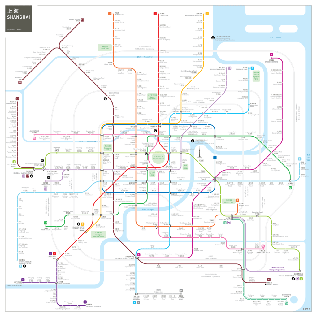
Jug Cerovic’s lecture and workshop about map design is one of the most fantastic learning experiences I have ever had. I’m most interested in metro map design and I would like to share my takeaways and thoughts in this essay.

Schematic maps are the most efficient way to represent metro systems. Since most of the subway’s facilities are underground and people can not explore the tunnels on their own, some physical characteristics like distance, direction, and shape become less important. Therefore, when designing a metro map, the path can be simplified. The connection between underground locations and geographic locations on the ground only needs to be roughly represented. The information that people need to know, such as different lines, stations, and ways to transfer, has to be presented in an orderly, clear and concise manner. Motivated by these principles, Cerovic summed up a universal design language and rules for the metro maps. He then designed unified metro maps for more than 50 cities in the world.

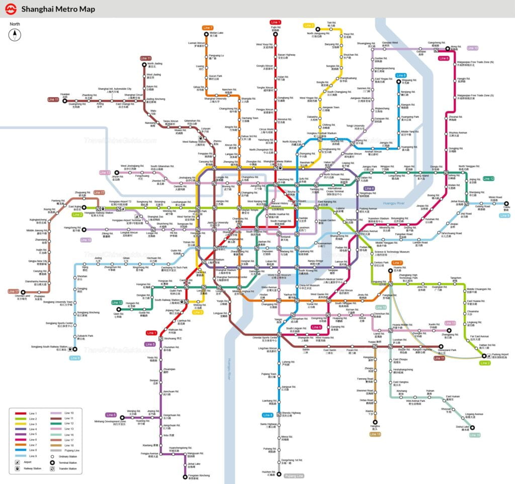
Figure 1  Shanghai metro map 2020

https://www.travelchinaguide.com/images/map/shanghai/subway-map.jpg

Figure 2  Shanghai metro map designed  by  Jug Cerovic

http://www.inat.fr/metro/shanghai/

As I lived in Shanghai, I’m curious about the difference between the metro map Shanghai uses currently and the map designed by Cerovic. According to my experience of living in Shanghai, I thought the Shanghai map completes the role of navigation and is clear and effective. However, when I compare it to Cerovic’s Shanghai metro map, I realized that it could be much better designed. Comparing the two maps, my immediate impression is that although the two maps show the same amount of information, one is very crowded and cluttered while the other is delightful and concise. How did Cerovic do it? First, he simplified the path of the metro lines, omitting small changes in the path, and using straight lines to represent them. Second, he appropriately expanded the proportion of the central area, giving more space for dense information. Third, he considered the importance of information and uses different colors and sizes to establish hierarchy. Considering that the information-heavy metro map is not suitable for viewing at a distance, he used thinner lines and smaller texts. The blank spaces provide a pleasing visual experience and make it easier for people’s eyes to locate information.

Cerovic’s map even contains more information, including Shanghai highways, famous parks, and the Pearl of the Orient. The application of landmark labels connects the underground metro system to important locations, helping people relate the metro map to their mental maps, and making it easier for people to find their way.

Beyond that, he did an amazing job in defining symmetrical shapes from concrete metro lines. On the current map of Shanghai, I can vaguely find rectangles and grid shapes in the central area. In Cerovic’s design, the rectangle is more conspicuous. The grid is also more organized due to the same distance between lines. The most outstanding design is the water drop shape in the center. The literal translation of the second character in Shanghai (上海) means the sea (海). I don’t know if Cerovic did it on purpose, but the shape of the water drop makes the map strongly associated with Shanghai, in a sense integrating the city’s identity symbol into the map design. This association and transformation are incredible to me.

Also, he could have reduced the pink line (line 13) to a vertical straight line, but he chose to create a memorable shape to add features to the Shanghai metro map. One of my biggest takeaways from his lecture was that one of the essences of design is making choices. Designers choose what information to present, what information to hide, when to incorporate distinctive shapes, and when to apply unity. They choose the balance point between simplicity and redundancy, symbolism and functionality. The choices are made based on context. It is only by investing a great deal of research and practice that we can make reasonable and comprehensive choices.

Analogy, Metaphor, and Synecdoche

In the last lecture, the professor talked about creative wayfinding design, emphasizing that the most powerful tools are analogy, metaphor, and synecdoche. This method is to display information in an indirect way. It is sometimes clearer and more interesting than the direct representation and can leave a deep impression. By connecting certain objects, people, concepts, and ideas, it emphasizes their similarities and associations. It helps people to understand an unknown situation with a familiar situation.

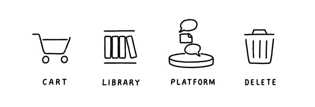
In fact, we often see the application of analogy, metaphor, and synecdoche in our daily life. The trash can in computer systems is an example. “The function to delete a file is actually quite complex, involving marking portions of hard-drive space to be written over once they are needed.” By comparing this function to a trash can, a more familiar object, users can easily understand this process. And just like the trash can in real life, if you don’t empty the trash can, you still have the chance to get the things you throw away back. The shopping cart icon in online stores is the same. Using physical objects in life to describe the virtual concept in the digital world is a common technique used by designers.

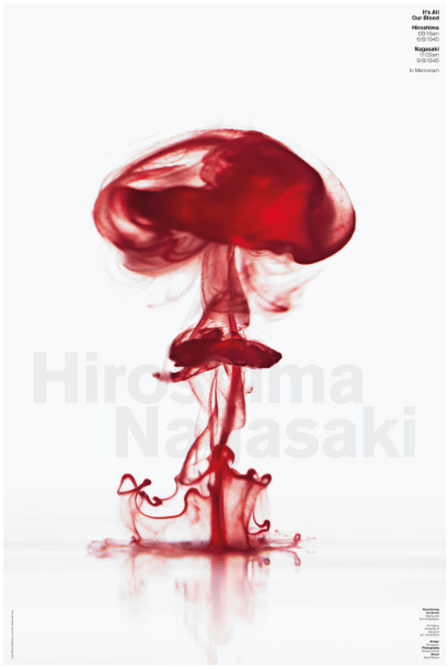
Apply analogy in poster design makes the poster striking and memorable once the audience realizes it. A famous example is Harry Pearce’s poster It’s All Our Blood, a product commemorating the 70th anniversary of the dual nuclear explosions of Hiroshima and Nagasaki. “The poster is a photograph of a drop of blood hitting the water’s surface, creating a deep red cloud similar to an atomic explosion”. The message of the poster is self-evident. The visuals and details are beautiful, but it is the creative analogy idea that makes the poster stand out.

Another poster I found online was produced by the World Wildlife Fund. WWF clearly states their views and appeals, which is protecting animals, without displaying a single word. WWF compares ecosystems to Jenga, emphasizing the importance of each kind of animal, showing the idea that the elimination of any one kind of animal leads to the crashing of the entire ecosystem.

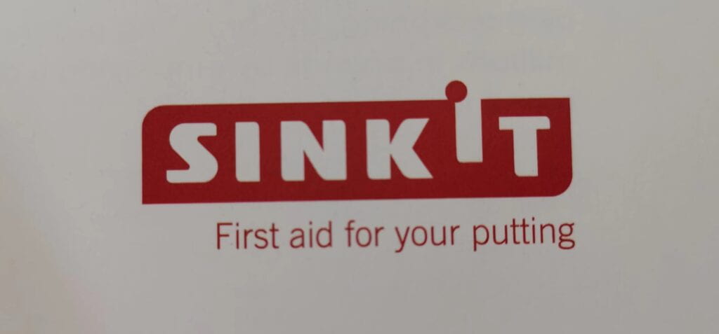
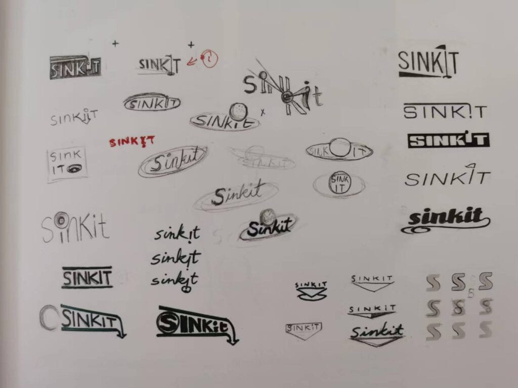
I also would like to share with you some examples in logo design I found in the book I borrowed Logo Design Love: A Guide to Creating Iconic Brand Identities by David Airey. In logo design, designers often reshape letters or incorporate brand-related images into the logo subtly. This not only makes the logo stand out but also shows the main business of the brand. The following is the logo of Sinkit which provide tool and service to help golfers with their putting. They came up with a brilliant idea of transforming the second “I” into a golf hole and representing a golf ball that is about to drop into the hole with a dot. The design also separates the words “sink” and “it”, preventing it from being misread as sin kit.

The logo of Talkmore, a wholesaler of mobile phones and accessories also impressed me. The designer found the similarity between the quote marks and the letters “a” and “e”, and transformed the letter effectively. The treatment is relevant to the company’s business. And the designer drew people’s attention to the transformation with just enough color added.

The use of analogy, metaphor, and synecdoche plays an important role in creative thinking. When brainstorming ideas we should also try to find indirect solutions, making the visual display smart and beautiful, avoiding “banana”.


Resources:

https://xd.adobe.com/ideas/perspectives/leadership-insights/designers-create-change-visual-metaphors/

https://www.pentagram.com/work/its-all-our-blood/story

https://penji.co/wp-content/uploads/2021/09/10-wwf-ad-819×1024.jpeg


Learning from the Olympic Pictograms

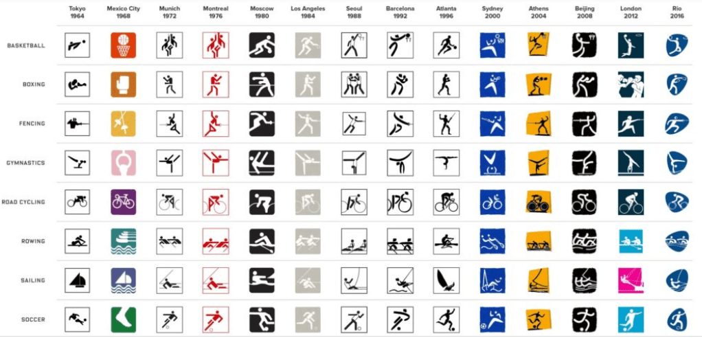
Olympic pictograms appeared for the first time in 1964 at the Olympic Games in Tokyo. Japanese developed this international language in order to communicate with people all over the world in ways other than words and writing. Their graphic symbols, which were both effective and modern, were used to indicate the various events on the program, but also all the services provided to the spectators. It was a big innovation. Since 1964, each edition of the Games has generated its unique set of pictograms and redefined the genre.

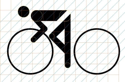
To make Olympic pictograms, the key points are: simplify the athlete’s body as much as possible; Show the athlete moving in a proactive position; Indicate the sports equipment.

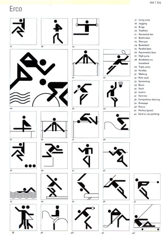
Here are the pictograms for the 1972 Games in Munich (Germany).


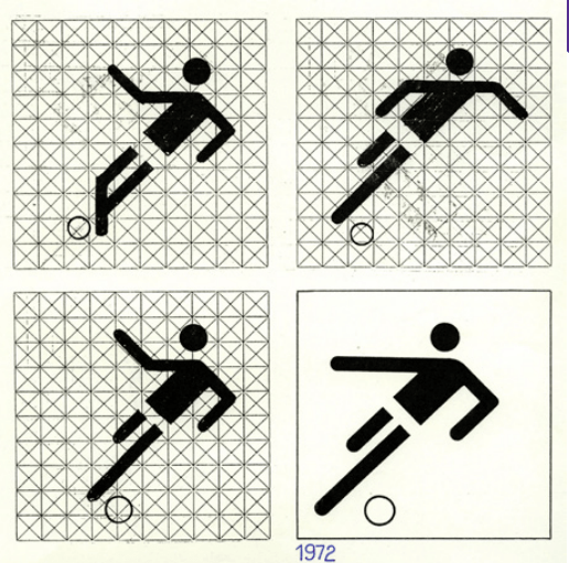
With only a few Elements, designer Otl Aicher was able to depict 21 sports. Aicher’s pictograms marked the debut of the circular head, the 45 and 90 degree angled lines, and the simplified body shapes that would become standard stick figure iconography not just in the Olympics but throughout the world. In fact, Aicher’s technique of representation through design was adopted by the United States Department of Transportation as they developed the DOT pictograms in 1974. The famous toilet pictogram is one of those. According to Aicher, he based them on “tongue depressors” to create his characters. His athletes had skinny stick-like bodies as a result of this. He made use of the Univers typeface for the Olympics. This series was a great success and influenced later editions for almost 15 years.

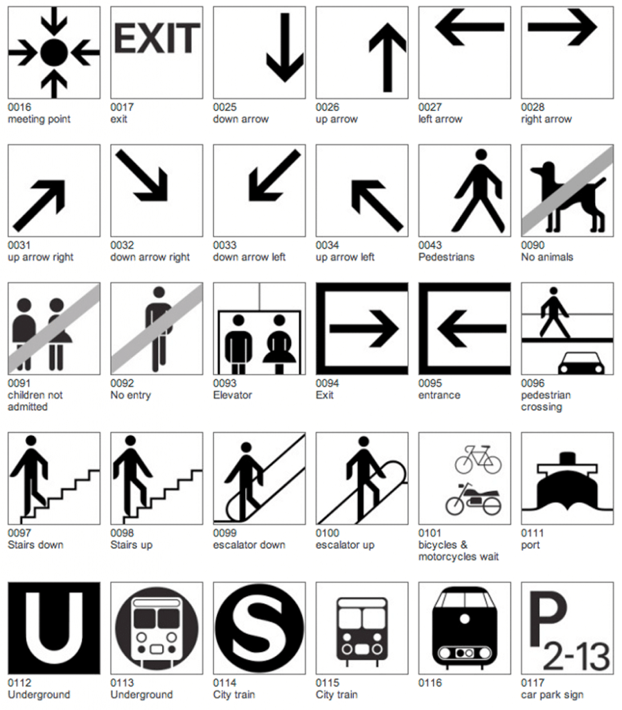
In addition to Olympic pictograms, Aicher also developed one of the most iconic wayfinding symbol sets in the 1970s for the Frankfurt airport. The set is a comprehensive system for air traffic and travel influenced by the most modern and futuristic design of the time. The symbols are ubiquitous today since they are the original contemporary symbol set for airports and their style and approach have been copied many times over.

Sometimes, the branding role of Olympic pictograms is more important than conveying understandable information. For example, the pictograms for the 1994 Winter Olympics in Norway were based on famous rock drawings in Norway that date back thousands of years. Sydney’s use of boomerangs in 2000 is also culturally relevant. Beijing’s are calligraphic representing Chinese tradition.

A poorly designed Olympic pictogram won’t lead to a dangerous or embarrassing situation like a poorly designed toilet pictogram. But in general, when it comes to pictogram design, conciseness and specification are way more important than artistry.

A good pictogram should be clear, simple, motivated, and easy to understand. As we are going to design pictograms for our next assignment, I think the following tips will be helpful.

– Draw pictograms on the grid to maintain consistent positioning and proportions

– One pictogram should not look heavier or lighter than other pictograms of the same size. Maintain the same visual weight by using the same stroke weight when designing

– Never distort pictograms and be sure to avoid dimensional representations. Use more objective vantage points that are straight-on or profile views

– Use 45 angles or use increments of 15 angles to create harmony

– Use straight segments, perfect arcs where possible

– Pictograms are aligned to the center of the grid within the boundary box.

– Communicate the ideas with only the most essential elements. Avoid details


Resources:

https://www.wired.com/2016/08/decoding-hidden-meanings-olympic-symbols/

https://www.fastcompany.com/90160160/decoding-pyeongchangs-olympic-pictograms

Otl Aicher

Iconic Icons: Aicher’s Pictograms

https://www.ibm.com/design/language/iconography/pictograms/usage

Wayfinding Signage Design of Gimpo International Airport

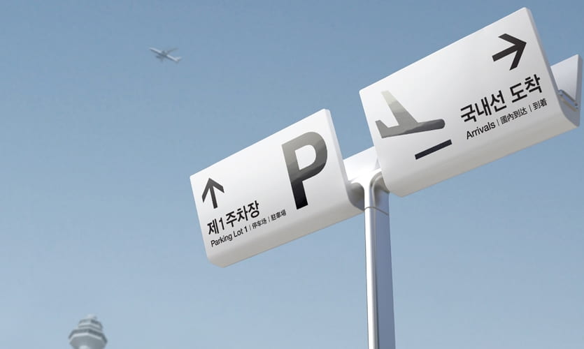
The wayfinding signs designed by YIEUM Partners for Gimpo International Airport attained Wayfinding SEGD Global Design Honor Awards in 2020. The simplicity of its design and the aim of offering inclusive information for everyone impressed me and I would like to share with you this project here.

figure 1

Gimpo International Airport is an extremely active airport, with an annual passenger load of over 24 million passengers, servicing over 60 international destinations and all domestic flights. However, its wayfinding signage design is not effective. In 2018, Seoul-based design firm Yieum Partners created a new total wayfinding solution from points of entry to the final departure gates.

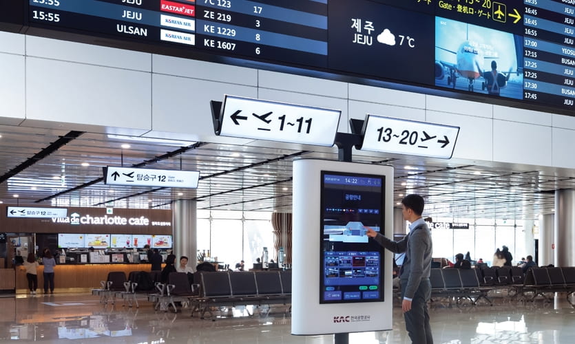
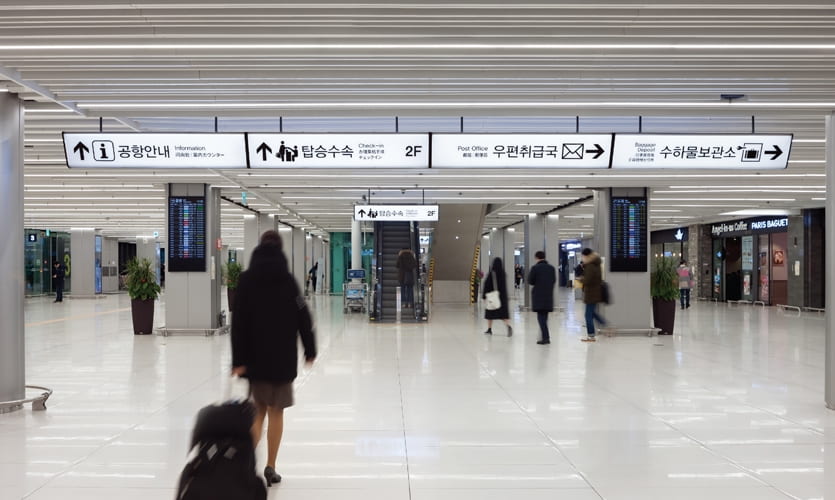
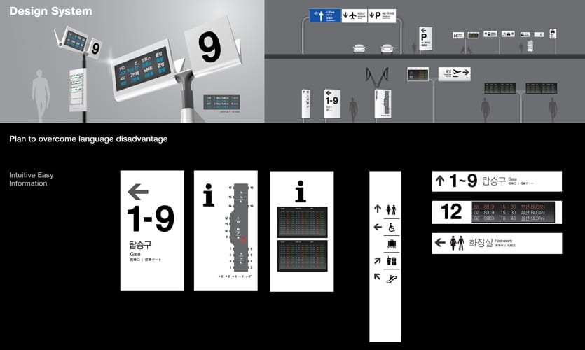
The first challenge of this project was to provide information efficiently to people from all over the world. Signage in the airport is required to provide information in four languages. However, there are still travelers who are unable to understand any of those languages, so the team developed a series of pictograms to convey messages. The pictograms are bold and presented at a large scale on signage. Whether people understand the languages provided or not, the emphasized pictograms make the process of getting information faster and effortless. Sometimes there are only pictograms on the signage because those pictograms are so motivated and easy to understand. Sometimes pictograms are easy to understand only for people who are familiar with airports procedures. To better illustrate, text in four languages is neatly and elegantly arranged next to the pictograms. These design decisions show us the designer’s trade-off between simplicity and redundancy, and the consideration of establishing hierarchy.

figure 2

figure 3

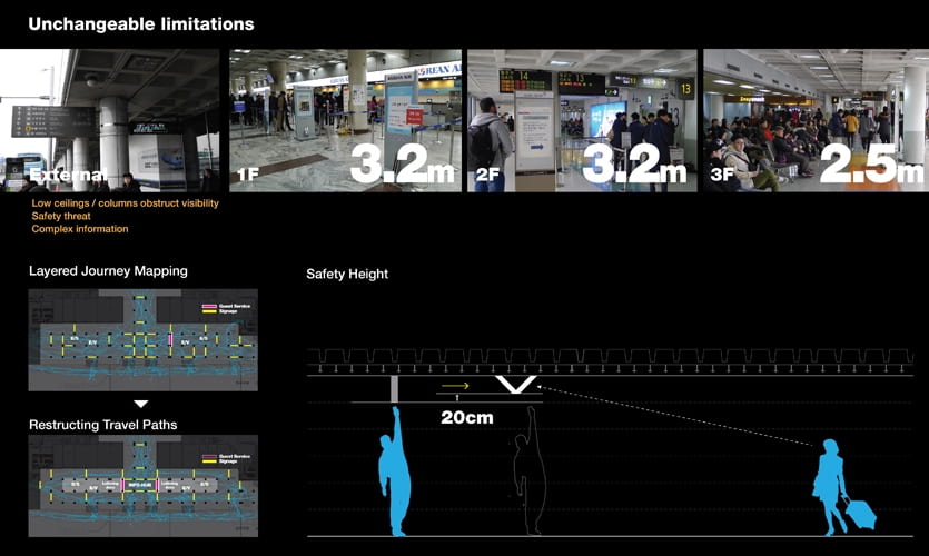
The overall design and installation of the signage was another challenge. Unlike many other airports that use color coding, plain signage, or signage with illuminated text, Gimpo International Airport has white and entirely illuminated signage. It is because the structural layout of the airport – a space of low ceilings and a densely populated field of structural support columns – created a very limited field of view, making the existing signage nearly invisible. The illuminated signage, unified and continuous design, and striking and concise typography make the signage stand out from the complex surroundings, increasing its legibility. The signage can also act as a light source to create a brighter environment. With low ceilings, the team also installed the signage at an angle to ensure a safe height for the space.


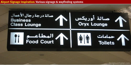
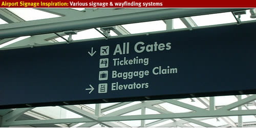
        figure 4 Doha, Qatar          figure 5 Portland International Airport

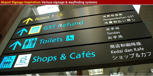
figure 6 Singapore Terminal 3 Airport

figure 7

figure 8

The placement of signage also has an important impact on wayfinding. By looking at the before-after picture (figure 8) I find that simply changing the position of the sign without changing any information can change the path of people and make it more orderly. In my opinion, it is all about user experience. Only by simulating the real process of wayfinding in the airport, simulating travelers’ action after seeing the sign, and understanding the user’s psychology, can a successful and effective sign system be achieved.

Based on my personal experience, it can also be helpful to show the time it takes to get to the gate on the signage in airports. This can reduce people’s anxiety and help people organize their time reasonably. People can use their extra time to eat nearby or visit duty-free shops without worrying about not being able to get to the boarding gate that they don’t know how far it is on time. Marking the estimated time spent can also help people find the shortest path. For example, when I was looking for a subway station entrance at the Shanghai Hongqiao Airport, there was a sign showing that there were two entrances on my left and right. At that time, if the estimated time was displayed, I could quickly choose a direction, instead of hesitating and hoping that I was lucky enough to choose the closest one.


Reference

“Gimpo International Airport: Info Inclusive For Everyone | SEGD”. Segd.Org, 2020, https://segd.org/gimpo-international-airport-info-inclusive-everyone.

“Airport Signage – Designworkplan”. Designworkplan, https://www.designworkplan.com/read/airport-signage-photo-inspiration.

Experience Affordance in Umm Al Emarat Park

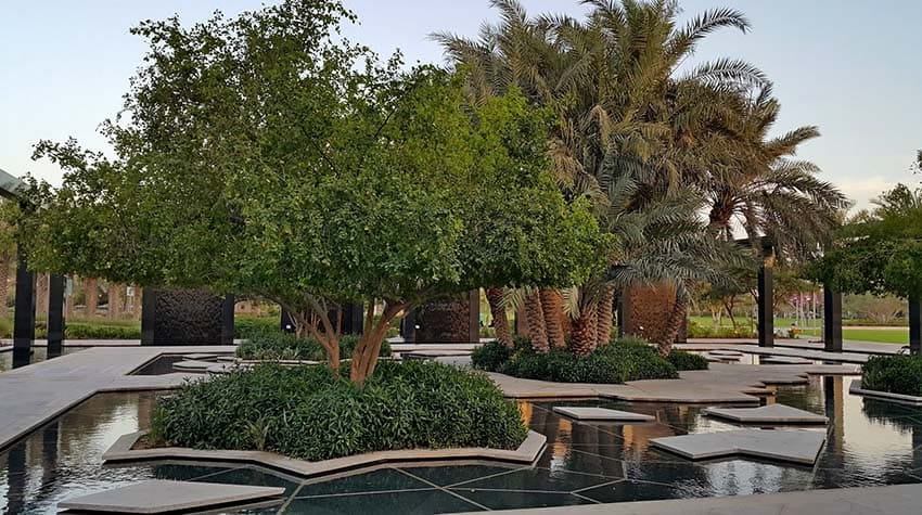
This weekend I went to the Umm Al Emarat Park to picnic. Surrounded by plenty of plants, stones, and water, the park claims to be a resting place with modern designs for families. We had a lot of fun and had a nice view of the beautiful scenery. But something happened while I was walking around, which made me pay attention to the design of this public space.

Figure 1  https://blog.raynatours.com/wp-content/uploads/2017/07/umm-al-emarat-park.jpg

I was at the place where the trees were in the middle of the water, and some asymmetrical geometric slates were scattered in the water. What a wonderful view! I thought that it would be nice if I stood on one of these slates and took a photo of me surrounded by the water. 

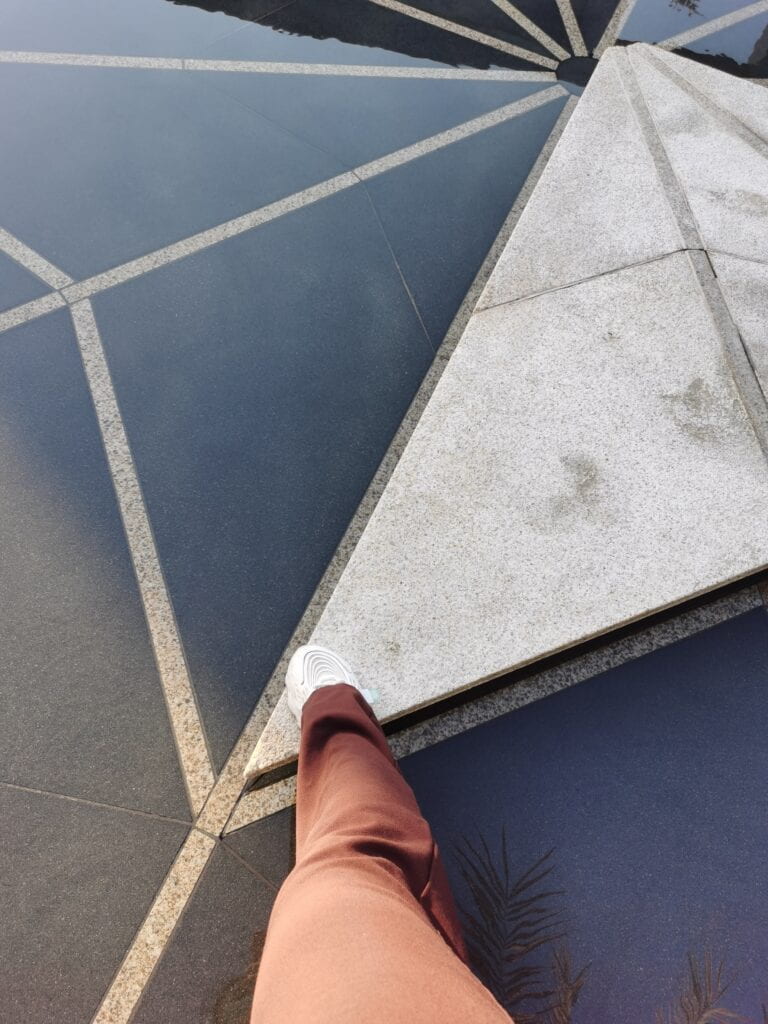
So I did what I thought. However, when I stepped on it, the security guard came over and said to me helplessly “No, you can not do that.” I stepped out with little embarrassment. I stood aside for a while, and I observed that all this security guard did was walk around the space and stop the visitors from stepping on the slates in the water. Isn’t this the same as the scene where people put their elbows on the exhibition platforms in the Louvre?     

  Figure 2


It is the affordance of the slates in the water that allows people to stand on it. It is the way it is designed that allowed this behavior. The size of the slate is just enough for an adult to stand. The slate is just placed where an adult can easily step on it. The color and material of the slate are the same as the normal road. It is these properties of the environment that provide the conditions for people to do so. It implies and allures people to do so.

Figure 3

One possibility is that the designer was intended to allow people to step on the slates, but later the park managers prevented this for some unknown reasons. But if this is not the designer’s intention, the designer should have designed it in other ways. The designer should have perceived from the user’s point of view. People come to the park on weekend afternoons, enjoying the natural plants and the sunshine, having fun like children. Of course, they want to step onto the slate in the water because why not? Isn’t it cool? Kids who come to the park are more willing to jump on the slate. What’s more, I even found this beautifully rendered promotional photo online where kids are jumping from one slate to another (Figure 4). However, the reality is that security will come and stop it. I think this contradiction may be related to the communication between the management department and the advertising department of the park.

Figure 4  https://encrypted-tbn0.gstatic.com/images?q=tbn:ANd9GcTEQQCAoEVI6dsSOU5igtqX-OM46jv9U1VSXw&usqp=CAU

                                      Figure 5


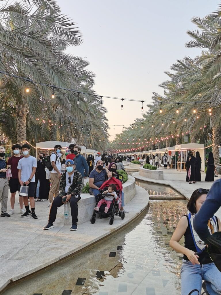
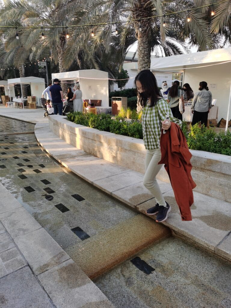
Another place I want to discuss is the park’s main road. The Water and fountains built in the middle of the road add beauty and atmosphere to the park. But it also prevents people from moving freely from the left to the right side of the road. This may not be a problem. But it becomes a problem if the ripe market is located on the main road. There were booths on both sides of the road. When I walked on the right side of the road, I was attracted by the goods on the left. But the water in the middle got in my way.


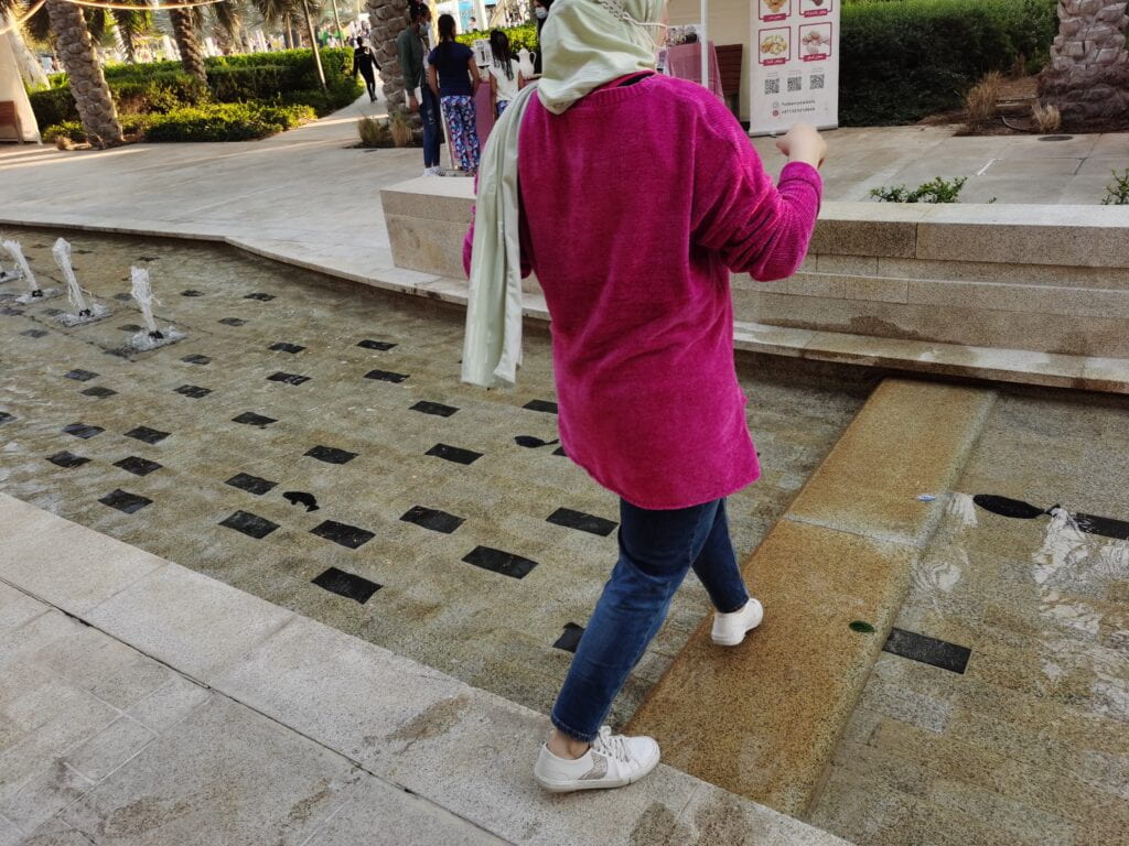
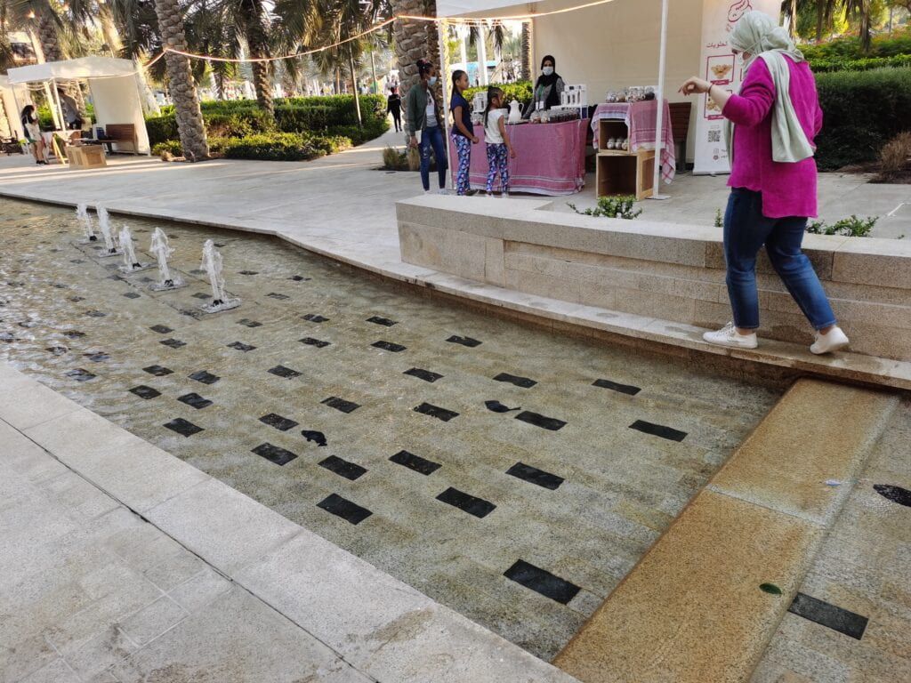
What many people did was to find the narrowest part of the pool and step over (Figure 6) (I don’t know if this is intentional that the narrowest part of the pool is just one step span for an adult) However, children, elderly people with limited mobility, and disabled people can not step over. They can only bypass the pool in the middle (a pool is about 10-15m long I guess), which definitely is not their desire path.


                            Figure 6                                                                                              Figure 7

There are also some raised parts in the pool that makes me confused (Figure 7). If it’s a path for people to go across the pool, it’s not reasonable as it’s actually about 2cm below the water surface. You can still get your feet wet passing it if you’re not careful or if you’re wearing thin-soled slippers. If it’s not a road, I wonder what its purpose is. In fact, some people do use it as a path because of its affordance (though it is not the most ideal road). But the consequence of using this path is that you will encounter a more embarrassing path (Figure 8).

                                                                      Figure 8

By analyzing examples of suboptimal design in parks, I learned how affordance in environments affects people’s behavior. I learned the importance of affordance and user experience in wayfinding design with my personal experiences. This motivates me to continue to observe the environment around me from the perspective of a designer and learn from the examples around me.