Insights from Wayfinding Class

If truth be told, when I first enrolled in the “Wayfinding: Graphic Design in the Built Environment” course, my only motivation for enrolling was to be done with one of my core requirements. I not only did not have any interest in this topic, I wasn’t even sure what wayfinding actually meant! Though the word itself is pretty self-explanatory, I wondered how is it possible to have a whole course based on simply finding the way?

Only now that I have completed this course, I have not only realized the vastness and significance of this topic, but through Professor Goffredo’s rippling energy throughout the semester, I have actually become passionate about user experience and have acquired a highly observant eye when it comes to wayfinding systems.

While I have already documented my learnings from the topics covered throughout the semester such as principles of affordance and nudges, motivation and convention in pictograms, use of wayfinding strategies, principles of simplicity and redundancy, and more in my previous blogs, I will be highlighting some of the other attributes and experiences that I gained from Wayfinding that I am utterly grateful for.

The first time Professor Goffredo showed us a picture of the inaccessible use of stairs on the beach, none of us had any clue what was wrong with the image. Now, whether it be the buttons on the lift not being accessible, or no sound indicating the arrival of the lift, or lack of braille systems, or only the presence of stairs to reach the Torch Club, or the accessible ramps to the underground markets in Tbilisi that I noticed on my Spring break, accessibility or the lack of it, is the first thing that grabs my attention wherever I go! The course has opened my mind and eyes to think from new perspectives and especially realize the privilege that I have if I couldn’t even notice what was so evidently wrong with the picture.

Similarly, despite having lived on the NYUAD campus for the past 3 years, I wondered how I never noticed the inaccuracies and inefficiencies in the wayfinding system on our campus. However, on the first day of in-person class, when my 3 peers and I were assigned the task of finding the flaws in the wayfinding system from B1 to Torch Club, we were able to gather over 30 flaws in the system! This wasn’t because there were so many, but being a part of a group which possessed such diverse experiences and intellectual backgrounds, enabled us to share our individual experiences, get inspired from each other’s ideas and further continuously build upon them. 

Similarly through other group exercises when we had to discover an ideal way to cover up Roberto’s piano to protect it during house renovation, we were able to arrive at the perfect solution – covering it with a large wooden triangle. We were only able to do this by continuously building upon each other’s thoughts. Through these group exercises, I learned that no ideas are “stupid”, actually far from them, and therefore became more confident in my ability to express opinions and share ideas in groups. It is also by working with my peers I attained great knowledge from their personal experiences and skills. I learned how to make simple presentations with great design from Yeji, impactful logos from Abdelrahman, maps from Muskaan, as well as gained so many insights into the wayfinding systems back in their hometowns, ranging from airports, streets and even museums!

Moreover, my experience in this class was further enriched through the opportunity to listen and interact with some of the most renowned wayfinding and design experts, such as Guiseppe Attoma and Jug Cerovic. To be able to directly learn from their first-hand, large-scale, impactful, future proof and global experiences, and through their advice and feedback perfect my own designs and channel out my inner creativity during their workshops, was definitely no less than a privilege. 

If I had to volunteer to design and implement signages around campus for a Networking Night hosted by the CDC to guide employers from B1 and Welcome Center to Torch Club, I probably would have never and instead would have thought of it as a “boring task which only involves printing and sticking arrows on the wall”. However, only when I actually partook in this activity after being inspired to implement my learnings from my Wayfinding class, did I realize the extensivity and critical thinking required to effectively accomplish it.

What made the task even more challenging was that we had only 5 signboards which needed to cover the entire area from Welcome Centre to Torch Club, as well as, from B1 to Torch Club.  As this was a problem that I had already discussed extensively when I was put in a team with Yeji and Muskaan for our first ever group assignment, I was able to immediately able to present a thorough plan for this to the CDC staff, in fact very similar to our presentation in class to our “client”.

To solve this problem, the CDC initially sent out an email to the employers with a campus map to direct them to enter from the East Parking (so they are closer to the Torch Club with fewer chances of getting lost in the enormous parking lot which barely has any valuable signages). We also highlighted on the map the position of the lift (at the West-most end of B1) so they can take the lift directly to the Torch Club. For greater apprehension of the parking lot, we also put up an overview of the color-coded zones in the parking lot so they could understand their current location in relation to their intended location.

This then allowed us with greater flexibility to utilize most of the sign posts on the way from Welcome center to Torch Club. Out of the 5 we had available, we used an additional one to place right when the employers entered the parking lot to tell them which direction they need to go for the Tawasul Night in case they get confused about East and West wing. The rest of the 4 signages were then placed at every intersection from the Welcome Centre to the Torch Club lift at appropriate distances. In the end, it was very rewarding to know that none of the 30 employers had any difficulty in finding their way to their destination. 

So to conclude, whether it be any casual detail mentioned by my peers, or Professor Goffredo’s flat tire game or 1 minute rapid presentations, every small detail and interaction eventually led up to allowing me the courage and potential to take authority and implement such a project to perfection. As Darren Hardy once said, 

“It’s not the big things that add up in the end; it’s the hundreds, thousands, or millions of little things that separate the ordinary from the extraordinary.”

Expo 2020 Wayfinding Design

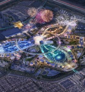
Considering the magnificent area of 1083 acres, with pavilions from 190 countries and further 20 organizational and special pavilions, on a site expecting to host 25 million visitors, designing a self-explanatory wayfinding system could not be an easy task. Considerations had to be made for the diversity of people who would be attending one of the largest global events, ranking alongside Olympics and the FIFA World Cup, as well as simultaneously exhibit the rich and unique culture and architecture of the United Arab Emirates. I believe that it was a consequence of these considerations that the wayfinding system had to be completely redesigned after 2015. 

Expo 2020 site

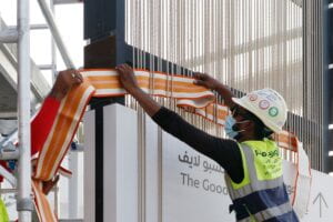
London Studio Spaceagency was appointed to develop the wayfinding and signage system for the international event including plazas, concourses, entrances, parks, car parks and internal transports, with the help of local craftspeople, over a span of 8 years. The aim of the design was to “weave the cultural heritage” into it and avoid a generic feel. 

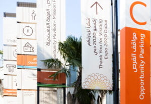
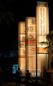
The signage design was inspired by a UNESCO-protected Emirati weaving technique called Al Sadu, which is a Bedouin tradition that is practiced in rural communities of the UAE. Each area has its own colors based on local pigments as well as regional symbols that can be woven into patterns. Similarly, each of the themes of the expo were given their color-coded identity and a different pattern using Sadu which split the expo into 5 smaller zones in order to be easily visualized from great distances and therefore provide an easier means of navigation between the different zones and car parks.


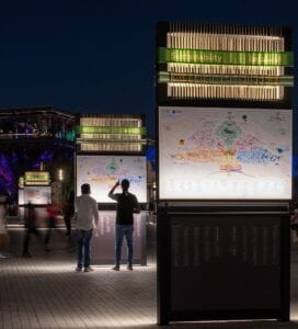
The map of the expo was also color coded correspondingly, and copies of it were placed around the site very frequently in order to familiarize the people with the theme behind each color, achieving a good balance between simplicity and redundancy. A noticeable landmark was also placed in each zone which fulfilled all the 4 conditions that a distinguishable landmark should: visible, conspicuous, easy to talk about and immutable.

Though the overall area seems easy to navigate and understand through the color-coded identities, the design and signages at particular instances, or sometimes the lack thereof, made me wonder about the effectiveness of the wayfinding system and whether the priority of the designers behind the infrastructure was the promotion of culture or ease of navigation.

As my friends and I entered the Expo, we were already lost at the entrance because we were unable to find the ticket booth. After searching on the signages for any indication of the booth, we had to eventually resort to asking an officer for the directions, getting an answer that the booth was situated after going straight, right, straight, left and then right, confusing us even further. There were also no signages in the way except for when we could already see the booth from a distance. The purpose of placing a ticket booth so complicatedly far from the entrance was something we were unable to decode.

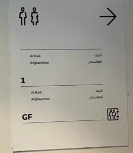
As we walked along further amidst the pavilions, we noticed that not only was there a lack of signages, some of them were also designed and placed inaccurately. An example of this was a sign which inaccurately informed us that the first and the ground floor in fact had the same spaces; Al Baik and Afghanistan were on the ground floor as well as on the first floor.

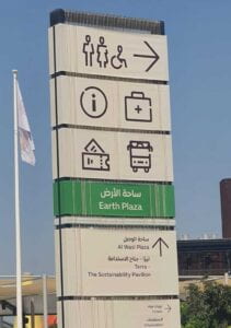
As shown in the picture below, another example was a sign board which held multiple pictograms, however without any indication of where they point towards. If the information center was on the right, under the signage or coming up ahead, was not clear at all.

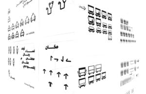
The most interesting aspect of the wayfinding system at Expo, however, was undoubtedly the unique design and depiction of the pictograms. The pictograms were created by the Spaceagency in collaboration with a Dubai-based design studio Tinkah. A calligraphic design was chosen to blend recognized pictograms with Arabic letterforms. 

The symbols were then used throughout the signage scheme at the Expo 2020 site. 

However, of how many pictograms from the picture above, can you state the meaning with utmost assurity?

Pictograms are universal pictorial signs that signify what they depict. They should be highly motivated so the intended viewer is immediately able to understand. Pictograms should also be conventionalized so they are standardized, well published and used consistently to teach the intended user its meaning. If one of the two conditions of motivation or convention fail, the other condition becomes important. If the user is not able to understand the pictogram, they should be able to remember it. If they cannot remember seeing the pictogram before, it is good to understand what it means by simply seeing it.  

However, the pictograms that were carefully crafted for Expo 2020 did not seem to meet either motivation or convention. For example, a design for a first aid kit is usually a cross in Western countries while a crescent in the UAE. To avoid conflicts of understanding, the design team eventually used a stethoscope.

As a stethoscope is not a conventionally used symbol for medical aid, the user is not immediately able to understand if that’s the purpose it serves. In an emergency situation, it is not ideal for the user to be conflicted about the meaning of the symbol instead of acting with urgency to cater to the emergency at hand. Instead a medical kit with a cross and crescent, such that is used in the Gulf, could have perhaps been designed which would indicate in clarity for both the audience its intended meaning.

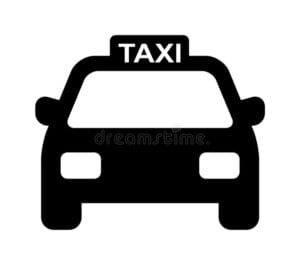
Similarly the universal pictogram for a taxi is highly motivated as the word taxi is clearly stated over it, however the one used at the Expo happened to confuse us regarding its meaning, we almost thought it was a chairlift!


On the other hand, the bus pictogram for the bus used at the Expo site did resemble the universal pictogram, however, it in fact looked similar to the pictogram of a man to indicate the direction of the toilets at the Expo, and hence instead the bus pictogram as a whole resembled a man standing behind a table, so perhaps a giveaway stand or an information desk.


Though the pictorial representation of signs in such a manner was intended to showcase Emirati culture, I personally would not have recognized the motivation behind these symbols was to represent Arabic calligraphy unless I had not read about it. Therefore, such contradictions in the design only complicated my user experience at the Expo instead of creating user enlightenment and admiration for the UAE culture.

As was done through the technique of Sadu and woven ropes behind the signages, in my opinion there was plenty of room to represent the local traditions; adding Arabic letterforms to the pictograms did not only not add much value to the depiction of Emirati culture but also failed to help maximize the purpose of the pictograms and hence could have perhaps been designed in an alternate way, if culture representation was a must.

In conclusion, the overall signage at the Expo including maps, the visibility of directions, font type, hierarchy of information on the signages were all some excellent examples of wayfinding design however improvements could have definitely been made to fine tune the user experience instead of prioritizing the ‘visual feel’ over the purpose of wayfinding.

Is the user always right?

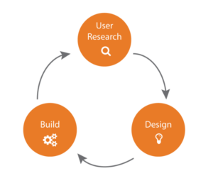
To explore the question – if the user is always right – let’s first understand what this statement actually means. People naturally prefer the path of least resistance and products that have been designed in the manner to reduce this resistance. This approach of design is known as user-centered design which is “optimizing products around how users can, want, or need to use the product, rather than forcing the users to change their behavior to accommodate the product.”

A 3-step approach to user-centered design

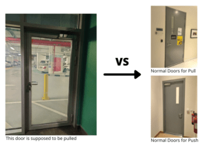
User-centered design is present even in the most basic products such as a simple example of a door. A door is user-centered if it caters to the needs of its user and is easy to use. You might be wondering how can a door not be user-centered? The door in Basement – B1 is a prime example of bad design. Having used multiple doors before, we have all come to relate the orientation of the door to understand if it needs to be pulled or pushed. Seeing the outer frames on the doors, our minds subconsciously understand that these door are designed to be opened by pushing while the side of the door that lacks frames is designed to be pulled. However the B1 door being designed exactly as doors that should normally be pushed, needs to be actually pulled in order to open it!

To put it plainly, it is the design of the object that dictates its use and not the user who is at fault for using it wrongly or worse not wanting to use it at all. 

Whether it be not using objects in the manner they are designed to be used, such as opening a soda can the wrong way, or using objects for tasks they are not originally designed for, such as using the information slabs in the Louvre Museum for resting arms and bags, it is never the user’s fault for simply using the object the way it affords to be used. One of the biggest principles of design is the principle of affordance – objects and environments should be designed to afford their intended function and negatively afford improper use. Therefore, the design should take into consideration every possible way an object could be used.

But is it really that simple? Is the user really always right? Just because a specific type of door is easy to use for users does it mean that it is well designed? A glass door, for example, may be lighter and not require much force to open (given that it does not confuse people as per the example I presented earlier), however a metal door is safer since it is not as easy to break and allows for more privacy while it may not be friendly enough to be used by people of varying disabilities. It mostly depends on the use cases of the objects, which shall not only be the ones intended, but in fact all the possible use cases of an object. The convenience of the user and the design would at times require a trade-off between numerous factors relating to the object, and in this particular case, it would be the safety and privacy of a user that would be a deciding factor towards the metal door.

Let’s break down these use cases and analyze the different factors that are involved in the design of a product apart from the design of least resistance or design which the user finds easiest to use.

But first, let’s understand who the user is of a certain product.

Every product has multiple use cases so one possible variation of a product can in no way appeal to all users. Let’s take an example of an item as simple as a tissue paper. A product not only used by a diverse population but also used by each person in that population in a diverse way. We have toilet paper, boxed tissue, paper towels, baby wipes, printed tissue, colored tissue, scented tissue and numerous others. All the tissues have the same purpose – to clean – but every user has a unique preference in terms of their needs. Hence to say, the user is always right – is not an incorrect statement here but every product has multiple users and therefore each product needs to be designed to cater to all their needs. In the example of a tissue paper, a different kind of tissue can be designed for a different kind of user, however the process is not as simple when the same product needs to be situated to the demands and needs of the different types of users that will be using it, for example in the case of the door.

To simplify the process though, if we are talking about only a specific type of a user of a certain product, does the phrase the user is always right stand corrected then?

To answer this question, let’s take an example of social media applications. Every few months, the applications need to be updated as the designers behind the applications have added new features and analyzed problems that users have faced with using previous features. Almost every other time Snapchat had a major user interface modification, I can remember everyone going into a frenzy that the new update is “so bad. I don’t like it anymore”. However, if you think of it, there were potentially some of the best UI/UX designers behind these updates, yet they always failed to please the users initially but in the long run they always succeeded towards attracting more users and generated more revenue. It can’t be that a bad design proved to engage users, in fact, the users had been used to an application for so long that accepting a new design, which may even be better for them, was particularly difficult.

While the digital applications and the users of them is more of a recent topic, there are also examples of design that seem suitable for the users in the real world that may not actually be the best for them. Examples of this would be widely used items like plastic containers, non-stick pans, perfumes and even the device screens – which are continually becoming smaller. Plastic containers, a convenient and cheap option for storing and eating food, and non-stick pans, another convenience for cooking food, may seem to be analogous to the shortest paths taken by a user due to the ease that they provide, however they definitely lead towards detrimental effects on the health of an individual, making it apparent that the user is not always right.

Hence, there is always a trade-off involved and a rational decision has to be made. The user does not always know the best decision for themselves, however data and statistics have proven that producing the right nudges (also with the help of data to some extent), can prove to be helpful for the user. An example of this is how the savings rates are low for employees that are not enrolled into a pension plan by default, however they are dramatically higher when the default option is to enroll. In both cases, the users have the freedom to change their plans, however the correct rational decision for the user is made through an intelligent nudge. Hence, what seems the best to the users themselves may not be the best choice for them.

Moreover, while the product may be designed with the intention to be used by some specific users, the design should not always only be considered with the perspective of the user. There could be endless considerations into the design, however if we were to touch the base of it, it definitely needs to be sustainable. The usage of plastic, convenient for the user, is not at all friendly for the environment and other non-users of plastic that are impacted by its usage. Therefore, considerations relating to the broader aspects of a design should always be taken as well. 

91% of plastic isn’t recycled

In my opinion, design should take into consideration the diversity of users as well as non-users . It may be suitable to some, and not suitable for others, and therefore a balance should be maintained. Additionally, design should also allow products to be used for their intended purpose in an easy manner, considering the idea of affordance, such that it takes into account all possible uses and ensures that it can withstand those, otherwise disallow them. Furthermore, the design should take into consideration factors relating to sustainability, safety and accessibility as well. All of this is the work of a designer who should take all these factors into account. To answer the question therefore, the statement the user is always right is debatable to say the least and the design process is much more complex than the statement makes it seem.

Evolution of My Perception On Wayfinding

What wayfinding meant for me?

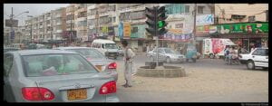
Wayfinding, a term unknown to me only 4 weeks earlier, has been a topic for my attention and the victim of my critical thinking and analysis lately. I grew up in Pakistan until I was 9 years old, where the definition of Wayfinding revolved around asking strangers on the street for guidance to the addresses, as there were no proper signages, and those that did exist had been outdated. The landmarks pertained to the very old shops or stores, such as the way I gave the address of my house to a friend by saying “Have you seen Disco Mor*? Yes the one where Rickshaw stands are. Enter the street which has ‘Imran Paan* Shop’ on the corner of it and it’s the second bungalow”. 

A picture of Disco Mor with a Rickshaw standing in front of Imran Paan shop.

I would have never realized that wayfinding is a topic of study as well as a profession. Living in the UAE in the past 10 years, I am still not sure over the routes I am allowed to take while driving. Did I ever think any of these were badly designed? No, not once. Similarly, not being able to find the A5 building, on the campus signage during Marhaba was only a consequence of my lack of sense of direction. Or so I thought. In fact, I would marvel at the architecture of our campus and how beautifully it has been designed – only before it became a victim to my critics in the past 4 weeks. Even in instances of architecture appreciated by the world, an example being Dubai Mall, I could never find my way in spite of having visited it multiple times and having asked the help desk personnel for directions. However, it is only now that I understand that the flaw wasn’t in me, it has in fact been in the design. What seems aesthetically pleasing can not be automatically regarded as being ‘well designed’.

What exactly is wayfinding?

The concept of design does take into consideration the visual aspects, since we are ultimately ‘visual mammals’, however the ability for it to be navigated easily and conveniently, taking into account the differently abled individuals, is what concatenates the idea of a good design.

Looking back at an example discussed in the class where an individual used a font of their choice, Comic Sans, for writing articles. I would not have regarded it as a problem until I was made to realize that what seems ‘cool’ or ‘pleasing’ to yourself may not be acceptable or really the standard. There are some principles that are essential and have to be followed for implementing any design. It is these principles that associate an identity to the wayfinding systems and from what I would consider a subconscious response to these systems with their consistency. Looking for Exit 11 on the highway? A small sign with blue background and text in the sans serif font will be the lookout!

Even though I have spent two years living at the NYU Abu Dhabi campus, it is only now that I realize the design inconsistency in the various aspects. In a walk around the campus, Professor Goffredo highlighted the inaccessible design, particularly referring to the braille signage around campus. In contrast to most places that lack the accessibility aspect, I had always thought our campus was very inclusive, only impressed by the braille imprints on some signages. However, when you actually think from the perspective of a person with visual impairment, you realize the significance of consistency in design – a particular example being the braille prints over the buttons outside the lift, and then being next to the button instead of being on top of them again.

Being made aware of these very small aspects that sum up a good design, I have since been observing the smallest of things in regards to design and signage. An instance, which I may not have noticed earlier, was when I saw a visually impaired person calling the ‘Public Lift 2’ on campus. I noticed that they were aware of the placement of the buttons and were aware of the design inconsistency, having spent some time on campus. However, what alarmed me was when the lift arrived, they could not easily identify with the ‘ting’ sound of the lift as to which of the two lifts had arrived. It made me realize that the problem lied far beyond only the inconsistency of design. 

Is wayfinding really even needed?

Some people question whether in the busy hurried and digital lives that we live, do we still even need wayfinding? Who even has the time to read and understand complicated maps when you can just ask around where a specific building is located? But that is exactly the point! Good wayshowing would not consume so much time to understand the maps. Maps are in place to simplify the experience of wayfinding, not to complicate it and frustrate the user. If a map is too confusing to understand or takes too long to read, it’s not a good means of wayshowing in the first place. 

Though in this modern digital world, GPS and WiFi systems have definitely simplified the experience of finding routes, wayfinding design is still crucial. A satellite map cannot tell me how to navigate to the American Eagle store on the 3rd Floor. Even if it can, it requires some prerequisite resources. If we solely start to rely on the GPS systems, how would we navigate in the absence of WiFi connection, or if the phone battery dies or if Google Maps has not even been updated with the latest routes? 

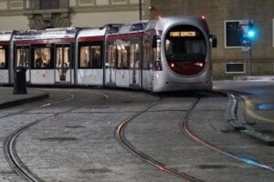
An example of such an instance was when my phone battery died on the top of Piazzale Michelangelo in Florence and I had to navigate my way back home. With no idea what times the buses will be arriving and which combination of buses will take me to my destination, I hopped on a random bus which actually took me to the outskirts of Florence. This was the first time I was truly grateful that ‘Compassing’ was only one of 9 strategies for wayfinding. Like Hansel and Gretel, I resorted to the most basic and effective one: Track Following. After asking some shopkeepers on how to get back and continuously losing my way, I was advised to simply follow the tram lines which led me directly to my destination. 

A picture of the tram lines in Florence.

Incidents like these are when we truly appreciate the importance of good wayfinding design. Different environments create different problems as well as provide different solutions. However, the 6 principles of good wayfinding design systems are constant and as follows:

      1. Perceptible by all necessary senses.
      2. Available at any user’s level of ability.
      3. Usable without enduring a safety hazard.
      4. Accessible without making significant effort.
      5. Obtainable in its simplest form.
      6. Variable in its use of media.

All in all, from not even considering wayfinding as having any relation with graphic design, I have come to a point where I actually regard wayfinding as a system of design. Anywhere I go, I view the design elements with an entirely new and considerate perspective, where something that is only aesthetically pleasing does not satisfy me, unless it is actually easily accessible and convenient for all visitors.