The wayfinding signs designed by YIEUM Partners for Gimpo International Airport attained Wayfinding SEGD Global Design Honor Awards in 2020. The simplicity of its design and the aim of offering inclusive information for everyone impressed me and I would like to share with you this project here.

figure 1
Gimpo International Airport is an extremely active airport, with an annual passenger load of over 24 million passengers, servicing over 60 international destinations and all domestic flights. However, its wayfinding signage design is not effective. In 2018, Seoul-based design firm Yieum Partners created a new total wayfinding solution from points of entry to the final departure gates.
The first challenge of this project was to provide information efficiently to people from all over the world. Signage in the airport is required to provide information in four languages. However, there are still travelers who are unable to understand any of those languages, so the team developed a series of pictograms to convey messages. The pictograms are bold and presented at a large scale on signage. Whether people understand the languages provided or not, the emphasized pictograms make the process of getting information faster and effortless. Sometimes there are only pictograms on the signage because those pictograms are so motivated and easy to understand. Sometimes pictograms are easy to understand only for people who are familiar with airports procedures. To better illustrate, text in four languages is neatly and elegantly arranged next to the pictograms. These design decisions show us the designer’s trade-off between simplicity and redundancy, and the consideration of establishing hierarchy.
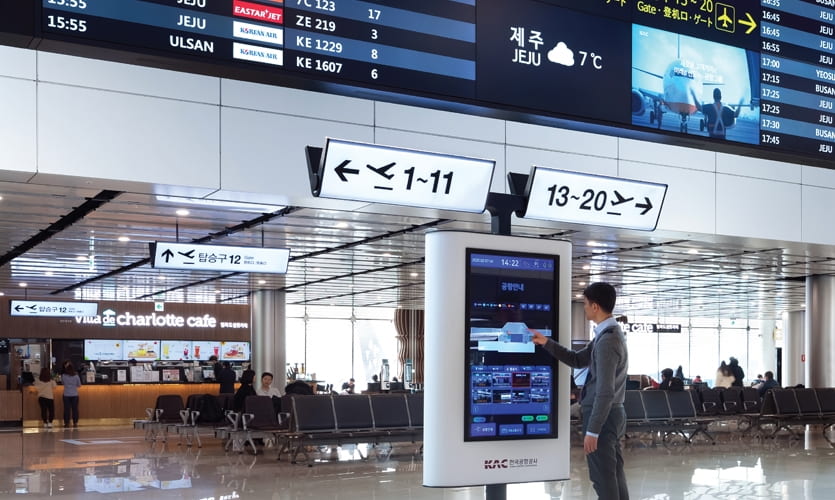
figure 2
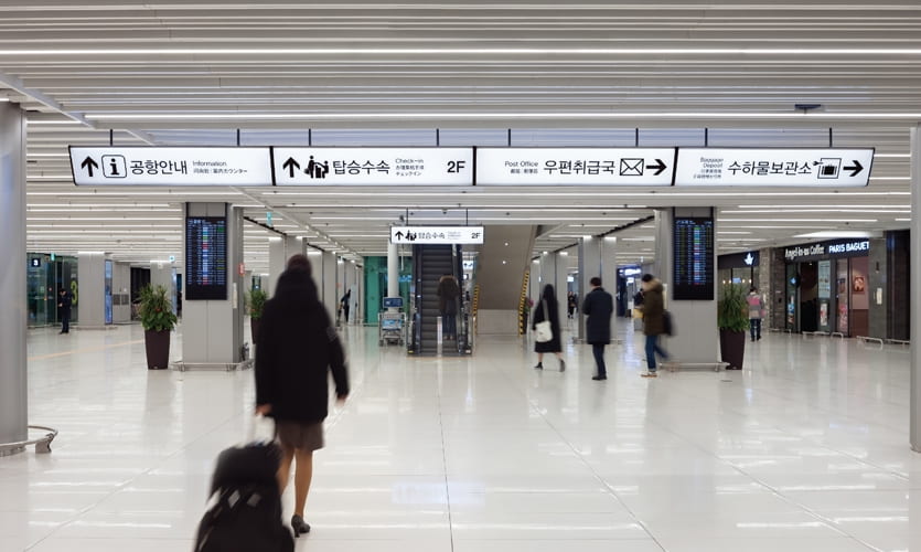
figure 3
The overall design and installation of the signage was another challenge. Unlike many other airports that use color coding, plain signage, or signage with illuminated text, Gimpo International Airport has white and entirely illuminated signage. It is because the structural layout of the airport – a space of low ceilings and a densely populated field of structural support columns – created a very limited field of view, making the existing signage nearly invisible. The illuminated signage, unified and continuous design, and striking and concise typography make the signage stand out from the complex surroundings, increasing its legibility. The signage can also act as a light source to create a brighter environment. With low ceilings, the team also installed the signage at an angle to ensure a safe height for the space.
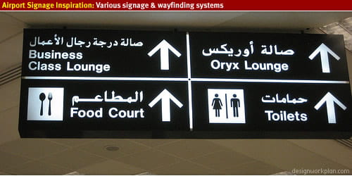
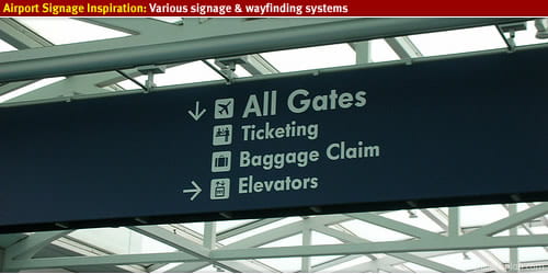
figure 4 Doha, Qatar figure 5 Portland International Airport
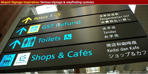
figure 6 Singapore Terminal 3 Airport
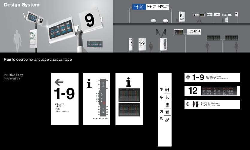
figure 7
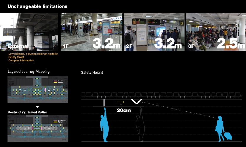
figure 8
The placement of signage also has an important impact on wayfinding. By looking at the before-after picture (figure 8) I find that simply changing the position of the sign without changing any information can change the path of people and make it more orderly. In my opinion, it is all about user experience. Only by simulating the real process of wayfinding in the airport, simulating travelers’ action after seeing the sign, and understanding the user’s psychology, can a successful and effective sign system be achieved.
Based on my personal experience, it can also be helpful to show the time it takes to get to the gate on the signage in airports. This can reduce people’s anxiety and help people organize their time reasonably. People can use their extra time to eat nearby or visit duty-free shops without worrying about not being able to get to the boarding gate that they don’t know how far it is on time. Marking the estimated time spent can also help people find the shortest path. For example, when I was looking for a subway station entrance at the Shanghai Hongqiao Airport, there was a sign showing that there were two entrances on my left and right. At that time, if the estimated time was displayed, I could quickly choose a direction, instead of hesitating and hoping that I was lucky enough to choose the closest one.
Reference
“Gimpo International Airport: Info Inclusive For Everyone | SEGD”. Segd.Org, 2020, https://segd.org/gimpo-international-airport-info-inclusive-everyone.
“Airport Signage – Designworkplan”. Designworkplan, https://www.designworkplan.com/read/airport-signage-photo-inspiration.