“Wayfinding: Graphic Design in the Built Environment”, a course posted on Albert caught my attention because the course reflected a crossroad between two seemingly unrelated and independent dimensions – graphic design and Wayfinding. A friend of mine advocated for this course and I decided to enroll in it hoping to be amazed as I have been with most of my cores. Looking back at it, only in the span of 4 weeks, I consider it to be one of the most intriguing learning experiences during my 2 and a half years at NYU Abu Dhabi.
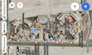
Before the class, I wondered the relevance of physical Wayfinding systems in the digital era that we live in. We have digital maps in our pockets through the powerful web and mobile applications by companies such as Apple and Google. These maps even support regularly updated satellite images, support aerial view, shortest paths, make use of Machine Learning and have any relevant information you would need.
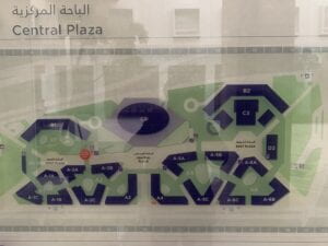
The essential need for the maps like the one attached below could be replaced:

Now that the digitized version attached below is even more enhanced:

However, I have come to believe that it is in fact very necessary to have efficient physical Wayfinding systems in the built environment. These digital maps may navigate us across broader areas effectively, however they fail, owing to the limitations of the existing technology, to serve the needs at the micro level. If you are inside of a College Building, or a Mall, or even in a relatively smaller open area, regardless of the satellite view, it becomes difficult to navigate through. Adding on, being dependent on technology is not always reliable. What if your phone battery dies or you lose the internet connection? It is essential in any case to be familiar with the Wayfinding systems.
If Google Maps or other similar applications had been reliable enough, it would not have been a regular sight seeing Deliveroo and Talabat riders roaming around the highline at NYU Abu Dhabi, seeming to be very lost and finding it difficult to communicate in a foreign language to ask for directions.
However, technological advancements have been taking place rapidly. An example of this is the ‘Live View’ feature of the google maps which makes use of Augmented Reality. A very recent development in this regard has been made with the partnership between the Zurich Airport and Google for providing directions on the user’s smartphone screen, making use of the back camera, which will guide them through directions on their screen. While this is a very interesting step and allows us to dwell on what the future in Wayfinding could potentially look like, perfecting this technology may definitely take time and then mass adoption by people could take even further. It may be easier to navigate, but not when someone is rushing for their flight by looking at the directional signages on the huge sign boards – they wouldn’t make the effort to open their phone, wait for the application to load up and hope that the machine guides them accurately and instantly. The need for physical Wayfinding systems, no matter where technology leads us, will always be integral to us.
If you haven’t noticed, all the aforementioned perspectives have taken into regard gifted individuals only. A very specific user base, the ones that can potentially read this blog post and those who could write using a keyboard. A significant learning on the Wayfinding has been to take into account the differently abled individuals amongst us as well. While the technological advancements do help with this by making use of Audio directions, the traditional methods will always be very essential (referring to the reasons mentioned earlier). This is what emphasizes the importance of design in Wayfinding systems, making it clear, accessible and perceivable by everyone (not only a specific target audience).
Now that we have discussed the significance of Wayfinding, I will look at the Wayfinding systems of NYU’s Abu Dhabi campus – where I have been navigating daily. Looking back at the Candidate Weekend, and then the Marhaba Week on campus, it is only now that I realize it was never my fault to not know my ‘way’ across campus. While I thought the campus was literally a puzzle over Candidate Weekend, it was still slightly better in the Marhaba Week and even then I had to ask an upper class person for a tour around the mere 8 buildings on campus.
Dwelling back, thinking from the perspective of an outsider, we were given the task, as part of the course, of guiding our way through a few buildings on campus, starting from the basement. Keeping aside the appreciation of the campus’ architecture, the task acted as the realization of the inconsistent Wayfinding design on the campus, coupled with the essential urge as a student to fix it, and the potential difficulty to be suffered by any visitor – particularly those who would have had to navigate their way from the (basement) B2 and might have to go to the (building) B2, not knowing when they are at their destination. Inconsistency in language was the major takeaway, as there were instances of ‘University Club’ and ‘Torch Club’ on different signages when they pertained to the same location. Even the Dining Halls, D1 and D2, are referred to by various names such as the West Dining Hall and Campus East Restaurant, lacking consistency. The lack of an easy-to-navigate system is what has caused me to understand the ways around campus only by walking around and getting lost multiple times.
My family always considered me as ‘inattentive’ for not knowing the ways of my area by heart, relating this discussion to my younger self, I realize it was again not my fault solely. While I do agree I was not extremely attentive to memorizing the ways then, I was not the same way in my study away in New York in Fall 2021, as I can claim to guide myself to 23rd Street and 3rd Avenue, where I lived, from any corner of Manhattan.
This brings me to the topic of the amazing New York Subway system. Once again, the google maps did get us closer but finding the actual entrances of the subway system, which might have been a challenge, were resolved due to the consistency in the design, specifically pertaining to their font, Helvetica. You could spot from afar, the similar designs and representations from the entrance designs of the subway to the banners and signages, and if anyone were to get lost in the streets of New York – I would regard it to the lack of attentiveness.
Wayfinding and Design go hand in hand. Whether it be towards considering accessibility or a general consensus on Sans Serif font for Wayfinding Signages, the goal is to progress towards enhancing the experience of a user. A similar combined effort as is between the user interface and user experience of mobile and web applications can also be applied towards Wayfinding design.