My experience with design
I have been a graphic designer since 2013. Throughout all these years, I have come to create manipulation designs, branding projects, marketing campaigns, and localized Arabic logos. Previously, when I thought about concepts such as planning, way-finding, or any similar concepts, I previously believed they were mainly related to the job an architect or an urban planner, not me as a graphic designer. While this might be, to some extent true, I come to realize lately that my entire perception of graphic design was limited—more of a digital-oriented definition— if we can describe it that way. And whenever the word “design” came to my mind, the first thing that I would think of is Adobe Photoshop and Illustrator, and nothing else. However, when I think of the same word “design” in Arabic, I think of design in the real world, not the digital one. While this might seem an ordinary point, it was they eye-opener for me; since the class started, I began to notice how design is everywhere around us, not just some elements, images, or shapes that insert into a screen or a software like Adobe Photoshop.
Design and the user
I would like to quote Professor Goffredo’s words that the English word “design” adds a type of ambiguity to the word that makes it comprehensive of all meanings related, unlike Arabic. Design in my opinion is how you change the experiences of others and give them a new way to witness and be affected by them. It is how you guide the subconscious minds of people to do things they might not be aware of, but we, as designers, must be aware of in order to give users the best experience. I think that such a conception is important in the sense that it will change designers’ motto from “the client is always right” to “the user is always right,” because through it we put ourselves in the shoes of users and know what will be suitable and what won’t, and this will be reflected in everything surrounding us.
Losing my way at NYUAD
When I first arrived here at the NYUAD campus for the first time, I was accompanied by one girl from the senior class who kindly volunteered to show me the way to the residential buildings. We walked from the welcome center, passing by the gigantic words of “NYUAD” that welcome visitors, and then headed left and straight on to the elevator. I was impressed; “where is this elevator taking us?” I asked myself. In less than a minute, I found myself in front of residential buildings, as if I teleported to another place. The idea of buildings that are built on other buildings—particularly our campus—was difficult for me to fathom. At this very moment, I realized how complex the NYUAD campus is. In the days that followed, I struggled to find my way around, was even made fun of by friends who questioned how I couldn’t navigate through the campus and went through embarrassing moments because of it. With all of that, I thought the problem was me, as the design is good, and as long as it looks good, then it is perfect. I was wrong.
Why can’t we find the way easily?
The problem today with design is that there is less focus on the experience of the user, and we are working more on producing the most beautiful designs without caring about the practicality and accessibility of what we design. I believe that questions such as “Is what we are designing suitable for people with disabilities?”, “does this design make it easy for people to navigate around and find their way without being lost?” or “is the signage we are designing catchy enough for people to notice?” are questions that are rarely asked in such design processes. When Professor Goffredo told us that the process of establishing means of wayfinding started right after construction, not in the process of designing the campus itself, it explained a lot to me why anyone is subjected to losing his way around campus, at least ones.
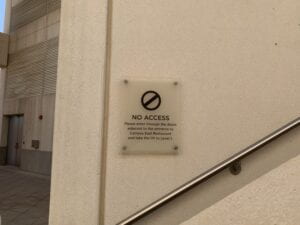
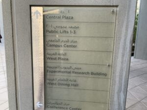
Two weeks ago, my group was asked to go around the NYUAD campus to analyze and evaluate wayfinding on campus starting from the car park in level B2 until we reached the torch club right above D2. Through that process, it happened that we, particularly people who are supposed to be familiar with the campus and its intricacies, even went through lots of problems with finding our way, let alone guests who come here for the first time. Hence, this course made me realize the importance of wayfinding around us.
The purpose of wayfinding
In my opinion, the purpose of wayfinding is making the user able to go around somewhere for the first time, and you, as a designer, has made sure that you prepared the route and the tools for him, through which he, even without prior knowledge on his part, can still able to find his way easily to his destination without losing his way. From what I see today, designers build and expect users to be able to discover and experience for themselves; there is not much focus on how making the user find his way, and if there is, then it is most probably not efficient (consider our campus as an example).

Sometimes designers do leave signs and directions; however, they can be misleading as well depending on the events taking place.

This can be due to various factors such as:
- An unclear numbering system
- Not focusing on how the direction design will be applied in real life (and where it will be put and choosing ambiguous pictograms (a triangle or an arrow for instance)

- Using fonts that lead to difficulty in readability
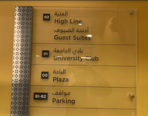
- A variety of naming systems used in designs at different names to refer to the same places, which might confuse the user.

We discovered by chance that the University club is the same as the Torch club While this class helped me put on a new lens of finding such mistakes in wayfinding, it also made me realize how difficult it can be to find solutions, it was eye-opening for me and made me realize how brilliantly our subconscious minds operate the way they do. We should put ourselves in the shoes of the user and think accordingly; if we leave something in front of the user, then it must have a purpose. If there is a button, then the logic says it must be pressed. If there is a sign, then it is there for one to follow. Hence we should always pay attention to these certain cases of affordances because even a slight change in the typeface can lead to drastic changes and how the message and its tone are conveyed. In the end, all it takes is a single sign in the street, which can lead to both the confusion of the user or him finding a way.
I loved the transition that you made in your definition of design. To be honest, I thought the same way as you did too – that anything that is beautiful is design. Needless to say, I could not be more wrong. Design is not beauty; beauty is more of an accidental by-product of good design. However, as time passed and design evolved into many different branches, I think people started to confuse beauty with good design, which is not the right understanding of good design. Good design is any design that serves its purpose perfectly well. This was an eye-opener for me. Thank you