As a semester full of learning in this class comes to an end, I look back in retrospect upon the meaning of Wayfinding and how my understanding of it has evolved. In my first blog, I wrote about my first thoughts on Wayfinding and described it as “a practice that has underlying complexities” and is “…about orienting people in unknown spaces and making the process natural”. However, if I now question myself, I was really unsure of what those complexities consist of when I was writing that blog. The class discussions and activities then introduced me to these practices, ideas, and principles that I then referred to as ‘complexities’. From the theoretical ideas of Wayfinding methods, affordances, and nudges to actually implementing those in my designs, I started experiencing what a wayfinding designer really does. So the class became much more than a class about graphic designing, it became an experience where ideas are given a frame of a wide variety of theoretical considerations, judged from a critical lens, and then shaped into reality. Whether it be going through different iterations of maps and diagrams with Jug Cerović or brainstorming so many impossible ideas for a pictogram on the whiteboard, what I learnt through the lectures found its place in reality through an integration of all the theoretical concepts. However, there was much more to it. A significantly important and sizeable portion of my learning experience about wayfinding and design came not just from theory and practice, but from my interactions with my peers.
Everyone in the class brought a unique perspective and set of skills to contribute towards the topic. The very first activity of our names in pictionary revealed how AbdelRahman is really skilled at quickly thinking of effective designs and then creating them using the graphic design tools. For most of us it was a new skill to learn, and so we had a different learning curve. However, seeing so many designs come up so quickly from AbdelRahman helped me understand the design process better, and helped me visualize what good designs could really look like. This undoubtedly helped me learn the Adobe suite quicker. Working and brainstorming ideas with Zunair, Ishmal, and Muskaan helped me give coherence to my thoughts while working on pictograms. Zunair brought a critical eye towards the practicality of an idea in wayfinding systems while Ishmal and Muskaan helped me make the pictograms wildly impossible. Laura’s critical questioning of whatever we discussed in class with the Professor or one of the guest speakers helped me ask questions that gave me a better perspective of wayfinding systems and ideas. Ulan’s openness to collaborate and Yeji’s cheatsheet’s design gave me ideas out of my own box of creativity while Jia’s design work based on the many theoretical ideas and her analysis of existing systems in her blog inspired further refinement in my own ideas. It would be unfair and impossible to try and summarize everyone’s contributions to my learning experience throughout the semester in just one blog. However, one thing is certain: every time anyone offered any opinion, it added another angle to my own perception about the different topics we came across. Without that, I would have had a very narrow understanding of wayfinding design no matter how many texts I read or how many designs I made. Through integrating all the different ideas coming from my peers, I have come a long way in learning about wayfinding. As I quoted Clement Mok, former creative director of Apple Inc., in my first blog:
““If you look at studies in wayfinding,…,it’s about creating a complete system. It’s about looking at the whole”.
What do I mean when I say “I have come a long way in learning about wayfinding”? Here, I do not just refer to what I learnt inside of the class. Before enrolling in the course, I came across reviews saying you will actually find yourself seeing design differently everywhere. The first campus activity of noting the wayfinding design issues was just an introduction. Soon, I had learnt so much about wayfinding systems that I started viewing everything with this critical angle I had just gained. This became to the point that some designs even became annoying and inconvenient when I could understand how little or no attention has been paid to wayfinding elements in these systems. Be it a walk on the campus highline, navigating myself in World Trade Center Mall Abu Dhabi, finding my way in Expo 2020 Dubai, or walking through the streets of Tbilisi during Spring Break. While I could see how ideas like simplicity and redundancy of design and integration of wayfinding principles could make these existing designs so much more helpful, I also found myself being able to easily find my way by employing some of the wayfinding ideas that we came across in class. Being less reliant on what Google Maps told me and employing track following, educated seeking, among other ideas worked for me almost all the time and I could actually enjoy seeing the world around me instead of staring down a path on my phone screen.
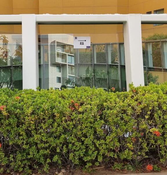
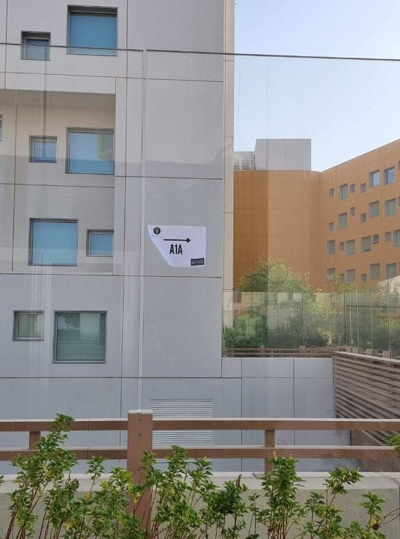
This critical analysis of existing systems makes me wonder about how much thought should be given to improve poor designs? And when does a wayfinding design fail? On a walk back to my room from class, I noticed something that immediately made me think that all the wayfinding design on our beautiful little campus has failed miserably. The disoriented maps, the conflicting directional signage, the unorganized braille, and the hidden components have no meaning at all and are really just there to check boxes when people cannot even use them. The following pictures I took will show you what I am talking about:


These paper signs were pasted across the campus pointing to buildings like A1A and D2. I even saw one saying “D2” pasted on a wall of D2 itself. Upon further inspection, they seemed to be pasted to help some visitors for an event to navigate on campus. Still, even with these paper signs, a visitor asked me the directions to A1A from palms at 4 a.m. While these speaks volumes about how the existing wayfinding systems have failed, it also invites and creates a space to think about what can be done moving forward. Surely, printing on A4 sized papers for every building every time there is a potential visitor unfamiliar to our campus spaces is not a very impressive solution, let alone effective or sustainable. From what we identified in this class, and this seemingly final nail on the coffin, the NYUAD campus is in critical need of a significant update to its wayfinding systems that are designed not just to check boxes but to actually help the users of these systems find their way.
From the number of buildings in this campus, the ambiguity surrounding their names, the ever moving offices, the dynamically shifting spaces, and the growing number of centers on campus, it can only be safe to assume that the problems are projected to increase. This is an example of a small campus where poor wayfinding design leads to problems. Now think of a larger system, perhaps cities like Abu Dhabi or projects like Etihad rail that are directly connected to millions of people and not just a few hundred on a university campus. The problems related to wayfinding could grow exponentially and, thus, it is imperative to have systems built around good wayfinding ideas at their core.
While our class is now attempting to provide some useful wayfinding recommendations to some centers on campus, it is going to take institutional effort for a major improvement. Nonetheless, the concepts I learnt in class from the lectures, from practice, and from my peers were vital in helping me think more critically about wayfinding. With an ever present need of good wayfinding design, it might be a wrap for our class this semester but now it’s never going to be a wrap for my learning experience around wayfinding.
Hi Muhammad, your question ‘And when does a wayfinding design fail?’ provoked many additional questions on my mind. I wonder whether a wayfinding design system can ever be satisfactory to all individuals using it. Considering the different level of needs we have, I wonder how many rounds of user testing is required to create a wayfinding system that works for all individuals. Also, considering how the social needs change based on time / location – zeitgeist – it seems that a wayfinding system that does not fail, from my perspective, is one that is endlessly adaptable, open to change and redesign based according to the user’s need. This would, however, be very challenging practically. Would love to hear further about your thoughts on this as well. Really enjoyed reading your post!