Jug Cerovic’s lecture and workshop about map design is one of the most fantastic learning experiences I have ever had. I’m most interested in metro map design and I would like to share my takeaways and thoughts in this essay.
Schematic maps are the most efficient way to represent metro systems. Since most of the subway’s facilities are underground and people can not explore the tunnels on their own, some physical characteristics like distance, direction, and shape become less important. Therefore, when designing a metro map, the path can be simplified. The connection between underground locations and geographic locations on the ground only needs to be roughly represented. The information that people need to know, such as different lines, stations, and ways to transfer, has to be presented in an orderly, clear and concise manner. Motivated by these principles, Cerovic summed up a universal design language and rules for the metro maps. He then designed unified metro maps for more than 50 cities in the world.

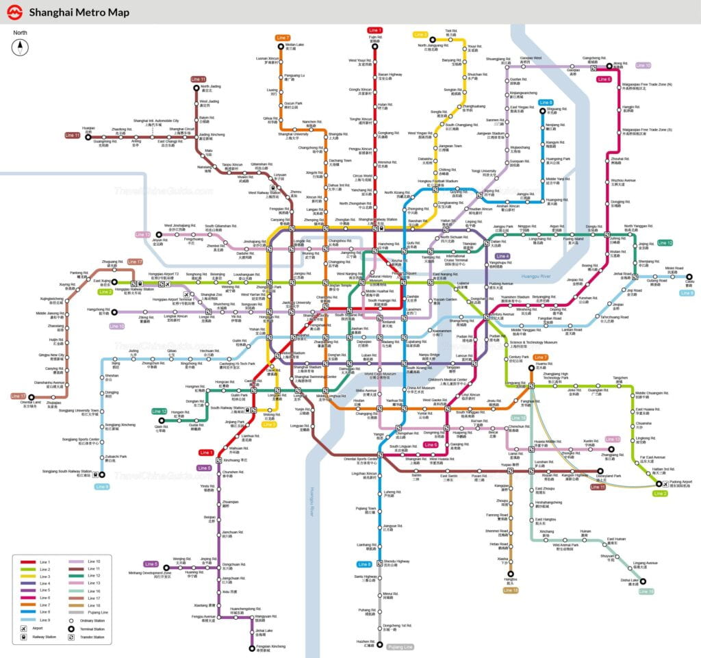
Figure 1 Shanghai metro map 2020
https://www.travelchinaguide.com/images/map/shanghai/subway-map.jpg

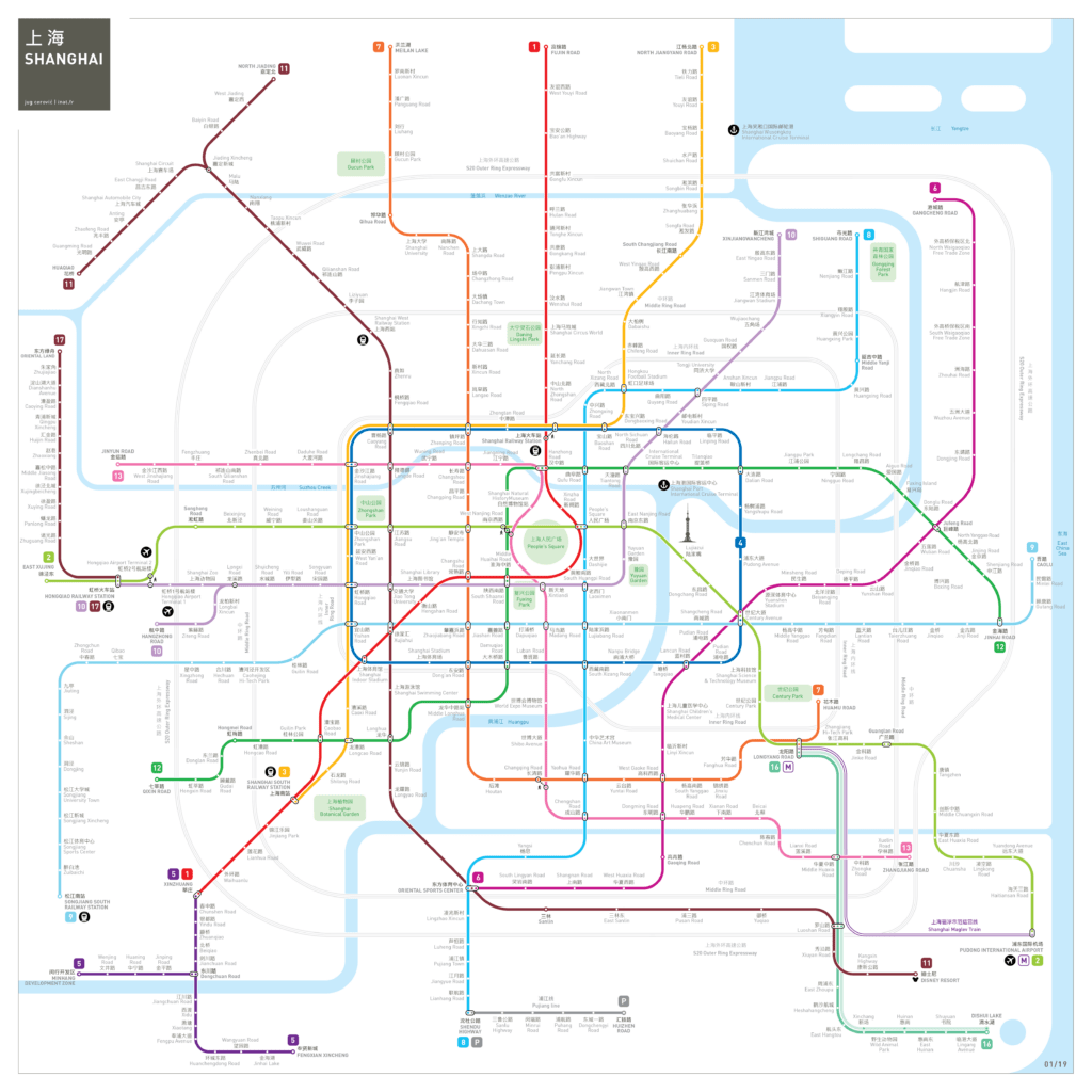
Figure 2 Shanghai metro map designed by Jug Cerovic
http://www.inat.fr/metro/shanghai/
As I lived in Shanghai, I’m curious about the difference between the metro map Shanghai uses currently and the map designed by Cerovic. According to my experience of living in Shanghai, I thought the Shanghai map completes the role of navigation and is clear and effective. However, when I compare it to Cerovic’s Shanghai metro map, I realized that it could be much better designed. Comparing the two maps, my immediate impression is that although the two maps show the same amount of information, one is very crowded and cluttered while the other is delightful and concise. How did Cerovic do it? First, he simplified the path of the metro lines, omitting small changes in the path, and using straight lines to represent them. Second, he appropriately expanded the proportion of the central area, giving more space for dense information. Third, he considered the importance of information and uses different colors and sizes to establish hierarchy. Considering that the information-heavy metro map is not suitable for viewing at a distance, he used thinner lines and smaller texts. The blank spaces provide a pleasing visual experience and make it easier for people’s eyes to locate information.
Cerovic’s map even contains more information, including Shanghai highways, famous parks, and the Pearl of the Orient. The application of landmark labels connects the underground metro system to important locations, helping people relate the metro map to their mental maps, and making it easier for people to find their way.
Beyond that, he did an amazing job in defining symmetrical shapes from concrete metro lines. On the current map of Shanghai, I can vaguely find rectangles and grid shapes in the central area. In Cerovic’s design, the rectangle is more conspicuous. The grid is also more organized due to the same distance between lines. The most outstanding design is the water drop shape in the center. The literal translation of the second character in Shanghai (上海) means the sea (海). I don’t know if Cerovic did it on purpose, but the shape of the water drop makes the map strongly associated with Shanghai, in a sense integrating the city’s identity symbol into the map design. This association and transformation are incredible to me.
Also, he could have reduced the pink line (line 13) to a vertical straight line, but he chose to create a memorable shape to add features to the Shanghai metro map. One of my biggest takeaways from his lecture was that one of the essences of design is making choices. Designers choose what information to present, what information to hide, when to incorporate distinctive shapes, and when to apply unity. They choose the balance point between simplicity and redundancy, symbolism and functionality. The choices are made based on context. It is only by investing a great deal of research and practice that we can make reasonable and comprehensive choices.
Thank you for this post, Jennifer! I, too, really enjoyed our workshop with Jug Cerovic (it was probably a highlight of this whole class for me) and this post reminded me why. As you said, he highlighted the art of decision making in design and that for me was a key takeaway from the workshop as well. Even just seeing the two maps of the Shanghai metro system makes this so clear – one is much less cluttered and easy to navigate. Thank you for such a comprehensive summary 🙂