In our everyday life, we make use of a vast variety of products and services which belong to numerous brands and companies. While the process of creating a physical product requires different planning from developing a software product, one thing they have in common is designing it to effectively cater to the needs of the target audience. However, a very important part in the design process is to also make it look visually appealing, since we are Visual Mammals – one of the first statements by Professor Goffredo from the Wayfinding Class that stuck with me.
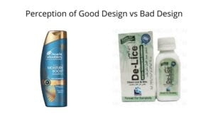
As per my personal experience, I often purchase products that have a better design, since I believe it subconsciously triggers my brain that design emphasizes the credibility of products. A brand that comes up with a new bottle of shampoo with a very old school and boring design, but actually very effective, may not even attract my attention, however, a brand that has a very stylish and fancy bottle having only a plastic bottle with a good color combination and a decently designed wrapper in their product would automatically become more appealing.
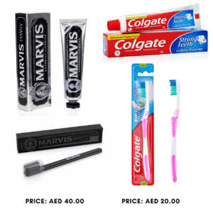
 A similar example of this is a new brand of toothbrush and toothpaste that I saw for the first time in my life at the convenience store at NYU Abu Dhabi. The packaging immediately attracted my attention even though the toothbrush was 2/3rd the size of a regular toothbrush and the toothpaste was equivalent to a travel size bottle of toothpaste. Regardless of the huge difference in quantity, the price difference was inversely proportional, such that the new brand was twice the price of a Colgate Toothpaste but half its size. Similarly, the toothpaste did not have any unique features, it was a plain and simple toothbrush, but the only thing that felt different from a first look was the way it was presented, its packaging and design, immediately grabbing my attention. Being honest, I was instigated to purchase that toothbrush just to try it out, but a rational mindset prevented me from doing so.

Knowing how design instigates my thought process and decision making in the regard that is mentioned above, I can’t help but think over the reason behind such rationale. This leads me to dwell upon the discussion of Familiarity and Bias in our Wayfinding class. As was highlighted in the class, brands pay a significant amount of money for advertisements, such as those in Times Square, in order to build trust so we subconsciously care more about them. I believe that a similar ideology can be navigated towards our familiarity and bias of the types of design. The way we can differentiate between a good design and a bad design is aided by the trust that is being built by the advertisements and design that is most frequently present around us. To explain this further, I will bring back the example of the aforementioned toothpaste company and appreciate the way they made use of the concept of nudge by producing a design that resonated with the concept of royalty and eliteness that is present in our mind. An elegant, pure black, simple and shiny packaging with a high price would definitely nudge us towards paying attention to that product.
Moving from the digital products to software products, websites and web applications have also developed a certain style of design that pertains to the norm and in a very similar fashion, the credibility of these startups is sometimes analyzed by how well their website is designed, at least to myself. If a company advertising its new software has a very sleek, unique and stylish website, I will be triggered to check it out in its entirety, but would not even pay full attention if the website is just like any other basic website.
As I have explained how I believe my personal decision making is influenced by design, it in fact goes far beyond an individual’s personal preferences and also impacts situations that have a life-changing impact. Two scenarios of such are explained in the Second Chapter of the book ‘Visual Explanations’ by Edward Tufte, from which we will look at
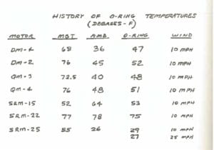
One of them was the Space Challenger Shuttle that exploded on the 28th of January in 1986, resulting in the death of 7 astronauts. In this scenario, it is very difficult to attribute a space shuttle and explosion to visual design, however the principles and learnings towards design lie at the back-end of this incident. When the engineers realized that the temperature on the day of the launch could potentially be detrimental towards the launch of the rocket, they immediately faxed a total of 13 charts to NASA, proposing to halt the scheduled rocket launch. However, the proposal was disregarded due to the lack of evidence presented by those charts, meaning that a lack of visual representation and convincing resulted in the lives of 7 people.
Researching deeper into the charts presented by the engineers, not only was there loads of irrelevant information not pertaining to the impact of temperature on the rocket, but incorrect representation with a lack in the data that was presented to support it. An example of this can be seen via the following graph that demonstrates the relation between temperature and O-rings, which was the cause of the explosion.

Compared to the next graph, which was produced later after the explosion as a learning from the incident, explains it much more clearly, to any individual not even pertaining to the field of engineering. It clearly shows how there were some incidents with temperatures of 70 degrees, however, as we go below 63 degrees, the incidents become more frequent, and just with this information, any individual would not be in favor of allowing a launch at the temperatures between 26 and 29 degrees.

Similarly, an interesting chart that was produced later beautifully shows the relationship between temperatures and the severity of incidents. It can be clearly seen that a lower temperature than 53 degrees would be totally a no-go.

By now, through the representations, it may seem that I am stating the obvious, however proper visual representations and design do have a great amount of significance to influence our decision making process. As we are Visual Mammals, we are appealed towards what pleases and convinces us visually.
The toothpaste example is 100% on point. I made the same mistake of being fooled by the beauty of the packaging design at the convenience store four months ago. I hurriedly went to buy a toothpaste and chose one based only on how it beautiful it looked and decided to try it. ( it was this one: https://binsinaimages.azureedge.net/images/catalogimages/73085_1.jpg)
After using it for one month and a half, I began to feel pain in my front teeth. After visiting a dentist and searching the internet, I found that this toothpaste (which is a charcoal toothpaste) is abrasive and in most of the times can detrimental to teeth.
Thanks for highlighting this issue! It’s interesting how we can choose something that can be harmful to us but we don’t even know just because we focus on aesthetics.