Olympic pictograms appeared for the first time in 1964 at the Olympic Games in Tokyo. Japanese developed this international language in order to communicate with people all over the world in ways other than words and writing. Their graphic symbols, which were both effective and modern, were used to indicate the various events on the program, but also all the services provided to the spectators. It was a big innovation. Since 1964, each edition of the Games has generated its unique set of pictograms and redefined the genre.
To make Olympic pictograms, the key points are: simplify the athlete’s body as much as possible; Show the athlete moving in a proactive position; Indicate the sports equipment.
Here are the pictograms for the 1972 Games in Munich (Germany).
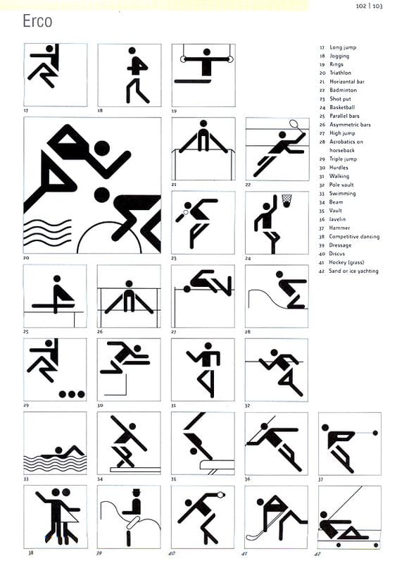

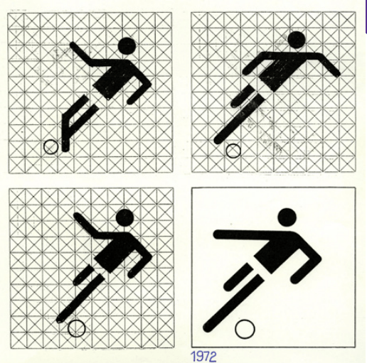
With only a few Elements, designer Otl Aicher was able to depict 21 sports. Aicher’s pictograms marked the debut of the circular head, the 45 and 90 degree angled lines, and the simplified body shapes that would become standard stick figure iconography not just in the Olympics but throughout the world. In fact, Aicher’s technique of representation through design was adopted by the United States Department of Transportation as they developed the DOT pictograms in 1974. The famous toilet pictogram is one of those. According to Aicher, he based them on “tongue depressors” to create his characters. His athletes had skinny stick-like bodies as a result of this. He made use of the Univers typeface for the Olympics. This series was a great success and influenced later editions for almost 15 years.
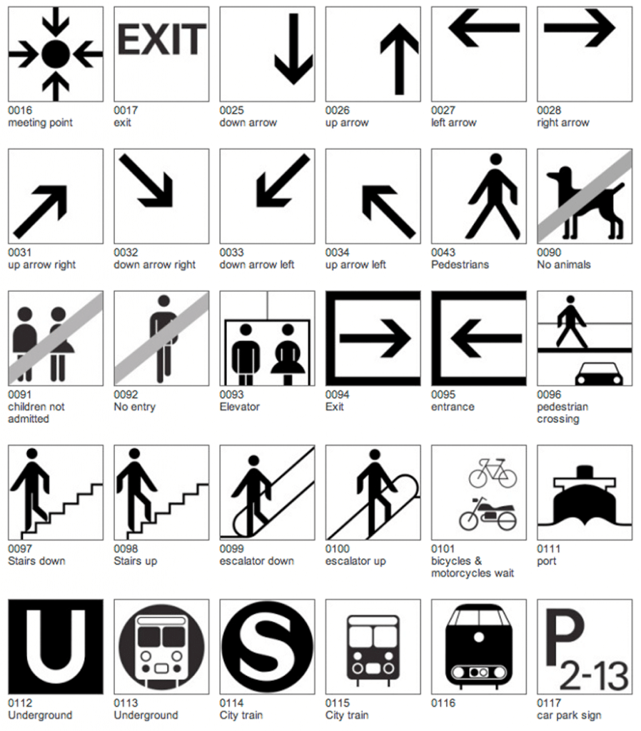
In addition to Olympic pictograms, Aicher also developed one of the most iconic wayfinding symbol sets in the 1970s for the Frankfurt airport. The set is a comprehensive system for air traffic and travel influenced by the most modern and futuristic design of the time. The symbols are ubiquitous today since they are the original contemporary symbol set for airports and their style and approach have been copied many times over.
Sometimes, the branding role of Olympic pictograms is more important than conveying understandable information. For example, the pictograms for the 1994 Winter Olympics in Norway were based on famous rock drawings in Norway that date back thousands of years. Sydney’s use of boomerangs in 2000 is also culturally relevant. Beijing’s are calligraphic representing Chinese tradition.
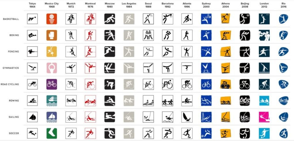
A poorly designed Olympic pictogram won’t lead to a dangerous or embarrassing situation like a poorly designed toilet pictogram. But in general, when it comes to pictogram design, conciseness and specification are way more important than artistry.
A good pictogram should be clear, simple, motivated, and easy to understand. As we are going to design pictograms for our next assignment, I think the following tips will be helpful.
– Draw pictograms on the grid to maintain consistent positioning and proportions
– One pictogram should not look heavier or lighter than other pictograms of the same size. Maintain the same visual weight by using the same stroke weight when designing
– Never distort pictograms and be sure to avoid dimensional representations. Use more objective vantage points that are straight-on or profile views
– Use 45 angles or use increments of 15 angles to create harmony
– Use straight segments, perfect arcs where possible
– Pictograms are aligned to the center of the grid within the boundary box.
– Communicate the ideas with only the most essential elements. Avoid details
Resources:
https://www.wired.com/2016/08/decoding-hidden-meanings-olympic-symbols/
https://www.fastcompany.com/90160160/decoding-pyeongchangs-olympic-pictograms
https://www.ibm.com/design/language/iconography/pictograms/usage