To explore the question – if the user is always right – let’s first understand what this statement actually means. People naturally prefer the path of least resistance and products that have been designed in the manner to reduce this resistance. This approach of design is known as user-centered design which is “optimizing products around how users can, want, or need to use the product, rather than forcing the users to change their behavior to accommodate the product.”
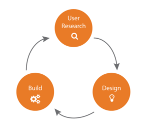
 A 3-step approach to user-centered design
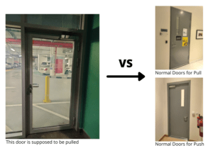
User-centered design is present even in the most basic products such as a simple example of a door. A door is user-centered if it caters to the needs of its user and is easy to use. You might be wondering how can a door not be user-centered? The door in Basement – B1 is a prime example of bad design. Having used multiple doors before, we have all come to relate the orientation of the door to understand if it needs to be pulled or pushed. Seeing the outer frames on the doors, our minds subconsciously understand that these door are designed to be opened by pushing while the side of the door that lacks frames is designed to be pulled. However the B1 door being designed exactly as doors that should normally be pushed, needs to be actually pulled in order to open it!

To put it plainly, it is the design of the object that dictates its use and not the user who is at fault for using it wrongly or worse not wanting to use it at all.
Whether it be not using objects in the manner they are designed to be used, such as opening a soda can the wrong way, or using objects for tasks they are not originally designed for, such as using the information slabs in the Louvre Museum for resting arms and bags, it is never the user’s fault for simply using the object the way it affords to be used. One of the biggest principles of design is the principle of affordance – objects and environments should be designed to afford their intended function and negatively afford improper use. Therefore, the design should take into consideration every possible way an object could be used.
But is it really that simple? Is the user really always right? Just because a specific type of door is easy to use for users does it mean that it is well designed? A glass door, for example, may be lighter and not require much force to open (given that it does not confuse people as per the example I presented earlier), however a metal door is safer since it is not as easy to break and allows for more privacy while it may not be friendly enough to be used by people of varying disabilities. It mostly depends on the use cases of the objects, which shall not only be the ones intended, but in fact all the possible use cases of an object. The convenience of the user and the design would at times require a trade-off between numerous factors relating to the object, and in this particular case, it would be the safety and privacy of a user that would be a deciding factor towards the metal door.
Let’s break down these use cases and analyze the different factors that are involved in the design of a product apart from the design of least resistance or design which the user finds easiest to use.
But first, let’s understand who the user is of a certain product.
Every product has multiple use cases so one possible variation of a product can in no way appeal to all users. Let’s take an example of an item as simple as a tissue paper. A product not only used by a diverse population but also used by each person in that population in a diverse way. We have toilet paper, boxed tissue, paper towels, baby wipes, printed tissue, colored tissue, scented tissue and numerous others. All the tissues have the same purpose – to clean – but every user has a unique preference in terms of their needs. Hence to say, the user is always right – is not an incorrect statement here but every product has multiple users and therefore each product needs to be designed to cater to all their needs. In the example of a tissue paper, a different kind of tissue can be designed for a different kind of user, however the process is not as simple when the same product needs to be situated to the demands and needs of the different types of users that will be using it, for example in the case of the door.

To simplify the process though, if we are talking about only a specific type of a user of a certain product, does the phrase the user is always right stand corrected then?
To answer this question, let’s take an example of social media applications. Every few months, the applications need to be updated as the designers behind the applications have added new features and analyzed problems that users have faced with using previous features. Almost every other time Snapchat had a major user interface modification, I can remember everyone going into a frenzy that the new update is “so bad. I don’t like it anymore”. However, if you think of it, there were potentially some of the best UI/UX designers behind these updates, yet they always failed to please the users initially but in the long run they always succeeded towards attracting more users and generated more revenue. It can’t be that a bad design proved to engage users, in fact, the users had been used to an application for so long that accepting a new design, which may even be better for them, was particularly difficult.
While the digital applications and the users of them is more of a recent topic, there are also examples of design that seem suitable for the users in the real world that may not actually be the best for them. Examples of this would be widely used items like plastic containers, non-stick pans, perfumes and even the device screens – which are continually becoming smaller. Plastic containers, a convenient and cheap option for storing and eating food, and non-stick pans, another convenience for cooking food, may seem to be analogous to the shortest paths taken by a user due to the ease that they provide, however they definitely lead towards detrimental effects on the health of an individual, making it apparent that the user is not always right.
Hence, there is always a trade-off involved and a rational decision has to be made. The user does not always know the best decision for themselves, however data and statistics have proven that producing the right nudges (also with the help of data to some extent), can prove to be helpful for the user. An example of this is how the savings rates are low for employees that are not enrolled into a pension plan by default, however they are dramatically higher when the default option is to enroll. In both cases, the users have the freedom to change their plans, however the correct rational decision for the user is made through an intelligent nudge. Hence, what seems the best to the users themselves may not be the best choice for them.
Moreover, while the product may be designed with the intention to be used by some specific users, the design should not always only be considered with the perspective of the user. There could be endless considerations into the design, however if we were to touch the base of it, it definitely needs to be sustainable. The usage of plastic, convenient for the user, is not at all friendly for the environment and other non-users of plastic that are impacted by its usage. Therefore, considerations relating to the broader aspects of a design should always be taken as well.

91% of plastic isn’t recycled
In my opinion, design should take into consideration the diversity of users as well as non-users . It may be suitable to some, and not suitable for others, and therefore a balance should be maintained. Additionally, design should also allow products to be used for their intended purpose in an easy manner, considering the idea of affordance, such that it takes into account all possible uses and ensures that it can withstand those, otherwise disallow them. Furthermore, the design should take into consideration factors relating to sustainability, safety and accessibility as well. All of this is the work of a designer who should take all these factors into account. To answer the question therefore, the statement the user is always right is debatable to say the least and the design process is much more complex than the statement makes it seem.