My childhood: opening doors was (and still is) a hard decision
Since I was a little child, I have always had a problem with doors. I hated them. Even now, people who know me in real life might notice that the moment I’m 5 meters near a door, I will zone out, look for clues, and try to make that door open from the first time I push/pull it. While this might sound trivial, for my younger self it wasn’t. As a 7-year-old kid, I remember going to a nearby supermarket to bring groceries home, and every time the elderly man standing on the cashier would point at me and make the same joke of how every time I always forgot how to open the door, making his customers laugh at me. While, of course, I don’t care about this now and forgot about it, I later realized that this has become entrenched in my subconscious mind: every time I open a door, I have to think about it beforehand to give myself enough time to open it correctly from the first time. I have always believed that it was my fault: “maybe I’m not good enough at opening doors?”
What is the diagnosis?
While I’ve always known that user experience and interface is important in web and application designs, I never thought about it in the context of the real world: how it affects our lives and how us, as designers, affect it as well. I think the problem here is that all of us grow up to find ourselves surrounded with doors with push/pull signs and we have to deal with them ourselves; we are told that it’s no one’s problem but ours if we don’t know how to open it correctly from the first time, as there is always that belief that designers don’t make mistakes. Well, now I believe this is wrong: if someone tried to do something, depending on his instincts, and, for some reason, wasn’t able to do it, then it isn’t his fault; it is whoever designed is. This realization is important, in my point of view, as it specifies the relation between designers and users, indicating that the user is always right.
How does the user’s experience relate to wayfinding?
The user’s experience is an integral part of the wayfinding process. The problem with badly designed wayfinding systems or anything in badly designed in is that the user is not given enough information to help him decide his course of action. He simply has everything in front of him yet he is incapable of knowing what he should do next. As a designer, I believe that the problem with today’s wayfinding designers or planners is not the incapability of designers to come up with solutions, but rather the fact that wayfinding is the last step in this process of planning. Elements of wayfinding, as accessibility, directional Signs and pictograms, and all of these are only thought of once the whole process of planning is finished—not while it’s happening. Designers, therefore, look at it as as the cherry on top: if it exists, that’s a bonus. If it doesn’t, then it’s okay; the user will manage to do it himself. As long as the design is beautiful it is okay and nothing will happen, thus becoming simply ignored.
I hence plan on analyzing the cases in which the user experience is influenced by bad choices and how they differ based on the designer but still lead to the same issue. I will use the term “designer” to refer to anyone in charge of planning or playing a role in guiding others to do/find something.
- First case: The designer made the job perfectly, but he doesn’t care what happens afterwards

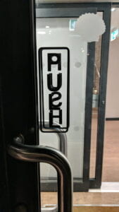
Unreadable Push/Pull sign on a door/ Source: Unknown
As we can see here, the designer did a great job of adding push and pull in both sides to facilitate the process for the user. However, the problem here is that he didn’t pay attention to the fact that the door is made of transparent glass, which causes the signs to appear from both sides thus becoming unreadable and unidentifiable, leading to confusion and error. Most probably, the designer saw it after finishing but decided to ignore it and mind his own business.
At the end of the day, everyone will see it and think that the job is done and might even blame themselves if they don’t identify the words, while, in fact, there is a problem.
2. Second case: Good design over practicality & clarity
Coming from Cairo, where signs in the streets might barely exist, I want to say that no words could express my happiness when I arrived here for the first time and saw the pictograms and signs on campus. As a designer, I pay attention to the fonts, especially to how the Arabic font share the same personality with its English counterpart as if they were from the same family type. That’s in addition
to the pictograms, their unified personality, consistency, alignment, and so on. What I didn’t like however was the lack of practicality: although the designs are well made, it was indeed hard for me to understand how and where I am supposed to go.
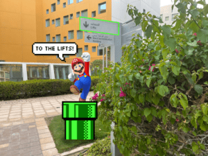
On of the things I went through the second day I arrived here was finding my way back to the lifts.

“What does this arrow mean here? To where does it point? So if I want to go to C2, should I use the lift to go downstairs or go downstairs to go to to the lift? Until this moment, I want to know what the designer was thinking of when he made the design of the downward arrow next to the lift. To me, whenever I see the sign the first thing that comes to my mind is Super Mario’s pipes, where whoever designed this expected us to use it to go downstairs. While it’s true that he provided signs at a decision point, the arrow was in fact confusing.

3. Designers who know there is a problem, and instead of fixing it, they accuse the user of being wrong.
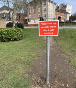
As we can see here, the designer knows that there is a problem

but he is reluctant about solving it in the first place. Here, in the picture, once the designer realized that the users created their own desire path, instead of paving and providing a pathway way here, he tells them “Please use the purpose made paved path provided.” Probably, the way people use this path is that it might be shorter and it saves time, but for the designer, the first and easies thing that comes to mind is a signage to prevent people from passing. A normal response to this can simply be “pave here then” as this designer, if he knew about desire paths he should have know that this is not a user’s problem but rather the designer’s.
One of the principles I love about wayfinding is “don’t give the user too many choices in navigation.” In my opinion, good designers are the ones who are able to expect the user’s next step and act upon it. Those who put in extra effort to present something that is beautifully done and also practical. I believe that the most important component of wayfinding is understanding that the user is always right, especially when all the users agree on something but the designer is for some reason reluctant about it. Good design makes life easier. Bad design makes everything like a math equation you have to solve, complicating it further.
This was a really nice post! I agree with all the points you made, and would like to ask this: How much more important is the aesthetics part of a design than the user experience? Do you think that the functionality of a design goes hand-in-hand with user experience?
Thank you for your comment, Ulan! I really liked your take on this topic as well!
Your question is really interesting and I think it’s difficult to answer it. However, I believe that user experience can be much more important than aesthetics. That’s because, from what I’ve seen in my life, people rarely notice good designs. Everyone is busy living their lives, and it’s totally okay. It’s only when a design is superb in all terms that people begin to notice its beauty and appreciate it. If it is above average or average, people will pass by it and won’t even notice.
In my point of view, user experience is important because any change of the quality of experience or if any bad/unexpected thing happens, people will be affected by it, and they will, of course, notice it.
This is again is not to say that design is not important; all of us know how important it is. However, in cases where there’s no good user experience at all, I think we should think of the priorities first and how to make people smoothly do what they want to do. This also means that I believe that the functionality of a design goes hand-in-hand with user experience.