In Summer 2021, the end of my Sophomore year, I was interning at Credit Book – a startup focused on financial technology (fintech in the startup lingo) in Pakistan. The position I held was of a Data Engineering & Science Intern. At that point in time, it had been 8 months since they launched their Application on the Google Play Store and had around 2 million downloads – resulting in a good amount of data work. Working on the data side of the application, I was not expecting that analyzing the data actually helps understand and shape the User Experience of an application. Hence, I was definitely up for a surprise.
My very first learning from the experience was working with the Team Lead to figure out the problem with less retention on the application. Retention is when an application is downloaded, but then the user stops using it. From the data analytics, it was apparent that while the application had more than 15,000 downloads in a day, it was being deleted by many of those in only a span of a few days. On analyzing the application usage for those users, the pattern which seemed evident was when most users reached the stage of generating a One Time Password on the application through a text message on their phone number, the application would be closed only a few seconds after. The analyzed reason was a delay in transmission of the One Time Password – ultimately leading towards lesser retention, a case of the impact of User Experience in the digital world that was apparent to me from a first person perspective.
Now, the question for me to answer is how does it relate to design? For me, if I downloaded the application I had a certain expectation from it. I was targeted by the people working on Digital Marketing at the company, who spent hours on making sure they reached the appropriate audience. Hence, I downloaded the application since I wanted to try it out. A good job by the company so far! However, upon downloading, if I click on a button to wait for a One Time Password but have no idea whether it is working or not, that is the result of bad design. Considering my motivation to download the application, I would be willing to wait for the One Time Password, only if I know I am going to receive it. The way I could know that the functionality of the button is intact is through Design. A change from the transparent button to a green button – demonstrating success, along with a feedback pop-up letting users know that the request was received would surely help at least some of those that downloaded the application to actually wait for the message.
Once you experience such design practices from a first hand perspective, you become more observant. That has been the case with me, where I noticed another very recent example of Design and User Experience. The mobile application of a local bank in Pakistan, namely Habib Metropolitan Bank, which I have been using for 3 years now, updated their application’s user interface. A decently working design, which I faced no problem with, except for a relatively old school feel, was replaced with bolder colors to match the design trends of this decade.
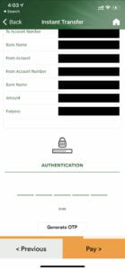
At first, it looked nice, however when I tried my first transaction, a not so urgent one, I faced a similar issue with the One Time Password (as the new users of Credit Book must have felt). I waited a while for the One Time Password, tried again 5 minutes later and then lost faith in the User Experience of the application. A demonstration of the screen can be seen as follows:

Looking at the above picture, one would click on the Lock Icon expecting something to happen. Then, I naturally tried pressing the ‘Pay’ button which in turn would ask me to enter the OTP first. In frustration, I closed the application, looking to sort it out later.
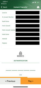
However, it was soon that I had to make an urgent transaction, and so I had to ask my father (a very regular user). Since he had a phone with a larger screen, he told me it’s at the bottom, which is how it usually shows up for him. Ultimately, I discovered the mysterious button in the following manner:

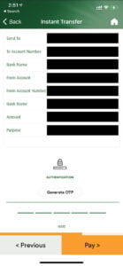
This was one of the worst user experiences I have faced personally. It was time to use my basic photoshop skills and some idea of user experience, from inference, to produce a proposed design. A very simple thing that could made it easier to navigate towards the OTP button would have been a scrollbar in the following manner:

The minimal scrollbar would be noticeable by those having a problem and would make it easy to find the button. Otherwise, better scaling of the content with the Generate OTP Button in the following manner could work as well:

While the experiences I have described pertain solely towards digital applications, these kinds of bad design principles can be seen all around us. The evolution of successful e-commerce businesses is becoming dependent upon how easily and conveniently they allow a customer to purchase an item from their application or website and this is synonymous with the concept of the shortest path that people take in the real world. A person walking through a grassy patch instead of a paved way, saving a minute of their time, shall not be considered wrong, in fact the bad design should be acknowledged such that the user’s preference and ease is not considered. The User is always right, and the design of things should be centered around that principle, making it easier and convenient for the intended audience.
This idea brings to light the concept of Affordance, which is the property of an object that defines all of its possible uses, not only the ones we think of. If a user of a normal sized table is able to sit on a table, the table allows an individual to do so, basically creating an affordance towards that. Hence, a person sitting on it is not to be considered wrong, the designer of the table could have made the table a bit higher to not allow people to sit on it or otherwise sturdy enough to hold the weight of a person.
This concept of Affordance, as discussed earlier, can be applied to web or app design as well. The fact that only seeing the button to ‘Generate OTP’ solved my problem – particularly due to the digital affordance that it created. Digital affordance in this case was to make the hyperlink on the page to resemble a real world button, which would have allowed users to press it, hence producing a similar digital feel for the digital button.
I believe there is a great deal to learn about the depth of User Experience and User Design, these are entire industry fields to be studied, especially with the growing digital era that we are in. People want ease in terms of the digital applications that they use, and the companies that offer them appropriately are succeeding.