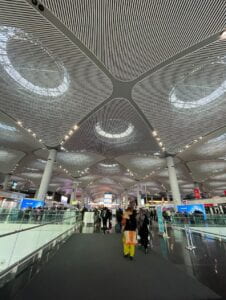
Istanbul Airport, also known as the World’s Largest Airport, is a landmark for international transportation. With more than 40 million passengers and a capacity to handle 90 million per year, this airport was awarded “The Most Efficient Airport in the European Union” by global leading aviation researchers at Air Transport Research Association in 2021. This gives us a peek into the impact this airport has in global commerce and tourism. And having been there at least 3 times, I can attest to the “strong infrastructure, efficient operation, superior technology, and premium travel experience” that it offers. However, I would say its most remarkable yet unnoticed characteristic is its wayfinding design.

When coming to NYUAD for the first time, I had a layover of 14 hours in Istanbul Airport, exposed to making thousands of decisions based on zero knowledge of the space I found myself in. As a first timer traveling to the other side of the world, I didn’t feel lost during my layover in Istanbul Airport. Of course, I didn’t know back then that this was connected to the good wayfinding this airport has. However, I did feel confused from time to time given the large size of said airport, so I will be going through the good examples we can apply someplace else and the things that can be improved.
One thing that I believe this airport did right is find a good balance between simplicity and redundancy in their signage and gates. They did a great job of playing with letters and numbers to name the different gates so as to avoid confusion and eliminate the perception that the airport is too big. For example, they could have had C50, but instead they chose small numbers and different letters. The quote in their website is “Do not be afraid to ever miss your flight with us” and it is actually true. They have big screens very close to each other and signage with the right distance between them to make sure no one misses their flight information. The balance of information and medium is perfect and very convenient for travelers from all parts of the world.
Adding to the positive design you can find at the Istanbul Airport, you have accessible pathways! As you navigate one of the biggest airports yet to exist, there are lifts where there are stairs. There are also a lot of electrical path rushers to make it in time for those who can’t run. Moreover, there are various cars to put your heavy bags on for which you can get a reimbursement after you use them almost everywhere in the airport. This is one of the highlights of the airport, and I wish there were more airports with these options.
In contrast, one thing I struggled with was finding the exchanging places late at night. It was an emergency, really, it was my last chance to try the Turkish ice cream, and I only had big bills for which they didn’t have change. I spent 40 minutes walking all around the airport, asking people around, and I believe they didn’t have any exchange servers sign, or at least not clear, visible ones. I risked losing my flight that night, all because there were no signs about the exchange servers’ locations. Now, on a more serious note, this is very relevant, especially in such an international hub of travelers with people coming from LITERALLY all parts of the world with all different currencies. Therefore, one thing this airport lacks is effective, clear signage of money exchange servers, which would save a lot of people time and struggles.
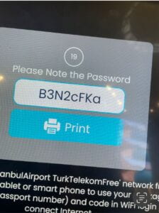
Similarly, there are no signs for the wifi connection places, which needless to say, are very important in Airports. But why can’t people just connect to the wifi from where they are? In Istanbul Airport, you only get one hour of wifi per passport. This means, you need to find a wifi spot, scan your passport, and connect to the wifi. If you’ve been traveling for 12 hours for the first time and you need to let your family know that you made it okay (in my case), then finding these spots should be a priority in signage. Moreover, even if you’re in an airport, you should have the right to know where you are at and do research on questions that might pop up, like where is your airlines’ section or what are the best places to eat.

The wayfinding design at Istanbul Airport is mostly on point, at least the intention: big, visible signage everywhere; clear names for the gates; intuitive signage for bathrooms, food, prayer rooms, and other attractions; and accessible pathways. With this in mind, there are some details to work on, like the visibility of money exchange places and wifi connectivity spots. From my personal experience, I can attest that navigating this HUGE airport is mostly very intuitive and smooth. Overall, there are so many things to replicate worldwide, but some things to be learned from other places and be applied.
SOURCES:
- https://www.internationalairportreview.com/news/163584/istanbul-airport-wins-most-efficient-eu-40-million-passengers-award-from-atrs/#:~:text=As%20the%20world’s%20largest%20airport,aviation%20industry%20with%20its%20strong
- http://www.airport-business.com/2021/04/istanbul-airport-enhancing-istanbuls-position-top-global-airports-league/
Can you upload bigger photos?
Just updated them! Thing is even when inserting photos I took (really good quality), the site is lowering the quality 🙁