Thoughts on Juxtaposition
For this blog post, I wanted to explore the idea of juxtaposition in design. This inspiration came from an example mentioned in class – a trash bin located right in front of a subway map.
The issue lied not in that fact that they were in the subway. It is when these two objects, each with their respective functions, are placed too closely to each other, that an issue arises. This creates an awkward situation in which there are two parties trying to do two different things in the same space – trash throwers and map readers that are now required to multitask in order to not get in each others’ ways. Neither can carry out their functions in the best way.
“Juxtaposition is what creates the problem”.
The issue arose with the juxtaposition of two objects. More specifically, how they were juxtaposed. This made me rethink the importance of cautious juxtaposition of elements when trying to optimize a certain function. It is important as, evident from the subway example, there are unintended consequences that could arise when this process is not kept in mind.
It is perhaps the role of the designer to juxtapose elements in a way that could optimize a function. This made me enquire, how can we design systems – specifically way finding systems – so that we make can optimize the juxtapositions we make? How does one enhance their ability to juxtapose?
Designing features for a public transport is extra challenging as you are designing for billions of people. You must be aware of what the people are looking for, where they could look for it, and provide the best model of juxtaposition of reduce confusion and help them find their way.
Keeping these thoughts in mind, I wanted to revisit the process of my commute during my semester abroad in New York, Fall of 2021. As an interactive media, most of my classes were situated in Brooklyn (where the IMA / ITP department relocated to a couple of years back).
My NYC Commute Experience
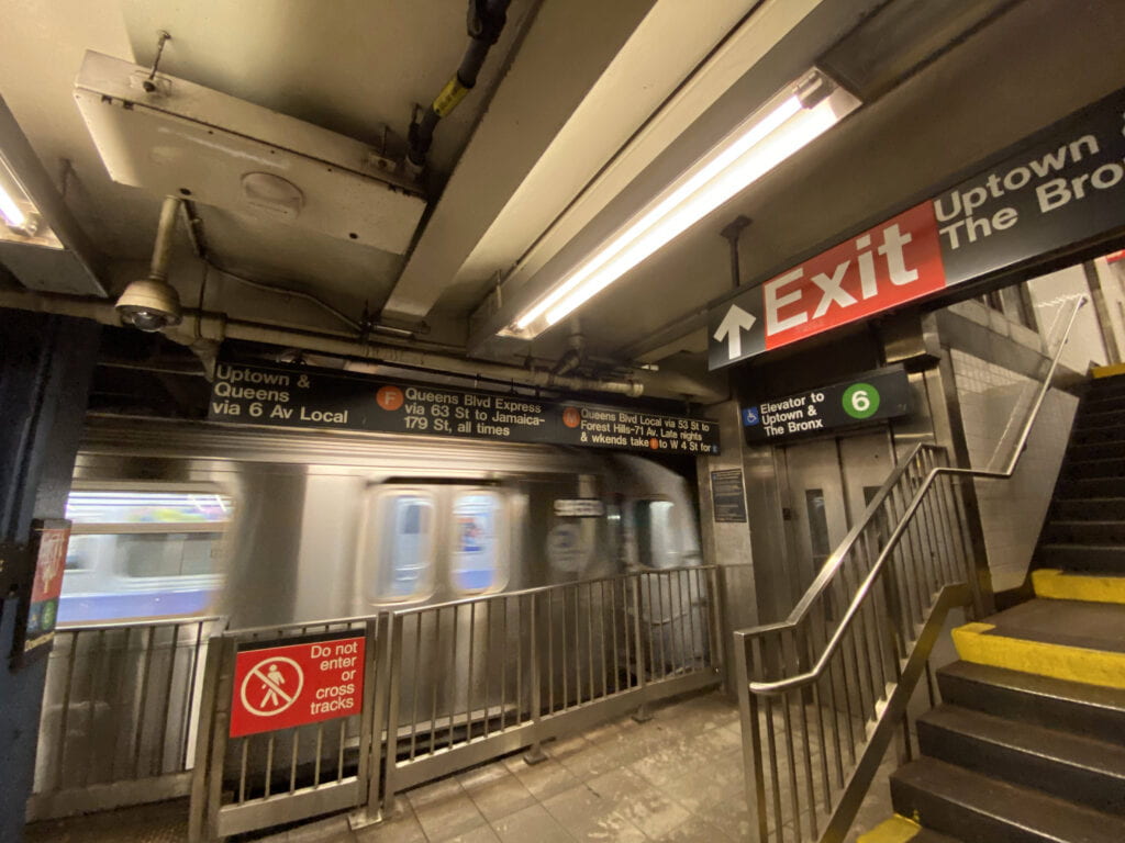
During my fall semester, I had to commute from Manhattan to Brooklyn three times a week. The commute took approximately 50 minutes including the wait. The length of the commute along with the poor internet connection underground forced me to disconnect and look around.
I took some pictures during my commute. Back then, I did not have much knowledge on signage systems – I just knew I liked the bright colors and the use of Helvetica. But taking this class made me want to revisit these pictures with a new eye.
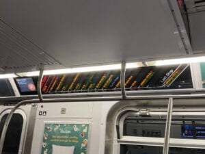

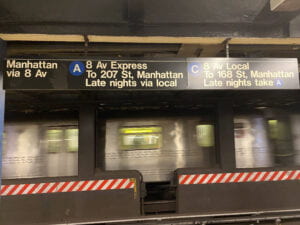
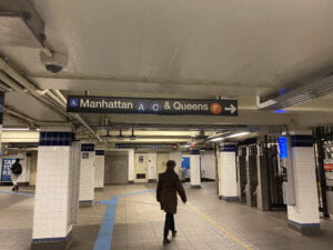
Navigating the New York subway system as a newcomer in the 21st century is an interesting one. With the emergence of smart phones, the way we navigate in the physical space has changed forever. Prior to taking my trip, I first opened my google maps to construct a brief mental map of my route. From google maps, I knew that I had to take the lines F and line 6 and the subway station I had to walk towards.
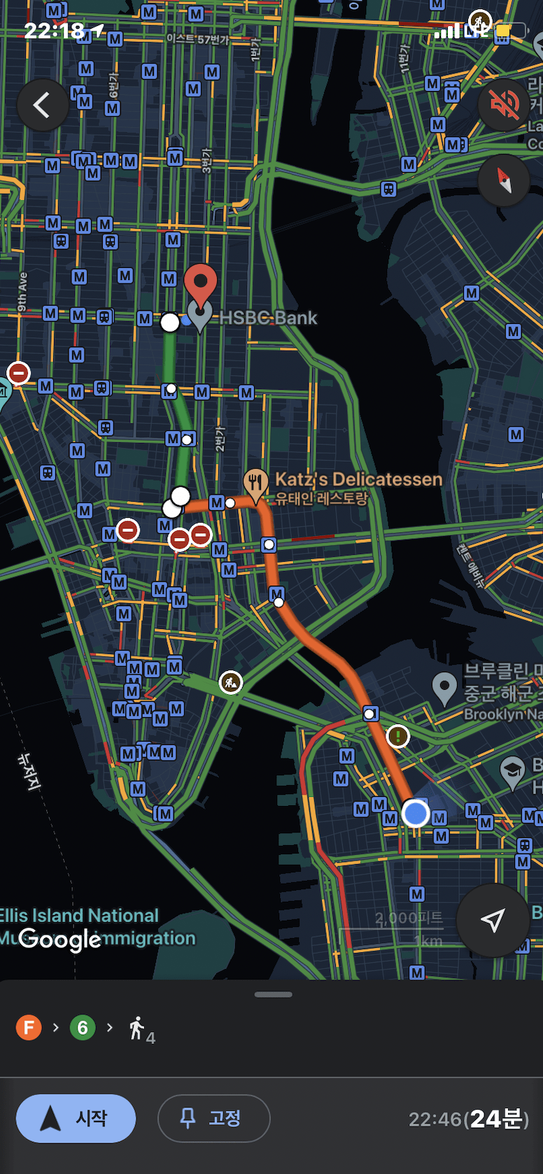
One challenge I faced during my first week in New York was that I did not have a sim card and internet data. This meant that once I reached the subway station, I had to rely on physical signages. Once I reached the metro, I saw a map displayed by the entrance.
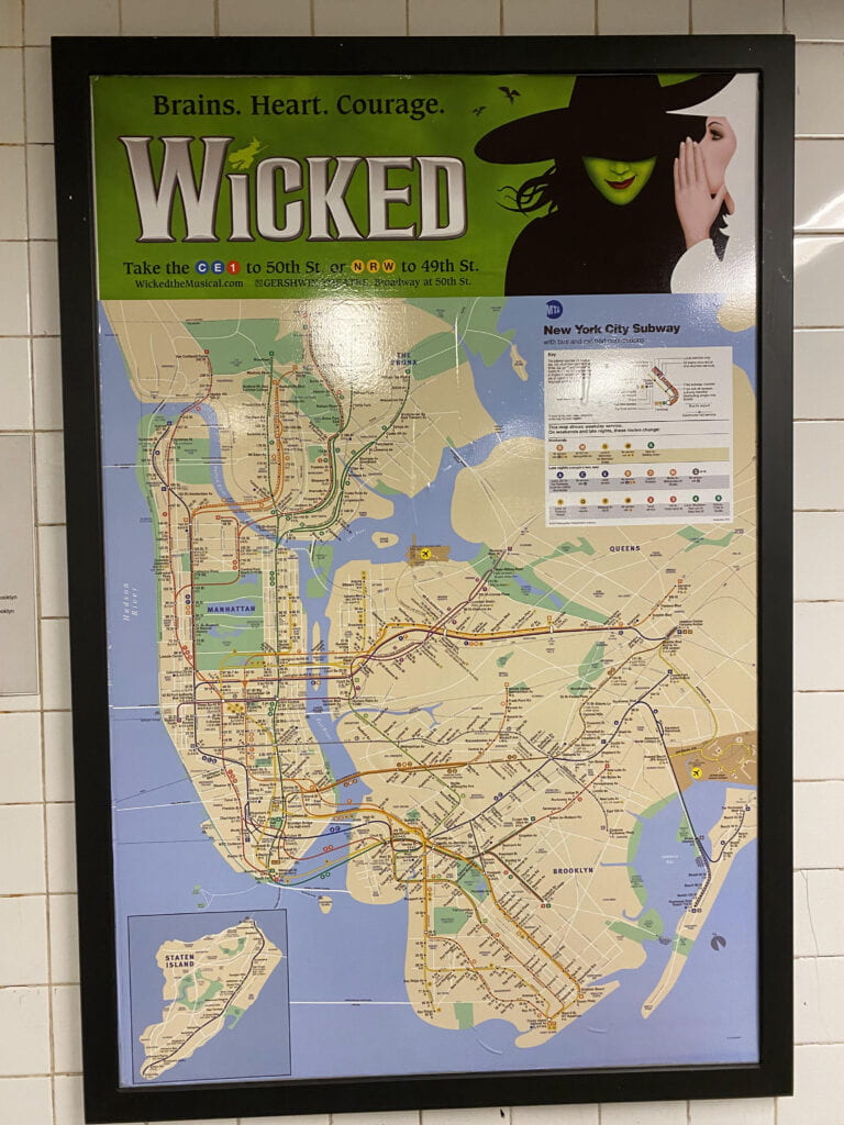
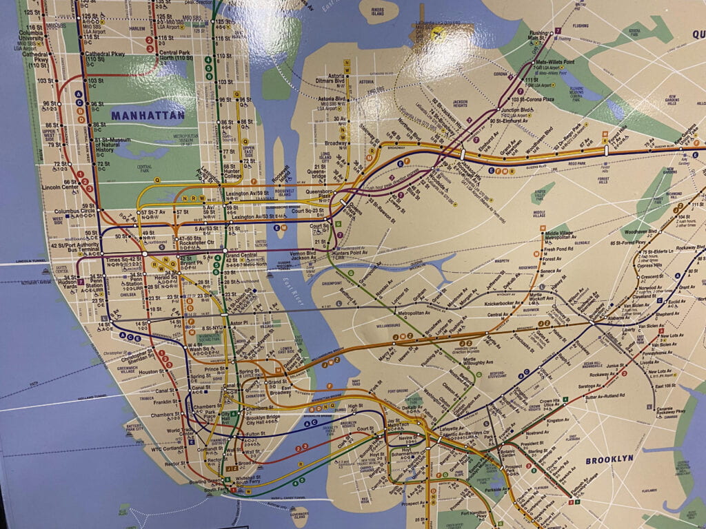
Now I know that this map was designed by Michael Hertz, influenced by Massimo Vignelli’s 1972 map design. Looking at the screen shot of my google maps, I looked for the starting point (Mad Sq Av Park) and the destination (Jay St) to familiarize myself with the lines (the colors helped alot!) and to also ensure that I was taking the right track.
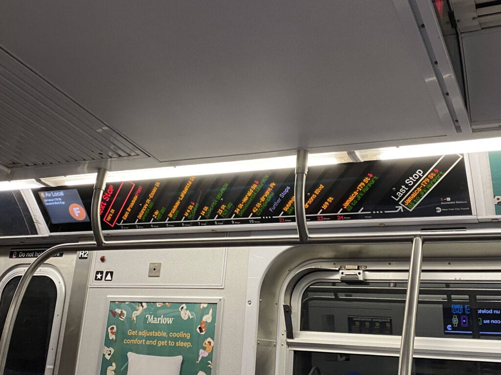
Once I got on the subway, there was a digital screen that updated the stops as the metro moved. The blend of digital and physical signage systems was very interesting. I also noticed QR codes around each station – the function of which I did not know back then.
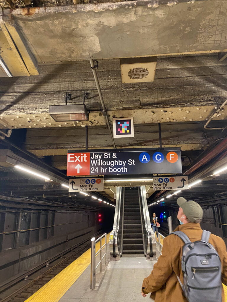
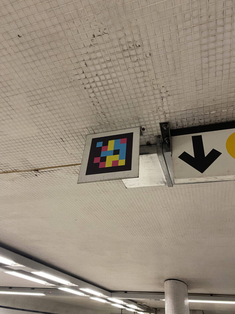
With some research, I found out that these QR codes were part of NaviLens which reads out signs and provides train arrivals in audio to help blind or low-vision users navigate the station. (Read more about that here: https://new.mta.info/accessibility/stationlab/navilens)
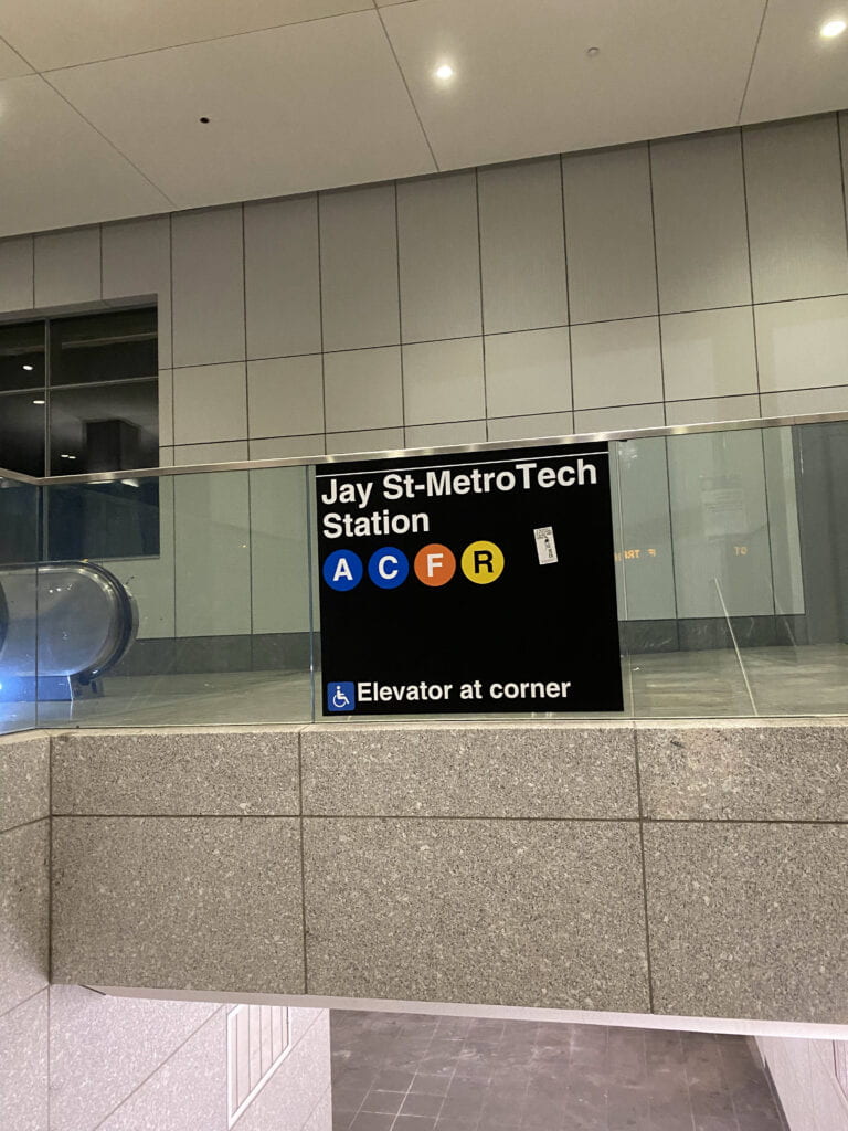
Once I reached the jay st metro station, I noticed black and white maps that had a different style to the main metro map. These were floor maps that showed the surrounding infrastructure once the user left the station. Each exit / entrance had a floor map, helping the navigator decide the nearest exit to their destination.
Each entrance and passage had the lines available for users to follow.

As someone who had never visited NYC before, it took me around a month to get used to navigating my commute without a phone. My mental map of NYC itself was non-existent. It seemed like I was taking on the final level of the video game before completing the previous levels. My first month involved not only getting used to the NYC subway system but getting used to NYC itself.
To a local, taking the F line heading to Queens took no thought but as a new comer, I had no idea where and what Queens was. Because my first encounter of NYC’s land was through the subway system, if someone asks me now to recount the places I visited in NYC, the first thing that comes to my mind is the NYC subway map.
The NYC subway map has forever imprinted an irreplaceable mental map into my consciousness.